Download as PDF, PPTX

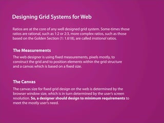
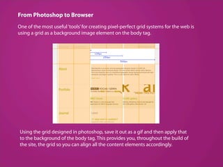
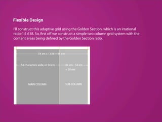
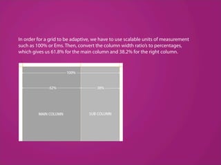
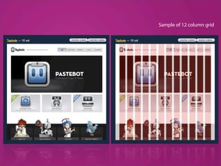
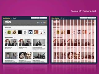
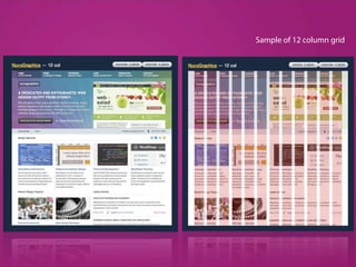
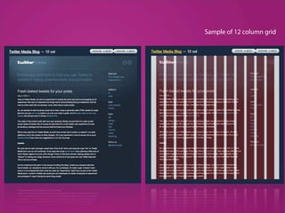
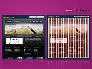
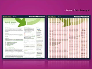
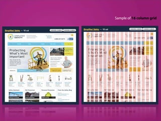
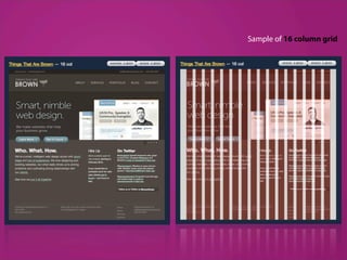


The document discusses grid systems in web design. It explains that grid systems use ratios and measurements to construct layouts with fixed or flexible widths. For fixed grids, the canvas size is based on screen resolution, while flexible grids scale to browser windows. The document also describes creating grids in Photoshop, using background images for alignment, and the 960 Grid System CSS framework which enables rapid prototyping with 12 or 16 column grids within a 960px container.