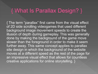
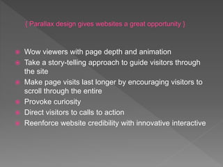
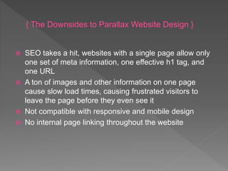
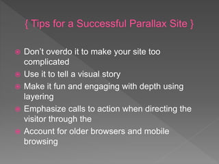
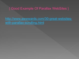
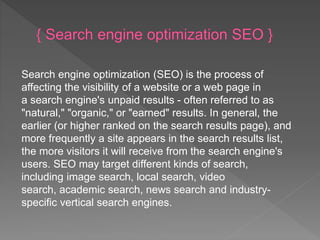
 Parallax WebSites
 SEO { Search Engine Optimization }
 Grid Design
 Bootstrap
 Animate.css
 Default Web Page Errors
{ The phenomenon of parallax scrolling website design is growing in
popularity across the internet, bringing the user experience to a new
interactive level of online viewing. With web designers and developers
constantly exploring new ways to make their web presence more appealing to
their sites’ visitors through engaging visuals and functionality, parallax
scrolling has taken hold as the new frontier of user experience }
{ The term “parallax” first came from the visual effect
of 2D side scrolling videogames that used different
background image movement speeds to create the
illusion of depth during gameplay. This was generally
done by making the background of the game move
slower than the foreground in order to make it seem
further away. This same concept applies to parallax
site design in which the background of the website
moves at a different speed as the rest of the page for
an impressive visual effect that allows for countless
creative applications for online storytelling. }
 Wow viewers with page depth and animation
 Take a story-telling approach to guide visitors through
the site
 Make page visits last longer by encouraging visitors to
scroll through the entire
 Provoke curiosity
 Direct visitors to calls to action
 Reenforce website credibility with innovative interactive
 SEO takes a hit, websites with a single page allow only
one set of meta information, one effective h1 tag, and
one URL
 A ton of images and other information on one page
cause slow load times, causing frustrated visitors to
leave the page before they even see it
 Not compatible with responsive and mobile design
 No internal page linking throughout the website
 Don’t overdo it to make your site too
complicated
 Use it to tell a visual story
 Make it fun and engaging with depth using
layering
 Emphasize calls to action when directing the
visitor through the
 Account for older browsers and mobile
browsing
http://www.awwwards.com/30-great-websites-
with-parallax-scrolling.html
Search engine optimization (SEO) is the process of
affecting the visibility of a website or a web page in
a search engine's unpaid results - often referred to as
"natural," "organic," or "earned" results. In general, the
earlier (or higher ranked on the search results page), and
more frequently a site appears in the search results list,
the more visitors it will receive from the search engine's
users. SEO may target different kinds of search,
including image search, local search, video
search, academic search, news search and industry-
specific vertical search engines.
Typography and various things you should undertake
before you start a design project, it’s time to start
getting down and dirty with some of the basics of
working with grids in your designs.
Grids enable you to build solid structure and form into
your designs. Much like we looked at typographic
hierarchies and rhythm, we can effectuate the same
feelings through using a grid structure. Just as with
coding, there are recommended ways to organise
modules and sections of code, and a grid system can
help similarly when designing for the web.
..a structure comprising a series of horizontal and
vertical lines, used to arrange content.
In its most basic terms, a grid system is a
structure comprising a series of horizontal and
vertical lines which intersect and are then used to
arrange content. In even more basic terms (which
make it easier to understand!) a grid system is a
way of providing a system that designers can work
with to structure and present content and imagery
in a much more readable, manageable way.
 There are many advantages to using grid systems - this can start when
you’re first designing the website but can also prove useful when you move
on to the build and development stages, as well as when managing both
the website’s design and build in the future.
 The good thing about grid systems is that they allow you to design in
proportions, balancing between all of the different elements that you might
have in your design. A grid system should always be very flexible, so that
you can almost twist it to your needs when you’re designing the different
parts of your website.
 Using a grid system in your design also allows for that sense of uniformity
and familiarity - whilst it may work for some sites to have vastly different
page designs, for many it will not be the case and you will want to have a
uniform and more structured feel to the main layout. This also makes it a
lot easier when you come to code the design up, as it will mean that you
can pick out the uniform elements in your design and apply this modular
effect to your code and CSS structure.
 First up, many people - particularly those who are new to design or designing with grids - may
find that grid systems are quite stifling and restrict creativity. Unfortunately, this can sometimes
happen and - pardoning the pun - you may sometimes feel like you’re being prevented from
thinking outside of the box and are instead creating very plain, clinical designs. In those sorts of
instances, I would encourage you to try and step back from the grid - instead, play around with
the elements on a page until they feel like they look like they’re in the right place, and then switch
to looking at your grid overlaying your design (we’ll talk some more about that in a bit), and see
how you can make your ideas work to the grid structure that you have. If it doesn’t conform to
that grid design, then it may be time to start working with another grid system or design instead.
 Grid systems are also really, really hard. Not only do they take a lot of willpower to get your head
around the first few times you use them (though you’ll likely have an “aha!” moment not long
after some good practising and playing with them) but they can also sometimes involve a lot of
maths and calculations. I’m not someone that ever copes well with doing much maths - so that
side of things I can personally find very difficult. It’s also really hard just to simply get your head
around the concept of grids and how they can help your design - but hopefully you’ll start to see
the effect soon after using them in your designs, just as you will have likely done with your
development practices somewhere down the line. And while grids are damn hard work, they’re
most definitely worth it for the end result.
 Set an overlay of your grid onto your design. If you’re
comfortable designing in the browser using your CSS framework
of choice (either a premade example, or one of your own) then
that’s fine - but otherwise, I would always recommend creating
an overlay of your grid system for your design. Whether you’re
in Photoshop or another favourite graphics program, set a top
layer that displays your grid and lock it in place. That way, it’s
always available for you to toggle on and off if you so please.
 Create some guides to help you. If you have an overlay in
place, the next thing to do is to create some guides to help me.
Generally, I like to create a guide for every beginning and end to
a column in my grid system. At this point, it is there purely as a
little extra helper alongside my grid overlay - to help me define
the edges at which my grid columns are.
 Try to work with constraints and restrictions. Many may
think that working with a grid system alone is a good recipe for
working in a more constrained manner, but that’s not the case.
Working with grid systems - and particularly when creating your
own - it’s very easy to go creating a system that allows for 16
columns, when 6 may instead be a wiser solution. Learning to
design with constraints - not just within your grid system - will
only help you in the long run, as you will be able to focus your
design on what is most important and relevant to your users.
 Pay attention to your spacing. A lot of the focus in grid
systems that we use is on the amount of columns there are - the
width of the columns, the width of the gutter between columns
(the amount of space between each column) and how much
space should be given around those elements. However, in turn,
don’t forget the vertical space that is available to you and ensure
that you also use your grid to help you with the spacing
available there. For example, using the measurement of the
gutter width, also as a vertical spacing value may work wonders
for your design and how elements are each spaced out.
 960 Grid Design - http://960.gs/
 1080 Grid Design - http://www.1080.gs/about/
 1200 Grid Design - http://1200px.com/
 Bootstrap is a free front-end framework for
faster and easier web development
 Bootstrap includes HTML and CSS based
design templates for typography, forms,
buttons, tables, navigation, modals, image
carousels and many other, as well as
optional JavaScript plugins
 Bootstrap also gives you the ability to easily
create responsive designs
 Easy to use: Anybody with just basic knowledge of
HTML and CSS can start using Bootstrap
 Responsive features: Bootstrap's responsive CSS
adjusts to phones, tablets, and desktops
 Mobile-first approach: In Bootstrap 3, mobile-first
styles are part of the core framework
 Browser compatibility: Bootstrap is compatible
with all modern browsers (Chrome, Firefox, Internet
Explorer, Safari, and Opera)
Animate.css is one of the most popular
animation library in web design it only works
through css3 the elements of the library can
easily be used in any websites. It allows
flexibility because it is not dependent to
JavaScript. – demo
https://daneden.github.io/animate.css/
The following is a list of Hypertext Transfer
Protocol (HTTP) response status codes. This
includes codes from IETF internet standards as
well as other IETF RFCs, other specifications and
some additional commonly used codes. The first
digit of the status code specifies one of five
classes of response; the bare minimum for an
HTTP client is that it recognises these five
classes. The phrases used are the standard
examples, but any human-readable alternative
can be provided. Unless otherwise stated, the
status code is part of the HTTP/1.1 standard.
 1xx Informational
 2xx Success
 3xx Redirection
 4xx Client Error
 5xx Server Error
The Detailed Information Can be found in Wiki -
https://en.wikipedia.org/wiki/List_of_HTTP_status_codes
 Parallax - https://www.unleashed-
technologies.com/blog/2013/08/15/what-parallax-web-design-
%E2%80%93-definitions-tips-considerations
 SEO - https://en.wikipedia.org/wiki/Search_engine_optimization
 Grid Design - http://webdesign.tutsplus.com/articles/all-about-grid-
systems--webdesign-14471
 Bootstrap - http://getbootstrap.com/
 Bootstrap -
http://www.w3schools.com/bootstrap/bootstrap_get_started.asp
 Animation.css - http://www.w3schools.com/css/css3_animations.asp
 Animation.css - https://daneden.github.io/animate.css/
 HTTP Status Codes -
https://en.wikipedia.org/wiki/List_of_HTTP_status_codes

Graphic Design For Web

  • 2.
     Parallax WebSites SEO { Search Engine Optimization }  Grid Design  Bootstrap  Animate.css  Default Web Page Errors
  • 3.
    { The phenomenonof parallax scrolling website design is growing in popularity across the internet, bringing the user experience to a new interactive level of online viewing. With web designers and developers constantly exploring new ways to make their web presence more appealing to their sites’ visitors through engaging visuals and functionality, parallax scrolling has taken hold as the new frontier of user experience }
  • 4.
    { The term“parallax” first came from the visual effect of 2D side scrolling videogames that used different background image movement speeds to create the illusion of depth during gameplay. This was generally done by making the background of the game move slower than the foreground in order to make it seem further away. This same concept applies to parallax site design in which the background of the website moves at a different speed as the rest of the page for an impressive visual effect that allows for countless creative applications for online storytelling. }
  • 5.
     Wow viewerswith page depth and animation  Take a story-telling approach to guide visitors through the site  Make page visits last longer by encouraging visitors to scroll through the entire  Provoke curiosity  Direct visitors to calls to action  Reenforce website credibility with innovative interactive
  • 6.
     SEO takesa hit, websites with a single page allow only one set of meta information, one effective h1 tag, and one URL  A ton of images and other information on one page cause slow load times, causing frustrated visitors to leave the page before they even see it  Not compatible with responsive and mobile design  No internal page linking throughout the website
  • 7.
     Don’t overdoit to make your site too complicated  Use it to tell a visual story  Make it fun and engaging with depth using layering  Emphasize calls to action when directing the visitor through the  Account for older browsers and mobile browsing
  • 8.
  • 9.
    Search engine optimization(SEO) is the process of affecting the visibility of a website or a web page in a search engine's unpaid results - often referred to as "natural," "organic," or "earned" results. In general, the earlier (or higher ranked on the search results page), and more frequently a site appears in the search results list, the more visitors it will receive from the search engine's users. SEO may target different kinds of search, including image search, local search, video search, academic search, news search and industry- specific vertical search engines.
  • 10.
    Typography and variousthings you should undertake before you start a design project, it’s time to start getting down and dirty with some of the basics of working with grids in your designs. Grids enable you to build solid structure and form into your designs. Much like we looked at typographic hierarchies and rhythm, we can effectuate the same feelings through using a grid structure. Just as with coding, there are recommended ways to organise modules and sections of code, and a grid system can help similarly when designing for the web.
  • 11.
    ..a structure comprisinga series of horizontal and vertical lines, used to arrange content. In its most basic terms, a grid system is a structure comprising a series of horizontal and vertical lines which intersect and are then used to arrange content. In even more basic terms (which make it easier to understand!) a grid system is a way of providing a system that designers can work with to structure and present content and imagery in a much more readable, manageable way.
  • 12.
     There aremany advantages to using grid systems - this can start when you’re first designing the website but can also prove useful when you move on to the build and development stages, as well as when managing both the website’s design and build in the future.  The good thing about grid systems is that they allow you to design in proportions, balancing between all of the different elements that you might have in your design. A grid system should always be very flexible, so that you can almost twist it to your needs when you’re designing the different parts of your website.  Using a grid system in your design also allows for that sense of uniformity and familiarity - whilst it may work for some sites to have vastly different page designs, for many it will not be the case and you will want to have a uniform and more structured feel to the main layout. This also makes it a lot easier when you come to code the design up, as it will mean that you can pick out the uniform elements in your design and apply this modular effect to your code and CSS structure.
  • 13.
     First up,many people - particularly those who are new to design or designing with grids - may find that grid systems are quite stifling and restrict creativity. Unfortunately, this can sometimes happen and - pardoning the pun - you may sometimes feel like you’re being prevented from thinking outside of the box and are instead creating very plain, clinical designs. In those sorts of instances, I would encourage you to try and step back from the grid - instead, play around with the elements on a page until they feel like they look like they’re in the right place, and then switch to looking at your grid overlaying your design (we’ll talk some more about that in a bit), and see how you can make your ideas work to the grid structure that you have. If it doesn’t conform to that grid design, then it may be time to start working with another grid system or design instead.  Grid systems are also really, really hard. Not only do they take a lot of willpower to get your head around the first few times you use them (though you’ll likely have an “aha!” moment not long after some good practising and playing with them) but they can also sometimes involve a lot of maths and calculations. I’m not someone that ever copes well with doing much maths - so that side of things I can personally find very difficult. It’s also really hard just to simply get your head around the concept of grids and how they can help your design - but hopefully you’ll start to see the effect soon after using them in your designs, just as you will have likely done with your development practices somewhere down the line. And while grids are damn hard work, they’re most definitely worth it for the end result.
  • 14.
     Set anoverlay of your grid onto your design. If you’re comfortable designing in the browser using your CSS framework of choice (either a premade example, or one of your own) then that’s fine - but otherwise, I would always recommend creating an overlay of your grid system for your design. Whether you’re in Photoshop or another favourite graphics program, set a top layer that displays your grid and lock it in place. That way, it’s always available for you to toggle on and off if you so please.  Create some guides to help you. If you have an overlay in place, the next thing to do is to create some guides to help me. Generally, I like to create a guide for every beginning and end to a column in my grid system. At this point, it is there purely as a little extra helper alongside my grid overlay - to help me define the edges at which my grid columns are.
  • 15.
     Try towork with constraints and restrictions. Many may think that working with a grid system alone is a good recipe for working in a more constrained manner, but that’s not the case. Working with grid systems - and particularly when creating your own - it’s very easy to go creating a system that allows for 16 columns, when 6 may instead be a wiser solution. Learning to design with constraints - not just within your grid system - will only help you in the long run, as you will be able to focus your design on what is most important and relevant to your users.  Pay attention to your spacing. A lot of the focus in grid systems that we use is on the amount of columns there are - the width of the columns, the width of the gutter between columns (the amount of space between each column) and how much space should be given around those elements. However, in turn, don’t forget the vertical space that is available to you and ensure that you also use your grid to help you with the spacing available there. For example, using the measurement of the gutter width, also as a vertical spacing value may work wonders for your design and how elements are each spaced out.
  • 16.
     960 GridDesign - http://960.gs/  1080 Grid Design - http://www.1080.gs/about/  1200 Grid Design - http://1200px.com/
  • 17.
     Bootstrap isa free front-end framework for faster and easier web development  Bootstrap includes HTML and CSS based design templates for typography, forms, buttons, tables, navigation, modals, image carousels and many other, as well as optional JavaScript plugins  Bootstrap also gives you the ability to easily create responsive designs
  • 18.
     Easy touse: Anybody with just basic knowledge of HTML and CSS can start using Bootstrap  Responsive features: Bootstrap's responsive CSS adjusts to phones, tablets, and desktops  Mobile-first approach: In Bootstrap 3, mobile-first styles are part of the core framework  Browser compatibility: Bootstrap is compatible with all modern browsers (Chrome, Firefox, Internet Explorer, Safari, and Opera)
  • 19.
    Animate.css is oneof the most popular animation library in web design it only works through css3 the elements of the library can easily be used in any websites. It allows flexibility because it is not dependent to JavaScript. – demo https://daneden.github.io/animate.css/
  • 20.
    The following isa list of Hypertext Transfer Protocol (HTTP) response status codes. This includes codes from IETF internet standards as well as other IETF RFCs, other specifications and some additional commonly used codes. The first digit of the status code specifies one of five classes of response; the bare minimum for an HTTP client is that it recognises these five classes. The phrases used are the standard examples, but any human-readable alternative can be provided. Unless otherwise stated, the status code is part of the HTTP/1.1 standard.
  • 21.
     1xx Informational 2xx Success  3xx Redirection  4xx Client Error  5xx Server Error The Detailed Information Can be found in Wiki - https://en.wikipedia.org/wiki/List_of_HTTP_status_codes
  • 22.
     Parallax -https://www.unleashed- technologies.com/blog/2013/08/15/what-parallax-web-design- %E2%80%93-definitions-tips-considerations  SEO - https://en.wikipedia.org/wiki/Search_engine_optimization  Grid Design - http://webdesign.tutsplus.com/articles/all-about-grid- systems--webdesign-14471  Bootstrap - http://getbootstrap.com/  Bootstrap - http://www.w3schools.com/bootstrap/bootstrap_get_started.asp  Animation.css - http://www.w3schools.com/css/css3_animations.asp  Animation.css - https://daneden.github.io/animate.css/  HTTP Status Codes - https://en.wikipedia.org/wiki/List_of_HTTP_status_codes