Fonts
•Download as PPTX, PDF•
1 like•133 views
This document evaluates several fonts for their suitability as a magazine masthead for a school magazine. It discusses how some fonts have a graffiti or street style that could appeal to students but may not be appropriate. Other fonts are evaluated as being too formal, not reflecting the word "cool", or being better suited to an American audience rather than the target country. Handwritten styles are considered as they could appeal to children and represent school, but may not capture the element of cool sought for the magazine name.
Report
Share
Report
Share

Recommended
Fonts
This document discusses potential magazine masthead fonts. The first font brings an element of "cool" but may not appeal to the target audience. The second font has associations with graffiti and street culture. The third font resembles childlike bubble writing and seems more child-friendly and informal, making it a suitable masthead for a magazine aimed at children.
Fonts
This document discusses font and iconography styles for an indie/alternative music magazine. It evaluates several font options, considering factors like readability, sophistication, and similarity to styles from American pop culture references. One font is favored for its quirkiness but refined look. Iconography ideas discussed include using a shattered text effect to imply the magazine is "shockingly" good, and favoring simple, punchy mastheads like those of NME and Billboard that allow space for images. Possible theme ideas for magazine issues focus on popular new albums, local artists, festivals and concerts, and top artists/songs to appeal to a wide audience.
Fonts
This font is bold but not too childish, which would attract the document author's target audience. While plain, it is not too bold or too plain and would suit a pop magazine. It is fun, quirky, and unusual, making the magazine cover stand out. However, some fonts may be too girly or childish for the mature target audience. While feminine and bold, some fonts would not look as good in different colors as the black version.
Font research
This document discusses four fonts and their suitability for a pop genre magazine. The first font is described as more serious and edgy, better suited to an indie magazine. The second font is fun but may look unprofessional and handwritten. The third font is playful but too childish and doodle-like. The fourth and final font is concluded to be the most suitable as it is fun, playful, on-trend, and would work efficiently for the intended audience.
Student research
The magazine uses a layout with large images and minimal text to appeal to readers who prefer visuals over large blocks of text. Across its four pages, 12 images are used to engage visual learners. A consistent brand identity is created through the use of red and black colors and a sans serif font. Most images show male musicians in dark costumes, which aligns with the indie rock genre but could alienate female readers by lacking representation of women. Analyzing this magazine's design informed the student's own magazine creation process.
Font styles
The document discusses different font styles and their suitability for magazine covers. Several fonts are described as standing out due to being bold, having spaces between letters, or curvy designs that could attract females or children. Other fonts are said to be good choices because they are unique, wavy, funky or creative, which could attract young readers. A few fonts are suggested as being suitable for music magazines due to looking musical or matching the genre with their up and down or curvy designs.
Planning 2
The document summarizes the planning for a music magazine, including choosing a color scheme of purple, grey, and black; fonts like "Coolvetica" and "A Love of Thunder"; photographs with models centered or to the side; and using some slang and exclamation points in the text to appeal to the target audience of young women aged 15-21.
Planning 2
The document summarizes the planning for a music magazine, including choosing a color scheme of purple, grey, and black; selecting the font "Coolvetica" ; using casual photography of models from the waist up or centered; and addressing readers using some slang to appeal to the target audience of young women aged 15-21.
Primary Research
This document discusses the results of market research conducted to help design a new rock magazine. Key findings include:
- 87.5% of the target audience correctly identified the sample magazine as a rock magazine, showing the style conveyed the intended genre.
- Over half found the sample magazine's sell lines on the cover appealing, especially a question as a sell line.
- 37.5% found the sell lines uninteresting, so the new magazine should include more sell lines.
- Most would pay £2 for the magazine, so that is a good price point.
- The sample used mainly male images, so the new magazine needs a mix of male and female images to appear for both g
Magazine Details and Planning
1. The document discusses color choices for magazine design elements to ensure important information stands out to readers. Reds, blues, purples, yellows, black and white are considered for backgrounds, text, and images based on their visual impact and gender associations.
2. Paper quality, binding method, page size and number of pages are selected to match lower-cost magazines like Kerrang to keep the price affordable for the target audience. A monthly rather than weekly release schedule is chosen to allow more time for writing quality stories about a diverse range of bands.
3. Color schemes will vary between artist features to suit different styles of music like pop punk or heavier bands, but the overall design aims to look professional
Tabloid research
The document discusses font selection and layout design for a student project creating a mock tabloid newspaper. It examines different fonts for headlines, subheadings, and articles, evaluating fonts based on boldness, clarity, and suitability for a tabloid style. Sample fonts considered include Impact, Arial Rounded, and Times New Roman. The document also explores image selection, considering photos of Obama and Lil Jojo to accompany an article, and references layout elements of real tabloids to guide the design, such as large headlines and images with related stories in boxes below.
Masthead Font Styles
The candidate evaluated 6 different font styles for the masthead of their magazine, comparing each to their inspiration of Kerrang magazine. They found that the fonts "Haze", "aBite", "Babalusa Cut", and "LA Street Kids" were all similar to Kerrang in style and well suited to their underground genre. However, "I the hero" was difficult to read and not similar to Kerrang. They selected "Brush Grunge" as the best option as its scratches and fading effect suited the genre of their magazine "UNKNWN" and had an edgy aesthetic.
Fonts and colours
Fonts and colours are important for conveying the intended message and target audience of a music magazine. The right fonts and colours can attract readers and influence whether they buy the magazine. Serif fonts appear older while sans serif fonts like Franklin Gothic Demi look modern and stand out in magazines. Larger, bolder fonts catch readers' attention. Colours also send messages - red may convey passion while blue represents relaxation. The author discusses appropriate and inappropriate font and colour choices for different music genres like rock to effectively target the right readership.
Evaluation media work newest one
The document discusses how the author's music magazine Metal Entity uses and develops conventions from real music magazines like Metal Hammer, Kerrang!, and Rock Sound. It covers the magazine's title, font, masthead style, written content, and photo shoots. The author aimed to be unique while taking inspiration from these magazines, using fonts, changing mastheads, addressing readers directly, and taking natural photos to seem realistic rather than staged.
Contents planning
The document discusses the author's process for planning and creating a contents page for their magazine called "Metal Entity". They go through multiple drafts, focusing on layout, image selection, font choices and keeping the design consistent with the rest of the magazine. They evaluate their final contents page as having an organized structure with a good use of images and fonts to represent the metal genre and draw in readers.
Masthead designs
Lydia Platts is designing the masthead for her new music magazine called "Vibes". She sampled several fonts from dafont.com but none were quite right. The first font, "M12 Match Biker", was too quirky and techno for an R&B magazine. The second font, "Mabella", was too formal. The third, "Distracted Musician", was too childish. The fourth, "Fabada Regular", was too thin. Finally, she selected the font "Haettenschweiler" because it was formal, big, and bold making it the most suitable choice for the masthead.
Lady gaga
Q magazine uses a large red pull quote in the form of the letter "L" to emphasize Lady Gaga's name across a double page spread. They utilize significant white space around the spread to make the black and grey photograph and text stand out. Drop capitals are also used to liven up the dense copy and keep readers engaged. The magazine targets young males through revealing photographs and avoids taboo language.
Magazine Music Font
1) The document considers several potential magazine names and font pairings.
2) The author decides the name "Unlimited" paired with the Angelic War font is the best option as the patterns in the font are not overpowering but still eye-catching.
3) The preferred names are "Established", which perfectly suits the genre, paired with the iNked God font for boldness without being overpowering.
Textual analysis hannah nicholls
The document summarizes and analyzes various elements of Rolling Stone magazine's design and layout. It notes that the front cover features a close-up shot of the main character's face with a serious expression to draw the audience in. The contents page is organized into columns and features a medium close-up picture. A double page spread uses bold, serif typography and eye-catching language to engage readers with a story about a classy main character who does not make eye contact.
Style sheet (finished)
The document discusses font and color scheme choices for a magazine. For the magazine name, the author chose the Varsity font because it is unique and bold to attract attention. For the masthead text, New Athletic was selected as it is plain but bold to contrast nicely with the name font. The main text font is Ani Typewriter since it is easy to read but also unique looking. For the color scheme, a blue and green pastel scheme was finalized as it will provide an "indie" look when contrast is increased to seem hipster-inspired, reflecting the magazine's genre of indie rock.
Finding masthead ideas from existing magazines
The document discusses different font options for a magazine masthead and whether they would be suitable. Several fonts are disliked for reasons such as being too similar to other magazines, looking too "girly", being too fancy or simple, or not suiting the genre. One font is liked because it is eye-catching and would not make the cover look crowded. Another liked font is bold, not too fancy, and suits the genre. A third liked font is simple but customized to represent the genre through added lines, making it unique.
Stylesheet
This document discusses style choices for a rock magazine, including fonts and color schemes. For fonts, a simple yet elegant font is selected for articles, a distinctive font is chosen for mastheads to be eye-catching but readable, and a third font is picked for titles and contents to complement the other fonts. The selected color scheme mixes typical rock colors like red with less common shades like pink to appeal to both female readers and rock audiences while standing out from other magazines through its color balance.
Fmp planning v6
The document outlines a 7 week production plan for creating a fanzine about the film Hot Fuzz. In each week, the author describes the tasks and goals, which include researching the film, designing the logo and artwork, creating pixel art or comic book style drawings of scenes, and compiling written explanations and insights. By week 4, the author aims to have half the fanzine completed to begin layout designs. Weeks 5-7 focus on finishing artwork and content, getting test prints, and finalizing the fanzine for professional printing.
Colour pallets and fonts x10
The document discusses color palettes and fonts for a new magazine. It focuses on a feminine, relaxing feel aimed at teenage girls. The author's favorite color palettes are 2 and 3, as they complement the magazine's style and can be combined in photos. These colors also match what female country artists wear. The author has researched natural colors from flowers and coasts to create a calm atmosphere. Regarding fonts, the author selects Angelface as the favorite as it looks feminine and matches the target market. The Impact Label font also fits the retro, modern vintage style. Hoedown will be used within articles to incorporate the country music genre. Some other fonts are deemed difficult to read or not feminine enough for the magazine.
Focus group
The focus group provided feedback on magazine mockups for a hip hop/rap genre publication. They liked the eye-catching red headline that stood out from the black background. The color scheme of black and red was seen as attractive with good contrast. The mockups fit the genre without images since black is often associated with rappers. They suggested adding more subheadings and pull quotes to attract readers inside and expected consistency in colors/style as well as more images of featured artists.
Magazines 1
The document discusses pre-school magazines that are sold in the UK and aimed at pre-school children, as evidenced by the topics featured like Disney and Thomas the Tank Engine that would interest that age group. These magazines use bright colors, clear writing, and many images to engage children and ensure they are not bored by any single topic. While the layout may seem chaotic to older people, the magazines are designed to be easily understood by children through images and fonts they can recognize.
Fonts
The document discusses font and color choices for a magazine cover. For fonts, the author wants to use three similar sans serif fonts for text, with a bolder font for the masthead to make it stand out. Sans serif fonts are chosen to seem more informal for the target audience of females aged 18-30. The chosen colors are purples and blues, as these were advised to suit the target audience better than other colors like pink. Blues represent qualities like trust and calmness, relating to the beach sunset cover image. Purples represent luxury, relevant to the magazine's luxury boutique shop contents. Darker blues and purples will mainly be used.
Apps vs-mobile
The document compares mobile apps and mobile websites for small businesses. A survey of over 500 small businesses found that 73% reported higher returns on investment from mobile apps compared to 27% for mobile websites. Customers also preferred apps over mobile websites, with 81% preferring apps. Both apps and mobile websites are important, with 81% of business owners recognizing they are equally important. Apps can provide benefits like increased customer loyalty, improved customer service, and higher revenue. However, mobile websites have advantages like lower costs and not requiring installation. The document promotes developing both a mobile app and website for a complete mobile marketing strategy.
More Related Content
What's hot
Primary Research
This document discusses the results of market research conducted to help design a new rock magazine. Key findings include:
- 87.5% of the target audience correctly identified the sample magazine as a rock magazine, showing the style conveyed the intended genre.
- Over half found the sample magazine's sell lines on the cover appealing, especially a question as a sell line.
- 37.5% found the sell lines uninteresting, so the new magazine should include more sell lines.
- Most would pay £2 for the magazine, so that is a good price point.
- The sample used mainly male images, so the new magazine needs a mix of male and female images to appear for both g
Magazine Details and Planning
1. The document discusses color choices for magazine design elements to ensure important information stands out to readers. Reds, blues, purples, yellows, black and white are considered for backgrounds, text, and images based on their visual impact and gender associations.
2. Paper quality, binding method, page size and number of pages are selected to match lower-cost magazines like Kerrang to keep the price affordable for the target audience. A monthly rather than weekly release schedule is chosen to allow more time for writing quality stories about a diverse range of bands.
3. Color schemes will vary between artist features to suit different styles of music like pop punk or heavier bands, but the overall design aims to look professional
Tabloid research
The document discusses font selection and layout design for a student project creating a mock tabloid newspaper. It examines different fonts for headlines, subheadings, and articles, evaluating fonts based on boldness, clarity, and suitability for a tabloid style. Sample fonts considered include Impact, Arial Rounded, and Times New Roman. The document also explores image selection, considering photos of Obama and Lil Jojo to accompany an article, and references layout elements of real tabloids to guide the design, such as large headlines and images with related stories in boxes below.
Masthead Font Styles
The candidate evaluated 6 different font styles for the masthead of their magazine, comparing each to their inspiration of Kerrang magazine. They found that the fonts "Haze", "aBite", "Babalusa Cut", and "LA Street Kids" were all similar to Kerrang in style and well suited to their underground genre. However, "I the hero" was difficult to read and not similar to Kerrang. They selected "Brush Grunge" as the best option as its scratches and fading effect suited the genre of their magazine "UNKNWN" and had an edgy aesthetic.
Fonts and colours
Fonts and colours are important for conveying the intended message and target audience of a music magazine. The right fonts and colours can attract readers and influence whether they buy the magazine. Serif fonts appear older while sans serif fonts like Franklin Gothic Demi look modern and stand out in magazines. Larger, bolder fonts catch readers' attention. Colours also send messages - red may convey passion while blue represents relaxation. The author discusses appropriate and inappropriate font and colour choices for different music genres like rock to effectively target the right readership.
Evaluation media work newest one
The document discusses how the author's music magazine Metal Entity uses and develops conventions from real music magazines like Metal Hammer, Kerrang!, and Rock Sound. It covers the magazine's title, font, masthead style, written content, and photo shoots. The author aimed to be unique while taking inspiration from these magazines, using fonts, changing mastheads, addressing readers directly, and taking natural photos to seem realistic rather than staged.
Contents planning
The document discusses the author's process for planning and creating a contents page for their magazine called "Metal Entity". They go through multiple drafts, focusing on layout, image selection, font choices and keeping the design consistent with the rest of the magazine. They evaluate their final contents page as having an organized structure with a good use of images and fonts to represent the metal genre and draw in readers.
Masthead designs
Lydia Platts is designing the masthead for her new music magazine called "Vibes". She sampled several fonts from dafont.com but none were quite right. The first font, "M12 Match Biker", was too quirky and techno for an R&B magazine. The second font, "Mabella", was too formal. The third, "Distracted Musician", was too childish. The fourth, "Fabada Regular", was too thin. Finally, she selected the font "Haettenschweiler" because it was formal, big, and bold making it the most suitable choice for the masthead.
Lady gaga
Q magazine uses a large red pull quote in the form of the letter "L" to emphasize Lady Gaga's name across a double page spread. They utilize significant white space around the spread to make the black and grey photograph and text stand out. Drop capitals are also used to liven up the dense copy and keep readers engaged. The magazine targets young males through revealing photographs and avoids taboo language.
Magazine Music Font
1) The document considers several potential magazine names and font pairings.
2) The author decides the name "Unlimited" paired with the Angelic War font is the best option as the patterns in the font are not overpowering but still eye-catching.
3) The preferred names are "Established", which perfectly suits the genre, paired with the iNked God font for boldness without being overpowering.
Textual analysis hannah nicholls
The document summarizes and analyzes various elements of Rolling Stone magazine's design and layout. It notes that the front cover features a close-up shot of the main character's face with a serious expression to draw the audience in. The contents page is organized into columns and features a medium close-up picture. A double page spread uses bold, serif typography and eye-catching language to engage readers with a story about a classy main character who does not make eye contact.
Style sheet (finished)
The document discusses font and color scheme choices for a magazine. For the magazine name, the author chose the Varsity font because it is unique and bold to attract attention. For the masthead text, New Athletic was selected as it is plain but bold to contrast nicely with the name font. The main text font is Ani Typewriter since it is easy to read but also unique looking. For the color scheme, a blue and green pastel scheme was finalized as it will provide an "indie" look when contrast is increased to seem hipster-inspired, reflecting the magazine's genre of indie rock.
Finding masthead ideas from existing magazines
The document discusses different font options for a magazine masthead and whether they would be suitable. Several fonts are disliked for reasons such as being too similar to other magazines, looking too "girly", being too fancy or simple, or not suiting the genre. One font is liked because it is eye-catching and would not make the cover look crowded. Another liked font is bold, not too fancy, and suits the genre. A third liked font is simple but customized to represent the genre through added lines, making it unique.
Stylesheet
This document discusses style choices for a rock magazine, including fonts and color schemes. For fonts, a simple yet elegant font is selected for articles, a distinctive font is chosen for mastheads to be eye-catching but readable, and a third font is picked for titles and contents to complement the other fonts. The selected color scheme mixes typical rock colors like red with less common shades like pink to appeal to both female readers and rock audiences while standing out from other magazines through its color balance.
Fmp planning v6
The document outlines a 7 week production plan for creating a fanzine about the film Hot Fuzz. In each week, the author describes the tasks and goals, which include researching the film, designing the logo and artwork, creating pixel art or comic book style drawings of scenes, and compiling written explanations and insights. By week 4, the author aims to have half the fanzine completed to begin layout designs. Weeks 5-7 focus on finishing artwork and content, getting test prints, and finalizing the fanzine for professional printing.
Colour pallets and fonts x10
The document discusses color palettes and fonts for a new magazine. It focuses on a feminine, relaxing feel aimed at teenage girls. The author's favorite color palettes are 2 and 3, as they complement the magazine's style and can be combined in photos. These colors also match what female country artists wear. The author has researched natural colors from flowers and coasts to create a calm atmosphere. Regarding fonts, the author selects Angelface as the favorite as it looks feminine and matches the target market. The Impact Label font also fits the retro, modern vintage style. Hoedown will be used within articles to incorporate the country music genre. Some other fonts are deemed difficult to read or not feminine enough for the magazine.
Focus group
The focus group provided feedback on magazine mockups for a hip hop/rap genre publication. They liked the eye-catching red headline that stood out from the black background. The color scheme of black and red was seen as attractive with good contrast. The mockups fit the genre without images since black is often associated with rappers. They suggested adding more subheadings and pull quotes to attract readers inside and expected consistency in colors/style as well as more images of featured artists.
Magazines 1
The document discusses pre-school magazines that are sold in the UK and aimed at pre-school children, as evidenced by the topics featured like Disney and Thomas the Tank Engine that would interest that age group. These magazines use bright colors, clear writing, and many images to engage children and ensure they are not bored by any single topic. While the layout may seem chaotic to older people, the magazines are designed to be easily understood by children through images and fonts they can recognize.
Fonts
The document discusses font and color choices for a magazine cover. For fonts, the author wants to use three similar sans serif fonts for text, with a bolder font for the masthead to make it stand out. Sans serif fonts are chosen to seem more informal for the target audience of females aged 18-30. The chosen colors are purples and blues, as these were advised to suit the target audience better than other colors like pink. Blues represent qualities like trust and calmness, relating to the beach sunset cover image. Purples represent luxury, relevant to the magazine's luxury boutique shop contents. Darker blues and purples will mainly be used.
What's hot (19)
Viewers also liked
Apps vs-mobile
The document compares mobile apps and mobile websites for small businesses. A survey of over 500 small businesses found that 73% reported higher returns on investment from mobile apps compared to 27% for mobile websites. Customers also preferred apps over mobile websites, with 81% preferring apps. Both apps and mobile websites are important, with 81% of business owners recognizing they are equally important. Apps can provide benefits like increased customer loyalty, improved customer service, and higher revenue. However, mobile websites have advantages like lower costs and not requiring installation. The document promotes developing both a mobile app and website for a complete mobile marketing strategy.
Re-Membering Nelson Mandela
This document discusses leadership lessons that can be learned from Nelson Mandela. It highlights Mandela's values of servant leadership, forgiveness, reconciliation, social cohesion and nation building. It calls for creating a caring South Africa where everyone treats each other with kindness, respect and dignity, and shares mutual responsibility for the country's wellbeing.
The lungs
The respiratory system is made up of the nose, pharynx, larynx, trachea, bronchi, bronchioles, alveoli and lungs. Air enters the nose and is warmed, filtered and moistened before passing to the lungs. The lungs contain bronchioles that divide into alveoli where the exchange of oxygen and carbon dioxide occurs between the bloodstream and cells. Common respiratory diseases include asthma, bronchitis, emphysema and lung cancer.
Hero honda
Hero Honda Motors Ltd. is the world's largest manufacturer of two-wheelers based in India as a joint venture between India's Hero Group and Honda Motor Company that began in 1984. In 2001, Hero Honda achieved the position of largest two-wheeler manufacturing company in India and the 'World No. 1' company in terms of annual unit sales, a position it has retained. Every 30 seconds, someone in India buys Hero Honda's top-selling motorcycle, the Splendor.
Coupa cafe beverly hills
The document discusses the benefits of exercise for mental health. Regular physical activity can help reduce anxiety and depression and improve mood and cognitive functioning. Exercise causes chemical changes in the brain that may help protect against mental illness and improve symptoms.
Dampak positif&negatif jaringan komputer
Dokumen tersebut membahas dampak positif dan negatif dari jaringan komputer. Dampak positifnya meliputi berbagi sumber daya tanpa terbatas jarak, keamanan data yang tinggi, berbagi perangkat keras, pengorganisasian data, dan peningkatan kinerja. Namun demikian, dampak negatifnya adalah peningkatan biaya untuk membangun jaringan, diperlukannya manajemen yang baik, berbagi file yang tidak diinginkan, serta ancaman
Leadership lessons from Nelson Mandela
The document discusses Nelson Mandela's leadership lessons and values that are still relevant today. It highlights quotes from Mandela about courage, overcoming adversity, humility, collective action, and understanding others. Mandela is celebrated for his ability to inspire hope and unite people across the world through his leadership and example.
CELEBRATING 20 YEARS OF LIBERATION & DEMOCRACY
The first democratic elections were held in South Africa on April 27, 1994, allowing citizens of all ethnic groups to vote for the first time. Millions of South Africans waited in long lines over three days to cast their historic votes. The African National Congress won with 62% of the vote, and Nelson Mandela was elected as the country's first black president, marking a new era of freedom and democracy in South Africa.
Abstract (Noman Ali)
Abstract expressionism was an influential art movement that began in the 1940s in New York City. It focused on spontaneous, abstract paintings that expressed the artist's inner feelings rather than representing external scenes or objects. Key artists included Jackson Pollock, known for his "drip" technique, Willem de Kooning, a leader in the 1950s, and Franz Kline, who created black and white paintings resembling Japanese calligraphy that influenced modern architecture. The movement emphasized personal expression over social messages and was influenced by surrealism and earlier abstract artists like Kandinsky.
Font ideas
This document discusses font choices for a magazine targeting a hip-hop/rap audience. It recommends the fonts Whoa!, Codygraff, Tagster, and Nova Solid as they have styles representing graffiti or are eye-catching fonts used in other hip-hop publications. These fonts will appeal to and attract the target readership.
Font design (done)
The document discusses several fonts being considered for a CD cover and evaluates their suitability. It finds that one font is inappropriate as it is unclear and creepy. Another font is deemed very good as it has a big blocky style that fits the feelgood pop song and features flowers linking to the music video. The best font is described as visually representing clouds, connecting to the song title and having a warm inviting tone fitting the theme.
Viewers also liked (20)
Similar to Fonts
Font analysis
This document discusses 7 different fonts and their uses in a music magazine targeted towards young people:
1. Disko font is used as the masthead as it appeals to the target audience with its bubble writing style.
2. Billo font is not used because it cannot be customized with color.
3. Chocolate cake font could have attracted the audience but may be difficult to read.
4. Lucida handwriting font will be used in various places as the audience can relate to it from school.
5. Gill Sans Ultra Bold will title double page spreads to attract attention with its boldness.
6. Arial font will be used for content as it is simple and easy to read for a
Fonts media copy 2
This document evaluates several fonts and mastheads for their suitability in a pop music magazine. For the fonts, pros and cons are discussed for each one in terms of visual appeal, readability with other design elements, and appropriateness for the target teenage audience and pop music genre. Similarly, potential mastheads are analyzed based on their relation to music, visual impact, and how well they represent the top charts theme for both male and female readers. The best options are bold, eye-catching designs that appeal to teenagers while complementing the magazine's focus on popular music.
Fonts media copy 3
This document discusses several fonts and mastheads and evaluates their suitability for a pop magazine. For the fonts, pros and cons are provided for each one. Some fonts are described as fun, bold, or eye-catching making them suitable for a pop magazine audience. However, other fonts are said to be too busy, lack character, or wouldn't suit all articles. For the mastheads, pros and cons again evaluate suitability for a pop/top charts music genre magazine in terms of relating to music, being eye-catching but not too girly. Overall the document considers different design options and how well they may work for the intended magazine genre and audience.
Planning: mood board and flat plan
This part of the planning includes the mood board (colour scheme, mast head designs, flashes, camera shots, mode of address and images used). It also includes the flat plan of my magazine.
Fonts media copy 2
This document evaluates several fonts for their suitability in a pop magazine. It discusses the pros and cons of each font, and whether they would be appropriate for the genre and target audience. Some of the fonts are described as fun, funky, bold, and eye-catching, making them suitable for a pop magazine aimed at teenagers. However, other fonts may be too busy or not have enough character. The document considers whether each font would stand out while allowing the content to remain the focus.
Mood board and flat plan
The document discusses plans for a music magazine targeted towards young women aged 15-21. It considers color schemes, fonts, images, and modes of address to appeal to the target audience. The preferred color scheme is bright purple, grey, and black. Favorite fonts are bold, trendy styles like "Coolvetica" and "Europe Underground Worn" to look fun and draw attention. Casual camera shots and some slang language in the mode of address would make the magazine feel less formal and appeal more to teenagers.
Typefaces
This document discusses font choices for different sections of a pop music magazine for youth. It evaluates several fonts for their appropriateness for the masthead, contents page text, and articles based on reflecting the pop music genre, attracting and engaging the target youth audience, and clarity of reading. The author determines that a serif font best suits the masthead to look attractive, while a solid black font on white provides prominence without seeming too informal. Other fonts are deemed too unclear, childish, formal or unclear to read for the intended sections.
Typefaces
The document discusses different font options for various elements of a pop music magazine, including the masthead, contents page, and feature page. It provides analysis of several font styles, considering pros and cons in terms of readability, visual appeal, and whether the font fits the target audience and genre of a pop magazine for teenage girls. Overall assessments are made on which fonts are most suitable or unsuitable for different purposes based on these criteria. The best options are bold, colorful fonts that look fun yet professional and clearly convey the pop music theme of the magazine.
Masthead font styles
The document discusses different font style options for a magazine masthead called "Flow". It evaluates fonts based on how well their names relate to hip hop culture and the target audience. The final choice is the Sebastiana font, which is selected because its elaborate letters that flow well match the name of the magazine. It will look effective in red on black and appeal to the older target audience rather than children. The goal is for the masthead to convey that "Flow" is a premium hip hop magazine superior to competitors.
Fonts1
The document discusses different fonts and their suitability for a rock music magazine. It evaluates several handwritten fonts as not being suitable due to lack of lowercase letters or being too artistic. One font is deemed appropriate for headlines and subheadings as it collaborates well with the rock genre and appeals to the target audience. Another standard font is identified as useful for long articles due to being easy to read for younger audiences. One font is marked as a possible use for an indie band plug given its association with that genre.
Font styles
The document discusses selecting a font style for the masthead of a magazine focused on house music. Several font styles are considered and evaluated based on how well they represent the rebellious personality and clubbing lifestyle of the target audience for house music. Ultimately, a script font is selected for the masthead because it appeals to upper-class house music listeners and can be contrasted with a block font to represent different socioeconomic classes within the audience.
Magazine proposal
The document outlines initial ideas for a magazine targeted at girls ages 10-14. It will be called "girl behaviour" and focus on topics of interest like celebrities, fashion, music, and gossip. The magazine will use informal language and bright colors to appeal to its young audience. The cover will feature a close-up photo of an upcoming celebrity and include a competition to attract buyers. The contents page will list popular stories prominently with fancy pink and yellow writing and small photos. Some interior pages will have a split layout with text on one side and a large image on the other to vary the design. All celebrity photos will be highly edited to look attractive and give the impression they were taken specially for the magazine.
Font choices
The document discusses the various fonts used throughout a music magazine, including for the masthead, pull quotes, subheadings, main text, and page numbers. Reasons for font choices included capturing a music vibe, appearing funky or young while still being readable, creating familiarity across pages, and appealing to the target audience of teenagers and young adults. Consistency was used for some elements like the masthead font to remind readers of the magazine brand. The fonts were selected to attract readers, relate to the music focus, and match the style of magazine.
Font choices
The document discusses the various fonts used throughout a music magazine, including for the masthead, pull quotes, subheadings, main text, and page numbers. Reasons for font choices included capturing a music vibe, appearing funky or young while still being readable, creating familiarity across pages, and appealing to the target audience of teenagers and young adults. Consistency was used for some elements like the masthead font to remind readers of the magazine brand. The fonts were selected to attract readers, represent different music genres, and relate to the style and content of the magazine.
Fearne
The document discusses different font options considered for a school magazine masthead. The author ultimately chooses "SKETCH COLLEGE" as it resembles a bored student's doodling and will appeal to younger audiences. Other fonts like one with a faded effect or a distinctive look were not chosen on the advice of peers who felt they did not fit a typical school magazine layout.
Font analysis
The document evaluates several fonts for use in a magazine masthead and sell line. It selects the "Hole Hearted" font for the masthead because it clearly represents the teenage audience with bold letters and hearts, looking cheerful and allowing identification. It also selects "POPLAR STD" for the main sell line because it is a display font that will stand out without overshadowing the masthead, suggesting professional articles with a hint of femininity and fun.
Magazine pre-production stage.pptx
This document provides planning details for Nina Lima's fashion magazine titled "Modealisation". It includes research on existing magazine layouts, covers, and content pages to inspire Nina's own magazine design. Sample magazine names are presented to audiences and "Modealisation" is selected as the top choice. Font and image research is also included to inform the magazine's visual design. Draft cover, content page, and double-page spread layouts are presented with descriptions. The double-page spread will feature an interview with Nina as an up-and-coming fashion designer.
Masthead designs
Nicola Nightingale is choosing a font and masthead for her magazine targeted at young girls. She considers 9 different font options, commenting on whether each font would appeal to her target audience and be bold enough for a magazine cover. Her favorite option is the "Blenda Script" font because it is bold and joins up the lettering in a way that would appeal to young girls.
Fonts 1
The document discusses several fonts that are being considered for use in a magazine masthead and text. For each font, short evaluations are provided on how well the font matches the intended style and genre of the magazine. Some fonts are deemed unsuitable due to not matching the design ideas or looking too childish. Others are found to match elements of the design or capture the intended messy, hip-hop style. The best options are noted to be those with sharp, bold letters while also having a rounded ampersand symbol.
Similar to Fonts (20)
Recently uploaded
GraphRAG for Life Science to increase LLM accuracy
GraphRAG for life science domain, where you retriever information from biomedical knowledge graphs using LLMs to increase the accuracy and performance of generated answers
Mind map of terminologies used in context of Generative AI
Mind map of common terms used in context of Generative AI.
AI-Powered Food Delivery Transforming App Development in Saudi Arabia.pdf
In this blog post, we'll delve into the intersection of AI and app development in Saudi Arabia, focusing on the food delivery sector. We'll explore how AI is revolutionizing the way Saudi consumers order food, how restaurants manage their operations, and how delivery partners navigate the bustling streets of cities like Riyadh, Jeddah, and Dammam. Through real-world case studies, we'll showcase how leading Saudi food delivery apps are leveraging AI to redefine convenience, personalization, and efficiency.
HCL Notes und Domino Lizenzkostenreduzierung in der Welt von DLAU
Webinar Recording: https://www.panagenda.com/webinars/hcl-notes-und-domino-lizenzkostenreduzierung-in-der-welt-von-dlau/
DLAU und die Lizenzen nach dem CCB- und CCX-Modell sind für viele in der HCL-Community seit letztem Jahr ein heißes Thema. Als Notes- oder Domino-Kunde haben Sie vielleicht mit unerwartet hohen Benutzerzahlen und Lizenzgebühren zu kämpfen. Sie fragen sich vielleicht, wie diese neue Art der Lizenzierung funktioniert und welchen Nutzen sie Ihnen bringt. Vor allem wollen Sie sicherlich Ihr Budget einhalten und Kosten sparen, wo immer möglich. Das verstehen wir und wir möchten Ihnen dabei helfen!
Wir erklären Ihnen, wie Sie häufige Konfigurationsprobleme lösen können, die dazu führen können, dass mehr Benutzer gezählt werden als nötig, und wie Sie überflüssige oder ungenutzte Konten identifizieren und entfernen können, um Geld zu sparen. Es gibt auch einige Ansätze, die zu unnötigen Ausgaben führen können, z. B. wenn ein Personendokument anstelle eines Mail-Ins für geteilte Mailboxen verwendet wird. Wir zeigen Ihnen solche Fälle und deren Lösungen. Und natürlich erklären wir Ihnen das neue Lizenzmodell.
Nehmen Sie an diesem Webinar teil, bei dem HCL-Ambassador Marc Thomas und Gastredner Franz Walder Ihnen diese neue Welt näherbringen. Es vermittelt Ihnen die Tools und das Know-how, um den Überblick zu bewahren. Sie werden in der Lage sein, Ihre Kosten durch eine optimierte Domino-Konfiguration zu reduzieren und auch in Zukunft gering zu halten.
Diese Themen werden behandelt
- Reduzierung der Lizenzkosten durch Auffinden und Beheben von Fehlkonfigurationen und überflüssigen Konten
- Wie funktionieren CCB- und CCX-Lizenzen wirklich?
- Verstehen des DLAU-Tools und wie man es am besten nutzt
- Tipps für häufige Problembereiche, wie z. B. Team-Postfächer, Funktions-/Testbenutzer usw.
- Praxisbeispiele und Best Practices zum sofortigen Umsetzen
20240605 QFM017 Machine Intelligence Reading List May 2024
Everything I found interesting about machines behaving intelligently during May 2024
CAKE: Sharing Slices of Confidential Data on Blockchain
Presented at the CAiSE 2024 Forum, Intelligent Information Systems, June 6th, Limassol, Cyprus.
Synopsis: Cooperative information systems typically involve various entities in a collaborative process within a distributed environment. Blockchain technology offers a mechanism for automating such processes, even when only partial trust exists among participants. The data stored on the blockchain is replicated across all nodes in the network, ensuring accessibility to all participants. While this aspect facilitates traceability, integrity, and persistence, it poses challenges for adopting public blockchains in enterprise settings due to confidentiality issues. In this paper, we present a software tool named Control Access via Key Encryption (CAKE), designed to ensure data confidentiality in scenarios involving public blockchains. After outlining its core components and functionalities, we showcase the application of CAKE in the context of a real-world cyber-security project within the logistics domain.
Paper: https://doi.org/10.1007/978-3-031-61000-4_16
AI 101: An Introduction to the Basics and Impact of Artificial Intelligence
Imagine a world where machines not only perform tasks but also learn, adapt, and make decisions. This is the promise of Artificial Intelligence (AI), a technology that's not just enhancing our lives but revolutionizing entire industries.
UiPath Test Automation using UiPath Test Suite series, part 6
Welcome to UiPath Test Automation using UiPath Test Suite series part 6. In this session, we will cover Test Automation with generative AI and Open AI.
UiPath Test Automation with generative AI and Open AI webinar offers an in-depth exploration of leveraging cutting-edge technologies for test automation within the UiPath platform. Attendees will delve into the integration of generative AI, a test automation solution, with Open AI advanced natural language processing capabilities.
Throughout the session, participants will discover how this synergy empowers testers to automate repetitive tasks, enhance testing accuracy, and expedite the software testing life cycle. Topics covered include the seamless integration process, practical use cases, and the benefits of harnessing AI-driven automation for UiPath testing initiatives. By attending this webinar, testers, and automation professionals can gain valuable insights into harnessing the power of AI to optimize their test automation workflows within the UiPath ecosystem, ultimately driving efficiency and quality in software development processes.
What will you get from this session?
1. Insights into integrating generative AI.
2. Understanding how this integration enhances test automation within the UiPath platform
3. Practical demonstrations
4. Exploration of real-world use cases illustrating the benefits of AI-driven test automation for UiPath
Topics covered:
What is generative AI
Test Automation with generative AI and Open AI.
UiPath integration with generative AI
Speaker:
Deepak Rai, Automation Practice Lead, Boundaryless Group and UiPath MVP
Fueling AI with Great Data with Airbyte Webinar
This talk will focus on how to collect data from a variety of sources, leveraging this data for RAG and other GenAI use cases, and finally charting your course to productionalization.
Artificial Intelligence for XMLDevelopment
In the rapidly evolving landscape of technologies, XML continues to play a vital role in structuring, storing, and transporting data across diverse systems. The recent advancements in artificial intelligence (AI) present new methodologies for enhancing XML development workflows, introducing efficiency, automation, and intelligent capabilities. This presentation will outline the scope and perspective of utilizing AI in XML development. The potential benefits and the possible pitfalls will be highlighted, providing a balanced view of the subject.
We will explore the capabilities of AI in understanding XML markup languages and autonomously creating structured XML content. Additionally, we will examine the capacity of AI to enrich plain text with appropriate XML markup. Practical examples and methodological guidelines will be provided to elucidate how AI can be effectively prompted to interpret and generate accurate XML markup.
Further emphasis will be placed on the role of AI in developing XSLT, or schemas such as XSD and Schematron. We will address the techniques and strategies adopted to create prompts for generating code, explaining code, or refactoring the code, and the results achieved.
The discussion will extend to how AI can be used to transform XML content. In particular, the focus will be on the use of AI XPath extension functions in XSLT, Schematron, Schematron Quick Fixes, or for XML content refactoring.
The presentation aims to deliver a comprehensive overview of AI usage in XML development, providing attendees with the necessary knowledge to make informed decisions. Whether you’re at the early stages of adopting AI or considering integrating it in advanced XML development, this presentation will cover all levels of expertise.
By highlighting the potential advantages and challenges of integrating AI with XML development tools and languages, the presentation seeks to inspire thoughtful conversation around the future of XML development. We’ll not only delve into the technical aspects of AI-powered XML development but also discuss practical implications and possible future directions.
Best 20 SEO Techniques To Improve Website Visibility In SERP
Boost your website's visibility with proven SEO techniques! Our latest blog dives into essential strategies to enhance your online presence, increase traffic, and rank higher on search engines. From keyword optimization to quality content creation, learn how to make your site stand out in the crowded digital landscape. Discover actionable tips and expert insights to elevate your SEO game.
Choosing The Best AWS Service For Your Website + API.pptx
Have you ever been confused by the myriad of choices offered by AWS for hosting a website or an API?
Lambda, Elastic Beanstalk, Lightsail, Amplify, S3 (and more!) can each host websites + APIs. But which one should we choose?
Which one is cheapest? Which one is fastest? Which one will scale to meet our needs?
Join me in this session as we dive into each AWS hosting service to determine which one is best for your scenario and explain why!
OpenID AuthZEN Interop Read Out - Authorization
During Identiverse 2024 and EIC 2024, members of the OpenID AuthZEN WG got together and demoed their authorization endpoints conforming to the AuthZEN API
Programming Foundation Models with DSPy - Meetup Slides
Prompting language models is hard, while programming language models is easy. In this talk, I will discuss the state-of-the-art framework DSPy for programming foundation models with its powerful optimizers and runtime constraint system.
Your One-Stop Shop for Python Success: Top 10 US Python Development Providers
Simplify your search for a reliable Python development partner! This list presents the top 10 trusted US providers offering comprehensive Python development services, ensuring your project's success from conception to completion.
Full-RAG: A modern architecture for hyper-personalization
Mike Del Balso, CEO & Co-Founder at Tecton, presents "Full RAG," a novel approach to AI recommendation systems, aiming to push beyond the limitations of traditional models through a deep integration of contextual insights and real-time data, leveraging the Retrieval-Augmented Generation architecture. This talk will outline Full RAG's potential to significantly enhance personalization, address engineering challenges such as data management and model training, and introduce data enrichment with reranking as a key solution. Attendees will gain crucial insights into the importance of hyperpersonalization in AI, the capabilities of Full RAG for advanced personalization, and strategies for managing complex data integrations for deploying cutting-edge AI solutions.
Building Production Ready Search Pipelines with Spark and Milvus
Spark is the widely used ETL tool for processing, indexing and ingesting data to serving stack for search. Milvus is the production-ready open-source vector database. In this talk we will show how to use Spark to process unstructured data to extract vector representations, and push the vectors to Milvus vector database for search serving.
Ocean lotus Threat actors project by John Sitima 2024 (1).pptx
Ocean Lotus cyber threat actors represent a sophisticated, persistent, and politically motivated group that poses a significant risk to organizations and individuals in the Southeast Asian region. Their continuous evolution and adaptability underscore the need for robust cybersecurity measures and international cooperation to identify and mitigate the threats posed by such advanced persistent threat groups.
Things to Consider When Choosing a Website Developer for your Website | FODUU
Choosing the right website developer is crucial for your business. This article covers essential factors to consider, including experience, portfolio, technical skills, communication, pricing, reputation & reviews, cost and budget considerations and post-launch support. Make an informed decision to ensure your website meets your business goals.
Recently uploaded (20)
GraphRAG for Life Science to increase LLM accuracy
GraphRAG for Life Science to increase LLM accuracy
Mind map of terminologies used in context of Generative AI
Mind map of terminologies used in context of Generative AI
AI-Powered Food Delivery Transforming App Development in Saudi Arabia.pdf
AI-Powered Food Delivery Transforming App Development in Saudi Arabia.pdf
HCL Notes und Domino Lizenzkostenreduzierung in der Welt von DLAU
HCL Notes und Domino Lizenzkostenreduzierung in der Welt von DLAU
20240605 QFM017 Machine Intelligence Reading List May 2024
20240605 QFM017 Machine Intelligence Reading List May 2024
CAKE: Sharing Slices of Confidential Data on Blockchain
CAKE: Sharing Slices of Confidential Data on Blockchain
AI 101: An Introduction to the Basics and Impact of Artificial Intelligence
AI 101: An Introduction to the Basics and Impact of Artificial Intelligence
UiPath Test Automation using UiPath Test Suite series, part 6
UiPath Test Automation using UiPath Test Suite series, part 6
Best 20 SEO Techniques To Improve Website Visibility In SERP
Best 20 SEO Techniques To Improve Website Visibility In SERP
Choosing The Best AWS Service For Your Website + API.pptx
Choosing The Best AWS Service For Your Website + API.pptx
Programming Foundation Models with DSPy - Meetup Slides
Programming Foundation Models with DSPy - Meetup Slides
Your One-Stop Shop for Python Success: Top 10 US Python Development Providers
Your One-Stop Shop for Python Success: Top 10 US Python Development Providers
Full-RAG: A modern architecture for hyper-personalization
Full-RAG: A modern architecture for hyper-personalization
Building Production Ready Search Pipelines with Spark and Milvus
Building Production Ready Search Pipelines with Spark and Milvus
Ocean lotus Threat actors project by John Sitima 2024 (1).pptx
Ocean lotus Threat actors project by John Sitima 2024 (1).pptx
Things to Consider When Choosing a Website Developer for your Website | FODUU
Things to Consider When Choosing a Website Developer for your Website | FODUU
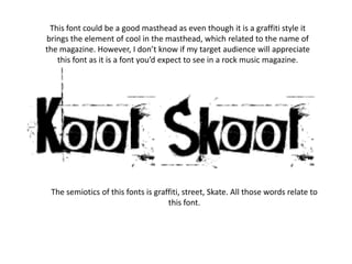
Fonts
- 1. This font could be a good masthead as even though it is a graffiti style it brings the element of cool in the masthead, which related to the name of the magazine. However, I don’t know if my target audience will appreciate this font as it is a font you’d expect to see in a rock music magazine. The semiotics of this fonts is graffiti, street, Skate. All those words relate to this font.
- 2. This font seems like a better masthead than the first one, as it seems more child friendly. Children used to write in bubble writing so this font could relate to them. It also seems like a more informal way of writing school and I think it goes with how the font is spelt incorrectly. When you see this font you think of children as children write in bubble writing when writing a title, that is another good reason why this is a suitable masthead.
- 3. This font will appeal to the students, yet I don’t know how much it would appeal to the parents, as it isn’t very formal. The font is more formal than the first as it is not a graffiti font and is all in a straight line. I think if this font was underlined it would appeal to the parents more.
- 4. This font is handwritten, and it is the style of handwriting children would use when they’re practicing their handwriting. This represents school quite well but, doesn’t reflect the word cool that well. With this type of font it would be better to keep the word school in this font but, have a typeface like the first one to write the word cool in. People would feel the headline is ironic when written in this font and I don’t want them to think that.
- 5. This font came under the ‘old school’ category and it is more of a American college font, it was also called all star. Now I think about it, it was one of my most irrelevant fonts. It would be quite an eye catching masthead but it wouldn’t appeal to my target audience. It wouldn’t be appropriate for a magazine in this country but, maybe in America…
- 6. This font looks as if a child has practiced writing this because, it has the guidelines a child would use to write something. It does look very good if a child did write this but the fact that it has the guidelines relate to the guidelines for letter you would use at school, this is why it would appeal to my target market. Again this font doesn’t reflect the word cool, it isn’t relaxed it is very formal.