Font names
•Download as PPTX, PDF•
0 likes•251 views
The document discusses different fonts and their impressions for a school magazine. It evaluates several fonts for their suitability for the magazine. It dismisses fonts that have an eerie, childish, horror-themed, or sporty impression as not appropriate. It selects a font that gives a classy and formal impression as the best choice for the magazine.
Report
Share
Report
Share

Recommended
Font names
The document discusses different fonts and their impressions for a magazine. The author considers fonts that give eerie, childish, horror, sporty, and fun impressions but ultimately selects a font from the fourth slide because it gives a classy and formal impression suitable for their magazine.
A story about a boy
This document provides a weekly schedule for a person named Nir. It lists the activities Nir engages in each day of the week. On Sundays, Nir rests. On Mondays, he goes to school in Ramat Gan and takes a Capoeira class, getting there by public transportation. On Tuesdays, he has a trumpet lesson and goes home afterwards. Thursdays involve meeting friends to play football. Fridays and Saturdays are for relaxing and socializing with friends. The document also includes exercises to generate questions about Nir's weekly schedule in different question formats.
Speakout Upper Intermediate 2nd ed Unit3 day2r
This document contains discussion questions about reading habits and preferences. It asks whether people have lied about reading something and why someone might do so. It also asks about preferences for different genres like detective stories or historical fiction. The document includes exercises where students rewrite sentences about books they have or have not read.
A1.2 unit 1 - making friends
The document provides tips for starting friendly conversations, including introducing yourself, discussing universal topics like the weather or one's day, commenting on your surroundings, finding common interests, and asking questions. It also gives examples of questions to get to know new classmates and find things you have in common with the other person. The tips encourage keeping workplace conversations less personal and avoiding gossip. It suggests topics that are and aren't appropriate to discuss when starting a conversation.
Lessons to be learnt from Bhagat singh
Bhagat Singh knew precisely what he wanted out of life and pursued his purpose with passion, even if it meant going hungry or staying sleep deprived. He did not simply follow the crowd but instead lived as his own person and found a greater purpose beyond procreation. While imprisoned, he read over 300 books and took up social causes, showing there is more to life than marriage and children.
Autobiography
This document provides guidance on writing an autobiography in three parts. It explains that an autobiography is a story of one's own life written by oneself, and that autobiographies have been written since the 4th century AD. It then outlines five steps to the writing process: prewriting, drafting, revising, editing, and publishing. Finally, it provides questions to help structure an autobiography, including questions about one's name, birthday, family, hobbies, ambitions, and personal principles. The overall document serves as a guide for how to approach and organize writing one's own autobiography.
How to blend in erika 9 a
The document discusses different types of social groups that students can join at school to make friends. It describes study groups for social or solitary students, popular groups that socialize and gossip, football players and their fans, wallflowers who quietly observe others, and unknown observers who are discreet. It suggests trying different groups to find where one fits best but also encourages students to simply be themselves.
Presentation1
The Teen Times document provides a schedule for the week of November 12th, 2012 focusing on hair. It includes posts on favorite hairstyles on Tuesday, a how-to video on straightening hair on Wednesday, a DIY hair product tutorial on Thursday, and hair and shower tips plus a surprise post on Friday. The author also announces the removal of guest writers and tabs, and asks readers if they like the schedule format or if a weekly topic and poll would work better.
Spring 2014 brochure
This document announces events and workshops for students in the Student Support Services (SSS) program at a university. It provides an overview of participation requirements for the SSS program which includes meeting with an academic counselor three times per semester, attending orientation, and attending at least two SSS events each semester. It then lists various workshops on topics like healthy eating, financial aid, resume writing, communication styles, and stress relief techniques that will be offered throughout the spring semester. Locations and times are provided for each event.
Internship Assignment
Mallori Gerson Sewell was born in Atlanta, Georgia. She has 2 sisters and 1 brother. She graduated from Tucker High School in 2014 and currently attends Kennesaw State University. She enjoys pasta, warm weather, spending time with friends, playing video games, and traveling to Texas, Mississippi, and South Carolina. She dislikes steak, long lines, scary monsters, ghosts, black or grey colors, long classes, early mornings, and when people sneeze or cough. Her 3-year goals are to become an early childhood teacher, drive a pre-k school bus, and work at PetSmart with dogs. She wants to live in Atlanta or Los Angeles. Her family, friends, and academy staff
Media work
The document outlines plans for a new sixth form magazine at Wanstead High School. It will be a free, A4-sized magazine published monthly. It will focus on hobbies and interests like music, games, TV/film and sports as related to the sixth form. Audience research found students prefer gossip over school news but expect to see school news. The magazine will aim to balance these interests while being unique, relatable and inoffensive to the target sixth form audience.
Alumni Relations -- Listen First. Engage More. (THE POWER OF INSIGHTFUL LISTE...
Alumni Relations -- Listen First. Engage More. (THE POWER OF INSIGHTFUL LISTE...Chief Listening Officers
PRESENTED AT THE SUMMER 2017 UNIVERSITY OF MARYLAND ALUMNI RELATIONS MEETING
Perhaps the greatest strength one can have when meeting with a donor, alum, or colleague is the ability to listen. But what if we listened for the sole purpose of engaging and learning rather than to get someone to do something? It’s a different type of approach—for perspectives and opinions. Bob London, Founder & CEO of Chief Listening Officers, provides a high-energy dose of customer perspective and offers tips on what you should ask to get unbelievable, fresh and non-obvious insights from the other side of the table to improve results.
Missouri Naked Reading
This document discusses strategies for creating and sustaining readers. It begins by noting the problem that an overemphasis on standardized tests could undermine reading for enjoyment. It then outlines the T-A-R-G-E-T framework for engaging readers, which stands for Trust, Access, Response, Guidance, Enthusiasm, and Tween/Teen Appeal. Key strategies proposed include giving students choice in books, access to class and school libraries, opportunities to connect with authors, and activities that promote enthusiasm like reading aloud and listening to audiobooks.
Media Product Presentation
This document outlines plans for a new magazine for Wanstead High School's sixth form. It will be a free, A4-sized magazine published monthly. It will focus on hobbies and interests like music, games, TV/film and sports as pages. Audience research found students prefer gossip over school news but expect to see school news. The magazine will aim to balance what interests readers with necessary school information. The group believes the unique magazine directed at sixth form students will appeal to its target audience.
Your librarian - JulieAnn Kearney
The document describes a reading recommendation service provided by Warringah Council Library called "Your Librarian." It allows patrons to provide information about their reading preferences and receive a tailored list of book suggestions. The ability to understand a patron's reading tastes without judgment and recommend books that excite them about reading is an important part of the reader's advisory service. Patrons are invited to provide details about books and genres they like or dislike to help create customized recommendations for them.
The new look
This document discusses reasons why people make unpleasant choices when young and get tattoos, such as peer pressure, wanting to emulate celebrities, or personal choice. It notes potential reasons to change or remove tattoos later in life, like better employment or becoming a role model. The author offers to help remove tattoos and is developing a sponsorship plan with runners and writers to fund the tattoo removal process.
Audience feedback
The document summarizes the results of an audience feedback questionnaire given to the target demographic of a magazine. The questionnaire asked about gender, age, whether the magazine cover would stand out, the genre of music the cover suggested, whether the color scheme was suitable, if the contents page was easy to understand, if the double page spread looked suitable, and if there was too much or too little text on the double page spread. The majority of respondents were male, in the 16-19 age range, thought the cover would stand out, identified the genre as rock, punk, metal or hardcore, and thought the color scheme, contents page and double page spread looked suitable. However, half of respondents thought there was too much text on the
Letter to the judges format 2012 13
Tommy Aiken wrote a letter to the judges of his high school senior project describing the informative book he created about the history of each NFL team. He chose this project because he enjoys drawing, writing, and sports. While researching and creating the book, Tommy realized he does not want to pursue being a professional artist due to the difficulties artists face making a living through their art. However, he believes he could succeed in a career involving writing about or covering sports.
Audience research results - AS Media
The document summarizes audience research results for a proposed rock music magazine. Key findings include:
- Respondents were evenly split between male and female.
- The target age group is 15-24, especially 15-19 years old.
- Progressive rock is the most preferred subgenre.
- Readers most want to see new album reviews and photos in the magazine.
- Common magazine names like "Overdrive" and "Tuner" are preferred.
- Readers would buy the magazine weekly and spend £2.20-£2.90 on it.
- Interviews with famous bands are most desired.
Guided questions bullying at school and short story1
Bullying in schools can have major negative effects on children. When children are constantly bullied, they start to see other people in a negative light and assume others will also bully them. If a child is bullied their entire school career, they may develop a rebellious or uncaring attitude as they do not have a positive view of society. Bullies often do not intend physical harm but are seeking attention, and do not realize the severity of their actions. Children who experience bullying must learn to stand up to their bullies.
Task 7 - Introduction, graphs and conclusions
1) The document discusses the results of a questionnaire conducted to inform the creation of a magazine profile and target audience. Quantitative questions asked for quantities while qualitative questions asked for opinions and reasons.
2) The results showed the questionnaire asked mostly males instead of the intended female target audience. It also asked the correct age range but only white British people.
3) Most popular artists mentioned varied widely and were not related to the intended pop-punk genre. However, results indicated including posters and interviews would be well-received.
Survive college like a boss
Teaching college students about scheduling, planning their semester, excelling in the classroom, and having great roommate relationships.
Digipak inside drafting
Michael Baddeley drafted several interior designs for a digipak after researching common conventions, which included lyrics booklets, advertisements, or limited edition posters. While his designs departed from the simplicity of some covers, he maintained features like a plain white background and central symbol, and felt his professional-looking designs were authentic despite differing from genres that include many artist images. He created four drafts for the interior cover.
M044066366
International Journal of Engineering Research and Applications (IJERA) is an open access online peer reviewed international journal that publishes research and review articles in the fields of Computer Science, Neural Networks, Electrical Engineering, Software Engineering, Information Technology, Mechanical Engineering, Chemical Engineering, Plastic Engineering, Food Technology, Textile Engineering, Nano Technology & science, Power Electronics, Electronics & Communication Engineering, Computational mathematics, Image processing, Civil Engineering, Structural Engineering, Environmental Engineering, VLSI Testing & Low Power VLSI Design etc.
Front cover drafting
This document describes the author's process of drafting and revising their magazine cover design over 5 iterations. The author experimented with different masthead fonts, layouts, and color schemes to make the masthead stand out and use empty space effectively. In the final draft, the author was satisfied that the masthead stood out against the background colors chosen to complement the main image.
On the Edge, 2013
The document discusses several topics related to technology trends on the edge including:
1. The decline in usage of Google Reader and the rise of Twitter.
2. The massive growth of data, with 2.5 exabytes of data created daily and 90% of data created in the last two years.
3. Developments in wearable computing from early devices to modern smartglasses.
4. Changes in higher education around issues of cost, value of degrees, and potential new models of competency-based learning.
Întrvedere la Comrat
Intrevedere la Comrat cu bascnul autonomiei D-na Irina Vlah in cadrul vizitei de lucru cu expertul din germania Redelf Ennen, in cadrul programului de asistenta SES finatata de guvernului Germaniei, privitor la fortificarea ANARM si deschiderea a unui centru de achizitie a mierii si aprovizionare a apicultorilor din zona cu echipament si inventar apicol si proecte de finantare pentru tineri apicultori
The habit of smoking
Smoking began as a ritual among Native American tribes and was introduced to widespread American society by the Spanish. Smoking is now common among men and 1 in 3 women also smoke. Smoking reduces life expectancy, as each cigarette decreases life by 6-8 minutes and over 70% of smoker deaths are caused by smoking. Most people who start smoking between ages 15-20 will become heavy smokers. The negative health effects of smoking include increased risk of cancer, impacts on pregnancy, skin, respiratory, digestive, nervous and cardiovascular systems.
More Related Content
What's hot
Spring 2014 brochure
This document announces events and workshops for students in the Student Support Services (SSS) program at a university. It provides an overview of participation requirements for the SSS program which includes meeting with an academic counselor three times per semester, attending orientation, and attending at least two SSS events each semester. It then lists various workshops on topics like healthy eating, financial aid, resume writing, communication styles, and stress relief techniques that will be offered throughout the spring semester. Locations and times are provided for each event.
Internship Assignment
Mallori Gerson Sewell was born in Atlanta, Georgia. She has 2 sisters and 1 brother. She graduated from Tucker High School in 2014 and currently attends Kennesaw State University. She enjoys pasta, warm weather, spending time with friends, playing video games, and traveling to Texas, Mississippi, and South Carolina. She dislikes steak, long lines, scary monsters, ghosts, black or grey colors, long classes, early mornings, and when people sneeze or cough. Her 3-year goals are to become an early childhood teacher, drive a pre-k school bus, and work at PetSmart with dogs. She wants to live in Atlanta or Los Angeles. Her family, friends, and academy staff
Media work
The document outlines plans for a new sixth form magazine at Wanstead High School. It will be a free, A4-sized magazine published monthly. It will focus on hobbies and interests like music, games, TV/film and sports as related to the sixth form. Audience research found students prefer gossip over school news but expect to see school news. The magazine will aim to balance these interests while being unique, relatable and inoffensive to the target sixth form audience.
Alumni Relations -- Listen First. Engage More. (THE POWER OF INSIGHTFUL LISTE...
Alumni Relations -- Listen First. Engage More. (THE POWER OF INSIGHTFUL LISTE...Chief Listening Officers
PRESENTED AT THE SUMMER 2017 UNIVERSITY OF MARYLAND ALUMNI RELATIONS MEETING
Perhaps the greatest strength one can have when meeting with a donor, alum, or colleague is the ability to listen. But what if we listened for the sole purpose of engaging and learning rather than to get someone to do something? It’s a different type of approach—for perspectives and opinions. Bob London, Founder & CEO of Chief Listening Officers, provides a high-energy dose of customer perspective and offers tips on what you should ask to get unbelievable, fresh and non-obvious insights from the other side of the table to improve results.
Missouri Naked Reading
This document discusses strategies for creating and sustaining readers. It begins by noting the problem that an overemphasis on standardized tests could undermine reading for enjoyment. It then outlines the T-A-R-G-E-T framework for engaging readers, which stands for Trust, Access, Response, Guidance, Enthusiasm, and Tween/Teen Appeal. Key strategies proposed include giving students choice in books, access to class and school libraries, opportunities to connect with authors, and activities that promote enthusiasm like reading aloud and listening to audiobooks.
Media Product Presentation
This document outlines plans for a new magazine for Wanstead High School's sixth form. It will be a free, A4-sized magazine published monthly. It will focus on hobbies and interests like music, games, TV/film and sports as pages. Audience research found students prefer gossip over school news but expect to see school news. The magazine will aim to balance what interests readers with necessary school information. The group believes the unique magazine directed at sixth form students will appeal to its target audience.
Your librarian - JulieAnn Kearney
The document describes a reading recommendation service provided by Warringah Council Library called "Your Librarian." It allows patrons to provide information about their reading preferences and receive a tailored list of book suggestions. The ability to understand a patron's reading tastes without judgment and recommend books that excite them about reading is an important part of the reader's advisory service. Patrons are invited to provide details about books and genres they like or dislike to help create customized recommendations for them.
The new look
This document discusses reasons why people make unpleasant choices when young and get tattoos, such as peer pressure, wanting to emulate celebrities, or personal choice. It notes potential reasons to change or remove tattoos later in life, like better employment or becoming a role model. The author offers to help remove tattoos and is developing a sponsorship plan with runners and writers to fund the tattoo removal process.
Audience feedback
The document summarizes the results of an audience feedback questionnaire given to the target demographic of a magazine. The questionnaire asked about gender, age, whether the magazine cover would stand out, the genre of music the cover suggested, whether the color scheme was suitable, if the contents page was easy to understand, if the double page spread looked suitable, and if there was too much or too little text on the double page spread. The majority of respondents were male, in the 16-19 age range, thought the cover would stand out, identified the genre as rock, punk, metal or hardcore, and thought the color scheme, contents page and double page spread looked suitable. However, half of respondents thought there was too much text on the
Letter to the judges format 2012 13
Tommy Aiken wrote a letter to the judges of his high school senior project describing the informative book he created about the history of each NFL team. He chose this project because he enjoys drawing, writing, and sports. While researching and creating the book, Tommy realized he does not want to pursue being a professional artist due to the difficulties artists face making a living through their art. However, he believes he could succeed in a career involving writing about or covering sports.
Audience research results - AS Media
The document summarizes audience research results for a proposed rock music magazine. Key findings include:
- Respondents were evenly split between male and female.
- The target age group is 15-24, especially 15-19 years old.
- Progressive rock is the most preferred subgenre.
- Readers most want to see new album reviews and photos in the magazine.
- Common magazine names like "Overdrive" and "Tuner" are preferred.
- Readers would buy the magazine weekly and spend £2.20-£2.90 on it.
- Interviews with famous bands are most desired.
Guided questions bullying at school and short story1
Bullying in schools can have major negative effects on children. When children are constantly bullied, they start to see other people in a negative light and assume others will also bully them. If a child is bullied their entire school career, they may develop a rebellious or uncaring attitude as they do not have a positive view of society. Bullies often do not intend physical harm but are seeking attention, and do not realize the severity of their actions. Children who experience bullying must learn to stand up to their bullies.
Task 7 - Introduction, graphs and conclusions
1) The document discusses the results of a questionnaire conducted to inform the creation of a magazine profile and target audience. Quantitative questions asked for quantities while qualitative questions asked for opinions and reasons.
2) The results showed the questionnaire asked mostly males instead of the intended female target audience. It also asked the correct age range but only white British people.
3) Most popular artists mentioned varied widely and were not related to the intended pop-punk genre. However, results indicated including posters and interviews would be well-received.
Survive college like a boss
Teaching college students about scheduling, planning their semester, excelling in the classroom, and having great roommate relationships.
What's hot (14)
Alumni Relations -- Listen First. Engage More. (THE POWER OF INSIGHTFUL LISTE...
Alumni Relations -- Listen First. Engage More. (THE POWER OF INSIGHTFUL LISTE...
Guided questions bullying at school and short story1
Guided questions bullying at school and short story1
Viewers also liked
Digipak inside drafting
Michael Baddeley drafted several interior designs for a digipak after researching common conventions, which included lyrics booklets, advertisements, or limited edition posters. While his designs departed from the simplicity of some covers, he maintained features like a plain white background and central symbol, and felt his professional-looking designs were authentic despite differing from genres that include many artist images. He created four drafts for the interior cover.
M044066366
International Journal of Engineering Research and Applications (IJERA) is an open access online peer reviewed international journal that publishes research and review articles in the fields of Computer Science, Neural Networks, Electrical Engineering, Software Engineering, Information Technology, Mechanical Engineering, Chemical Engineering, Plastic Engineering, Food Technology, Textile Engineering, Nano Technology & science, Power Electronics, Electronics & Communication Engineering, Computational mathematics, Image processing, Civil Engineering, Structural Engineering, Environmental Engineering, VLSI Testing & Low Power VLSI Design etc.
Front cover drafting
This document describes the author's process of drafting and revising their magazine cover design over 5 iterations. The author experimented with different masthead fonts, layouts, and color schemes to make the masthead stand out and use empty space effectively. In the final draft, the author was satisfied that the masthead stood out against the background colors chosen to complement the main image.
On the Edge, 2013
The document discusses several topics related to technology trends on the edge including:
1. The decline in usage of Google Reader and the rise of Twitter.
2. The massive growth of data, with 2.5 exabytes of data created daily and 90% of data created in the last two years.
3. Developments in wearable computing from early devices to modern smartglasses.
4. Changes in higher education around issues of cost, value of degrees, and potential new models of competency-based learning.
Întrvedere la Comrat
Intrevedere la Comrat cu bascnul autonomiei D-na Irina Vlah in cadrul vizitei de lucru cu expertul din germania Redelf Ennen, in cadrul programului de asistenta SES finatata de guvernului Germaniei, privitor la fortificarea ANARM si deschiderea a unui centru de achizitie a mierii si aprovizionare a apicultorilor din zona cu echipament si inventar apicol si proecte de finantare pentru tineri apicultori
The habit of smoking
Smoking began as a ritual among Native American tribes and was introduced to widespread American society by the Spanish. Smoking is now common among men and 1 in 3 women also smoke. Smoking reduces life expectancy, as each cigarette decreases life by 6-8 minutes and over 70% of smoker deaths are caused by smoking. Most people who start smoking between ages 15-20 will become heavy smokers. The negative health effects of smoking include increased risk of cancer, impacts on pregnancy, skin, respiratory, digestive, nervous and cardiovascular systems.
Gaia Sagrada- A Place to Heal the Heart
Gaia Sagrada is a retreat center located in Ecuador that offers a transformative experience surrounded by nature and like-minded spiritualists. Visitors can experience ancient practices like working with shamans, meditating in lush gardens, and connecting more deeply with themselves and their spirituality. The goal is for guests to heal their hearts and minds through immersing themselves in the tranquility of the sacred landscape.
Hierachy of fonts needs adding to blog spot
The document lists different font types and styles, including Century Gothic, Aharoni, Berlin Sans, Impact, Calibri, Verdana, and Mongolian Baiti. It then discusses Mongolian Baiti font in more detail, noting that it was chosen for a magazine because it looks formal, has a straightforward yet distinctive appearance, pairs well with the planned color scheme as a non-colored font, and gives an impression of a solid font style suitable for the magazine.
How did you attract/ address your audience?
The document discusses how the author attracted and addressed their target audience for their media product, a magazine. They based the magazine on Kerrang!, a successful music magazine known for its informal language and relationship with readers. To attract the target audience, the author designed an eye-catching masthead using colors that emphasized the grunge/rock theme. Throughout the magazine, informal language is used to directly address readers and make the content more relatable. Interactive elements like a "Voice Your Opinions" page were also included to engage readers.
Aprendizaje colaborativo bernie velman
El documento describe los principios del aprendizaje colaborativo, incluyendo la formación de grupos con una identidad compartida y apoyo mutuo, la interdependencia positiva a través de la comunicación efectiva, y la responsabilidad individual para lograr metas grupales. El aprendizaje colaborativo valora las contribuciones individuales y desarrolla habilidades interpersonales y de grupo.
Cielo's UK Talent Rising Summit - Jim Birtwell
Explore careers, be inspired, take action. Whether you’ve got a career in mind or you haven’t got a clue, Plotr CEO, Jim Birtwell, shares the importance of discovering your future and guiding you to careers you could be great at.
Angela Kirk cv 02.03
Angela Kirk is an experienced warehouse and inventory manager seeking a new position. She has over 20 years of experience managing warehouse operations and teams, including her current role as Outbound Manager at Clintons Distribution Centre where she oversees all outbound logistics. Prior to that, she held warehouse management roles at Watermark Packaging and was self-employed as a taxi proprietor. She has strong skills in operations management, team leadership, reporting, and ensuring smooth warehouse workflows.
A basic course on Research data management, part 3: sharing your data
A basic course on research data management for PhD students. The course consists of 4 parts. The course was given at Eindhoven University of Technology (TUe), 24-01-2017
Viewers also liked (18)
A basic course on Research data management, part 3: sharing your data
A basic course on Research data management, part 3: sharing your data
Similar to Font names
Importance of an autobiography template and samples you can refer to
Importance of an autobiography template and samples you can refer toAcademic Research Paper Writing Services
An autobiography template is a tool you use as a guide when you want to write a personal biography. The template provides highlights of what you are supposed to include in the biography. It makes it easy to browse through your past and find what aspects in your past and current life are important enough to be included in your autobiography.Fearne
The document discusses different font options considered for a school magazine masthead. The author ultimately chooses "SKETCH COLLEGE" as it resembles a bored student's doodling and will appeal to younger audiences. Other fonts like one with a faded effect or a distinctive look were not chosen on the advice of peers who felt they did not fit a typical school magazine layout.
Help My Essay
My Reflection
Change Start Time Essay
Asking For Help Essay
My Writing Essay
Essay About Myself
I Am A Healthy Life Essay
My Personal Reflection
My Writing Center Reflection
My Writing Way
Writing a college essay
This document provides guidance on writing a college essay. It discusses focusing the essay on yourself and how others affected you. Colleges are looking to learn about who you are. Essays should be 500-600 words and tell a story about your experiences and what makes you unique. Common application prompts are analyzed, emphasizing the need to connect experiences back to yourself and lessons learned. Overall, the document stresses writing concisely about meaningful life events and their impact on your identity.
Font research
This document discusses four fonts and their suitability for a pop genre magazine. The first font is described as more serious and edgy, better suited to an indie magazine. The second font is fun but may look unprofessional and handwritten. The third font is playful but too childish and doodle-like. The fourth and final font is concluded to be the most suitable as it is fun, playful, on-trend, and would work efficiently for the intended audience.
Mastheads and analysis
This document discusses different font options for the masthead of a music magazine focused on the indie genre. Five initial masthead options are presented along with peer feedback. Masthead 4 receives the most positive feedback for fitting the indie style and looking simplistic. While Masthead 5 is also liked, it is deemed too simplistic. In the end, a simple masthead with a large capital 'N' is selected to represent the magazine's name and look professional while aligning with the indie genre.
6traits Friendly Letter Revision1
The document provides an agenda and learning objectives for an English class. It outlines topics to be covered on different days, including the six traits of effective writing, revising writing by adding transition words and deleting worn-out words. It discusses developing sentence fluency and using conjunctions. Homework involves revising a draft letter using strategies learned.
Planning
The document discusses choosing a title, font, colors, and layout for a magazine cover and contents page. It analyzes titles like NME and Q magazine and decides on BMM which stands for "best music magazine." Red is selected as the main color. Sample magazine covers and layouts are shown as inspiration for the design.
Feedback and Evaluation of Cover
The student created a magazine cover about starting 6th form and received feedback from peers. The feedback suggested adding a selling line, making the heading bolder, and making the main cover line stand out more. Based on this, the student added a white selling line in the corner reading "Achieve everything you want here". To make the heading bolder, a black "GO" was added behind the pink one. The word "FRESH" was made larger to draw attention to the main cover line. These changes made the cover more realistic and appealing.
What is a personal statement
A personal statement is a mini CV or essay that universities ask applicants to submit. It should describe the applicant's personality, strengths, current studies, and what they hope to gain from the particular course they are applying for to demonstrate their enthusiasm. When writing it, applicants should ensure proper grammar, spelling, and flow while being truthful and avoiding plagiarism. They should discuss their skills, interests, work experience, reasons for wanting to attend university, and what they hope to achieve to portray themselves well to the university. An effective personal statement is between 2,000-4,000 characters which is about 2-4 paragraphs.
My Favorite Family
The author describes their favorite room, their bedroom, which reflects their personality. They chose the tan and brown painted walls, cream flooring, and ceiling fan themselves. The room contains a dresser with colorful personal items, an oval mirror to check appearances, and a queen-sized bed covered in cheetah print sheets, where they sleep comfortably with pillows. An alarm clock sits on a black bedside table. The room provides a relaxing space for alone time.
1. initial plans
Here are some key points from the mood board analysis:
- Colors are repeated to represent each season naturally - pastels for spring, brights for summer, oranges/browns for fall, greys for winter.
- Clothing, shoes, hairstyles depicted match what is popular/visual for each season.
- Locations shown will influence photo shoot locations to match season themes.
- Understanding seasonal styles and colors from the boards will help choose clothing/layouts that look good and match the intended season in the magazine.
- The mood boards provide visual references to draw from for realistic seasonal representation in the final product.
Preliminary task
Ella Smith is creating a school magazine called "Three-Thirty" targeted towards teenage students. The main cover story will be about the new head boy and girl of the school. Additional sub-stories include how to relieve exam stress and ways to customize your school uniform. Ella planned to use bright colors and varied fonts to attract young readers but received feedback that her color scheme was too busy. She will modify it based on audience input. Ella also plans to incorporate small design elements like clocks showing 3:30 to make the cover more eye-catching.
Genre and Masthead Designs
The document discusses different font options for the masthead of a female-oriented magazine. It considers four fonts, liking one for its heart-shaped "i" which fits the magazine's focus on females. Another font is deemed too small for a masthead but could work as a subheading. The third font is praised for being unusual, clear, and large enough for readers. The fourth font is liked for being bold, large, and clear, making it suitable for the masthead.
Evaluation of school magazine
The document summarizes the design choices made for a school magazine targeted at years 7-9. A sixth form student was used as the foreground image on the cover to provide an icon for younger students to look up to. The masthead "Skools R 4 fools" was chosen as the most popular title from a survey. A competition to win money on lunch cards was advertised to attract readers. The contents page included images and logos to encourage reading different articles and represent the school. In conclusion, the author was not fully happy with font size and background choices and would make adjustments if redesigning the magazine.
Planning
The document discusses choosing a title, font, colors, and layout for a magazine cover and contents page. It considers titles like NME and Vibes but decides on BMM which stands for "best music magazine." Red is selected as the main color. Images and text box arrangements from sample magazine pages are referenced as inspiration for the cover and double page spread layout.
Media Front Cover Research Powerpoint
The document analyzes the front cover of Q4 Magazine from 2014. It notes that the large red and white masthead takes up 1/4 of the page and the cover stories are in different colors, sizes, and fonts. It believes the magazine targets 16-25 year olds based on its modern, fresh style. The main image shows singer Lilly Allen dramatically kicking a microphone, linked to the headline "KICKS OUT" to grab attention. While the analyzer likes the simple color scheme and linked image and headline, they feel the cover is too busy with much writing.
Media Front Cover Research Powerpoint
The document analyzes the front cover of Q4 Magazine from 2014. It notes that the large red and white masthead takes up 1/4 of the page and the cover stories are in different colors, sizes, and fonts. It determines that the target audience is likely 16-25 year olds of both genders. It describes the main image as a dramatic full-length shot of singer Lilly Allen kicking a microphone, with the headline "KICKS OUT" linking to the action. While the analyzer likes how the image connects to the headline, they feel the cover is too busy overall with much text.
Media Front Cover Research Powerpoint
The document analyzes the front cover of Q4 Magazine from 2014. It notes that the masthead takes up 1/4 of the page in red and white in the top left corner. There are 5 cover stories in different colors, sizes, and fonts. The magazine targets 16-25 year olds of both genders. The large, dramatic image of singer Lilly Allen kicking a microphone relates well to the headline "KICKS OUT" and grabs attention. However, the cover also has a lot of text and elements, making it visually busy.
Similar to Font names (19)
Importance of an autobiography template and samples you can refer to
Importance of an autobiography template and samples you can refer to
More from jasonb139
Evaluation
The document outlines an evaluation containing 7 questions about a media product. It then provides detailed responses to the first two questions. For question 1, the response discusses how the music magazine uses conventions of existing magazines in its front cover, contents page, and double page spread layouts while also challenging some conventions through new designs and color choices. For question 2, it represents the indie/alternative genre through the images, colors, and topics chosen that appeal to that social group.
Inspiration for my chosen genre
The document discusses the genre, inspiration, audience, and conventions for a rap music video. The genre chosen was rap based on discussions with friends about what genre they listen to daily. The audience for rap includes those interested in artists like Eminem and ASAP Rocky ranging from ages 12 to 25, though anyone could listen. Conventions seen in rap videos include artists wearing flashy jewelry and filming in rough areas to show that success is based on passion regardless of background.
Developments + drafts for contents page
The document describes the process of creating a contents page for a magazine, including adding sections, structuring the layout, inserting a logo and image, labeling pages, and filling in content topics. Feedback was incorporated to refine the design by adding separating lines around sections and a description box for the image. The contents page was then finalized by completely populating it with the magazine's content listings.
Drafts + feedback for double page spread
The document describes revisions made to a double-page magazine spread based on feedback. Key revisions included: (1) Changing names above pictures to a large "J" and "M" near each picture. (2) Ensuring text was professional and spelling was correct. (3) Making the "J" and "M" dissolve into pictures to stand out without interrupting images. (4) Changing background colors to grey and red with red "J" and "M" for better contrast. (5) Adding a glow behind the title and images to make them stand out. (6) Changing question text to black and answer text to white to distinguish between them.
Drafts + feedback for front cover
This document describes the iterative process of designing a magazine cover. The designer started with just the magazine name in red, then added a bar code after seeing them on other magazines. Next, the main story title was added in the top right corner to draw readers' eyes. Further details and shapes were incorporated based on feedback. Finally, additional topics were placed on the left side for balance.
Image planning done
The student plans to use photos of themselves and their father in their magazine image planning. For the front cover, they will use a photo of themselves or their father staring at the reader. For the contents page, they will use a photo of their father playing guitar along with an explanation. For the double page spread, they will use cropped photos of themselves and their father looking at the title to draw the reader's attention and make them recognizable. They selected photos that fulfill the roles needed of drawing the reader in and representing the story being told in the magazine.
Image editing done
The document discusses various image editing techniques used for different elements of a magazine. For the front cover image, no editing was done to keep the full image. The contents page image was cropped and a black bar was added on the left side to fit the magazine size. For double page spreads, the background was removed using the rubber and crop tools to perfectly fit the images into the spreads.
Colour palette
This 3 sentence summary provides the high-level information from the document:
The document discusses a color palette for a magazine. It describes choosing a black background with a green logo background and light green writing. Green will be the main color as it will be in the logo, with black as the second most used color for all the text.
Double page spread layout
This double page spread will be used as the images and layout fit well with the idea. The contents and headline are correctly positioned to fill out the empty spaces on the pages.
Contents page layout
This document provides a contents page layout with sections labeled CONTENTS and a special offer section. An image is included and placed in a location intended to attract the reader's attention. The overall structure and organization of the contents page is deemed to be in good order and visually appealing.
Front cover layout
This document discusses a magazine layout that uses common magazine elements like headlines, text blocks, and logos. The layout includes a masthead, headline, text blocks, and mini contents section repeated across the front cover. The document explains that this layout is inspired by a Q magazine cover and uses the space well, making it a good choice for this magazine's front cover design.
Drafts for contents page needs uploading to blogspot
This document describes the design process for a magazine contents page. The designer used contrasting colors of light brown and red for readability. Bullet points and a fun font were added to section headings to draw the reader's eye. An image was included on the final cover to illustrate the purpose of a contents page.
Drafts for front cover needs uploading to blogspot
This document describes the steps taken to design the front cover of a magazine called "Ffays". The cover includes the magazine title in the top left corner using the chosen light brown color scheme. A logo was added to explain the name and idea of the magazine. Text was also placed on the side to inform readers about the magazine's content and what they can gain from reading it. The final design features the title, explanatory logo, content information, and an image of a shocked student to represent interesting school facts covered within.
Fonts for masthead
The document discusses 4 different fonts and the impressions they give to readers. Font 1 gives a childish impression but also simplicity. Font 2 gives a gothic impression and hints at the magazine's weird content. Font 3 gives a fun, easygoing impression appropriate for its childish look. Font 4 gives a scary, serious feeling, suggesting importance and focus, which the author feels suits their indie alternative news magazine.
Colour palette
This document outlines a color palette for a magazine, consisting of a black background with a green logo background and light green writing. Green will be the primary color as it appears in the logo, while black will be the secondary color used for most of the text.
Hierachy of typefaces
The document lists different typefaces and their font style variations including normal, bold, italics, and bold italics. It provides examples of common typefaces like Century Gothic, Aharoni, Berlin Sans, Impact, Calibri and Verdana as well as less common styles like Rockwell Extra Bold, Underground Riot, and Edwarian Script.
Layout
This document contains various sections common to magazines including headlines, text pieces, logos and mini contents. It discusses different topics across several sections with headlines, plugs and mastheads placed throughout. The document has a mix of formatting and magazine style elements.
Music magazine genre
This document discusses creating a music magazine focused on the indie and alternative genre. It will use a close-up photo of the author's friend on the cover to represent the genre's style. Previous magazines in the genre like Kerrang and NME served as examples, using close-up band/singer images and designs featuring red, black, and white colors. The text in these magazines is large and centered to draw attention. The target audience for the new magazine is people ages 16-30 across all income levels, making it widely accessible.
Magazine double page spreads
This document contains multiple paragraphs about different magazine articles and photos. The first paragraph describes a black and white photo of Lady Gaga that conveys her iconic image as a singer. There is a large red "L" in the background that represents her name and sexuality. Another paragraph discusses photos of a band in the studio working on their music development. A final paragraph analyzes an image of Lily Allen that shows her rebellious attitude through her posture and clothing in the photo.
More from jasonb139 (20)
Drafts for contents page needs uploading to blogspot
Drafts for contents page needs uploading to blogspot
Drafts for front cover needs uploading to blogspot
Drafts for front cover needs uploading to blogspot
Recently uploaded
Mind map of terminologies used in context of Generative AI
Mind map of common terms used in context of Generative AI.
“Building and Scaling AI Applications with the Nx AI Manager,” a Presentation...
“Building and Scaling AI Applications with the Nx AI Manager,” a Presentation...Edge AI and Vision Alliance
For the full video of this presentation, please visit: https://www.edge-ai-vision.com/2024/06/building-and-scaling-ai-applications-with-the-nx-ai-manager-a-presentation-from-network-optix/
Robin van Emden, Senior Director of Data Science at Network Optix, presents the “Building and Scaling AI Applications with the Nx AI Manager,” tutorial at the May 2024 Embedded Vision Summit.
In this presentation, van Emden covers the basics of scaling edge AI solutions using the Nx tool kit. He emphasizes the process of developing AI models and deploying them globally. He also showcases the conversion of AI models and the creation of effective edge AI pipelines, with a focus on pre-processing, model conversion, selecting the appropriate inference engine for the target hardware and post-processing.
van Emden shows how Nx can simplify the developer’s life and facilitate a rapid transition from concept to production-ready applications.He provides valuable insights into developing scalable and efficient edge AI solutions, with a strong focus on practical implementation.Artificial Intelligence for XMLDevelopment
In the rapidly evolving landscape of technologies, XML continues to play a vital role in structuring, storing, and transporting data across diverse systems. The recent advancements in artificial intelligence (AI) present new methodologies for enhancing XML development workflows, introducing efficiency, automation, and intelligent capabilities. This presentation will outline the scope and perspective of utilizing AI in XML development. The potential benefits and the possible pitfalls will be highlighted, providing a balanced view of the subject.
We will explore the capabilities of AI in understanding XML markup languages and autonomously creating structured XML content. Additionally, we will examine the capacity of AI to enrich plain text with appropriate XML markup. Practical examples and methodological guidelines will be provided to elucidate how AI can be effectively prompted to interpret and generate accurate XML markup.
Further emphasis will be placed on the role of AI in developing XSLT, or schemas such as XSD and Schematron. We will address the techniques and strategies adopted to create prompts for generating code, explaining code, or refactoring the code, and the results achieved.
The discussion will extend to how AI can be used to transform XML content. In particular, the focus will be on the use of AI XPath extension functions in XSLT, Schematron, Schematron Quick Fixes, or for XML content refactoring.
The presentation aims to deliver a comprehensive overview of AI usage in XML development, providing attendees with the necessary knowledge to make informed decisions. Whether you’re at the early stages of adopting AI or considering integrating it in advanced XML development, this presentation will cover all levels of expertise.
By highlighting the potential advantages and challenges of integrating AI with XML development tools and languages, the presentation seeks to inspire thoughtful conversation around the future of XML development. We’ll not only delve into the technical aspects of AI-powered XML development but also discuss practical implications and possible future directions.
20240609 QFM020 Irresponsible AI Reading List May 2024
Everything I found interesting about the irresponsible use of machine intelligence in May 2024
Pushing the limits of ePRTC: 100ns holdover for 100 days
At WSTS 2024, Alon Stern explored the topic of parametric holdover and explained how recent research findings can be implemented in real-world PNT networks to achieve 100 nanoseconds of accuracy for up to 100 days.
Let's Integrate MuleSoft RPA, COMPOSER, APM with AWS IDP along with Slack
Discover the seamless integration of RPA (Robotic Process Automation), COMPOSER, and APM with AWS IDP enhanced with Slack notifications. Explore how these technologies converge to streamline workflows, optimize performance, and ensure secure access, all while leveraging the power of AWS IDP and real-time communication via Slack notifications.
Removing Uninteresting Bytes in Software Fuzzing
Imagine a world where software fuzzing, the process of mutating bytes in test seeds to uncover hidden and erroneous program behaviors, becomes faster and more effective. A lot depends on the initial seeds, which can significantly dictate the trajectory of a fuzzing campaign, particularly in terms of how long it takes to uncover interesting behaviour in your code. We introduce DIAR, a technique designed to speedup fuzzing campaigns by pinpointing and eliminating those uninteresting bytes in the seeds. Picture this: instead of wasting valuable resources on meaningless mutations in large, bloated seeds, DIAR removes the unnecessary bytes, streamlining the entire process.
In this work, we equipped AFL, a popular fuzzer, with DIAR and examined two critical Linux libraries -- Libxml's xmllint, a tool for parsing xml documents, and Binutil's readelf, an essential debugging and security analysis command-line tool used to display detailed information about ELF (Executable and Linkable Format). Our preliminary results show that AFL+DIAR does not only discover new paths more quickly but also achieves higher coverage overall. This work thus showcases how starting with lean and optimized seeds can lead to faster, more comprehensive fuzzing campaigns -- and DIAR helps you find such seeds.
- These are slides of the talk given at IEEE International Conference on Software Testing Verification and Validation Workshop, ICSTW 2022.
Climate Impact of Software Testing at Nordic Testing Days
My slides at Nordic Testing Days 6.6.2024
Climate impact / sustainability of software testing discussed on the talk. ICT and testing must carry their part of global responsibility to help with the climat warming. We can minimize the carbon footprint but we can also have a carbon handprint, a positive impact on the climate. Quality characteristics can be added with sustainability, and then measured continuously. Test environments can be used less, and in smaller scale and on demand. Test techniques can be used in optimizing or minimizing number of tests. Test automation can be used to speed up testing.
HCL Notes and Domino License Cost Reduction in the World of DLAU
Webinar Recording: https://www.panagenda.com/webinars/hcl-notes-and-domino-license-cost-reduction-in-the-world-of-dlau/
The introduction of DLAU and the CCB & CCX licensing model caused quite a stir in the HCL community. As a Notes and Domino customer, you may have faced challenges with unexpected user counts and license costs. You probably have questions on how this new licensing approach works and how to benefit from it. Most importantly, you likely have budget constraints and want to save money where possible. Don’t worry, we can help with all of this!
We’ll show you how to fix common misconfigurations that cause higher-than-expected user counts, and how to identify accounts which you can deactivate to save money. There are also frequent patterns that can cause unnecessary cost, like using a person document instead of a mail-in for shared mailboxes. We’ll provide examples and solutions for those as well. And naturally we’ll explain the new licensing model.
Join HCL Ambassador Marc Thomas in this webinar with a special guest appearance from Franz Walder. It will give you the tools and know-how to stay on top of what is going on with Domino licensing. You will be able lower your cost through an optimized configuration and keep it low going forward.
These topics will be covered
- Reducing license cost by finding and fixing misconfigurations and superfluous accounts
- How do CCB and CCX licenses really work?
- Understanding the DLAU tool and how to best utilize it
- Tips for common problem areas, like team mailboxes, functional/test users, etc
- Practical examples and best practices to implement right away
Communications Mining Series - Zero to Hero - Session 1
This session provides introduction to UiPath Communication Mining, importance and platform overview. You will acquire a good understand of the phases in Communication Mining as we go over the platform with you. Topics covered:
• Communication Mining Overview
• Why is it important?
• How can it help today’s business and the benefits
• Phases in Communication Mining
• Demo on Platform overview
• Q/A
GraphSummit Singapore | Enhancing Changi Airport Group's Passenger Experience...
Dr. Sean Tan, Head of Data Science, Changi Airport Group
Discover how Changi Airport Group (CAG) leverages graph technologies and generative AI to revolutionize their search capabilities. This session delves into the unique search needs of CAG’s diverse passengers and customers, showcasing how graph data structures enhance the accuracy and relevance of AI-generated search results, mitigating the risk of “hallucinations” and improving the overall customer journey.
20240607 QFM018 Elixir Reading List May 2024
Everything I found interesting about the Elixir programming ecosystem in May 2024
Uni Systems Copilot event_05062024_C.Vlachos.pdf
Unlocking Productivity: Leveraging the Potential of Copilot in Microsoft 365, a presentation by Christoforos Vlachos, Senior Solutions Manager – Modern Workplace, Uni Systems
Presentation of the OECD Artificial Intelligence Review of Germany
Consult the full report at https://www.oecd.org/digital/oecd-artificial-intelligence-review-of-germany-609808d6-en.htm
Cosa hanno in comune un mattoncino Lego e la backdoor XZ?
ABSTRACT: A prima vista, un mattoncino Lego e la backdoor XZ potrebbero avere in comune il fatto di essere entrambi blocchi di costruzione, o dipendenze di progetti creativi e software. La realtà è che un mattoncino Lego e il caso della backdoor XZ hanno molto di più di tutto ciò in comune.
Partecipate alla presentazione per immergervi in una storia di interoperabilità, standard e formati aperti, per poi discutere del ruolo importante che i contributori hanno in una comunità open source sostenibile.
BIO: Sostenitrice del software libero e dei formati standard e aperti. È stata un membro attivo dei progetti Fedora e openSUSE e ha co-fondato l'Associazione LibreItalia dove è stata coinvolta in diversi eventi, migrazioni e formazione relativi a LibreOffice. In precedenza ha lavorato a migrazioni e corsi di formazione su LibreOffice per diverse amministrazioni pubbliche e privati. Da gennaio 2020 lavora in SUSE come Software Release Engineer per Uyuni e SUSE Manager e quando non segue la sua passione per i computer e per Geeko coltiva la sua curiosità per l'astronomia (da cui deriva il suo nickname deneb_alpha).
Essentials of Automations: The Art of Triggers and Actions in FME
In this second installment of our Essentials of Automations webinar series, we’ll explore the landscape of triggers and actions, guiding you through the nuances of authoring and adapting workspaces for seamless automations. Gain an understanding of the full spectrum of triggers and actions available in FME, empowering you to enhance your workspaces for efficient automation.
We’ll kick things off by showcasing the most commonly used event-based triggers, introducing you to various automation workflows like manual triggers, schedules, directory watchers, and more. Plus, see how these elements play out in real scenarios.
Whether you’re tweaking your current setup or building from the ground up, this session will arm you with the tools and insights needed to transform your FME usage into a powerhouse of productivity. Join us to discover effective strategies that simplify complex processes, enhancing your productivity and transforming your data management practices with FME. Let’s turn complexity into clarity and make your workspaces work wonders!
Full-RAG: A modern architecture for hyper-personalization
Mike Del Balso, CEO & Co-Founder at Tecton, presents "Full RAG," a novel approach to AI recommendation systems, aiming to push beyond the limitations of traditional models through a deep integration of contextual insights and real-time data, leveraging the Retrieval-Augmented Generation architecture. This talk will outline Full RAG's potential to significantly enhance personalization, address engineering challenges such as data management and model training, and introduce data enrichment with reranking as a key solution. Attendees will gain crucial insights into the importance of hyperpersonalization in AI, the capabilities of Full RAG for advanced personalization, and strategies for managing complex data integrations for deploying cutting-edge AI solutions.
GraphSummit Singapore | The Art of the Possible with Graph - Q2 2024
Neha Bajwa, Vice President of Product Marketing, Neo4j
Join us as we explore breakthrough innovations enabled by interconnected data and AI. Discover firsthand how organizations use relationships in data to uncover contextual insights and solve our most pressing challenges – from optimizing supply chains, detecting fraud, and improving customer experiences to accelerating drug discoveries.
Why You Should Replace Windows 11 with Nitrux Linux 3.5.0 for enhanced perfor...
The choice of an operating system plays a pivotal role in shaping our computing experience. For decades, Microsoft's Windows has dominated the market, offering a familiar and widely adopted platform for personal and professional use. However, as technological advancements continue to push the boundaries of innovation, alternative operating systems have emerged, challenging the status quo and offering users a fresh perspective on computing.
One such alternative that has garnered significant attention and acclaim is Nitrux Linux 3.5.0, a sleek, powerful, and user-friendly Linux distribution that promises to redefine the way we interact with our devices. With its focus on performance, security, and customization, Nitrux Linux presents a compelling case for those seeking to break free from the constraints of proprietary software and embrace the freedom and flexibility of open-source computing.
GraphSummit Singapore | Graphing Success: Revolutionising Organisational Stru...
Sudheer Mechineni, Head of Application Frameworks, Standard Chartered Bank
Discover how Standard Chartered Bank harnessed the power of Neo4j to transform complex data access challenges into a dynamic, scalable graph database solution. This keynote will cover their journey from initial adoption to deploying a fully automated, enterprise-grade causal cluster, highlighting key strategies for modelling organisational changes and ensuring robust disaster recovery. Learn how these innovations have not only enhanced Standard Chartered Bank’s data infrastructure but also positioned them as pioneers in the banking sector’s adoption of graph technology.
Recently uploaded (20)
Mind map of terminologies used in context of Generative AI
Mind map of terminologies used in context of Generative AI
“Building and Scaling AI Applications with the Nx AI Manager,” a Presentation...
“Building and Scaling AI Applications with the Nx AI Manager,” a Presentation...
20240609 QFM020 Irresponsible AI Reading List May 2024
20240609 QFM020 Irresponsible AI Reading List May 2024
Pushing the limits of ePRTC: 100ns holdover for 100 days
Pushing the limits of ePRTC: 100ns holdover for 100 days
Let's Integrate MuleSoft RPA, COMPOSER, APM with AWS IDP along with Slack
Let's Integrate MuleSoft RPA, COMPOSER, APM with AWS IDP along with Slack
Climate Impact of Software Testing at Nordic Testing Days
Climate Impact of Software Testing at Nordic Testing Days
HCL Notes and Domino License Cost Reduction in the World of DLAU
HCL Notes and Domino License Cost Reduction in the World of DLAU
Communications Mining Series - Zero to Hero - Session 1
Communications Mining Series - Zero to Hero - Session 1
GraphSummit Singapore | Enhancing Changi Airport Group's Passenger Experience...
GraphSummit Singapore | Enhancing Changi Airport Group's Passenger Experience...
Presentation of the OECD Artificial Intelligence Review of Germany
Presentation of the OECD Artificial Intelligence Review of Germany
Cosa hanno in comune un mattoncino Lego e la backdoor XZ?
Cosa hanno in comune un mattoncino Lego e la backdoor XZ?
Essentials of Automations: The Art of Triggers and Actions in FME
Essentials of Automations: The Art of Triggers and Actions in FME
Full-RAG: A modern architecture for hyper-personalization
Full-RAG: A modern architecture for hyper-personalization
GraphSummit Singapore | The Art of the Possible with Graph - Q2 2024
GraphSummit Singapore | The Art of the Possible with Graph - Q2 2024
Why You Should Replace Windows 11 with Nitrux Linux 3.5.0 for enhanced perfor...
Why You Should Replace Windows 11 with Nitrux Linux 3.5.0 for enhanced perfor...
GraphSummit Singapore | Graphing Success: Revolutionising Organisational Stru...
GraphSummit Singapore | Graphing Success: Revolutionising Organisational Stru...
Font names
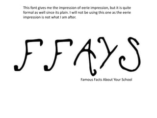
- 1. Famous Facts About Your School This font gives me the impression of eerie impression, but it is quite formal as well since its plain. I will not be using this one as the eerie impression is not what I am after.
- 2. Famous Facts About Your School This font looks like it is aimed at children and teenagers since it is a bit childish. And is not appropriate for my magazine.
- 3. Famous Facts About Your School This font gives me the impression of a horror theme or scary, which could be for my magazine because the facts could be scary, but I will be using a formal way to represent my magazine.
- 4. Famous Facts About Your School This text gives the impression of a bit of a classy look and looks suitable on the top of my magazine and this is why I will be choosing this one.
- 5. Famous Facts About Your School This font give me the impression of a sporty type of perspective as it is like a basketball theme and is not suitable for my magazine.
- 6. Famous Facts About Your School This text gives the impression of fun and enjoyable but is not suitable for the type of magazine I will be creating.
- 7. • I believe that the 4th slide is the best for my magazine because it is formal and looks good and is straight to the point and looks classy.