George music front cover analysis
•Download as DOCX, PDF•
0 likes•138 views
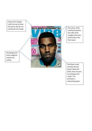
The document summarizes the design elements of a magazine cover. It notes that the masthead color matches the man's cardigan and some text, color is used for key points but not overused, and the background matches the man's clothes to create continuity. Well-placed photos and substories do not collide or block text or the main photo. Font and color schemes aim to catch attention but also create a welcoming and personal atmosphere for the reader.
Report
Share
Report
Share

Recommended
George music front cover analysis
The document provides design tips for magazine covers, recommending that font colors be used sparingly to highlight key points without overwhelming the reader. A well-designed cover features a central photograph of the main subject, with their eyes making contact with the reader to promote an engaging image. Additional details like matching the font and background colors to the subject's clothing, clearly styled mastheads, and properly placed supplementary stories help create an aesthetically pleasing layout.
Contents skeleton layout
This magazine contents page lists the main articles and pages in a bold font followed by a brief title. Not every page is included, just the most important pieces. There is also a small letter from the editor welcoming readers and previewing what they will find in this month's issue. Images with captions promote the main headline story and other featured content, with some arrows connecting them to the text in the contents listing.
question 1
The document summarizes the process of designing a magazine cover and how the author was inspired by conventions from Q magazine. The author liked how Q magazine used block colors to make elements stand out, had the artist name on the front, and used a letter for the title. The author also included images of the cover artist and other artists, numbered pages, contents in bold, and indicated the issue number. The red coloring and font used for page numbers were effective elements that were mirrored in the author's own magazine cover design.
Contents pages
The document discusses the design elements of a magazine contents page. It notes that a white background is used to make the text and images stand out. The masthead is in bold, bright colors and large font to attract readers' attention. Images are used strategically, with the main image showing a fashionable dress to appeal to the female target audience. Text uses a consistent style and color scheme throughout for a clean, organized look.
Contents page music magazine analysis
The document describes the contents page of a magazine. It highlights how the magazine uses visual elements like large, bold, and brightly colored text and images to attract readers' attention and showcase important articles. Key features emphasized are the use of the color red for titles, large images linked to article descriptions, and quotes from musicians to entice readers to learn more. The goal is for these design elements to make certain articles and sections stand out and draw readers into the magazine.
Question 1
This document summarizes how the media product uses and develops conventions from real music magazines. It discusses several common conventions including using a masthead, medium close-up images, features listing, anchor text highlighting the main story, cover lines drawing readers in, bold page numbers for navigation, a variety of sized images with the main linking to the main article, double page spreads with columns and pull quotes, and positioning elements like page numbers in the lower right corner. Specific examples are provided from other magazines to illustrate how the media product adheres to or develops typical magazine conventions.
Magazine covers
Magazine covers typically follow certain conventions: the masthead is prominently displayed at the top in a unique font, the main image takes up most of the cover and uses direct address to intrigue readers, and cover lines, price, and barcodes are placed unobtrusively to not distract from the main image while still providing information about the magazine's contents.
Codes and conventions of a contents page
The document discusses the typical design elements found on a magazine contents page, including a bold and prominent title in the same font and color scheme as the front cover. Page numbers are usually brightly colored to stand out, and the magazine logo is repeated throughout. The main image and artist featured relate to the cover story, and article titles in capital letters are accompanied by a brief description. Feature articles are also listed in a separate section.
Codes and conventions of a contents page
The document discusses the typical layout and design elements of a magazine contents page. It notes that the title, font, and color scheme are usually the same as the front cover to look professional. Page numbers are prominently displayed to indicate the articles inside. The magazine logo is repeated throughout for brand recognition. The date shows the issue's timeliness. The main image and artist relate to the cover story, with page numbers and quotes to entice readers. Article titles use capital letters to stand out from explanatory text and preview the content. The website is included for additional access. A section highlights the feature articles in each issue.
Codes & conventions of a newspaper
The document outlines various codes and conventions commonly used in newspapers, such as logos, slogans, mastheads, headlines, bylines, date lines, images and captions. It then provides a brief analysis of the codes and conventions used in 5 different local Pakistani newspapers (The News, Jung Newspaper, Pakistan Today, Dawn, and The Nation), discussing their mastheads, headlines, credits, lead stories, photographs/images, columns, advertisements and other distinguishing features. The purpose is to describe the typical elements of newspaper design and layout, and compare how these are implemented in some local newspapers.
Presentation of magazine front cover annotatinos and contents page
This document analyzes the design elements of magazine covers and contents pages. It discusses how elements like the masthead, cover lines, barcode, price and issue, puff or pug, main cover line, and images are used on covers to attract readers' attention and convey key information. It also examines how contents pages organize information into sections, use colors, images, and numbers to clearly guide readers to articles of interest and promote a sense of quality and readability.
Nme contents
The document discusses the layout and design elements of a magazine contents page. It explains that the band index is presented in the left third to easily identify featured bands, while articles are arranged in categories in the right third. The main image is highlighted with a border and caption to draw attention. Other standard elements like the masthead, page numbers, headings and date are also discussed in relation to helping readers navigate and identify content. The overall goal of the layout is to clearly present information and brand the magazine for its target rock music audience.
Conventions of newspapers
Newspaper articles follow certain conventions to effectively communicate information to readers. First, all articles are formatted in columns for easy reading. The most important information is placed at the beginning since some readers only read the first part. Within an article, the headline catches the reader's attention while the byline credits the author. The lead paragraph summarizes the story for quick readers. Main body paragraphs then provide the details, with key facts at the top in case readers do not finish the article. Other newspaper features include the masthead for identification, photographs to illustrate stories, and various sizes of headlines, advertisements and stories based on their importance.
Dps analysis
The document discusses various design elements used in magazine layouts, including a main image to draw focus, consistent fonts for neatness, equal column widths for readability, larger grab quotes and headings to attract attention, supporting images, and basic structural elements like page numbers. The layout aims to engage readers through visual hierarchy and organization of content.
Codes and conventions magazine front cover
The document discusses codes and conventions used on magazine front covers. It explains that the main image is centered and uses direct address to engage readers. The masthead is in a unique font at the top, attracting attention to the magazine name. Cover lines are designed to entice readers with bold snippets and teasers of articles. The main cover line stands out at the bottom in its own font and color, suggesting the fashion issue content is most important. Additional elements like banners, dates, and barcodes are placed strategically to not distract from the main visual elements.
Presentation1 2
The magazine covers analyzed use vibrant colors and simple yet meaningful main images. Key elements of the covers include the master head (title in bold colors), cover line (hinting at articles), main image (featuring celebrities), main cover line (highlighting main content), and puff (stamp promoting internal content). These elements are designed to catch readers' attention and encourage buying by hinting at fashion advice, trends, and tips found inside the magazines.
Contents page analysis
This document analyzes the key elements of a magazine contents page, including the main image, masthead, editor's letter, coverlines, subsidiary images, subheadings, headlines, date, page numbers, image captions, graphic features, and typography. The main image and color scheme are used to represent the magazine's genre. The masthead is in large, capital letters to stand out from the background. Coverlines, subheadings, and headlines are designed to attract readers to specific articles. Subsidiary images, page numbers, and dates provide additional information to readers. Together, these elements are carefully crafted to entice readers and convey what the magazine offers.
Contents analysis 3
The document discusses the layout and design elements used on a magazine contents page. It is split into three columns corresponding to the rule of thirds. Key elements like the editor's letter, news, and albums are placed in the left, center, and right columns. Images are also included relating to articles. Consistent colors and fonts are used to build a house style and brand recognition. Captions are paired with images to provide context in a lighthearted tone. Borders, titles, dates, page numbers, main headings, and subheadings are employed to organize content and guide readers to find specific articles.
Media s 2
This document analyzes different elements found on magazine content pages. It identifies common elements like page numbers, headers, footers, issue dates, article images, titles, and puffs. The page number helps readers find articles, the issue date shows the publication date, and the article title and image provide a preview of the content. Headers and footers typically display branding or page numbers to help navigate pages.
Magazine Analysis.
This document analyzes the conventions used in magazine design across three music magazines: MusicWeek, NME, and Kerrang. It discusses how the magazines follow typical conventions such as having a large masthead at the top of the front cover in bright colors to draw readers' attention. The contents pages also mirror the style of the front covers for continuity. Main articles are featured prominently and use techniques like pull quotes, large images, and column formatting to make the text easy to read while engaging readers visually.
Content page
This document analyzes the contents pages of three magazines - Vibe, XXL Magazine, and The Source. It examines various design elements of each contents page such as the masthead, images, font types, contents sections, credits, and house style. Overall, the document provides examples of how different magazines utilize visual elements like photos, fonts, and layouts on their contents pages to attract readers and represent their brand styles.
NME magazine analysis
The magazine cover uses several design elements to attract readers. The masthead "NME" stands out with an eye-catching design that relates to the magazine's music genre. Cover lines use bold text and varying sizes to highlight important stories. The central image of musician Jack White draws attention with his serious expression and rock-inspired clothing. Additional elements like price, date, and barcode are placed consistently to guide customers.
Double spread
The document provides guidelines for magazine article analysis, including using bold text and images to catch readers' attention, short descriptions of photos, quoting photographers to convey their feelings, separating paragraphs with lines to avoid boredom, using capital letters and prominent placement to promote articles, and including supporting photos to give readers a clear understanding of the content.
Codes and conventions of a front cover
The document describes the key elements that typically appear on the front cover of a magazine, including the main image featuring the celebrity subject, the masthead in large unique font, and cover lines providing insights into the magazine's contents to grab readers' attention. Other common front cover elements are the barcode, puff text adding character, main cover line relating to the celebrity, and strap line above the masthead listing features. Color schemes are usually simple with bold masthead color standing out against the main celebrity image.
Q magazine analysis
The document summarizes the key design elements of the cover of a magazine called "Q". It analyzes the masthead featuring the letter Q, banner with partially visible text, pull quote saying "I love the queen!", cover lines in red and white capital letters, and a large central image of the band Muse looking in different directions. Different fonts are used for various elements, and the price, date, and barcode are featured on the bottom corner as usual.
Mag anal 2
The document summarizes the contents page of two different magazines - Kerrang and Q magazine.
For Kerrang, the contents page uses a consistent blue, white, yellow and black color scheme. It features previews of double page articles along with headlines and artist images. The lead singer image is bright and vibrant, grabbing the reader's attention to the featured article.
For Q magazine, the masthead uses a simple red, black and white color scheme for recognition. Subheadings help readers navigate to pages of interest. Sub images preview artists to entice readers to specific pages. Page numbers vary in size depending on the sub image importance. The main image is an extreme close up creating synergy with the front cover.
Generic Layouts
The generic layout for punk rock magazines, magazine covers, and double page articles involve large dominant images that draw the reader's attention. Headlines are bold and contrasting colors. Additional details are provided in smaller sub-headers and images. Articles are summarized with highlighted quotes and details to encourage readers to engage further.
Kerrang contents
The document discusses the design elements of a magazine contents page. The blue background stands out and makes the contents clear despite not matching the magazine's color scheme. The contents page also lists the issue number and date. The main index helps readers find stories by page number and headings separate content into sections. A main image intends to intrigue readers about a featured article. Small pictures provide insights into articles and page numbers help readers locate stories related to the pictures. The editor's comment gives insight into the issue.
La Utilidad de la Economía en el Estudio del Crimen
Este documento discute la utilidad de la economía en el estudio del crimen. Explica que la economía puede analizar la conducta criminal como un acto racional dirigido a maximizar beneficios, minimizar costos y obtener ganancias. También analiza factores como las necesidades, la posición social y la formación que pueden influir en la decisión de cometer un crimen. Finalmente, propone que las políticas criminales deben enfocarse en la prevención, rehabilitación de criminales y mejorar el sistema de justicia penal.
Sector Analysis - Health Care
The document provides an analysis of the healthcare sector. It discusses the industries that make up the sector, including pharmaceuticals, biotechnology, medical devices, health insurers, hospitals, and more. It analyzes the sector's performance, valuation metrics, macroeconomic factors like government spending and regulation, and demographic trends. Several investment firms are cited that believe the sector will continue growing due to an aging population but also face volatility due to the election and drug pricing debates. Biotech companies are seen as particularly promising for outperformance.
More Related Content
What's hot
Codes and conventions of a contents page
The document discusses the typical layout and design elements of a magazine contents page. It notes that the title, font, and color scheme are usually the same as the front cover to look professional. Page numbers are prominently displayed to indicate the articles inside. The magazine logo is repeated throughout for brand recognition. The date shows the issue's timeliness. The main image and artist relate to the cover story, with page numbers and quotes to entice readers. Article titles use capital letters to stand out from explanatory text and preview the content. The website is included for additional access. A section highlights the feature articles in each issue.
Codes & conventions of a newspaper
The document outlines various codes and conventions commonly used in newspapers, such as logos, slogans, mastheads, headlines, bylines, date lines, images and captions. It then provides a brief analysis of the codes and conventions used in 5 different local Pakistani newspapers (The News, Jung Newspaper, Pakistan Today, Dawn, and The Nation), discussing their mastheads, headlines, credits, lead stories, photographs/images, columns, advertisements and other distinguishing features. The purpose is to describe the typical elements of newspaper design and layout, and compare how these are implemented in some local newspapers.
Presentation of magazine front cover annotatinos and contents page
This document analyzes the design elements of magazine covers and contents pages. It discusses how elements like the masthead, cover lines, barcode, price and issue, puff or pug, main cover line, and images are used on covers to attract readers' attention and convey key information. It also examines how contents pages organize information into sections, use colors, images, and numbers to clearly guide readers to articles of interest and promote a sense of quality and readability.
Nme contents
The document discusses the layout and design elements of a magazine contents page. It explains that the band index is presented in the left third to easily identify featured bands, while articles are arranged in categories in the right third. The main image is highlighted with a border and caption to draw attention. Other standard elements like the masthead, page numbers, headings and date are also discussed in relation to helping readers navigate and identify content. The overall goal of the layout is to clearly present information and brand the magazine for its target rock music audience.
Conventions of newspapers
Newspaper articles follow certain conventions to effectively communicate information to readers. First, all articles are formatted in columns for easy reading. The most important information is placed at the beginning since some readers only read the first part. Within an article, the headline catches the reader's attention while the byline credits the author. The lead paragraph summarizes the story for quick readers. Main body paragraphs then provide the details, with key facts at the top in case readers do not finish the article. Other newspaper features include the masthead for identification, photographs to illustrate stories, and various sizes of headlines, advertisements and stories based on their importance.
Dps analysis
The document discusses various design elements used in magazine layouts, including a main image to draw focus, consistent fonts for neatness, equal column widths for readability, larger grab quotes and headings to attract attention, supporting images, and basic structural elements like page numbers. The layout aims to engage readers through visual hierarchy and organization of content.
Codes and conventions magazine front cover
The document discusses codes and conventions used on magazine front covers. It explains that the main image is centered and uses direct address to engage readers. The masthead is in a unique font at the top, attracting attention to the magazine name. Cover lines are designed to entice readers with bold snippets and teasers of articles. The main cover line stands out at the bottom in its own font and color, suggesting the fashion issue content is most important. Additional elements like banners, dates, and barcodes are placed strategically to not distract from the main visual elements.
Presentation1 2
The magazine covers analyzed use vibrant colors and simple yet meaningful main images. Key elements of the covers include the master head (title in bold colors), cover line (hinting at articles), main image (featuring celebrities), main cover line (highlighting main content), and puff (stamp promoting internal content). These elements are designed to catch readers' attention and encourage buying by hinting at fashion advice, trends, and tips found inside the magazines.
Contents page analysis
This document analyzes the key elements of a magazine contents page, including the main image, masthead, editor's letter, coverlines, subsidiary images, subheadings, headlines, date, page numbers, image captions, graphic features, and typography. The main image and color scheme are used to represent the magazine's genre. The masthead is in large, capital letters to stand out from the background. Coverlines, subheadings, and headlines are designed to attract readers to specific articles. Subsidiary images, page numbers, and dates provide additional information to readers. Together, these elements are carefully crafted to entice readers and convey what the magazine offers.
Contents analysis 3
The document discusses the layout and design elements used on a magazine contents page. It is split into three columns corresponding to the rule of thirds. Key elements like the editor's letter, news, and albums are placed in the left, center, and right columns. Images are also included relating to articles. Consistent colors and fonts are used to build a house style and brand recognition. Captions are paired with images to provide context in a lighthearted tone. Borders, titles, dates, page numbers, main headings, and subheadings are employed to organize content and guide readers to find specific articles.
Media s 2
This document analyzes different elements found on magazine content pages. It identifies common elements like page numbers, headers, footers, issue dates, article images, titles, and puffs. The page number helps readers find articles, the issue date shows the publication date, and the article title and image provide a preview of the content. Headers and footers typically display branding or page numbers to help navigate pages.
Magazine Analysis.
This document analyzes the conventions used in magazine design across three music magazines: MusicWeek, NME, and Kerrang. It discusses how the magazines follow typical conventions such as having a large masthead at the top of the front cover in bright colors to draw readers' attention. The contents pages also mirror the style of the front covers for continuity. Main articles are featured prominently and use techniques like pull quotes, large images, and column formatting to make the text easy to read while engaging readers visually.
Content page
This document analyzes the contents pages of three magazines - Vibe, XXL Magazine, and The Source. It examines various design elements of each contents page such as the masthead, images, font types, contents sections, credits, and house style. Overall, the document provides examples of how different magazines utilize visual elements like photos, fonts, and layouts on their contents pages to attract readers and represent their brand styles.
NME magazine analysis
The magazine cover uses several design elements to attract readers. The masthead "NME" stands out with an eye-catching design that relates to the magazine's music genre. Cover lines use bold text and varying sizes to highlight important stories. The central image of musician Jack White draws attention with his serious expression and rock-inspired clothing. Additional elements like price, date, and barcode are placed consistently to guide customers.
Double spread
The document provides guidelines for magazine article analysis, including using bold text and images to catch readers' attention, short descriptions of photos, quoting photographers to convey their feelings, separating paragraphs with lines to avoid boredom, using capital letters and prominent placement to promote articles, and including supporting photos to give readers a clear understanding of the content.
Codes and conventions of a front cover
The document describes the key elements that typically appear on the front cover of a magazine, including the main image featuring the celebrity subject, the masthead in large unique font, and cover lines providing insights into the magazine's contents to grab readers' attention. Other common front cover elements are the barcode, puff text adding character, main cover line relating to the celebrity, and strap line above the masthead listing features. Color schemes are usually simple with bold masthead color standing out against the main celebrity image.
Q magazine analysis
The document summarizes the key design elements of the cover of a magazine called "Q". It analyzes the masthead featuring the letter Q, banner with partially visible text, pull quote saying "I love the queen!", cover lines in red and white capital letters, and a large central image of the band Muse looking in different directions. Different fonts are used for various elements, and the price, date, and barcode are featured on the bottom corner as usual.
Mag anal 2
The document summarizes the contents page of two different magazines - Kerrang and Q magazine.
For Kerrang, the contents page uses a consistent blue, white, yellow and black color scheme. It features previews of double page articles along with headlines and artist images. The lead singer image is bright and vibrant, grabbing the reader's attention to the featured article.
For Q magazine, the masthead uses a simple red, black and white color scheme for recognition. Subheadings help readers navigate to pages of interest. Sub images preview artists to entice readers to specific pages. Page numbers vary in size depending on the sub image importance. The main image is an extreme close up creating synergy with the front cover.
Generic Layouts
The generic layout for punk rock magazines, magazine covers, and double page articles involve large dominant images that draw the reader's attention. Headlines are bold and contrasting colors. Additional details are provided in smaller sub-headers and images. Articles are summarized with highlighted quotes and details to encourage readers to engage further.
Kerrang contents
The document discusses the design elements of a magazine contents page. The blue background stands out and makes the contents clear despite not matching the magazine's color scheme. The contents page also lists the issue number and date. The main index helps readers find stories by page number and headings separate content into sections. A main image intends to intrigue readers about a featured article. Small pictures provide insights into articles and page numbers help readers locate stories related to the pictures. The editor's comment gives insight into the issue.
What's hot (20)
Presentation of magazine front cover annotatinos and contents page
Presentation of magazine front cover annotatinos and contents page
Viewers also liked
La Utilidad de la Economía en el Estudio del Crimen
Este documento discute la utilidad de la economía en el estudio del crimen. Explica que la economía puede analizar la conducta criminal como un acto racional dirigido a maximizar beneficios, minimizar costos y obtener ganancias. También analiza factores como las necesidades, la posición social y la formación que pueden influir en la decisión de cometer un crimen. Finalmente, propone que las políticas criminales deben enfocarse en la prevención, rehabilitación de criminales y mejorar el sistema de justicia penal.
Sector Analysis - Health Care
The document provides an analysis of the healthcare sector. It discusses the industries that make up the sector, including pharmaceuticals, biotechnology, medical devices, health insurers, hospitals, and more. It analyzes the sector's performance, valuation metrics, macroeconomic factors like government spending and regulation, and demographic trends. Several investment firms are cited that believe the sector will continue growing due to an aging population but also face volatility due to the election and drug pricing debates. Biotech companies are seen as particularly promising for outperformance.
Relación tributaria
El documento describe tres roles relacionados con impuestos: el Contribuyente que obtiene recursos, el Responsable que los gasta, y el Agente de Retención que los administra, según lo establecido en los artículos 8, 9 y 10 respectivamente.
Tobi photoshoot plan
Two bands, Above All Odds and The Four Horsemen, will participate in a photoshoot. Above All Odds has four members - George Lake, Luke Beckess, Nathan Gravett, and Dan Rogers. The Four Horsemen also has four members - Dan Rogers, Poppy Rowe, Luke Beckess, and Louis Darling. The photoshoot will feature the bands using props like bass guitars, drums, microphones, and electric guitars borrowed from the music department. Each band member will wear different clothing reflecting their individual styles.
Türkiye'de Sanat, Koleksiyon Objeleri ve Antikaların Ekspertizi ve Restorasyonu
Türkiye'de Sanat, Koleksiyon Objeleri ve Antikaların Ekspertizi ve Restorasyonu, neden sigortalanmalı?
Valuation and Restoration of Art, Antiques and collectible items in Turkey
Teoría General de las Sociedades
Este documento describe las diferentes formas asociativas y la distinción entre asociaciones y sociedades. Explica que las asociaciones y sociedades comparten rasgos como surgir de actos voluntarios y tener objetivos comunes, pero se diferencian en que las sociedades persiguen fines lucrativos mientras que las asociaciones no. Sin embargo, en la práctica muchas asociaciones sin fines de lucro obtienen ganancias que distribuyen entre sus miembros, por lo que la distinción entre lucro directo e indirecto es más importante que la ausencia
KASHF ALI
Kashif Ali is a mechanical engineer from Pakistan seeking a position that allows him to utilize his skills and experience. He has over 10 years of experience in operations, maintenance, project management, and commissioning roles in Saudi Arabia and Pakistan. His career includes roles with SEPCO Arabia, Takhzeen Group, S. Zia-ul-Haq & Sons Co, Muhammad M. Al Husain & Partner Co, Lucky Cement Factory, and Tharparkar Sugar Mill. He has extensive experience working with utilities equipment including boilers, turbines, pumps, and more. He is proficient in safety practices, preventative maintenance, and coordinating shutdown activities.
Getting Organized & Time Management
The document provides tips and strategies for getting organized, managing time efficiently, and overcoming procrastination. It recommends creating a plan, simplifying tasks, de-cluttering spaces, prioritizing activities, scheduling your day, eliminating distractions, and learning to say no in order to balance responsibilities and accomplish goals in a timely manner. The document also stresses that effective time management requires accurately assessing how long tasks take, focusing on one task at a time, making efficient use of small time periods, and completing mundane tasks quickly.
Evaluation question 5
The document summarizes the design choices made for a music magazine, including:
1) Choosing to feature the influential band Nirvana and using a circle to highlight articles.
2) Naming the magazine "Morning Glory" because it's amusing and appeals to the target audience of teenage boys.
3) Using large features like exclusives to attract fans to buy the magazine.
RobLatimerDesignPortfolio_16
The document appears to be a portfolio or resume for Rob Latimer Design & Lettering. It lists various design projects completed for clients such as Hallmark, BAC Music, and Saint Luke's Health System. The projects include designs for playing cards, logos, brochures, e-cards, book covers, greeting cards, and other graphic design work. The contact information for Rob Latimer Design & Lettering is listed at the bottom of each entry.
Actuators
This document discusses different types of actuators. It defines an actuator as a transducer that converts one form of energy into motion. The main types discussed are pneumatic, electro-pneumatic, hydraulic, electro-hydraulic, and electric actuators. Pneumatic actuators are most commonly used in process control and work by using air pressure on a diaphragm to move a valve plug. Electro-pneumatic actuators combine a pressure transducer, positioner, and pneumatic actuator to handle signals from computer controllers. Hydraulic and electro-hydraulic actuators similarly use fluid pressure on pistons, while electric actuators can be motors or solenoids.
Tas - dynamic simulations of lightweight construction and phase change materi...
Presentation by Alan Jones of EDSL
More information: https://storify.com/subutcher/cost-effective-thermal-comfortsolutions-for-the-p
Nordstrom Audit - Group 9
Nordstrom takes an interfunctional approach to service and product design that considers both market demands and technological advances. Product designs are created by in-house teams based on customer needs, while services are designed by People Lab teams. Nordstrom also uses an Innovation Lab to test new product and service ideas using models like Build-Measure-Learn. For employee training, Nordstrom focuses on its values and technical skills rather than a manual, empowering employees to satisfy unique customer needs.
Viewers also liked (20)
La Utilidad de la Economía en el Estudio del Crimen
La Utilidad de la Economía en el Estudio del Crimen
Türkiye'de Sanat, Koleksiyon Objeleri ve Antikaların Ekspertizi ve Restorasyonu
Türkiye'de Sanat, Koleksiyon Objeleri ve Antikaların Ekspertizi ve Restorasyonu
Tas - dynamic simulations of lightweight construction and phase change materi...
Tas - dynamic simulations of lightweight construction and phase change materi...
Similar to George music front cover analysis
Magazine analysis cover, contents and double page spread
The magazine has a light, bright colour palette creating a crisp finish. Pink lettering provides colour against the white background. The artist's name is in pink, drawing attention.
The photographs and artists match the pop music genre of the magazine. Each issue follows the same simple, neat design maintaining the brand. In comparison to rock magazines with busy covers, this magazine has an alternative, simple yet effective design.
The masthead is smaller than competitors but the bold white text allows it to stand out against backgrounds. A large selection of issues use the same white masthead colour requiring careful background colour selection.
Heart clip art reinforces the pop theme. Fun, bubbly text and imagery conveys the genre and
In style front cover
The magazine cover features a mid-shot photograph of a celebrity model to attract readers. Her hair is blown back to look flawless against the high key lighting. Text plugs for interior articles appear reversed out on her shirt and hair without obscuring her face. The color scheme is pink, white, and black throughout, with the exception of some light pink text that is difficult to read. The basic layout supports new readers in locating key information like the issue date and main coverline text.
Magazine Conventions
The document discusses the layout and design of magazine covers, specifically music magazine NME. It notes that NME covers use strong imagery, creative fonts, and iconography associated with indie/rock music to appeal to alternative music readers. Key elements of the covers include the masthead identifying the magazine, the feature article photo to attract readers, headlines and quotes from interviews. Color schemes and fonts are consistent issue to issue but varied to keep covers looking modern. Overall the covers have a relaxed yet edgy style and use space well to provide information without overwhelming readers.
Review Of A Kerrang Cover
The document provides an analysis of the cover of Kerrang magazine issue 1536 from September 27, 2014. It examines the main image on the cover, which depicts a musician looking directly at the camera. Several aspects of the image are analyzed, including the lighting, background, and body language displayed. The document also summarizes the layout of the cover, including the prominent placement of the main headline in bold text above the main image, the use of additional smaller images, and how the text and images are positioned around the page to draw attention to the central focal point.
Summary of codes and conventions
The document summarizes common codes and conventions used in magazine design. The front cover typically features a large masthead in the publication's brand colors to catch readers' attention. A strapline below the masthead distinguishes it in a different font. Contrasting font colors are used to stand out. Sell lines on the right promote key articles. Additional images intrigue readers. The barcode, price and date are usually bottom left.
The contents page conventionally lists subcategories around the page for navigation. The title is large and colorful at the top. Colors continue the house style. Advertisements use different colors to stand out. Main images relate to front cover content. Page numbers are distinct fonts.
Advert
Summary of codes and conventions
The document summarizes common conventions used in magazine design across front covers, contents pages, and advertisements. Front covers typically feature a masthead in the publication's branding, a strapline below the logo, and contrasting colors. Sell lines on the right promote articles and additional images intrigue readers. Contents pages commonly use subcategories, colored titles, main images paired with headlines, and page numbers in a distinct font. Advertisements mainly consist of large eye-catching images in bright colors that establish tone, with minimal direct text addressing readers. Consistent branding and layouts aid navigation and connection throughout magazines.
Contents Page Analysis We Love Pop
The contents page uses bright colors, pictures, quotes and page numbers to entice readers to explore specific articles within the magazine. Key details like the magazine's logo, masthead and color scheme create a cohesive brand and draw attention to the main feature story. White space, columns and compact text allow important information to be conveyed concisely.
Spin research
The document discusses the design elements used on the cover and interior pages of a magazine. It analyzes the use of the rule of thirds, bold fonts, direct address, minimal color schemes, mastheads, page numbers, and column formatting and how they follow industry conventions to guide the reader's eye and engage them with the content. Key details like the artist featured and their clothing are also examined to provide insights into the magazine's intended audience. Overall, the document demonstrates how the magazine effectively employs design principles and techniques standard across the industry.
Contents page analysis "We Love Pop"
The contents page of a magazine uses bright colors and bold fonts to draw readers' attention to picture previews of articles, listed with page numbers and quotes to entice readers. It also prominently displays the magazine logo, masthead, and web address to provide more information about the publication and its contents. The layout employs columns, images, and varied text colors to efficiently showcase what's inside the issue in an eye-catching design.
Analysis of other double page spreads
This double page magazine spread follows conventions like using a large main image of the subject, secondary images of the subject, captions explaining the images and drop caps. The color scheme of pink, black and white is intended to convey romance and style. The masthead is a bold quote from the article. The headline is in large serif font above the main image of Robert Patterson, drawing the viewer in. The spread uses techniques like pull quotes, subtexts and gutters to guide the reader through the story.
AS Media Transition Project
- The font used on the magazine cover is sans serif for the headline and block capitals for other text to attract readers.
- The layout follows the typical route of the eye from top to bottom and left to right with the headline, subtitles and image.
- The image used is of a smiling teenage student in school uniform to relate to the target audience.
Content page
The document discusses the key elements of an effective contents page for a magazine, including:
- A masthead in the largest font that matches the magazine's house style and grabs the reader's attention.
- Photos that indicate what's inside and help readers understand the issue's focus.
- Information in house style fonts and colors that gives insight into the main topic and interviews.
- A brief using matching fonts that tells readers what each page includes.
- A clear, uncrowded layout that makes the contents easy to read and eye-catching.
School Magazine Evaluation
The document provides feedback on different elements of a school magazine cover and contents page. For the masthead, it notes the basic font does not attract all readers and could include more exciting words. The plugs use the same font and color, so stories seem similar and less engaging. No puff was included, making the magazine seem tedious. The cover photo shows a smiling student but cutting could be improved. The style is childish but lacks appeal compared to best sellers due to little content and an ugly background color. The headline is straightforward but basic. Content page images positively portray the school but information is brief and uninteresting.
Codes and convention of front cover breakdown
The document discusses the codes and conventions used in magazine front covers. It notes that regional magazines typically use a dark background with a vibrantly colored masthead centered at the top to identify the publication. Images on the cover are usually long shots depicting calm scenery to convey relaxation. Text is often boldfaced and on one side to allow viewing of full-page background images. Layout conventions include text on one side of the page and barcodes in the bottom right corner without detracting from the overall design.
Music cov
The document outlines codes and conventions for music magazine front covers. It discusses various design elements including the masthead, main cover image, background, cover lines, pricing/date information, quotes, lists of artists, and splash text. Elements are strategically placed and sized to draw attention to key stories while maintaining a consistent house style across issues. The goal is to intrigue readers about the magazine's contents and entice them to purchase the issue.
Codes and conventions
1) Music magazines use consistent branding elements like logos and fonts to establish themselves and guide readers through relevant content.
2) Covers draw readers in with large images of subjects and bold headlines about main articles while also listing other pieces to entice purchase.
3) Inside pages continue consistent branding and use additional images, text boxes, and article layouts to highlight key people and themes while guiding readers through the magazine in a cohesive manner.
Content page analysis by muskaan final
The content page has a masthead in bold white font against a black background to highlight the magazine title. It features a close-up image of a young man with a curious expression intended to intrigue readers. Article titles are written in bold white with page numbers in blue and brief descriptions in smaller font below for context. Categories are not explicitly stated but implied by the image and article topics. The footer is unobtrusively placed in small font in the bottom right corner.
Spin magazine
The document analyzes the design elements of a magazine cover and interior pages. It finds that the cover follows most conventions such as large bold cover lines and masthead, but breaks some rules by not centering the main image. Interior pages also adhere to conventions through masthead placement, use of columns and fonts, and direct address in images. Analysis of images, fonts, and colors used suggests the magazine targets mature indie pop music fans aged 16-27.
Detailed analysis of music magazine
The document analyzes different pages from the Vibe music magazine. It summarizes the key design elements on the main cover page including the tagline, masthead, cover lines, image of a serious model, and color scheme. It then summarizes the content page which features the title at the top, an image of a seductive model on the left, and text columns on the right. Finally, it summarizes the double page spread which has images of a tense model at the top and bottom with columns of small text in between.
Codesandconventions
The document discusses various codes and conventions used on magazine cover pages, including:
- The masthead is placed at the top in a unique bold font, sometimes overlapping the main image.
- The main image is central and features artists/bands to attract readers. Cover lines surround the image and provide content insights.
- A positioning statement near the top sells the magazine's value for the target audience.
- Cover lines of varying sizes provide more content details, with the largest main cover line linked to the main image.
- The skyline at the top may contain a cover line or positioning statement.
- The house style reflects the target audience through font, color, organization, and language
Similar to George music front cover analysis (20)
Magazine analysis cover, contents and double page spread
Magazine analysis cover, contents and double page spread
More from Charis Creber
Webiste analysis
The document analyzes and compares the websites of three indie bands: Catfish and the Bottlemen, Twenty One Pilots, and The Neighbourhood. For Catfish and the Bottlemen, the website prominently features the band's logo and images of their albums for sale. Twenty One Pilots' minimalist website uses intriguing graphics and colors consistent with their album artwork. The Neighbourhood's site immediately draws attention with background images and prominently features their new album for purchase or download.
Evalution (1)
The document discusses conventions used in horror media products and how the author has developed and challenged some of these conventions in their own horror magazine cover, film poster, and trailer. For the magazine cover, the author uses bold text and red and black colors which represent blood and death for horror. The film poster features a dark and sinister background with a creepy house in the center and smudged tagline. The trailer uses unsettling old-fashioned music and only features one character instead of many to make it unique.
Q3
Luke Beckess created a trailer, poster, and magazine for a horror film project. He shared these on Facebook and survey monkey to collect feedback. For the trailer, feedback indicated that volume needed adjusting during loud scenes. For the poster, people suggested making the house photo darker and more sinister. For the magazine, feedback noted the font colors needed to be red and black to better convey the horror genre. Luke took this critical feedback and made improvements, resulting in products that were more clearly identifiable as horror-related and better suited the audience.
Contents take
Kendall Jenner is interested in dating Chris Brown now that he and Karrueche Tran have broken up. Nicki Minaj's new album "The Pink Print" is out now. An article questions if Kendrick Lamar can top his acclaimed album "GOOD KID M.A.A.D CITY" now that he has worldwide attention.
Contents take 2
Kendall Jenner is interested in dating Chris Brown now that he and Karrueche Tran have broken up. Nicki Minaj's new album "The Pink Print" is out now. An article questions if Kendrick Lamar can top his acclaimed album "GOOD KID M.A.A.D CITY" now that he has worldwide attention.
Double page spread....
Kianne is a 17-year-old singer and actress who is achieving success in multiple areas at a young age. She has had a hit single on her debut album, starred in her own MTV series, and is rumored to be the youngest contestant ever on Dancing with the Stars. Though she finds the success and stress difficult to cope with at times, she makes self-care a priority by taking time to relax and zone out. Her message to fans is to follow their dreams and try their hardest.
Media question 5
The document discusses how the creator of a music magazine addressed and attracted their audience through design elements. Key points include:
- Using a consistent font throughout to make the magazine look professional and easy to read.
- Incorporating colors like red, white and blue to target a UK audience where much indie music originates.
- Including distant, edgy cover model photos and contest prizes to engage readers.
- Organizing content in a way that looks new but is still useful.
- Maintaining branding elements like impactful fonts and a red banner across pages.
- Using a three-column layout and section headings to help readers navigate efficiently.
- Continuing the red
Zombie makeup
The document discusses the benefits of exercise for mental health. Regular physical activity can help reduce anxiety and depression and improve mood and cognitive functioning. Exercise causes chemical changes in the brain that may help protect against mental illness and improve symptoms.
Magazine film cover analysis
The document discusses design elements for the cover of a horror/thriller magazine. It suggests that a dark, creepy font will attract the target audience and that a picture of a zombie as the main image tells viewers what to expect inside. It also recommends including a creepy subtitle in blood red, along with a relevant image. Descriptions of similar movies and actors down the left side provide more information. An attention-grabbing title in big, bold letters will draw in fans of the action/thriller genre. The makeup and costume of a character pictured can give the impression of a villain through appearing pale and in war-like clothing.
Story board + script
The document discusses the benefits of exercise for mental health. Regular physical activity can help reduce anxiety and depression and improve mood and cognitive functioning. Exercise causes chemical changes in the brain that may help protect against mental illness and improve symptoms.
Cover page
The document promotes a new music service called TheReaLMusic and their new RAW album. It advertises 20 top songs that can be downloaded for £1.89 from the RAW album and TheReaLMusic service which features the motto "Iftheskyisthelimit thengothere."
Contents take 2
Kendrick Lamar released the acclaimed album GOOD KID M.A.A.D CITY in 2012 to critical acclaim. Now that he has established himself, his new album will be highly anticipated to see if he can surpass his previous work. The magazine also profiles several other artists, including a debut album from Kianne, the rising boy band Y&F, and Nicki Minaj's new album The Pinkprint being released. Chris Brown is reportedly interested in dating Kendall Jenner now that he has split with Karrueche Tran.
%Magzine cover
The document discusses a priory dish and canteen specials. It mentions a priory, dishes, and meals available from a canteen. The brief document seems to be listing the name of a publication and noting the topic of the first issue is options for meals at a communal dining area.
Double page spread....
Kianne is a 17-year-old singer, songwriter, and actress who has found success in music, television, and publishing at a young age. She discusses her busy career pursuing music, television, and writing. While it can be stressful, she finds making time for herself and zoning out to be important. For Kianne, music is the easiest way for her to communicate how she wants and it is very important to her and others. Her goals are to have amazing experiences collaborating with others through her music and career, and to continue writing songs and putting them out while traveling with her music.
Evaluation 7
The document summarizes the progression of skills learned from an initial magazine project to a subsequent, improved magazine project. Key skills learned include using Photoshop to improve image and font quality, implementing a cohesive color scheme, choosing a close-up main image, and layering elements in Photoshop for a more polished, professional appearance.
More from Charis Creber (20)
Recently uploaded
Freshworks Rethinks NoSQL for Rapid Scaling & Cost-Efficiency
Freshworks creates AI-boosted business software that helps employees work more efficiently and effectively. Managing data across multiple RDBMS and NoSQL databases was already a challenge at their current scale. To prepare for 10X growth, they knew it was time to rethink their database strategy. Learn how they architected a solution that would simplify scaling while keeping costs under control.
June Patch Tuesday
Ivanti’s Patch Tuesday breakdown goes beyond patching your applications and brings you the intelligence and guidance needed to prioritize where to focus your attention first. Catch early analysis on our Ivanti blog, then join industry expert Chris Goettl for the Patch Tuesday Webinar Event. There we’ll do a deep dive into each of the bulletins and give guidance on the risks associated with the newly-identified vulnerabilities.
GNSS spoofing via SDR (Criptored Talks 2024)
In the realm of cybersecurity, offensive security practices act as a critical shield. By simulating real-world attacks in a controlled environment, these techniques expose vulnerabilities before malicious actors can exploit them. This proactive approach allows manufacturers to identify and fix weaknesses, significantly enhancing system security.
This presentation delves into the development of a system designed to mimic Galileo's Open Service signal using software-defined radio (SDR) technology. We'll begin with a foundational overview of both Global Navigation Satellite Systems (GNSS) and the intricacies of digital signal processing.
The presentation culminates in a live demonstration. We'll showcase the manipulation of Galileo's Open Service pilot signal, simulating an attack on various software and hardware systems. This practical demonstration serves to highlight the potential consequences of unaddressed vulnerabilities, emphasizing the importance of offensive security practices in safeguarding critical infrastructure.
Programming Foundation Models with DSPy - Meetup Slides
Prompting language models is hard, while programming language models is easy. In this talk, I will discuss the state-of-the-art framework DSPy for programming foundation models with its powerful optimizers and runtime constraint system.
AppSec PNW: Android and iOS Application Security with MobSF
Mobile Security Framework - MobSF is a free and open source automated mobile application security testing environment designed to help security engineers, researchers, developers, and penetration testers to identify security vulnerabilities, malicious behaviours and privacy concerns in mobile applications using static and dynamic analysis. It supports all the popular mobile application binaries and source code formats built for Android and iOS devices. In addition to automated security assessment, it also offers an interactive testing environment to build and execute scenario based test/fuzz cases against the application.
This talk covers:
Using MobSF for static analysis of mobile applications.
Interactive dynamic security assessment of Android and iOS applications.
Solving Mobile app CTF challenges.
Reverse engineering and runtime analysis of Mobile malware.
How to shift left and integrate MobSF/mobsfscan SAST and DAST in your build pipeline.
The Microsoft 365 Migration Tutorial For Beginner.pptx
This presentation will help you understand the power of Microsoft 365. However, we have mentioned every productivity app included in Office 365. Additionally, we have suggested the migration situation related to Office 365 and how we can help you.
You can also read: https://www.systoolsgroup.com/updates/office-365-tenant-to-tenant-migration-step-by-step-complete-guide/
Leveraging the Graph for Clinical Trials and Standards
Katja Glaß
OpenStudyBuilder Community Manager - Katja Glaß Consulting
Marius Conjeaud
Principal Consultant - Neo4j
Choosing The Best AWS Service For Your Website + API.pptx
Have you ever been confused by the myriad of choices offered by AWS for hosting a website or an API?
Lambda, Elastic Beanstalk, Lightsail, Amplify, S3 (and more!) can each host websites + APIs. But which one should we choose?
Which one is cheapest? Which one is fastest? Which one will scale to meet our needs?
Join me in this session as we dive into each AWS hosting service to determine which one is best for your scenario and explain why!
5th LF Energy Power Grid Model Meet-up Slides
5th Power Grid Model Meet-up
It is with great pleasure that we extend to you an invitation to the 5th Power Grid Model Meet-up, scheduled for 6th June 2024. This event will adopt a hybrid format, allowing participants to join us either through an online Mircosoft Teams session or in person at TU/e located at Den Dolech 2, Eindhoven, Netherlands. The meet-up will be hosted by Eindhoven University of Technology (TU/e), a research university specializing in engineering science & technology.
Power Grid Model
The global energy transition is placing new and unprecedented demands on Distribution System Operators (DSOs). Alongside upgrades to grid capacity, processes such as digitization, capacity optimization, and congestion management are becoming vital for delivering reliable services.
Power Grid Model is an open source project from Linux Foundation Energy and provides a calculation engine that is increasingly essential for DSOs. It offers a standards-based foundation enabling real-time power systems analysis, simulations of electrical power grids, and sophisticated what-if analysis. In addition, it enables in-depth studies and analysis of the electrical power grid’s behavior and performance. This comprehensive model incorporates essential factors such as power generation capacity, electrical losses, voltage levels, power flows, and system stability.
Power Grid Model is currently being applied in a wide variety of use cases, including grid planning, expansion, reliability, and congestion studies. It can also help in analyzing the impact of renewable energy integration, assessing the effects of disturbances or faults, and developing strategies for grid control and optimization.
What to expect
For the upcoming meetup we are organizing, we have an exciting lineup of activities planned:
-Insightful presentations covering two practical applications of the Power Grid Model.
-An update on the latest advancements in Power Grid -Model technology during the first and second quarters of 2024.
-An interactive brainstorming session to discuss and propose new feature requests.
-An opportunity to connect with fellow Power Grid Model enthusiasts and users.
Apps Break Data
How information systems are built or acquired puts information, which is what they should be about, in a secondary place. Our language adapted accordingly, and we no longer talk about information systems but applications. Applications evolved in a way to break data into diverse fragments, tightly coupled with applications and expensive to integrate. The result is technical debt, which is re-paid by taking even bigger "loans", resulting in an ever-increasing technical debt. Software engineering and procurement practices work in sync with market forces to maintain this trend. This talk demonstrates how natural this situation is. The question is: can something be done to reverse the trend?
Fueling AI with Great Data with Airbyte Webinar
This talk will focus on how to collect data from a variety of sources, leveraging this data for RAG and other GenAI use cases, and finally charting your course to productionalization.
What is an RPA CoE? Session 1 – CoE Vision
In the first session, we will review the organization's vision and how this has an impact on the COE Structure.
Topics covered:
• The role of a steering committee
• How do the organization’s priorities determine CoE Structure?
Speaker:
Chris Bolin, Senior Intelligent Automation Architect Anika Systems
“Temporal Event Neural Networks: A More Efficient Alternative to the Transfor...
“Temporal Event Neural Networks: A More Efficient Alternative to the Transfor...Edge AI and Vision Alliance
For the full video of this presentation, please visit: https://www.edge-ai-vision.com/2024/06/temporal-event-neural-networks-a-more-efficient-alternative-to-the-transformer-a-presentation-from-brainchip/
Chris Jones, Director of Product Management at BrainChip , presents the “Temporal Event Neural Networks: A More Efficient Alternative to the Transformer” tutorial at the May 2024 Embedded Vision Summit.
The expansion of AI services necessitates enhanced computational capabilities on edge devices. Temporal Event Neural Networks (TENNs), developed by BrainChip, represent a novel and highly efficient state-space network. TENNs demonstrate exceptional proficiency in handling multi-dimensional streaming data, facilitating advancements in object detection, action recognition, speech enhancement and language model/sequence generation. Through the utilization of polynomial-based continuous convolutions, TENNs streamline models, expedite training processes and significantly diminish memory requirements, achieving notable reductions of up to 50x in parameters and 5,000x in energy consumption compared to prevailing methodologies like transformers.
Integration with BrainChip’s Akida neuromorphic hardware IP further enhances TENNs’ capabilities, enabling the realization of highly capable, portable and passively cooled edge devices. This presentation delves into the technical innovations underlying TENNs, presents real-world benchmarks, and elucidates how this cutting-edge approach is positioned to revolutionize edge AI across diverse applications.JavaLand 2024: Application Development Green Masterplan
My presentation slides I used at JavaLand 2024
Biomedical Knowledge Graphs for Data Scientists and Bioinformaticians
Dmitrii Kamaev, PhD
Senior Product Owner - QIAGEN
Artificial Intelligence and Electronic Warfare
Artificial Intelligence and Electronic WarfarePapadakis K.-Cyber-Information Warfare Analyst & Cyber Defense/Security Consultant-Hellenic MoD
AI & Electronic WarfareRecently uploaded (20)
Freshworks Rethinks NoSQL for Rapid Scaling & Cost-Efficiency
Freshworks Rethinks NoSQL for Rapid Scaling & Cost-Efficiency
Programming Foundation Models with DSPy - Meetup Slides
Programming Foundation Models with DSPy - Meetup Slides
AppSec PNW: Android and iOS Application Security with MobSF
AppSec PNW: Android and iOS Application Security with MobSF
Nordic Marketo Engage User Group_June 13_ 2024.pptx
Nordic Marketo Engage User Group_June 13_ 2024.pptx
The Microsoft 365 Migration Tutorial For Beginner.pptx
The Microsoft 365 Migration Tutorial For Beginner.pptx
Leveraging the Graph for Clinical Trials and Standards
Leveraging the Graph for Clinical Trials and Standards
Choosing The Best AWS Service For Your Website + API.pptx
Choosing The Best AWS Service For Your Website + API.pptx
Overcoming the PLG Trap: Lessons from Canva's Head of Sales & Head of EMEA Da...
Overcoming the PLG Trap: Lessons from Canva's Head of Sales & Head of EMEA Da...
“Temporal Event Neural Networks: A More Efficient Alternative to the Transfor...
“Temporal Event Neural Networks: A More Efficient Alternative to the Transfor...
JavaLand 2024: Application Development Green Masterplan
JavaLand 2024: Application Development Green Masterplan
Biomedical Knowledge Graphs for Data Scientists and Bioinformaticians
Biomedical Knowledge Graphs for Data Scientists and Bioinformaticians
Deep Dive: AI-Powered Marketing to Get More Leads and Customers with HyperGro...
Deep Dive: AI-Powered Marketing to Get More Leads and Customers with HyperGro...
George music front cover analysis
- 1. The colour of the masthead matches the collar of his cardigan and some of the text on the front cover. Colour font changes catch the eye to show key points, but do not overwhelm the reader. The background of the magazine matches his clothes. The Photo is well centred; the text doesn’t block the photo. Also, his eyes are looking at the reader. This promotes a welcoming aspect.
- 2. Clear font for masthead with its own unique style. Sub stories are well placed on the cover. They don’t collide with each other. Main photo is well centralised on the cover, readers know the main article is about him The colour scheme is a bit all over the place.
- 3. Text is wrapped around the cover photo. Grabs the reader’s attention immediately without affecting the text. Eyes are focused on the reader, promoting a welcoming image. Font colours match clothes. This creates a personal atmosphere for the reader. Text colour is well readable in contrast with the white background.