Contents page analysis
Katy Minshull
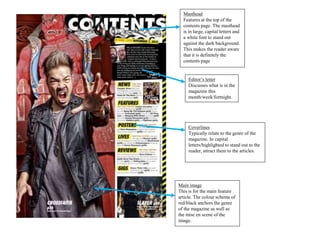
Main image
This is for the main feature
article. The colour scheme of
red/black anchors the genre
of the magazine as well as
the mise en scene of the
image.
Masthead
Features at the top of the
contents page. The masthead
is in large, capital letters and
a white font to stand out
against the dark background.
This makes the reader aware
that it is definitely the
contents page
Editor’s letter
Discusses what is in the
magazine this
month/week/fortnight.
Coverlines
Typically relate to the genre of the
magazine. In capital
letters/highlighted to stand out to the
reader, attract them to the articles.
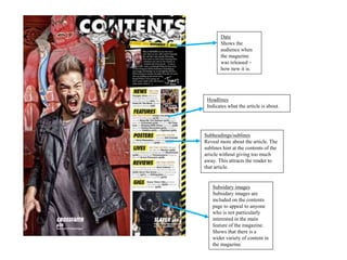
Subsidary images
Subsidary images are
included on the contents
page to appeal to anyone
who is not particularly
interested in the main
feature of the magazine.
Shows that there is a
wider variety of content in
the magazine.
Subheadings/sublines
Reveal more about the article. The
sublines hint at the contents of the
article without giving too much
away. This attracts the reader to
that article.
Headlines
Indicates what the article is about.
Date
Shows the
audience when
the magazine
was released –
how new it is.
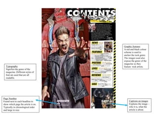
Page Number
Found next to each headline to
show which page the article is on.
Typically in chronological order
and large in size.
Captions on images
Explains the image –
who it is, what the
article is about.
Graphic features
A red and black colour
scheme is used to
anchor the rock genre.
The images used also
expose the genre of the
magazine as they
feature rock artists.Typography
Signifies the genre of the
magazine. Different styles of
font are used that are all
readable.

Contents page analysis

  • 1.
  • 2.
    Main image This isfor the main feature article. The colour scheme of red/black anchors the genre of the magazine as well as the mise en scene of the image. Masthead Features at the top of the contents page. The masthead is in large, capital letters and a white font to stand out against the dark background. This makes the reader aware that it is definitely the contents page Editor’s letter Discusses what is in the magazine this month/week/fortnight. Coverlines Typically relate to the genre of the magazine. In capital letters/highlighted to stand out to the reader, attract them to the articles.
  • 3.
    Subsidary images Subsidary imagesare included on the contents page to appeal to anyone who is not particularly interested in the main feature of the magazine. Shows that there is a wider variety of content in the magazine. Subheadings/sublines Reveal more about the article. The sublines hint at the contents of the article without giving too much away. This attracts the reader to that article. Headlines Indicates what the article is about. Date Shows the audience when the magazine was released – how new it is.
  • 4.
    Page Number Found nextto each headline to show which page the article is on. Typically in chronological order and large in size. Captions on images Explains the image – who it is, what the article is about. Graphic features A red and black colour scheme is used to anchor the rock genre. The images used also expose the genre of the magazine as they feature rock artists.Typography Signifies the genre of the magazine. Different styles of font are used that are all readable.