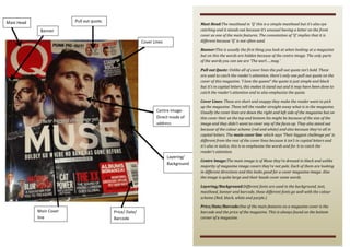
The document summarizes the key design elements of the cover of a magazine called "Q". It analyzes the masthead featuring the letter Q, banner with partially visible text, pull quote saying "I love the queen!", cover lines in red and white capital letters, and a large central image of the band Muse looking in different directions. Different fonts are used for various elements, and the price, date, and barcode are featured on the bottom corner as usual.
1. Pull out quote.
Mast Head
Mast Head:The masthead in ‘Q’ this is a simple masthead but it’s also eye
catching and it stands out because it’s unusual having a letter on the front
cover as one of the main features. The connotation of ‘Q’ implies that it is
different because ‘Q’ is not often used.
Banner
Cover Lines
Banner:This is usually the first thing you look at when looking at a magazine
but on this the words are hidden because of the centre image. The only parts
of the words you can see are ‘The worl…..mag.’
Pull out Quote: Unlike all of cover lines the pull out quote isn’t bold. These
are used to catch the reader’s attention, there’s only one pull out quote on the
cover of this magazine. ‘I love the queen!’ the quote is just simple and black
but it’s in capital letters, this makes it stand out and it may have been done to
catch the reader’s attention and to also emphasize the quote.
Centre ImageDirect mode of
address
Layering/
Background
Cover Lines: These are short and snappy they make the reader want to pick
up the magazine. These tell the reader straight away what is in the magazine.
Usually the cover lines are down the right and left side of the magazine but on
this cover their at the top and bottom his might be because of the size of the
image and they didn’t want to cover any of the faces up. They also stand out
because of the colour scheme (red and white) and also because they’re all in
capital letters. The main cover line which says ‘Their biggest challenge yet’ is
different from the rest of the cover lines because it isn’t in capital letters and
it’s also in italics, this is to emphasize the words and for it to catch the
reader’s attention.
Centre Image:The main image is of Muse they’re dressed in black and unlike
majority of magazine image covers they’re not pale. Each of them are looking
in different directions and this looks good for a cover magazine image. Also
the image is quite large and their heads cover some words.
Layering/Background:Different fonts are used in the background, text,
masthead, banner and barcode, these different fonts go well with the colour
scheme (Red, black, white and purple.)
Main Cover
line
Price/ Date/
Barcode
Price/Date/Barcode:One of the main features on a magazine cover is the
barcode and the price of the magazine. This is always found on the bottom
corner of a magazine.