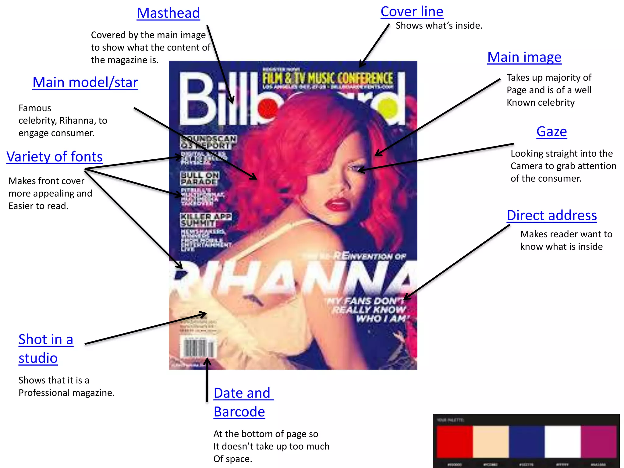
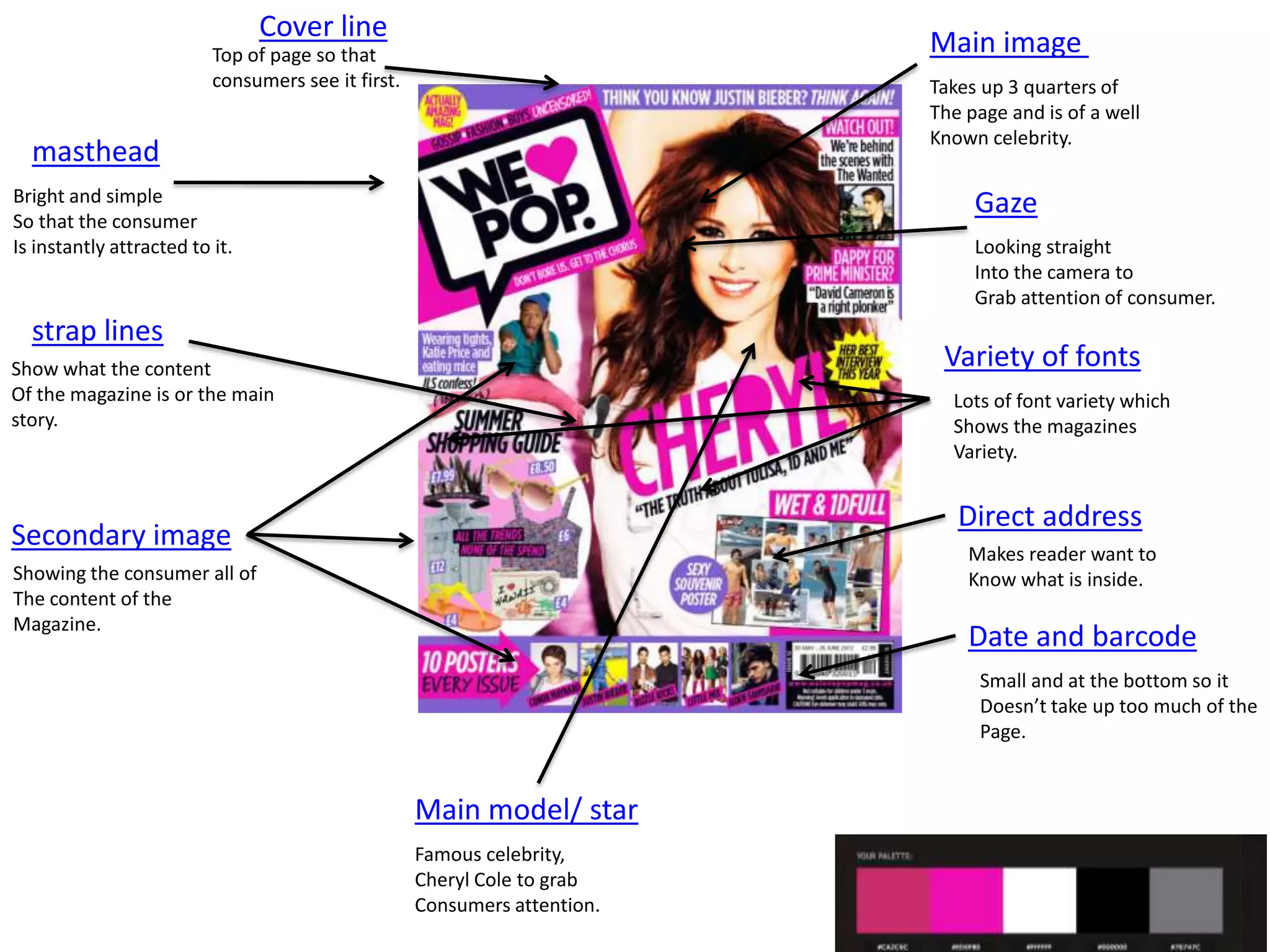
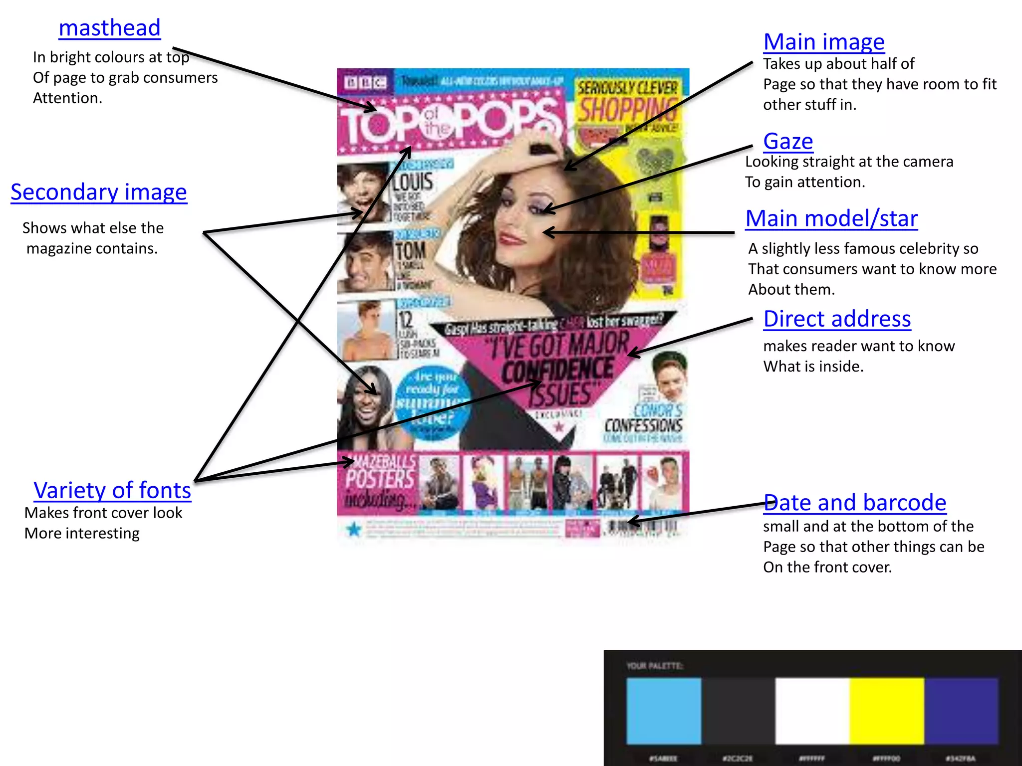
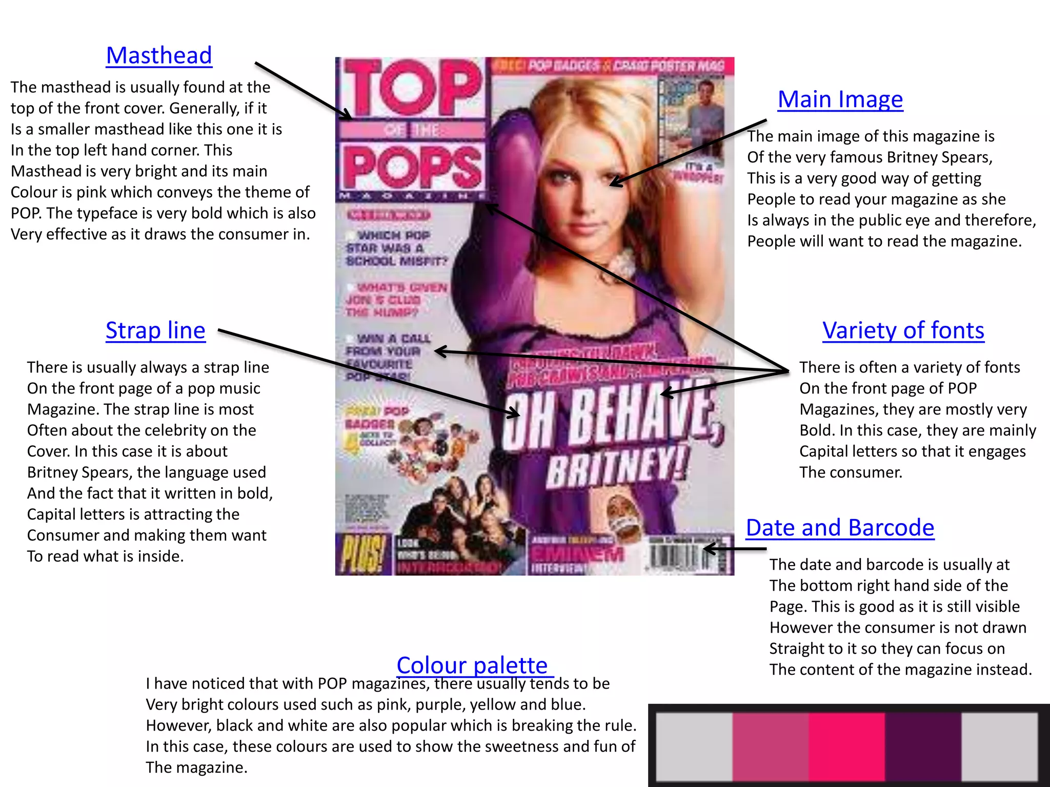
Generic
conventions
of POP
magazines
Cover line

Masthead

Shows what’s inside.

Covered by the main image
to show what the content of
the magazine is.

Main image
Takes up majority of
Page and is of a well
Known celebrity

Main model/star
Famous
celebrity, Rihanna, to
engage consumer.

Gaze
Looking straight into the
Camera to grab attention
of the consumer.

Variety of fonts
Makes front cover
more appealing and
Easier to read.

Direct address
Makes reader want to
know what is inside

Shot in a
studio
Shows that it is a
Professional magazine.

Date and
Barcode
At the bottom of page so
It doesn’t take up too much
Of space.
Cover line

Main image

Top of page so that
consumers see it first.

Takes up 3 quarters of
The page and is of a well
Known celebrity.

masthead
Bright and simple
So that the consumer
Is instantly attracted to it.

Gaze
Looking straight
Into the camera to
Grab attention of consumer.

strap lines

Variety of fonts

Show what the content
Of the magazine is or the main
story.

Lots of font variety which
Shows the magazines
Variety.

Direct address

Secondary image

Makes reader want to
Know what is inside.

Showing the consumer all of
The content of the
Magazine.

Date and barcode
Small and at the bottom so it
Doesn’t take up too much of the
Page.

Main model/ star
Famous celebrity,
Cheryl Cole to grab
Consumers attention.
masthead
In bright colours at top
Of page to grab consumers
Attention.

Main image
Takes up about half of
Page so that they have room to fit
other stuff in.

Gaze

Secondary image
Shows what else the
magazine contains.

Looking straight at the camera
To gain attention.

Main model/star
A slightly less famous celebrity so
That consumers want to know more
About them.

Direct address
makes reader want to know
What is inside.

Variety of fonts
Makes front cover look
More interesting

Date and barcode
small and at the bottom of the
Page so that other things can be
On the front cover.
Masthead
The masthead is usually found at the
top of the front cover. Generally, if it
Is a smaller masthead like this one it is
In the top left hand corner. This
Masthead is very bright and its main
Colour is pink which conveys the theme of
POP. The typeface is very bold which is also
Very effective as it draws the consumer in.

Main Image
The main image of this magazine is
Of the very famous Britney Spears,
This is a very good way of getting
People to read your magazine as she
Is always in the public eye and therefore,
People will want to read the magazine.

Strap line

Variety of fonts

There is usually always a strap line
On the front page of a pop music
Magazine. The strap line is most
Often about the celebrity on the
Cover. In this case it is about
Britney Spears, the language used
And the fact that it written in bold,
Capital letters is attracting the
Consumer and making them want
To read what is inside.

There is often a variety of fonts
On the front page of POP
Magazines, they are mostly very
Bold. In this case, they are mainly
Capital letters so that it engages
The consumer.

Date and Barcode

Colour palette

I have noticed that with POP magazines, there usually tends to be
Very bright colours used such as pink, purple, yellow and blue.
However, black and white are also popular which is breaking the rule.
In this case, these colours are used to show the sweetness and fun of
The magazine.

The date and barcode is usually at
The bottom right hand side of the
Page. This is good as it is still visible
However the consumer is not drawn
Straight to it so they can focus on
The content of the magazine instead.

Generic conventions of magazines

  • 1.
  • 2.
    Cover line Masthead Shows what’sinside. Covered by the main image to show what the content of the magazine is. Main image Takes up majority of Page and is of a well Known celebrity Main model/star Famous celebrity, Rihanna, to engage consumer. Gaze Looking straight into the Camera to grab attention of the consumer. Variety of fonts Makes front cover more appealing and Easier to read. Direct address Makes reader want to know what is inside Shot in a studio Shows that it is a Professional magazine. Date and Barcode At the bottom of page so It doesn’t take up too much Of space.
  • 3.
    Cover line Main image Topof page so that consumers see it first. Takes up 3 quarters of The page and is of a well Known celebrity. masthead Bright and simple So that the consumer Is instantly attracted to it. Gaze Looking straight Into the camera to Grab attention of consumer. strap lines Variety of fonts Show what the content Of the magazine is or the main story. Lots of font variety which Shows the magazines Variety. Direct address Secondary image Makes reader want to Know what is inside. Showing the consumer all of The content of the Magazine. Date and barcode Small and at the bottom so it Doesn’t take up too much of the Page. Main model/ star Famous celebrity, Cheryl Cole to grab Consumers attention.
  • 4.
    masthead In bright coloursat top Of page to grab consumers Attention. Main image Takes up about half of Page so that they have room to fit other stuff in. Gaze Secondary image Shows what else the magazine contains. Looking straight at the camera To gain attention. Main model/star A slightly less famous celebrity so That consumers want to know more About them. Direct address makes reader want to know What is inside. Variety of fonts Makes front cover look More interesting Date and barcode small and at the bottom of the Page so that other things can be On the front cover.
  • 5.
    Masthead The masthead isusually found at the top of the front cover. Generally, if it Is a smaller masthead like this one it is In the top left hand corner. This Masthead is very bright and its main Colour is pink which conveys the theme of POP. The typeface is very bold which is also Very effective as it draws the consumer in. Main Image The main image of this magazine is Of the very famous Britney Spears, This is a very good way of getting People to read your magazine as she Is always in the public eye and therefore, People will want to read the magazine. Strap line Variety of fonts There is usually always a strap line On the front page of a pop music Magazine. The strap line is most Often about the celebrity on the Cover. In this case it is about Britney Spears, the language used And the fact that it written in bold, Capital letters is attracting the Consumer and making them want To read what is inside. There is often a variety of fonts On the front page of POP Magazines, they are mostly very Bold. In this case, they are mainly Capital letters so that it engages The consumer. Date and Barcode Colour palette I have noticed that with POP magazines, there usually tends to be Very bright colours used such as pink, purple, yellow and blue. However, black and white are also popular which is breaking the rule. In this case, these colours are used to show the sweetness and fun of The magazine. The date and barcode is usually at The bottom right hand side of the Page. This is good as it is still visible However the consumer is not drawn Straight to it so they can focus on The content of the magazine instead.