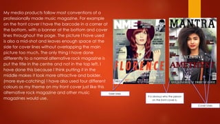
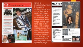
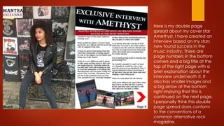
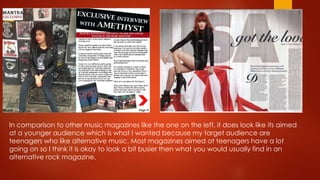
Question 1
In what ways does your media
product use, develop or challenge
forms and conventions of real
media products?
My media products follow most conventions of a
professionally made music magazine. For example
on the front cover I have the barcode in a corner at
the bottom, with a banner at the bottom and cover
lines throughout the page. The picture I have used
is also a mid-shot and leaves enough space at the
side for cover lines without overlapping the main
picture too much. The only thing I have done
differently to a normal alternative rock magazine is
put the title in the centre and not in the top left, I
have done this because I think putting it in the
middle makes it look more attractive and bolder.
(more eye-catching) I have also used four different
colours as my theme on my front cover just like this
alternative rock magazine and other music
magazines would use.
It is obvious who the person
on the front cover is.
Cover Lines.
Cover Lines.
Here is a
professionally made
Q magazine
contents page and
on the right is my
music magazine
contents page. As
you can see they
both have a main
image on the right
hand side of the
page with smaller
images also on the
page. They both
also have a page
guide on the left
hand side with the
title and name of
the magazine at the
top of the page.
Here is my double page
spread about my cover star
Amethyst. I have created an
interview based on my stars
new found success in the
music industry. There are
page numbers in the bottom
corners and a big title at the
top of the right page with a
brief explanation about the
interview underneath it. It
also has smaller images and
a big arrow at the bottom
right implying that this is
continued on the next page.
I personally think this double
page spread does conform
to the conventions of a
common alternative rock
magazine.
In comparison to other music magazines like the one on the left, it does look like its aimed
at a younger audience which is what I wanted because my target audience are
teenagers who like alternative music. Most magazines aimed at teenagers have a lot
going on so I think it is okay to look a bit busier then what you would usually find in an
alternative rock magazine.

Media question 1

  • 1.
    Question 1 In whatways does your media product use, develop or challenge forms and conventions of real media products?
  • 2.
    My media productsfollow most conventions of a professionally made music magazine. For example on the front cover I have the barcode in a corner at the bottom, with a banner at the bottom and cover lines throughout the page. The picture I have used is also a mid-shot and leaves enough space at the side for cover lines without overlapping the main picture too much. The only thing I have done differently to a normal alternative rock magazine is put the title in the centre and not in the top left, I have done this because I think putting it in the middle makes it look more attractive and bolder. (more eye-catching) I have also used four different colours as my theme on my front cover just like this alternative rock magazine and other music magazines would use. It is obvious who the person on the front cover is. Cover Lines. Cover Lines.
  • 3.
    Here is a professionallymade Q magazine contents page and on the right is my music magazine contents page. As you can see they both have a main image on the right hand side of the page with smaller images also on the page. They both also have a page guide on the left hand side with the title and name of the magazine at the top of the page.
  • 4.
    Here is mydouble page spread about my cover star Amethyst. I have created an interview based on my stars new found success in the music industry. There are page numbers in the bottom corners and a big title at the top of the right page with a brief explanation about the interview underneath it. It also has smaller images and a big arrow at the bottom right implying that this is continued on the next page. I personally think this double page spread does conform to the conventions of a common alternative rock magazine.
  • 5.
    In comparison toother music magazines like the one on the left, it does look like its aimed at a younger audience which is what I wanted because my target audience are teenagers who like alternative music. Most magazines aimed at teenagers have a lot going on so I think it is okay to look a bit busier then what you would usually find in an alternative rock magazine.