Download to read offline
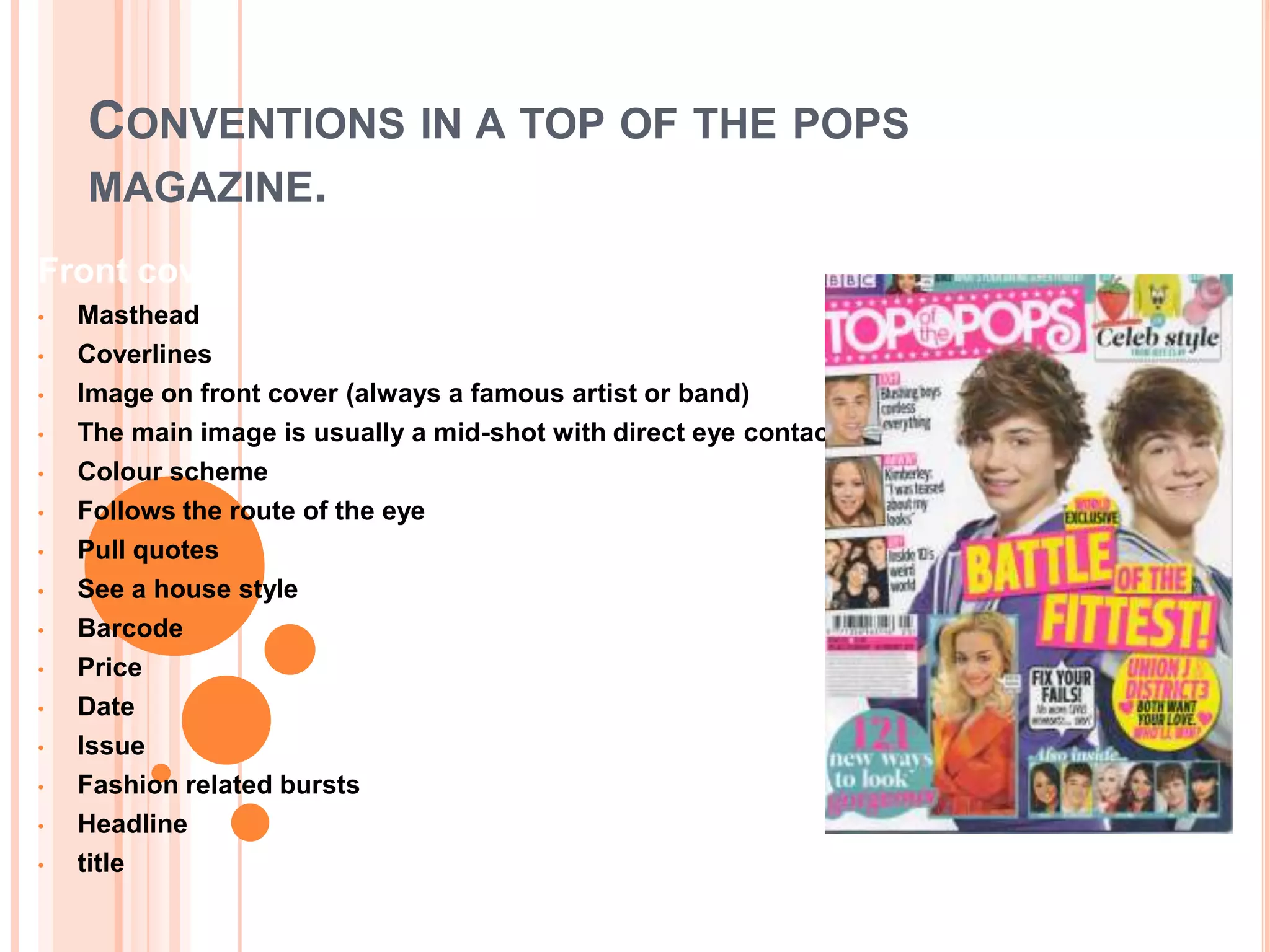
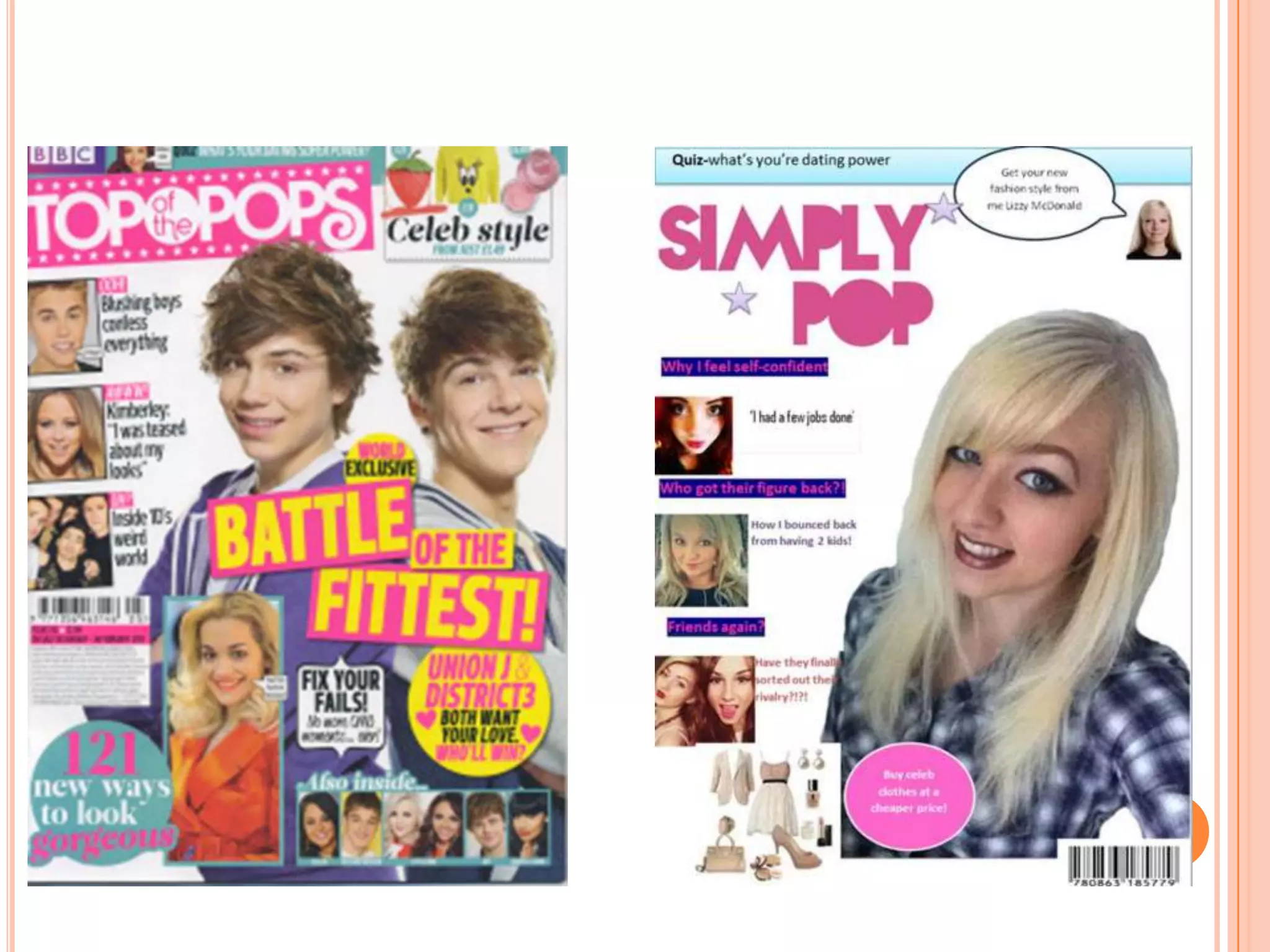
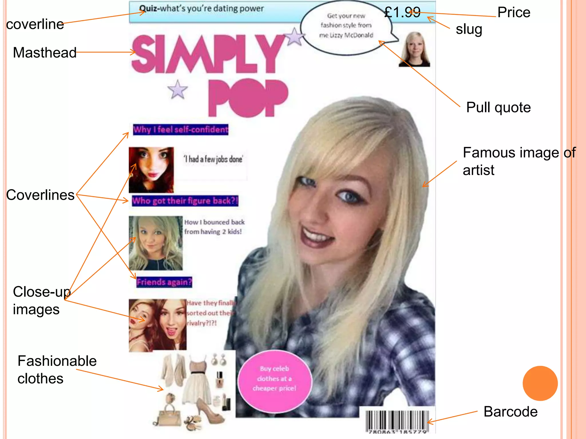
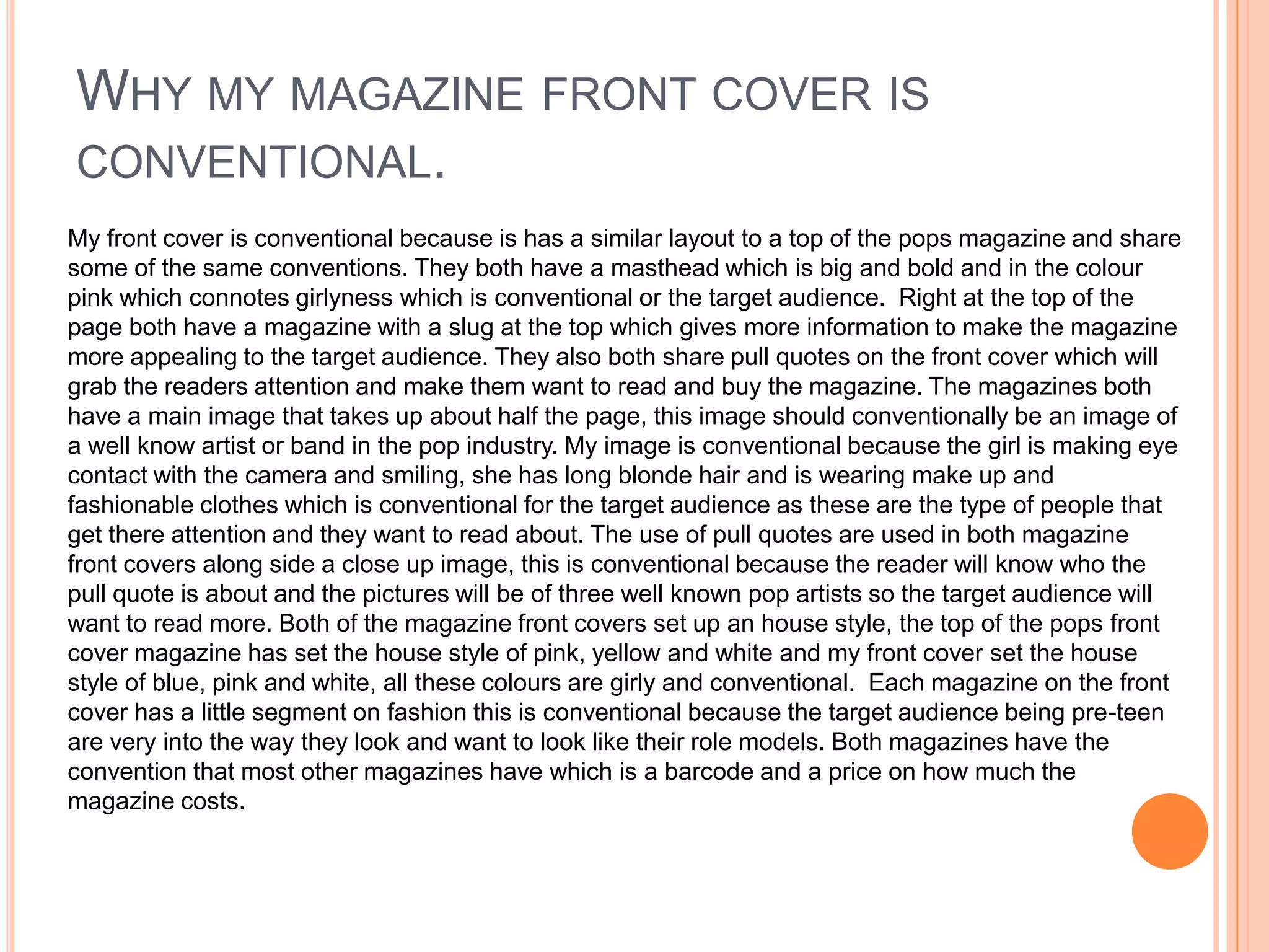

The document discusses conventions of magazine front covers, specifically pop music magazines. It notes that magazine covers typically feature: a masthead logo at the top; coverlines to grab attention; a main image of a famous artist or band making eye contact; pull quotes; and follow an established "house style" with colors and layout. The example magazine cover shown adheres to these conventions by including the masthead in pink, a full-color image of a smiling female artist, pull quotes, and an established color scheme of blue, pink, and white. By sharing these common design elements, the example cover takes a conventional approach familiar to readers of the genre.


![[BROCHURE] Italy Tour Project | @SlideON](https://cdn.slidesharecdn.com/ss_thumbnails/brochure8-251215152319-2805af68-thumbnail.jpg?width=640&height=640&fit=bounds)


