Islamabad Escorts | Call 03274100048 | Escort Service in Islamabad
Front cover analysis
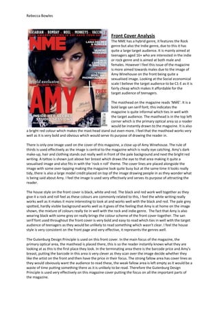
1. Rebecca Bowles
Front Cover Analysis
The NME has a hybrid genre, it features the Rock
genre but also the Indie genre, due to this it has
quite a large target audience. It is mainly aimed at
teenagers aged 16+ who are interested in the indie
or rock genre and is aimed at both male and
females. However I feel this issue of the magazine
is more aimed towards males due to the image of
Amy Winehouse on the front being quite a
sexualised image. Looking at the Social economical
scale I believe the target audience to be C1-E as it is
fairly cheap which makes it affordable for the
target audience of teenagers.
The masthead on the magazine reads ‘NME’. It is a
bold large san serif font; this indicates the
magazine is quite informal which ties in well with
the target audience. The masthead is in the top left
corner which is the primary optical area so a reader
would be instantly drawn to the magazine. It is also
a bright red colour which makes the mast head stand out even more. I feel that the masthead works very
well as it is very bold and obvious which would serve its purpose of drawing the reader in.
There is only one image used on the cover of this magazine, a close up of Amy Winehouse. The rule of
thirds is used effectively as the image is central to the magazine which is really eye catching. Amy’s dark
make-up, hair and clothing stands out really well in front of the pale background and next the bright red
writing. A tattoo is shown just above her breast which draws the eye to that area making it quite a
sexualised image and also fits in with the ‘rock n roll’ theme. The cover lines are placed alongside the
image with some over-lapping making the magazine look quite busy but at the same time it looks really
tidy, there is also a large model credit placed on top of the image drawing people in as they wonder what
is being said about Amy. I feel the image is used very effectively and serves its purpose of attracting the
reader.
The house style on the front cover is black, white and red. The black and red work well together as they
give it a rock and roll feel as these colours are commonly related to this, I feel the white writing really
works well as it makes it more interesting to look at and works well with the black and red. The pale grey
spotted, hardly visible background works well as it gives of the feeling that Amy is at home on the image
shown, the mixture of colours really tie in well with the rock and indie genre. The fact that Amy is also
wearing black with some grey on really brings the colour scheme of the front cover together. The san
serif font used throughout the front cover is very bold and easy to read which ties in well with the target
audience of teenagers as they would be unlikely to read something which wasn’t clear. I feel the house
style is very consistent on the front page and very effective, it represents the genres well.
The Gutenburg Design Principle is used on this front cover. In the main focus of the magazine, the
primary optical area, the masthead is placed there, this is so the reader instantly knows what they are
looking at as this is the first place they look. In the terminating area there is the barcode price and Amy’s
breast, putting the barcode in this area is very clever as they scan over the image decide whether they
like the artist on the front and then have the price in their focus. The strong fallow area has cover lines as
they would obviously want the audience to read these, the weak fallow area is left empty as it would be a
waste of time putting something there as it is unlikely to be read. Therefore the Gutenburg Design
Principle is used very effectively on this magazine cover putting the focus on all the important parts of
the magazine.
2. Rebecca Bowles
Q magazine features many different genres; it has
Rock, Rap, Indie and Pop. However the target
audience is mainly aimed at adults aged about 25-
40both male and female. But I feel this issue is
more aimed at adult Females as the main feature is
Take That who are more appealing to females.
Looking at the Social economical scale I believe the
target audience of this to be B-E as it is slightly
pricier than other magazines as its target audience
are people in full time employment.
The masthead on this magazine reads ‘Q’ it is in a
large bold serif font which relates to the more
mature target audience. It is in the primary optical
area which instantly draws the reader to it. The
image slightly overlaps the masthead which
suggests the magazine is so well known and popular
it doesn’t need the full masthead to be on display.
The mast head is white and is placed over a bright
red background which makes stand out. I feel the
masthead is very effective as it is bold and eye
catching therefore attracting the audience well.
There is one image used on the front cover of the band Take That doing some sort of pile on game.
The rule of thirds is used to some extent as the image is just of centre of the page. All band members
are fully clothed wearing the same outfit, a black leather jacket, this fits in well with the target
audience as it appeals more to the mature audience. The cover lines are neatly placed around the
image only one slightly overlapping the image but covering nothing of importance, this gives the
front cover a very tidy, uncluttered feeling which again would appeal more to the mature audience it
is aimed at. I feel the image is used effectively it suits the target audience very well and serves its
purpose of attracting the reader.
The house style on the front cover is black and white with small sections of red and gold. The black
and white give it a really traditional feel and again fit in with the mature audience it is aimed at. The
red and gold give the magazine a sense of fun and don’t really give too much away about the genres
as there are many genres featured in the magazine. The background is plain white with tie in with
the tidy, uncluttered feeling of the magazine. The band on the front are also wearing all black and
even their hair looks darker than usual, this really clarifies the colour scheme used on the front
cover. There is san serif and serif fonts used on the front cover, the serif fonts represent the mature
audience and the san serif fonts represent the mixture of genres in the magazine, I feel this works
well. All fonts are bold and very easy to read. I feel the house style is consistent and very effective it
represents the target audience and mixture of genres very well.
The Gutenburg Design Principle is used on this issue of Q. The primary optical area is the masthead,
this is the first place the reader would look so they straight away no what they are looking at. In the
terminating optical area there is the last word of a cover line which starts in the weak fallow area,
this is very clever as they have actually placed something in the weak fallow area so it is unlikely to
be seen but as it goes across to the terminating area the eye will then be drawn to the weak fallow
area to see what the full cover line reads. The model credit is placed in the strong fallow area which
clarifies the main focus of this week’s issue of the magazine and is guaranteed to be read. Taking this
into consideration the Gutenburg Design Principle is used effectively on this front cover.