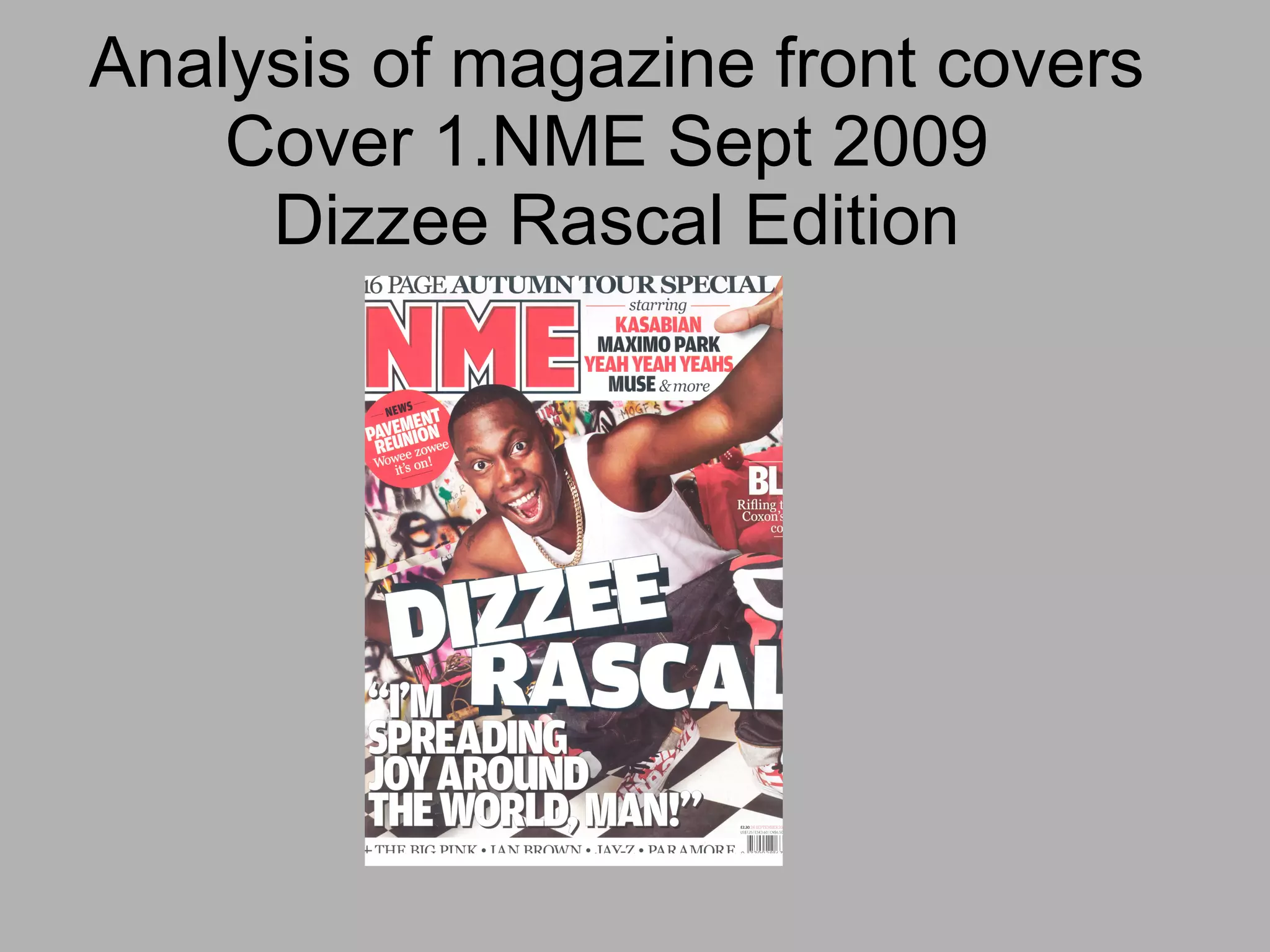
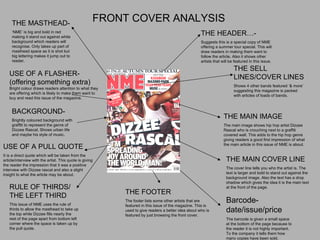
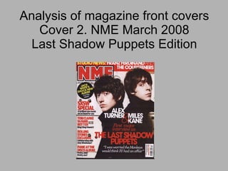
Analysis of magazine front covers Cover 1.NME Sept 2009  Dizzee Rascal Edition
FRONT COVER ANALYSIS THE MASTHEAD- ‘ NME’ is big and bold in red making it stand out against white background which readers will recognise. Only takes up part of masthead space as it is shot but big lettering makes it jump out to reader. THE HEADER…- Suggests this is a special copy of NME offering a summer tour special. This will draw readers in making them want to follow the article. Also it shows other artists that will be featured in this issue. THE SELL LINES/COVER LINES Shows 4 other bands featured ‘& more’ suggesting this magazine is packed with articles of loads of bands. THE MAIN IMAGE The main image shows hip hop artist Dizzee Rascal who is crouching next to a graffiti covered wall. This adds to the hip hop genre giving readers a good first impression of what the main article in this issue of NME is about. THE MAIN COVER LINE The cover line tells you who the artist is. The text is larger and bold to stand out against the background image. Also the text has a drop shadow which gives the idea it is the main text at the front of the page. Barcode-date/issue/price The barcode is given a small space  at the bottom of the page because to the reader it is not highly important. To the company it tells them how many copies have been sold. THE FOOTER The footer lists some other artists that are featured in this issue of the magazine. This is used to give readers a better idea about who is featured by just browsing the front cover. USE OF A PULL QUOTE It is a direct quote which will be taken from the article/interview with the artist. This quote is giving the reader the impression that it was a positive interview with Dizzee rascal and also a slight insight to what the article may be about. BACKGROUND- Brightly coloured background with graffiti to represent the genre of Dizzee Rascal. Shows urban life and maybe his style of music. USE OF A FLASHER-(offering something extra)  Bright colour draws readers attention to what they are offering which is likely to make them want to buy and read this issue of the magazine. RULE OF THIRDS/ THE LEFT THIRD This issue of NME uses the rule of thirds to allow the masthead to take up the top while Dizzee fills nearly the rest of the page apart from bottom left corner where the space is taken up by the pull quote.
TARGET AUDIENCE OF THIS MAGAZINE METHODS USED TO ATTRACT THIS TARGET AUDIENCE ARE: -Image of a hip hop artist which appeals to the younger part of the audience but it still features bands such as Muse and Kasabian which will appeal to the older audience. - Reunion of bands that maybe the older reader may no making them want to read to keep up with the latest news. Research showed that 62% of readers choose to listen to indie/guitar bands The audience is mostly male (72%) which suggests why there are certain artists chosen that are maybe more targeted at men. The average age of NME readers is 17 – 30 which is why artists like Dizzee Rascal are chosen as he will appeal to this paticular age. Each issue of NME costs £2.20 and is released on a weekly basis. Their research shows that 73% of readers are ABC1 meaning they can afford this.
Analysis of magazine front covers Cover 2. NME March 2008 Last Shadow Puppets Edition
Front Cover Analysis Masthead ‘ NME’ is big and bold in red making it stand out against white background which readers will recognise. Only takes up part of masthead space as it is shot but big lettering makes it jump out to reader. Main Image The main image shows the two members of ‘The Last Shadow Puppets’ dressed in black. This stands out well against the background and immediately draws attention to them. Header This is offering up to date news about bands working in the studio meaning new albums to be released making readers want to find out more. Main Cover Line Shows the name of the artist in red which stands out against the background. Also it is in bold text  attracting the readers attention. It also lists the names of the band members Barcode-date/issue/price The barcode is given a small space at the bottom of the page because to the reader it is not highly important. To the company it tells them how many copies have been sold. Background This issues background is very plain using a simple white/grey which allows the main image and any text to stand out attracting the readers attention. Pull Quote This is a short quote from the article/interview with the last shadow puppets, it discusses one of the members previous or other bands and how they might feel betrayed. This gives the idea of suspense to see what they did think so the reader wants to buy the magazine and read the article. Flasher Flasher stands out from background by using a black circle with yellow text. This attracts the  readers attention. It offers a small section of  information that the reader will quickly notice. This will then draw the reader in to wanting to read the article and then buy the magazine. Sell Lines These sell lines are using red and black text to stand out against the light  background. They show the reader other things that are featured in this issue of NME and about what is in the articles/interview.  Rule of Thirds The top third of this page is devoted to the masthead showing that it is important that readers know what magazine this is. The middle and right third is taken up  mostly by the image of the two band members. This  shows that they are an important part of this issue and  that they are part of the main article. The left third shows the different cover lines and the flasher so the reader can find out what is in this issue.
Analysis of magazine front covers Cover 2.Kerrang December 2005 Foo Fighters edition.
Front Cover Analysis Masthead 'Kerrang' fills the top of the page so it is easily Recognisable, the white text on a black background Also stands out. The text is shattered which gives The idea that this magazines genre is rock/metal And that it does not conform with the rules.  Main Image The main image depicts the Foo Fighters, Dave Grohl Dressed in a brightly coloured red shirt so that he will  Stand out against the background. This is useful to the Magazine as it attracts peoples attention from a far. His Hairstyle and facial hair suggests he is quite grungy  And this goes well with the style of the magazine and Other fonts and images that are used on the front cover. Barcode The barcode is given a small space  at the bottom of the page  because to the reader it is not highly important. To the company it tells them how many copies  have been sold. Footer The footer adds to the sell lines by giving additional  Information about what artists are featured in this  Issue of Kerrang so if a reader sees an artist they like  They are more likely to buy this issue. Background The background is a blurred image of  Somewhere that looks like America, which Is where the main image (Dave Grohl) is from. The image is slightly blurred so the main Image stands out, also it uses very dull Colours to a similar effect. Main cover line The main cover line is using bold text with a drop Shadow suggesting it is important. It reads 'Foo Fighters' Which is the name of the band featured in the main article And the white colour font used stands out well against The red shirt in the main image. Also the small piece of  Text about the cover line suggests this is an exclusive And it is something they will not be able to read about In any other music magazine.  Header The header, similar to the footer lists Different artists featured in this issue of  The magazine. Flasher This is offering the reader a 'eight page Special' which will draw the reader in. It shows some of the bands featured in The special. Sell Lines The various sell lines show what other artists Are featured in this issue of Kerrang which draws the reader into the magazine wanting To read more so they are more likely to Buy the magazine.
TARGET AUDIENCE OF THIS MAGAZINE - Kerrang is published by Bauer Consumer Media and was first published in 1981 - Its target audience is 16 – 25 year old males but in recent years the age has lowered to an age of 14 – 17 as the main target audience. -It sells each magazine weekly for £2.20 which fits in with the target audiences age. - It is aimed at readers who enjoy listening to rock/alternative music and this is shown a lot through bands featured and many of the gigs/festivals that they advertise.

Magazine Front Cover Analysis

  • 1.
    Analysis of magazinefront covers Cover 1.NME Sept 2009 Dizzee Rascal Edition
  • 2.
    FRONT COVER ANALYSISTHE MASTHEAD- ‘ NME’ is big and bold in red making it stand out against white background which readers will recognise. Only takes up part of masthead space as it is shot but big lettering makes it jump out to reader. THE HEADER…- Suggests this is a special copy of NME offering a summer tour special. This will draw readers in making them want to follow the article. Also it shows other artists that will be featured in this issue. THE SELL LINES/COVER LINES Shows 4 other bands featured ‘& more’ suggesting this magazine is packed with articles of loads of bands. THE MAIN IMAGE The main image shows hip hop artist Dizzee Rascal who is crouching next to a graffiti covered wall. This adds to the hip hop genre giving readers a good first impression of what the main article in this issue of NME is about. THE MAIN COVER LINE The cover line tells you who the artist is. The text is larger and bold to stand out against the background image. Also the text has a drop shadow which gives the idea it is the main text at the front of the page. Barcode-date/issue/price The barcode is given a small space at the bottom of the page because to the reader it is not highly important. To the company it tells them how many copies have been sold. THE FOOTER The footer lists some other artists that are featured in this issue of the magazine. This is used to give readers a better idea about who is featured by just browsing the front cover. USE OF A PULL QUOTE It is a direct quote which will be taken from the article/interview with the artist. This quote is giving the reader the impression that it was a positive interview with Dizzee rascal and also a slight insight to what the article may be about. BACKGROUND- Brightly coloured background with graffiti to represent the genre of Dizzee Rascal. Shows urban life and maybe his style of music. USE OF A FLASHER-(offering something extra) Bright colour draws readers attention to what they are offering which is likely to make them want to buy and read this issue of the magazine. RULE OF THIRDS/ THE LEFT THIRD This issue of NME uses the rule of thirds to allow the masthead to take up the top while Dizzee fills nearly the rest of the page apart from bottom left corner where the space is taken up by the pull quote.
  • 3.
    TARGET AUDIENCE OFTHIS MAGAZINE METHODS USED TO ATTRACT THIS TARGET AUDIENCE ARE: -Image of a hip hop artist which appeals to the younger part of the audience but it still features bands such as Muse and Kasabian which will appeal to the older audience. - Reunion of bands that maybe the older reader may no making them want to read to keep up with the latest news. Research showed that 62% of readers choose to listen to indie/guitar bands The audience is mostly male (72%) which suggests why there are certain artists chosen that are maybe more targeted at men. The average age of NME readers is 17 – 30 which is why artists like Dizzee Rascal are chosen as he will appeal to this paticular age. Each issue of NME costs £2.20 and is released on a weekly basis. Their research shows that 73% of readers are ABC1 meaning they can afford this.
  • 4.
    Analysis of magazinefront covers Cover 2. NME March 2008 Last Shadow Puppets Edition
  • 5.
    Front Cover AnalysisMasthead ‘ NME’ is big and bold in red making it stand out against white background which readers will recognise. Only takes up part of masthead space as it is shot but big lettering makes it jump out to reader. Main Image The main image shows the two members of ‘The Last Shadow Puppets’ dressed in black. This stands out well against the background and immediately draws attention to them. Header This is offering up to date news about bands working in the studio meaning new albums to be released making readers want to find out more. Main Cover Line Shows the name of the artist in red which stands out against the background. Also it is in bold text attracting the readers attention. It also lists the names of the band members Barcode-date/issue/price The barcode is given a small space at the bottom of the page because to the reader it is not highly important. To the company it tells them how many copies have been sold. Background This issues background is very plain using a simple white/grey which allows the main image and any text to stand out attracting the readers attention. Pull Quote This is a short quote from the article/interview with the last shadow puppets, it discusses one of the members previous or other bands and how they might feel betrayed. This gives the idea of suspense to see what they did think so the reader wants to buy the magazine and read the article. Flasher Flasher stands out from background by using a black circle with yellow text. This attracts the readers attention. It offers a small section of information that the reader will quickly notice. This will then draw the reader in to wanting to read the article and then buy the magazine. Sell Lines These sell lines are using red and black text to stand out against the light background. They show the reader other things that are featured in this issue of NME and about what is in the articles/interview. Rule of Thirds The top third of this page is devoted to the masthead showing that it is important that readers know what magazine this is. The middle and right third is taken up mostly by the image of the two band members. This shows that they are an important part of this issue and that they are part of the main article. The left third shows the different cover lines and the flasher so the reader can find out what is in this issue.
  • 6.
    Analysis of magazinefront covers Cover 2.Kerrang December 2005 Foo Fighters edition.
  • 7.
    Front Cover AnalysisMasthead 'Kerrang' fills the top of the page so it is easily Recognisable, the white text on a black background Also stands out. The text is shattered which gives The idea that this magazines genre is rock/metal And that it does not conform with the rules. Main Image The main image depicts the Foo Fighters, Dave Grohl Dressed in a brightly coloured red shirt so that he will Stand out against the background. This is useful to the Magazine as it attracts peoples attention from a far. His Hairstyle and facial hair suggests he is quite grungy And this goes well with the style of the magazine and Other fonts and images that are used on the front cover. Barcode The barcode is given a small space at the bottom of the page because to the reader it is not highly important. To the company it tells them how many copies have been sold. Footer The footer adds to the sell lines by giving additional Information about what artists are featured in this Issue of Kerrang so if a reader sees an artist they like They are more likely to buy this issue. Background The background is a blurred image of Somewhere that looks like America, which Is where the main image (Dave Grohl) is from. The image is slightly blurred so the main Image stands out, also it uses very dull Colours to a similar effect. Main cover line The main cover line is using bold text with a drop Shadow suggesting it is important. It reads 'Foo Fighters' Which is the name of the band featured in the main article And the white colour font used stands out well against The red shirt in the main image. Also the small piece of Text about the cover line suggests this is an exclusive And it is something they will not be able to read about In any other music magazine. Header The header, similar to the footer lists Different artists featured in this issue of The magazine. Flasher This is offering the reader a 'eight page Special' which will draw the reader in. It shows some of the bands featured in The special. Sell Lines The various sell lines show what other artists Are featured in this issue of Kerrang which draws the reader into the magazine wanting To read more so they are more likely to Buy the magazine.
  • 8.
    TARGET AUDIENCE OFTHIS MAGAZINE - Kerrang is published by Bauer Consumer Media and was first published in 1981 - Its target audience is 16 – 25 year old males but in recent years the age has lowered to an age of 14 – 17 as the main target audience. -It sells each magazine weekly for £2.20 which fits in with the target audiences age. - It is aimed at readers who enjoy listening to rock/alternative music and this is shown a lot through bands featured and many of the gigs/festivals that they advertise.