
Recommended
More Related Content
What's hot
What's hot (20)
Viewers also liked
Similar to Contents Page Analysis
Similar to Contents Page Analysis (20)
Recently uploaded
Recently uploaded (20)
Contents Page Analysis
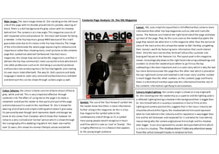
- 1. Contents Page Analysis: Dr. Dre XXL MagazineMain Image: The main image shows Dr. Dre standingon the left hand sideof the page with his thumbs placed into his pockets,wearing all black.There is a dull background of a grey colour with his shadow behind him. The camera is at a low angle.This magazine consists of well respected artistand producer Dr. Dre most well known for being a member in the hip-hop music group NWA becauseof this itwill guarantee sales due to his status in the hip-hop industry.The image of the artistdominates the whole page expressinghis relevanceand importance rather than showingmany small pictures on the contents page that symbolises whatwill befeatured likemost music magazines;this shows how exclusivethe XXL magazineis,and that it delivers the hip-hop community’s most successful artistswho branch into other professions such as Dr.Dre being a successful producer and business man producingmusic for hip-hop legends and creating his own music label aftermath. The way Dr. Dre’s posture and body languageis made to seem very calmand laid back butalso confident and dominant this can be shown through camera angle as well. Layout: XXL uses simplisticlayoutthatis still effectivethat contains more information than other hip-hop magazines such as vibe and rivals the source. The features are listed on the right hand sideof the page and takes up most of the page. They do this so as soon as the readership opens the page they would see what else is in the magazine other than the exclusive story of the main artist,this allowsthe reader to feel likethey aregetting their money’s worth by featuringmore information that could interest them. Only the main stories they think will attractthe customer into buyingwill be put on the features list. The layoutused in this magazine moves chronologically down on the right hand sideusingsubheadings and numbers to directthe readership on where to go firstas the top subheadingis the most important and is a cover story which is why the text has more dominanceover the page than the other text which is placed on the top righthand corner and labelled in red ‘cover story’ and the number is much bigger than the other numbers on the contents page and finally there is a thick black linethat separates this information fromthe rest of the contents information signifyingits exclusiveness. Camera Angle/Lighting: the camera angle is shown at a low anglewith Dr. Dre standingover the readership as a superior and the lightingused is a reflected lightinghavinga shadowin the background that is bigger than Dr. Dre himself which is usually a convention in horror films on this lightingand camera position this suggests that in the music industry we should be afraid of this figure, the shadowbehind himcould represent what he lives behind in the industry and his reputation is way bigger than him and he will beknown and respected for it and what he lives behind, reason being why the camera angleplaces himso high and his shadow even bigger. Itcan also representhis unseen dark pastbehind him which is in facthis shadow. The shadowdoesn’ttake anyattentionaway fromthe artistinsteaditlooksinrelationto him. Colour Scheme: the colour scheme consists of dark colours of black, grey, white and red. This is very simplebut effective through symbiotic link.The effect of usingred on the page is to make a statement and draw the reader to that particularpartof the page and also becauseitis used on the masthead. Dr. Dre is known for wearing allotof dark and simpleclothingwhich doesn’t give away his personality even though dark represents death and danger we know dr.dre comes from Compton which shows that however he remains a very civilised and ‘normal’person which is shown through the iconography of his wedding ringwhich he’s been married for over 15 years,this shows his normal lifestyle,values and beliefs Symbol: The use of the ‘fast-forward’symbol lets the reader know that there is more information further alongin the magazine. As this is a hip- hop magazine the symbol adds to the contemporary sideof things as it’s a symbol most young people would recognisein music and films which is seen as ‘cool’or ‘trendy’. This is highly effective as itis a feature that appeals to the young target audience.
- 2. Content Column: The content or ‘features’ listis on one column on the right hand sidehowever ithas been splitinto two sections separated by a black rectangle shape.This divides the information and makes it easier for the readership to read as then there isn’tso much information crammed into one spacemakingit look aesthetically pleasing.Justlike vibecontent page the crossheads in XXL’s contents page are in capital letters and arein bold font suggestingthey areimportant snippets of that feature or story which draws the readership readingmore about them. The cover stories subhead and page numbers are in a bigger font that the rest. This is so the readership can quickly access the information they need as majority of the time the whole point of the readership buyingthe magazine is becausethey want to read the cover story. The page numbers arebeside them in a bold font too similarly to vibe magazine which allows the readership to quickly identify whatpage that specific story or feature is on. Costume: Dr. Dre’s costume is a very mature, plain and simple one reason is becauseDr.dre is a much respected icon in the hip-hop industry which means he doesn’t need to wear the typical hip-hop gear to show what genre he belongs to or what he represents. In general, Dr. Dre has been very easy on his appearanceover his career and not been very flashy showing that he is an ordinary person from the ‘hood’ but with talent. In evidence to this it is stated in the quote on the left hand side placed near his head as itsays ‘I do this becauseI likemaking records that’s it’. Implyingthat is the reason why he went so far in his music career becausehe never did itfor anythingbut for the love of the music which explains his simplicity in costume and his appearancein front of the public eye. Heading: The heading for this contents page is positioned centrally atthe top of the page and font wise itis the biggest on the page. Having the masthead font the biggeston the page draws the attention of the readership as itis the firstthingthey see. The effect of XXL labellingtheir contents page ‘the A-side’ gives them an original and uniquefeel which will gain the readerships respectand give the magazine street creditability which is a convention of the hip-hop culture. It is also exclusiveto their magazine meaning itenables the readership to identify which magazine they are readingas itis likea trademark, this is known as a uniqueselling point as itdiffers and gives them a competitive edge over their competitors. The masthead is in black sansserif bold font and the dash ‘-‘is in a red colour which draws the readerships attention to it. It also shows symbiotic link between the colours used on the front cover and the rest of the magazine, this shows strong brand identity which the readership will recognise. Subhead: The ‘features’ subhead is another example of a wob. Instead of usinga bold font for the word ‘features’ to draw the reader’s attention XXL have used red brackets.This adds to XXL’s original and uniquefeel as itis unusual to see. It also has a symbiotic link between the XXL’s masthead colour scheme this makes the readership well awareof the brand identity. XXL’s Logo: The name of the magazine is in a white bold sans serif font in front of a red background this is known as a wob- white text on a black or other coloured background. The XXL logo is situated at the end on the rightsidein a smaller font than the masthead this may be due to the factthat becausethe labellingof the page is ‘the A-side’ instead of justthe typical ‘contents’ the masthead brands the publication and the XXL logo justreminds the readership which magazinethey are reading as they have a lot of magazines they brand.