How effective is the combination of your main product and ancillary texts?
1. Adam Cunliffe
How effective is the combination of your main product and ancillary texts?
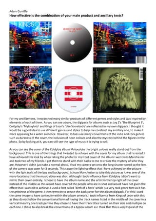
For my ancillary one, I researched many similar products of different genres and styles and was inspired by
elements of each of them. As you can see above, the digipack for albums such as Jay Z’s ‘The Blueprint 3’,
Coldplay’s ‘Myloxyloto’ and Kings of Leon's ‘Use Somebody’ are reflected in my own digipack. I thought it
would be a good idea to use different genres and styles to help me construct my ancillary one, to make it
more appealing to a wider audience. However, it does use many conventions of the indie and rock genres
such as darkness of the cover, the inclusion of neon colours and also the mystery behind the figures in the
photo. So by looking at it, you can still see the type of music it is trying to sell.
As you can see the cover of the Coldplay album Myloxyloto the bright colours really stand out from the
background. This is one of the things that I wanted to achieve with the cover for my album that I created. I
have achieved this look by when taking the photo for my front cover of the album I went into Manchester
and took two of my friends. I got them to stand with their backs to me to create the mystery of who they
are. However I didn't just take a normal photo, I had my camera set onto the long shutter speed so the lens
of the camera was open for 3 seconds. This cause the lighting effect that I have achieved on the picture
with the light trails of the bus and background. I chose Manchester to take this picture as it was one of the
many locations that the music video was shot. Although I took influence from Coldplay I didn't want to
mimic their cover entirely. I chose to have the album name and the artist in the top right of the cover
instead of the middle as this would have covered the people who are in shot and would have not given the
effect that I wanted to achieve. I used a font called 'birth of a hero' which is a very rock genre font as it has
the grittiness of the genre. I then went on to create the back cover for the album digipack. For this I used
the same image to have continuity within the album artwork. I took influence from Kings of Leon with this
as they do not follow the conventional form of having the track names listed in the middle of the cover in a
vertical linearity one track per line they chose to have their track titles turned on their side and multiple on
each line. I chose to also break the conventions of a typical album as I think that this is very typical of the
2. Adam Cunliffe
rock genre. I chose to have my tracks in the top left of the back cover with more than one track on each
line. I then came on to making the artwork for the disc itself. I chose to take influence from a different
genre with this piece of the artwork and took inspiration from Jay-Z's the blueprint 3; I did this by having a
simple disc stick. Jay-Z's album disc is very minimalistic as it is a white background with three thick red lines
through the centre. I took this and changed it slightly to reflect the rock genre more. I chose to have the
disc have a gradient where at one side it started black and gradually turned to white.
The poster that I have created is similar to that of kings of Leon. This is because the poster that they have
used to advertise their album, only by the night, also uses the cover of the album as the only image. This is
the same as my poster how I have used the exact same image on the cover of my album as on the poster,
this is to create synergy through the products and lets the customers know what they are looking for if
they want to buy the album. I have taken a minimal approach to the rest of the poster only including the
name of the album, the band and producer’s websites and the detail that the album is out now.
Synergy is a term used to describe a situation where different entities cooperate advantageously for a final
outcome. So in terms of my work it means that all the products link together. There is good synergy
between my works as first of all the poster and album both uses the same artwork and this instantly gives
a link between the two products. The art work takes the setting from my music video, so both products use
the same mise en scene of the busy city centre. This can cause the audience to find a link between all three
products if they see just one. For example they may see the poster in the street and recognised that it is
for my music video also if they see the poster they may go into the store and be able to recognise the cd
the want as they know what the artwork looks like. All three products use the typical conventions of the
rock and indie genres which fits into the house style I aimed to create. At first I create a different digipack
and poster, however I did not feel that it linked in well enough with the music video that I created so I
went back and changed the idea so that it was set in one of the shooting locations from the video so the
synergy is obvious. This can cause the product to be able to sell better.