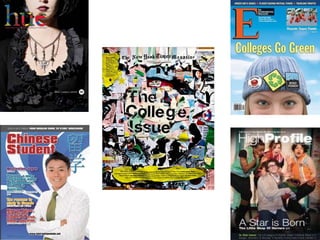
This document discusses a magazine cover that uses a simple, non-distracting image with plain text that gets its message across. The cover was chosen because the group image draws the viewer in while the small amount of text provides necessary information without being overwhelming. A second cover is described as having an elaborate, multi-layered image with important text despite its obscure title.
![[object Object],[object Object]](data:image/gif;base64,R0lGODlhAQABAIAAAAAAAP///yH5BAEAAAAALAAAAAABAAEAAAIBRAA7)