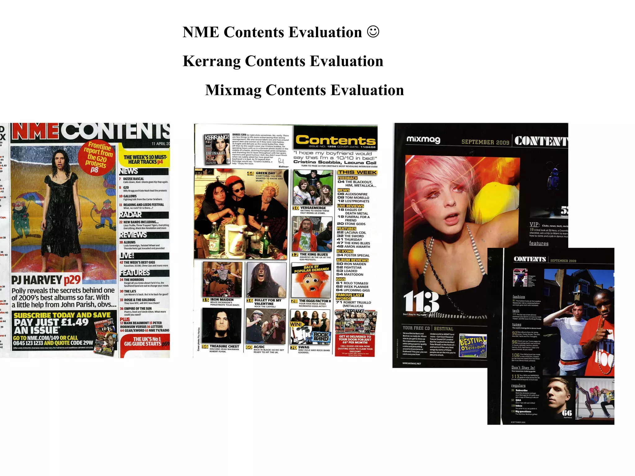
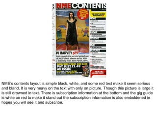
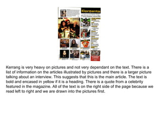
The document summarizes and compares the content layout styles of three music magazines: NME, Kerrang, and Mixmag. NME relies heavily on text with one large picture and uses bolding and color to draw attention to subscription and event information. Kerrang focuses more on pictures than text, using images to illustrate articles and bold yellow headings. Mixmag spreads its content across two pages to accommodate large colorful pictures describing the articles against a black background with white stencil text.