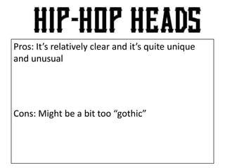
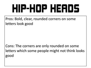
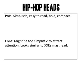
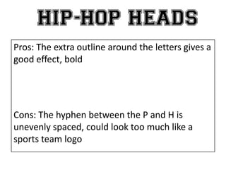
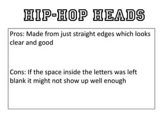
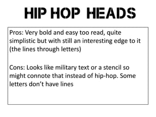
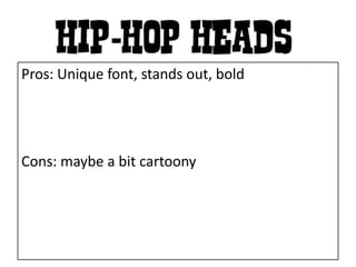
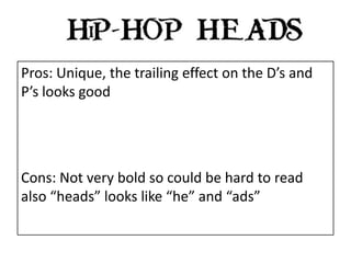
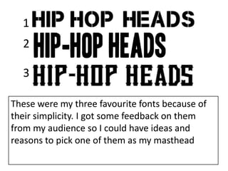
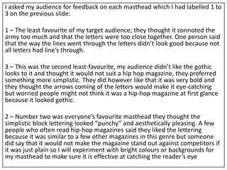
The document provides feedback on several font options for a magazine masthead. Audience feedback indicated that Font 1 connoted the military too much and had uneven letter spacing. Font 3 was viewed as too "gothic" and would not suit a hip-hop magazine. Font 2 was the favorite - the simple block lettering was seen as punchy, pleasing, and similar to other hip-hop magazines. However, it was noted that plain lettering may not stand out against competitors.