First Magazine Analysis
•Download as PPT, PDF•
0 likes•238 views
This magazine follows conventions of magazine design like placing the masthead at the top in a large font on a white background. It also follows the "rule of thirds" by placing the main image and text in the left two-thirds while reserving the right third for purchase details. The cover uses persuasive language and images of artists to attract readers and promote featured content inside the issue.
Report
Share
Report
Share

Recommended
First Magazine Analysis
This document summarizes and analyzes the front cover of an existing rock music magazine in the UK. It describes the layout elements including the masthead, selling lines, cover lines, barcode and date. It discusses how the cover follows the "eye flow" that readers follow, with the model placed across the left two-thirds. The cover is designed to attract readers with images and text about bands featured in the issue.
First Magazine Analysis
This magazine follows conventions of magazine design like placing the masthead at the top in a large font on a white background. It also follows the "C-shape" rule of eye flow and the rule of thirds in its layout. While the model breaks the rule of thirds, her highlighted features still keep her in the left two-thirds. The cover uses persuasive language and images like a funny button to attract readers and promote the artists and content inside.
Analysis of front cover, contents page and doubel page spread
The document analyzes the front covers and contents pages of three music magazines: Kerrang!, NME, and Classic Rock. For the front covers, it examines elements like masthead placement, color schemes, photo selection and editing. It notes differences between the magazines in these areas. For the contents pages, it describes layouts, use of images and text to list articles. The document concludes by listing aspects it will incorporate into its own magazine, like masthead and artist placement, and using a maximum of three colors.
Second Magazine Analysis
The magazine follows standard layout conventions with the masthead in the top left corner, the selling line at the top summarizing the content, and cover lines and images organized according to the rule of thirds. Larger text is used for important details like the main kicker crediting the cover model. The Green Day cover photo features the band members united and shows patriotism through imagery like the stars on the lead singer's shirt.
Second Magazine Analysis
The magazine follows standard layout conventions with the masthead in the top left corner, the selling line at the top summarizing the content, and cover lines and images organized according to the rule of thirds. Larger text is used for important details like the main kicker crediting the cover model. The Green Day cover features the band members wearing formal wear with the lead singer in the center, signaling their unity as a group after over 20 years together.
Analysis of professional magazine contents page
The document analyzes the layout and design conventions of a magazine contents page. It discusses several key elements including the word "contents" at the top, the main images featuring artists related to cover stories, page numbers that indicate article locations, a color scheme matching the cover, date and issue information, cover lines that describe articles, a subscription advertisement, feature articles specific to the issue, and regular sections. The analysis examines how each element is formatted and positioned to effectively communicate the magazine contents and stories to readers.
Double page
This document outlines common design elements and styles used in magazine layouts. Magazines typically feature a large artist or band image spread across one or two pages with accompanying text. Introductory snippets called stand firsts are only a few lines. Headlines sometimes use large drop capitals or quotes. Bylines identify the author. Columns, color schemes, page numbers, and logos are consistent within each magazine. Articles end with relevant dates and photographer credits appear near images. Some magazines include Q&As with differentiated question and answer formatting.
Eq1
This document analyzes the media product of a hip hop magazine the author created. It identifies several conventions of hip hop and rap music that were used, such as gold, graffiti, baseball caps, and gestures. It then compares elements of the author's magazine, such as the cover, contents page, and double page spread, to an existing hip hop magazine called XXL. While some conventions were similar, such as the color scheme and types of shots, the author notes differences in layout, text placement, and use of images between their magazine and the existing one.
Analysis of a professional double page spread
The document analyzes the layout of a double-page magazine spread. It has three columns with images in the middle column and text on both sides. The main image directly addresses the reader by featuring two artists from the band. The text uses informal language to engage readers. Color scheme and page design elements like drop caps and arrows between pages create a distinctive magazine style and brand identity.
Music Magazine’S
The document discusses several British music magazines, including Kerrang! and Mojo. It describes the typical design elements found on the covers of these magazines, such as the masthead, lead article, cover lines, main image, skyline, and barcode. While Kerrang! and Mojo focus on different music genres, they both share some design similarities, like using a dark color scheme and advertising CDs on the front cover, while also highlighting differences like featuring different bands and having distinct skyline fonts.
Ana lysis.
The magazine cover is designed to appeal to its target audience of hip hop fans. The large red masthead identifies it as VIBE magazine, and the cover image features hip hop artist Kendrick Lamar. Other elements like mentioning artists Kanye and R. Kelly in the cover lines and including hip hop symbols like chains and snapback hats help position the magazine as focused on hip hop culture. The layout lists article titles to give readers a clear sense of the magazine's contents and reassure them it will suit their tastes. Elements like the featured artist image, article listings and use of rule of thirds help guide readers' attention to the most important parts of the cover.
Codes and conventions of a magazine
The document summarizes key design elements of magazine covers. It notes that the main image is usually of the featured artist using direct address. The barcode, containing price and date, is typically in the bottom right corner. The masthead, containing the magazine title and branding, spans the top left. Sublines and cover lines hint at inside articles to attract readers beyond the main feature. Color schemes use only 3-4 simple colors. Buzzwords and puffs highlight interesting content to entice purchases.
Analysing NME Magazine
The document provides an analysis of the contents page and a double page spread from NME Magazine. It notes that the contents page uses various fonts, colors, and images to grab readers' attention and help them navigate sections. It also highlights unique features like a band index. The double page spread focuses on an interview with Florence Welch, using a large image of her draped in an American flag and contrasting outfit to signal the article will be about her time in the US. The headline plays on one of her song titles to engage fans.
Xxl double
This document analyzes the layout of a double-page spread in XXL magazine featuring their annual "Freshman" class. The headline spans the top third of both pages in an artsy font. Defying convention, the byline is on the left side of the first page rather than below the headline. The main image takes up the center of the spread. The article is in the right third of the second page in a high-contrast color. Overall the layout emphasizes the featured artists through large imagery and an unconventional design that stands out from other hip hop magazines.
Evaluation Question 5
Both magazines use black male models giving direct address wearing stereotypical hip-hop clothing like low jeans to attract their target audiences. They use similar color schemes and layouts featuring gradients focused on the main image with red coverlines and mastheads to stand out. The contents pages also both use a range of images and explanations of the features in one column with page numbers in the corners. While the example magazine doesn't have an editor's letter, including one helps introduce the new magazine's audience to the editor.
Q contents page
The document discusses various design elements of a magazine contents page. It explains that the masthead is prominently featured at the top as it identifies the magazine brand. While it does not use strict rule of thirds columns, the layout places the main image and article subtitles in the first column to draw reader attention. The page numbers are bold for easy reference and the layout provides clear information without empty space. A group photo is used as the large main image to reflect the magazine's informal tone.
The conventions of a music magazine
This document summarizes the key conventions and design elements of a music magazine cover. It identifies elements like the masthead, drop capitals, pull quotes from celebrities, cover lines describing interior articles, significant high-quality images of celebrities as the focal point, contact details, barcodes, and consistent colors and style. It also notes that having famous artists on the cover helps attract readers and fans looking at the magazine in stores.
Covers research
The front cover of a metal magazine features a bold masthead in black text on a white background to stand out on shelves. It includes a medium-close shot image of Sid Wilson from the band Slipknot. At the bottom is an advertisement for free posters included with purchase. The overall color scheme is consistent to look neat and appeal to metal fans. The contrasting red masthead and subtitle frame the central image to draw attention. The band image conveys a dark and sinister feeling through the depiction of weapons in the rain.
The Conventions of a Music Magazine
The document discusses several key conventions of music magazines, including the masthead, banner, lead, cover lines, and main image. The masthead displays the magazine's name and logo and can indicate its genre through color. The banner uses large black text on a white background to catch readers' eyes. The lead is an introductory paragraph summarizing the main article. Cover lines are side headings highlighting smaller stories to generate interest in the main piece. The main image on the cover depicts and advertises the primary focus of the issue.
Codes and conventions of a music magazine contents (2)
The document discusses the typical layout and features of a magazine contents page. It explains that the word "contents" is usually in large, bold letters at the top of the page to stand out. The main image is typically of the artist featured on the cover. Additional images of other artists are sometimes included to attract a wider audience. Page numbers are bold and aligned for easy navigation to articles. The date and color scheme usually match the cover to reinforce the issue identity.
Magazine Front Cover Research Men
The document analyzes magazine covers from various men's fashion magazines such as Vogue, GQ, Esquire, VMan, and Numéro. It identifies several common design elements across the magazines' covers including focusing on the models, limiting text colors to 3 or fewer, positioning text on the sides, superimposing text over mastheads, using direct gaze in more formal covers, and maintaining a consistent brand identity through elements like masthead placement and color palette. The document concludes by summarizing key design techniques for magazine covers.
Article Analysis - AS Media Studies
This document analyzes two articles from the music magazine NME. It discusses the forms and conventions used in the articles' design, such as images, fonts, headlines and pull quotes. It also examines the intended audience of NME, which includes young music fans who want to stay informed about new artists and albums. Finally, it describes NME as an important UK publication focused on indie rock that has a bold style and is well respected by fans of the genre.
Evaluation question 1
The document summarizes the differences and similarities between the front cover, contents page, and double page spread of the student's magazine and a magazine called XXL. Some key differences include image closeness on the covers, article formatting on the contents page, and placement of images and text on the double page spread. However, both magazines stick to their house styles and use techniques like centralized images, direct address, and sans serif fonts. In general, the student's magazine both follows and defies industry conventions to differentiate itself while representing the hip hop genre.
Article analysis 2
This summarizes an article from a music magazine about the Black Eyed Peas. The main image spans two pages and features the band members faded like ghosts, with will.i.am standing out prominently as the article focuses on him. The headline colors match the colors of his clothing to visually connect the story to him. Additional design elements like colored arrows also reference will.i.am's outfit. The direct gaze of the people in the image is intended to draw readers back to the magazine. The layout aims to appeal to teenage readers by connecting them to the band through the image's attitude.
Media magazine analsis
The document analyzes various elements of music magazine covers, including:
1) The left third is crucial for publishers as it is the first visible area and often features the magazine title and "exclusive interviews".
2) The main image is usually of a popular music icon to draw readers' attention, while cover lines advertise exclusive content and featured artists.
3) Elements like the masthead, cover lines, and kicker are designed and placed intentionally to attract readers in stores and convey what the issue contains.
Magazine analysis finished
This document analyzes magazine covers and contents pages from different music magazines including Uncut, Kerrang!, and NME. Key elements like the masthead, main images, articles, and page layout are examined to understand the target audiences and what information the magazines aim to highlight for readers. Hierarchies of important articles and repetition of design elements are discussed as techniques to guide readers to the most essential content.
Music Magazine Contents Page Analysis
The document analyzes the contents pages of three music magazines: Q, NME, and The Jazz Rag. It describes the design elements and layout of each contents page and how they represent the magazines' styles and target audiences. Q's contents page uses red boxes and a formal font to appeal to a mature audience. NME's is simple with colored sections and images linking to articles. The Jazz Rag has a straightforward design with boxes and a photo professionally representing its target readers.
Question 1: In what ways does your media product use, develop or challenge fo...
This document discusses the conventions used in the design of a magazine about rock music. It notes that the masthead uses a jagged, rough font to suggest the genre. The language and tone on the cover suggest a unique lifestyle without being overly specific. Color schemes in black, purple and white are used consistently throughout, along with 3 different fonts. The overall style follows conventions of rock music magazines through the use of dark colors and mystery. The rule of thirds is followed for layout, though some elements are placed on the right third instead of the typical left third.
C++
1) La palabra asm se utiliza para incluir directamente código ensamblador en un programa C++.
2) La palabra auto es un especificador de almacenamiento para variables temporales que se crean y destruyen dentro de un bloque.
3) El documento proporciona definiciones y ejemplos de uso para varias palabras reservadas de C++ como bool, break, case, catch, char, class, const, continue, entre otras.
THE PEOPLE'S WALL
This document provides the name of an institution, People's University, along with its location in China and the date of January 29/30, 2008. In 3 sentences or less, it identifies People's University in China on South Street Wall in January 2008.
More Related Content
What's hot
Analysis of a professional double page spread
The document analyzes the layout of a double-page magazine spread. It has three columns with images in the middle column and text on both sides. The main image directly addresses the reader by featuring two artists from the band. The text uses informal language to engage readers. Color scheme and page design elements like drop caps and arrows between pages create a distinctive magazine style and brand identity.
Music Magazine’S
The document discusses several British music magazines, including Kerrang! and Mojo. It describes the typical design elements found on the covers of these magazines, such as the masthead, lead article, cover lines, main image, skyline, and barcode. While Kerrang! and Mojo focus on different music genres, they both share some design similarities, like using a dark color scheme and advertising CDs on the front cover, while also highlighting differences like featuring different bands and having distinct skyline fonts.
Ana lysis.
The magazine cover is designed to appeal to its target audience of hip hop fans. The large red masthead identifies it as VIBE magazine, and the cover image features hip hop artist Kendrick Lamar. Other elements like mentioning artists Kanye and R. Kelly in the cover lines and including hip hop symbols like chains and snapback hats help position the magazine as focused on hip hop culture. The layout lists article titles to give readers a clear sense of the magazine's contents and reassure them it will suit their tastes. Elements like the featured artist image, article listings and use of rule of thirds help guide readers' attention to the most important parts of the cover.
Codes and conventions of a magazine
The document summarizes key design elements of magazine covers. It notes that the main image is usually of the featured artist using direct address. The barcode, containing price and date, is typically in the bottom right corner. The masthead, containing the magazine title and branding, spans the top left. Sublines and cover lines hint at inside articles to attract readers beyond the main feature. Color schemes use only 3-4 simple colors. Buzzwords and puffs highlight interesting content to entice purchases.
Analysing NME Magazine
The document provides an analysis of the contents page and a double page spread from NME Magazine. It notes that the contents page uses various fonts, colors, and images to grab readers' attention and help them navigate sections. It also highlights unique features like a band index. The double page spread focuses on an interview with Florence Welch, using a large image of her draped in an American flag and contrasting outfit to signal the article will be about her time in the US. The headline plays on one of her song titles to engage fans.
Xxl double
This document analyzes the layout of a double-page spread in XXL magazine featuring their annual "Freshman" class. The headline spans the top third of both pages in an artsy font. Defying convention, the byline is on the left side of the first page rather than below the headline. The main image takes up the center of the spread. The article is in the right third of the second page in a high-contrast color. Overall the layout emphasizes the featured artists through large imagery and an unconventional design that stands out from other hip hop magazines.
Evaluation Question 5
Both magazines use black male models giving direct address wearing stereotypical hip-hop clothing like low jeans to attract their target audiences. They use similar color schemes and layouts featuring gradients focused on the main image with red coverlines and mastheads to stand out. The contents pages also both use a range of images and explanations of the features in one column with page numbers in the corners. While the example magazine doesn't have an editor's letter, including one helps introduce the new magazine's audience to the editor.
Q contents page
The document discusses various design elements of a magazine contents page. It explains that the masthead is prominently featured at the top as it identifies the magazine brand. While it does not use strict rule of thirds columns, the layout places the main image and article subtitles in the first column to draw reader attention. The page numbers are bold for easy reference and the layout provides clear information without empty space. A group photo is used as the large main image to reflect the magazine's informal tone.
The conventions of a music magazine
This document summarizes the key conventions and design elements of a music magazine cover. It identifies elements like the masthead, drop capitals, pull quotes from celebrities, cover lines describing interior articles, significant high-quality images of celebrities as the focal point, contact details, barcodes, and consistent colors and style. It also notes that having famous artists on the cover helps attract readers and fans looking at the magazine in stores.
Covers research
The front cover of a metal magazine features a bold masthead in black text on a white background to stand out on shelves. It includes a medium-close shot image of Sid Wilson from the band Slipknot. At the bottom is an advertisement for free posters included with purchase. The overall color scheme is consistent to look neat and appeal to metal fans. The contrasting red masthead and subtitle frame the central image to draw attention. The band image conveys a dark and sinister feeling through the depiction of weapons in the rain.
The Conventions of a Music Magazine
The document discusses several key conventions of music magazines, including the masthead, banner, lead, cover lines, and main image. The masthead displays the magazine's name and logo and can indicate its genre through color. The banner uses large black text on a white background to catch readers' eyes. The lead is an introductory paragraph summarizing the main article. Cover lines are side headings highlighting smaller stories to generate interest in the main piece. The main image on the cover depicts and advertises the primary focus of the issue.
Codes and conventions of a music magazine contents (2)
The document discusses the typical layout and features of a magazine contents page. It explains that the word "contents" is usually in large, bold letters at the top of the page to stand out. The main image is typically of the artist featured on the cover. Additional images of other artists are sometimes included to attract a wider audience. Page numbers are bold and aligned for easy navigation to articles. The date and color scheme usually match the cover to reinforce the issue identity.
Magazine Front Cover Research Men
The document analyzes magazine covers from various men's fashion magazines such as Vogue, GQ, Esquire, VMan, and Numéro. It identifies several common design elements across the magazines' covers including focusing on the models, limiting text colors to 3 or fewer, positioning text on the sides, superimposing text over mastheads, using direct gaze in more formal covers, and maintaining a consistent brand identity through elements like masthead placement and color palette. The document concludes by summarizing key design techniques for magazine covers.
Article Analysis - AS Media Studies
This document analyzes two articles from the music magazine NME. It discusses the forms and conventions used in the articles' design, such as images, fonts, headlines and pull quotes. It also examines the intended audience of NME, which includes young music fans who want to stay informed about new artists and albums. Finally, it describes NME as an important UK publication focused on indie rock that has a bold style and is well respected by fans of the genre.
Evaluation question 1
The document summarizes the differences and similarities between the front cover, contents page, and double page spread of the student's magazine and a magazine called XXL. Some key differences include image closeness on the covers, article formatting on the contents page, and placement of images and text on the double page spread. However, both magazines stick to their house styles and use techniques like centralized images, direct address, and sans serif fonts. In general, the student's magazine both follows and defies industry conventions to differentiate itself while representing the hip hop genre.
Article analysis 2
This summarizes an article from a music magazine about the Black Eyed Peas. The main image spans two pages and features the band members faded like ghosts, with will.i.am standing out prominently as the article focuses on him. The headline colors match the colors of his clothing to visually connect the story to him. Additional design elements like colored arrows also reference will.i.am's outfit. The direct gaze of the people in the image is intended to draw readers back to the magazine. The layout aims to appeal to teenage readers by connecting them to the band through the image's attitude.
Media magazine analsis
The document analyzes various elements of music magazine covers, including:
1) The left third is crucial for publishers as it is the first visible area and often features the magazine title and "exclusive interviews".
2) The main image is usually of a popular music icon to draw readers' attention, while cover lines advertise exclusive content and featured artists.
3) Elements like the masthead, cover lines, and kicker are designed and placed intentionally to attract readers in stores and convey what the issue contains.
Magazine analysis finished
This document analyzes magazine covers and contents pages from different music magazines including Uncut, Kerrang!, and NME. Key elements like the masthead, main images, articles, and page layout are examined to understand the target audiences and what information the magazines aim to highlight for readers. Hierarchies of important articles and repetition of design elements are discussed as techniques to guide readers to the most essential content.
Music Magazine Contents Page Analysis
The document analyzes the contents pages of three music magazines: Q, NME, and The Jazz Rag. It describes the design elements and layout of each contents page and how they represent the magazines' styles and target audiences. Q's contents page uses red boxes and a formal font to appeal to a mature audience. NME's is simple with colored sections and images linking to articles. The Jazz Rag has a straightforward design with boxes and a photo professionally representing its target readers.
Question 1: In what ways does your media product use, develop or challenge fo...
This document discusses the conventions used in the design of a magazine about rock music. It notes that the masthead uses a jagged, rough font to suggest the genre. The language and tone on the cover suggest a unique lifestyle without being overly specific. Color schemes in black, purple and white are used consistently throughout, along with 3 different fonts. The overall style follows conventions of rock music magazines through the use of dark colors and mystery. The rule of thirds is followed for layout, though some elements are placed on the right third instead of the typical left third.
What's hot (20)
Codes and conventions of a music magazine contents (2)
Codes and conventions of a music magazine contents (2)
Question 1: In what ways does your media product use, develop or challenge fo...
Question 1: In what ways does your media product use, develop or challenge fo...
Viewers also liked
C++
1) La palabra asm se utiliza para incluir directamente código ensamblador en un programa C++.
2) La palabra auto es un especificador de almacenamiento para variables temporales que se crean y destruyen dentro de un bloque.
3) El documento proporciona definiciones y ejemplos de uso para varias palabras reservadas de C++ como bool, break, case, catch, char, class, const, continue, entre otras.
THE PEOPLE'S WALL
This document provides the name of an institution, People's University, along with its location in China and the date of January 29/30, 2008. In 3 sentences or less, it identifies People's University in China on South Street Wall in January 2008.
RubyMiniGuide-v1.0_0
This document provides a summary of key concepts in Ruby including:
- Everything is an object in Ruby including true, false, nil
- Classes are defined using class, modules using module, and objects are created using Object.new
- Methods are defined using def, variables can have default values, and returns are not required
- Modules contain reusable code that can be included in classes
- Classes can inherit from other classes and modules can be mixed in
Curriculum Vitae of Shannon Elliott
Shannon Elliott is seeking an entry-level position that utilizes her analytical and problem-solving skills. She has over 15 years of work experience in administrative, customer service, and legal clerk roles. Her experience includes positions in credit control, property administration, rebates administration, and reception. She is proficient in Microsoft Office applications and has strong time management, problem-solving, and customer service skills.
Recursos tecnologicos para el aprendizaje
Este documento describe varios recursos tecnológicos que pueden ser utilizados por docentes y estudiantes para mejorar el aprendizaje, incluyendo retroproyectores, proyectores de video, computadoras, pizarras digitales, televisión, computadoras portátiles y teléfonos móviles. Estos recursos pueden ayudar a mejorar la comprensión de conceptos, fomentar el trabajo colaborativo y facilitar el desarrollo de actividades. El documento también enfatiza la importancia de que los docentes incorporen est
Act econometria
La econometría establece indicadores económicos mediante el uso de variables para identificar y pronosticar resultados futuros teniendo en cuenta datos pasados. Analiza datos no experimentales, de series de tiempo, de panel y de corte transversal para comprender las relaciones entre variables económicas y predecir cómo pueden cambiar si otros factores se mantienen constantes.
MRM in the community - proposal revised 4 June 2014 - thumbnail version
MRM provides architectural services for community projects. It works closely with partners and clients to understand needs and deliver high-quality, affordable designs. The document outlines MRM's approach and provides examples of past projects, including church conversions, commercial renovations, and plans for sustainable developments like an aquatic center and eco-farm. MRM aims to engage communities, address their goals, and offer expertise in areas like renewable energy and heritage preservation.
The Alps Scenery And Songs
The document lists various locations in Switzerland, France, Italy and Austria, including Monte Pilatus, Vevey, Ghateaux D'oex, Gstaad, Grindelwald, Zermatt, Tiefencastel, Évian, Bellagio, Bellinzona, Trento, Bolzano, Montanhas Dolomitas, Tirol, Glossglockner and Zell am See. Many of these places are mentioned multiple times.
bestpractices
This document provides best practices for creating tutorials using Adobe Captivate. It recommends identifying the intended users, establishing clear learning goals, developing a script or storyboard, keeping productions under 3.5 minutes, using logical navigation, clear narration in a conversational tone, standard design elements, proofreading, and annual maintenance. Captivate tutorials should be short, focused visual guides to emphasize key points.
Caso clinico (tetano)
La paciente de 10 años fue ingresada al hospital con diagnóstico provisional de tétanos y meningoencefalitis. El diagnóstico definitivo fue tétanos. La paciente no tenía registro de vacunación completa y no recordaba haber recibido la vacuna contra el tétanos. Presentaba síntomas causados por la neurotoxina tetanospasmina secretada por la bacteria Clostridium tetani, la cual afecta los neurotransmisores GABA y glicina.
Ley No 1639
La ley fortalece las medidas de protección a las víctimas de crímenes con ácido al modificar el Código Penal para aumentar las penas por daños causados con ácidos. También crea un registro obligatorio para controlar la venta de ácidos y sustancias corrosivas, y una ruta de atención integral para las víctimas que incluye apoyo médico y laboral gratuito.
Michael malliagh
Michael Malliagh has over 20 years of experience in construction site, package, and fit out management. He has managed both multi-million pound development projects and diverse teams. Some of the projects he has worked on include schools, hospitals, rail projects, and residential housing developments. He is looking to bring his leadership skills and experience to a well-established company that values quality and diversity.
Viewers also liked (12)
MRM in the community - proposal revised 4 June 2014 - thumbnail version
MRM in the community - proposal revised 4 June 2014 - thumbnail version
Similar to First Magazine Analysis
First Magazine Analysis
This magazine is one of the most popular rock music magazines in the UK. The masthead is located at the top in a sans serif font with the magazine's name, "Kerrang!", in a larger size on a white background. Below the masthead is the selling line "Life is loud" in bold yellow sans serif font. The layout follows an eye flow pattern in the shape of a "C" and the rules of thirds for optimal viewing of the cover elements.
Second Magazine Analysis
The magazine follows standard layout conventions with the masthead in the top left corner, the selling line at the top summarizing the content, and cover lines and images organized according to the rule of thirds. Larger text is used for important details like the main kicker crediting the cover model. The Green Day cover features the band members wearing formal wear with the lead singer in the center, signaling their unity as a group after over 20 years together.
Analysis of magasines
This document analyzes conventions and unconventional elements in music magazine covers and contents pages. Some key conventions discussed include mastheads appearing in the top left, cover lines on the left side, mid-shot images of artists, and barcode placement on the bottom. However, some magazines break conventions by having smaller mastheads, cover lines across the front, or placing barcodes in other locations. Contents pages generally follow the rule of thirds layout and include dates, websites, and indexes, though some aspects like large images or small headers are less conventional. Overall, the document examines design elements and whether magazines adhere to typical structures or experiment with new approaches.
Music Magazine Analysis
The document analyzes features of music magazine covers and contents pages. It discusses conventions such as mastheads, dates, images, headlines and puffs on covers. It examines layouts of contents pages, including logos, titles, indexes, images and sub-headings. Key conventions highlighted include prominent placement of mastheads, stars on covers, charts and categories to organize content. Color schemes, fonts, images and headlines are designed to attract readers and promote the magazine's content and brand.
Kerrang
The document analyzes the cover of Kerrang magazine issue 1149, which features Within Temptation.
The cover uses images and text to advertise the bands and stories featured in the issue. This includes the main image of a woman from Within Temptation to promote the cover story. Additional images, text, and the overall layout and design help provide clues about the magazine's focus on rock music genres. The contents page and additional articles further entice readers with more previews of stories, bands, and a subscription offer, all following the magazine's established style.
Front cover analysis
This magazine focuses on the rap/RnB genre and features Dizze Rascal on the cover. The main image shows Dizze Rascal smiling broadly with graffiti in the background, representing the target audience. Other features highlighted include a special puff piece on another artist in a red circle and cover lines in red and black advertising additional articles. The masthead stands out in vibrant red capital letters to clearly display the magazine title.
Kerrang analysis
This document analyzes the cover and contents pages of the Kerrang! magazine. It discusses various design elements and how they appeal to the target audience of 14-18 year old white British males from working class families who are interested in rock music. The masthead, images of celebrities, bold text, and language are used to draw in readers. Articles are grouped under headers and columns of text make content easier to read. Advertisements encourage subscriptions to promote the brand. Images and headlines visually represent articles to quickly engage the target audience.
AS Media Analysis of Music Magazines
This document provides a summary of various magazine covers and contents pages, analyzing their design elements and how they appeal to readers. Some key points made:
- Main images are prominently featured on covers to attract attention, often showing iconic bands/artists looking directly at the viewer.
- Mastheads, layouts, fonts, and color schemes are generally consistent across pages for branding and readability.
- Contents pages balance large images with text listings, using different colors and fonts to guide the eye.
- Articles showcase bands through images from performances or the studio to give context.
- Magazines aim to appeal to both visual readers and those who read articles through their designs.
Deconstruction 2
The dominant central image takes up the full page, featuring artist Beyoncé wearing over-the-top makeup, hair and outfits to convey her as a very attention-seeking artist. The words "woman of the year" are emphasized in black text to highlight her impressive title and make the reader remember the article. The article uses traditional columns and features a bold, unique font for the title to stand out from the text and intrigue readers. The magazine's use of pink, purple and white suggests it targets a female audience, consistent with Beyoncé's style and genre of pop and R&B music.
Magazine analysis
Here are three magazines (Billboard, XXL and NME) which have all been analysed by the front page, contents and a double page spread.
Spin magazine
The document analyzes the design elements of a magazine cover and interior pages. It finds that the cover follows most conventions such as large bold cover lines and masthead, but breaks some rules by not centering the main image. Interior pages also adhere to conventions through masthead placement, use of columns and fonts, and direct address in images. Analysis of images, fonts, and colors used suggests the magazine targets mature indie pop music fans aged 16-27.
Textual analsis
The document provides details on the design elements of magazine covers and contents pages. It analyzes elements like the masthead, headlines, images, layout, and other visual components. According to the document, these elements are intentionally designed to attract readers' attention and encourage them to purchase the magazine. For example, prominent images of famous artists are used to draw interest, while plugs and free gifts provide an incentive. Additionally, the document notes that simplicity in design helps avoid overwhelming readers. Overall, the document examines how magazine covers and contents pages use visual rhetoric to market the publication to potential audiences.
Analysis of music magazine covers/contents/doublepage
The document analyzes magazine covers and articles. It discusses design elements like typography, color schemes, images, and layouts. Across multiple magazine covers and articles, it examines how these elements are used consistently to attract readers, emphasize important stories and artists, and effectively convey information about the content. Key topics, images, and stories are made to stand out through bold fonts, large sizes, central placement, and complementary colors relative to the rest of the design.
Analysing magazines
The document provides details about magazine covers and contents pages from different music magazines including Q, NME, and The Fly.
Some key points summarized:
- The magazines use different color schemes on their covers with Q using red prominently and NME and The Fly using simpler black, white, and one accent color.
- Photographs on the covers showcase the featured artists and use backgrounds and poses to represent their style. Captions and subtitles provide additional information.
- Contents pages continue the color branding and use varied formatting for article headlines to distinguish importance. They include mastheads, photographs, and subscription information.
- Interior spreads examined further demonstrate the casual yet professional representation of artists through photographs and article design
NME Analysis
The document summarizes key elements of the music magazine NME, including its history, target audience, and design elements that link different pages. It provides analysis of the cover, contents page, and a double-page article spread. The masthead, images, headings, and structure are consistently used throughout the magazine to maintain its brand identity and attract its target 17-25 year old male audience.
Analysis of Front Covers
The document discusses magazine cover design conventions across different genres. It analyzes several magazine covers, noting elements like mastheads, images, cover stories, and how they are used to target audiences and sell magazines. Key conventions highlighted include placing the masthead prominently, featuring important stories larger than secondary stories, relating images and text, and de-emphasizing non-essential elements like barcodes. Color schemes, fonts, and other stylistic elements are also chosen to suit the magazine's genre and audience.
Tolu Awojobi AS Media Coursework Magazine Analysis
This document analyzes the design elements of magazine covers, including the masthead, cover lines, headlines, central images, and color schemes. It examines several magazine covers, noting conventions like bold mastheads in the top corner, mid-shot or close-up central images looking at the viewer, and color schemes that complement or are based on the central image. It also points out unconventional elements, like a masthead partially covered by the image, a headline placed on the side, or a central image looking to the left rather than forward. Overall, the document discusses how magazine covers use visual design cues to engage readers within the conventions of their genre.
Magazine front cover analysis
The document analyzes the design elements of several magazine front covers. Key elements discussed include use of color to draw attention and represent genre, placement of images and text, house styles, and adherence to or defiance of conventions like placement of barcode and text on the left third. Overall, the document examines how various design choices on magazine covers work to engage readers, represent the magazine's content and brand, and influence perception of its target audience.
Analysing Music Magazines
This document analyzes and compares the front cover designs of the music magazines Kerrang! and Q. Kerrang! uses bright colors like red, yellow, black and white. It has a messy unconventional design that fits its target audience of 16-28 year olds. Q has a more minimalist design with one main image and uses darker colors like black, white and olive green, fitting its target of older readers in their 30s and 40s. While Kerrang! aims to include as much content as possible for its lower price, Q provides fewer but longer, in-depth articles for its higher price point audience.
Pop music magazine
This magazine cover features Cheryl Cole as the main image. The large main cover line "Cheryl Cole rocks" engages readers about what may be said about her in the magazine. Additional cover lines in red and white text advertise other music artists and stories featured inside. The masthead at the top identifies this as issue of "Q" magazine.
Similar to First Magazine Analysis (20)
Analysis of music magazine covers/contents/doublepage
Analysis of music magazine covers/contents/doublepage
Tolu Awojobi AS Media Coursework Magazine Analysis
Tolu Awojobi AS Media Coursework Magazine Analysis
More from guest0f911b
Evalution
The document describes the creation of a mock music magazine called RAWR that aims to target mid-teenagers and people in their early 20s interested in rock music. The magazine takes conventions from existing rock magazines like Kerrang and NME in its design of the front cover, double page spread, and contents pages. It represents its target audience through the informal language used and images of bands dressed in a style its readers can relate to. A suitable media institution to distribute the magazine would be one that can help broaden its target audience like IPC Media, while addressing readers through information on upcoming gigs and informal casual language.
Project Plan
This project plan outlines tasks for a media studies project from November 2009 through March 2009. It includes developing a questionnaire, analyzing existing magazine covers and tables of contents, creating mockups and drafts of a cover and table of contents, analyzing sample double page spreads, creating mockups and drafts of a double page spread, developing evaluation questions, giving an evaluation presentation, and finalizing a blog to hand in the project. The plan is broken into biweekly tasks with holidays and a half term break noted.
Photoshoot Plan
The document provides details for a photoshoot with two models: Theresa Jones and Sonia Naqvi. For Theresa Jones, a close-up mid-shot is proposed with plain white background and side fringe covering one eye. For Sonia Naqvi, a long shot from a high angle is proposed showing her sitting on the floor holding a guitar. Both shots aim to fit the magazine's genre with minimal editing needed.
Mock Up Of Front Cover
This mock up of a music magazine front cover includes the masthead at the top, a main image, and cover lines and explanatory text below the image. It also features a strap line above the masthead, a selling line below it, buttons, and identifying information at the bottom including a barcode, date line, and additional explanatory text.
Mock Up Of Front Cover
This mock up of a music magazine front cover includes the masthead at the top, a main image, and cover lines and explanatory text about the featured content. It also has a strap line at the top, selling line below the masthead, button, barcode at the bottom left, and date line and additional explanatory text at the bottom.
Target Market Questionnaire
The document is a questionnaire for a target market interested in rock and indie music genres. It asks respondents about their gender, age, preferred subgenres of rock and indie, what attracts them to magazines, which existing music magazines they read and how frequently a new magazine should be published. It also asks about pricing preferences and preferred article types, font styles and color schemes for a new music magazine. The purpose is to gather market research feedback to help design an effective new music magazine.
Photoshoot 2
Books about English literature revision were to be photographed with a close-up, bird's-eye view using indoor lamps or flash in a wooden or classroom table setting featuring 2-3 messy books piled with visible titles. An interview subject Jade Bennett was to be photographed from eye level in the common room next to a window using natural light, sitting and smiling in smart clothes looking at the camera for an article featured in the "features" column. Minor edits like removing price tags, rips, or rubbish may be needed, or a photoshop touch-up of the subject.
Music Magazine Project Plan
This project plan outlines the tasks and deadlines for creating a music magazine over several months. It includes researching the target audience through a questionnaire in early November, analyzing existing magazine covers and designs in November and December to create mockups and drafts of the front cover. In January, the team will analyze table of contents from other magazines and create mockups and drafts of the TOC. They will also analyze sample double page spreads and create drafts of the DPS in February. The final drafts of all elements are due in March along with an evaluation presentation and blog to finalize the project.
Photoshoot 2
This project plan outlines the tasks and deadlines for creating a music magazine over several months. It includes researching the target audience through a questionnaire in early November, analyzing existing magazine covers and designs in November and December to create mockups and drafts of the front cover. In January, the team will analyze table of contents pages and design drafts of the TOC before moving to designing drafts of double page spreads in February. The project culminates in final drafts of all materials, an evaluation, and presentation in March.
Music Magazine Project Plan
This project plan outlines the tasks and deadlines for creating a music magazine over several months. It includes researching the target audience through a questionnaire in early November, analyzing existing magazine covers and designs in November and December to create mockups and drafts of the front cover. In January, tables of contents will be modeled and drafted. Draft designs for double page spreads will be made throughout February and finalized in March along with an evaluation presentation before the final project is handed in.
Photoshoot 2
Books about English literature revision were to be photographed with a close-up, bird's-eye shot indoors using lamps or flash. The books would be arranged in a messy pile on a wooden table with their titles visible. An interview subject named Jade Bennet was to have a mid-shot taken at eye level indoors in the common room, next to a window to capture the view. Jade would be sitting and smiling at the camera while wearing smart clothes. Any unwanted objects in the shots could potentially be removed through editing.
Artist Research S.N
Sonia Naqvi researched five artists for her project focusing on buildings and architecture.
1) Rachel Whiteread focused on sculptures of rooms, stairs, and demolished housing estates, capturing destruction and disappearance.
2) Mark Rothko painted hazy rectangles to envelop viewers in atmospheric color.
3) M.C. Escher depicted buildings and architecture from different perspectives in abstract woodcuts and lithographs.
4) Franz Ackermann created colorful, collage-like abstract cityscapes with surreal elements.
5) Cy Twombly made minimal abstract works using lines, curves, colors and text to evoke themes like the seasons.
Feedback
The document contains feedback from three people on a magazine cover design. They provide feedback on what they like and don't like about features of the cover including the color scheme, main image, font, and amount of information in the explanatory text. Suggested improvements include changing the font to be less plain and making the text and masthead sizes larger so they stand out more.
Magazine Comparison
The document discusses the layout and design elements of a magazine cover, including the placement of the masthead at the top, a model covering most of the cover, and sans serif fonts used for the cover lines and text. Key features noted are the use of different colors for the masthead background, standout text color, cover lines around the model, and a caption below the masthead with the publication date.
More from guest0f911b (14)
Recently uploaded
Gabriel Whitley's Motion Summary Judgment
Here is Gabe Whitley's response to my defamation lawsuit for him calling me a rapist and perjurer in court documents.
You have to read it to believe it, but after you read it, you won't believe it. And I included eight examples of defamatory statements/
What Ukraine Has Lost During Russia’s Invasion
An astonishing, first-of-its-kind, report by the NYT assessing damage in Ukraine. Even if the war ends tomorrow, in many places there will be nothing to go back to.
Letter-from-ECI-to-MeiTY-21st-march-2024.pdf
भारत सरकार द्वारा बड़े पैमाने पर व्हाट्सएप अभियान चलाए जाने से डेटा गोपनीयता, नैतिकता और चुनावों की निष्पक्षता पर सवाल उठते हैं।
Acolyte Episodes review (TV series)..pdf
Acolyte Episodes review (TV series) The Acolyte. Learn about the influence of the program on the Star Wars world, as well as new characters and story twists.
Essential Tools for Modern PR Business .pptx
Discover the essential tools and strategies for modern PR business success. Learn how to craft compelling news releases, leverage press release sites and news wires, stay updated with PR news, and integrate effective PR practices to enhance your brand's visibility and credibility. Elevate your PR efforts with our comprehensive guide.
EED - The Container Port PERFORMANCE INDEX 2023
El Puerto de Algeciras continúa un año más como el más eficiente del continente europeo y vuelve a situarse en el “top ten” mundial, según el informe The Container Port Performance Index 2023 (CPPI), elaborado por el Banco Mundial y la consultora S&P Global.
El informe CPPI utiliza dos enfoques metodológicos diferentes para calcular la clasificación del índice: uno administrativo o técnico y otro estadístico, basado en análisis factorial (FA). Según los autores, esta dualidad pretende asegurar una clasificación que refleje con precisión el rendimiento real del puerto, a la vez que sea estadísticamente sólida. En esta edición del informe CPPI 2023, se han empleado los mismos enfoques metodológicos y se ha aplicado un método de agregación de clasificaciones para combinar los resultados de ambos enfoques y obtener una clasificación agregada.
Recently uploaded (9)
First Magazine Analysis
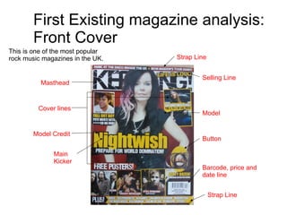
- 1. First Existing magazine analysis: Front Cover This is one of the most popular rock music magazines in the UK. Masthead Selling Line Model Model Credit Main Kicker Button Barcode, price and date line Strap Line Strap Line Cover lines
- 2. This is the masthead, located at the top of the magazine. The text is in sans serif font. As you can see, the model is in front of the masthead. This is one of the brands of this magazine as they often do this in most of the issue published. It is also obvious to the reader that the text behind the model is 'Kerrang!' because this never changes. The font size is bigger from the other text. This shows that it is the masthead. It is also on a white background unlike the other text which are featured on the image. The selling line 'Life is loud' is in bold, yellow sans serif font. It is also in a smaller size compared to the masthead. It stands out from the other text however, not as much as the masthead. It is over the masthead, this is another brand of the magazine. This could either be known as a strap line or a cover line as it contains news about bands featured in the magazine however, it is located above the masthead. The text is over the model as this is less obvious to the reader because it often changes.
- 3. Left two-thirds Right third Eye flow This magazine follows the eye flow of which the human follows when reading the front cover of a magazine. The layout of the magazine follows the eye order in a 'C' shape as shown by the green arrow. The magazine follows the rules of thirds as shown by the red dotted lines. However, the model is featured in both of the thirds, breaking the rule of convention. But this is an exception because the part of her hair highlighted in pink and her necklace, which is her logo, are in the left two-thirds of the magazine. So technically it is not exactly breaking the rule of thirds. The right third contains important information to purchase the magazine (barcode) and other news featured in it.
- 4. The magazine contains a button which features a funny image. This could attract the audience because it is something unusual which you won't see on every magazine. The explanatory text uses persuasive languages The cover lines used indirect language/exclusive mode of address. The explanatory text uses persuasive language which makes the reader curious. It also makes the reader want to buy the magazine i.e. it uses words like 'free' meaning they won't need to buy it separately. This is the second strap line located at the bottom of the front cover. It contains artists which are also featured in this week's issue of the magazine.
- 5. The clothes the model is wearing are really grungy and fits with the genre which the music magazine is based on. The colour she is mainly wearing is black which also links with the genre, however it has a hint of red (the heart) and pink(highlighted part of the hair). The pose she is doing is very feminine but can attract both genders because of what band she represents which is Nightwish. The background is just plain red. This contrasts to the colours the model is wearing.