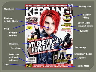
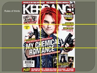
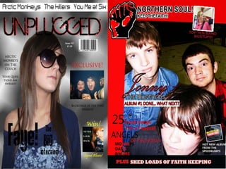
The document analyzes the cover design conventions of the Kerrang! magazine cover, noting the prominent featured image, color scheme of red, black and white that makes elements stand out, and use of basic fonts made impactful through color and positioning. It also discusses how the cover design and image suggests the tone of stories inside will be humorous and fun through the expression of the featured person. Layout follows rules of thirds with masthead in top middle and kickers on right to accommodate the facing image.