SlideShare a Scribd company logo
1 of 3
Colour Palette Analysis
1. Red on White– These are probablythe mostcommoncoloursusedinthe music
magazine industry.The contrastlooksprofessional andclean. Thisseemsthe mostsuitable
for rock/alternative magazines(Q,NMEand rollingstone are all basedonthe redon white
colourpalette)
2. White on Red – For titles orlogos (like Q) White on red has been proven to be
effectiveat grabbing the audience’s attention. But forthe wholepage to be white on red
could lookunprofessional and hard to read
3. White on Blue– I feel ablue andwhite (like billboard) looksgoodforpopmusicbutnot
for a hip-hop/rockmagazinedue tobothgenresbeingfairly serious/angryintheirsongs.
4. Yellow on Black – I thinkthat these twocolourstogetheronwhite wouldlookgoodin
a pop magazine ora hiphopmagazine asa title butas saidaboutwhite onred I feel that
yellowonblackonthe whole page maylookunprofessional .
5. Black on White – couldlookdull due to there beingverylittle colour (notdrawingas
much attentionasthe onesthat containcolour) onthe page butif executedcorrectlyit
couldbe successful
6. Black on Red - Thiswouldbe harderto read, togetherblackand redwork well buttobe
usedto contact one another,Iwon’tuse and I wouldn’trecommenddoingsoeither.
7. Black on Green - These twocontrastwell butlookhorrible together.Idon’tsee myself
usingthese twocolourstogetherorto contrast.It justdoesn’twork,toback up thisopinionI
haven’tseenanymagazineswiththesetwocoloursclose toeachother.
8. Yellow On Orange – These twocoloursdon’tcontrastenoughmakingitveryhard to
see/differentiatebetweenthe two.Otherthanona darkcolour I wouldn’trecommendusing
eitherof these coloursastheyare justtoobrightto be on a magazine otherwise.
9. Red On Green – These twocoloursdefinitelycontrastfromeachotherbutclash.Like
blackand greenI will notbe usingthese togetheranddon’tadvise anyone elsedoes.
10. Green on orange – these twolookhorrible togetherandalsodon’tcontrastthat much.
The textis veryhard to read.Thiswoulddisinterestthe potentialreaders
Font Analysis
Hip-Hop Styled
1. - This font would be great for a title of a hip hop
magazine; it is similar to some graffiti so it suits the genre. This
style looks good and is easily read.
2. – This font is bold but also has a half dirty
look to it. I feel this would suit rock but wouldn’t be appropriate for
a hip-hop/pop as it doesn’t look clean (contemporary)or street (hip-
hop). The bold would attract attention to a rock magazine but may
put off readers of another magazine as it doesn’t suit the genre.
3. – Again, this text may be ok for a
rock/alternative magazine but wouldn’t be appropriate for the other
two genres.
4. - This is a possibility for a pop magazine
though pop seems to have a more standard, bold and clean look to
it. This font has bits coming off the text so this may be a possibility
for a pop magazine but not so much a probability. Like the other two
this would only suit pop. Possibly rock/alternative
5. - This font could be a hip hop styled font or
alternatively rock as it doesn’t look perfect (purposely). The only
issue with this is that it could be hard to read.
6. – This font again could be used on a hip-hop
Magazine due to it looking like its been sprayed on (with marks
where the paints dried) linking back to graffiti that fits the
stereotypes of the genre (street music)
7. – This font may be suitable for pop
due to it being smooth and clean though it isn’t square like many I
have seen from other magazines
8. - This font could be good for a
rock/alternative magazine due to it looking warns out and bold, I
would only use this on a rock, magazine as it doesn’t suit the other
two genres.
9. – This could be used for a hip-hop based
magazine as it looks like handwriting/graffiti. Though it is readable, I
feel font 1 is more suited to the genre.
10. – another suited to rock, easily
read and worn out but still looks professional, this is a possibility.
11. - This even though it is a standard font suits pop
magazines (from observation) it is clean, and square. It looks more
professional as pop doesn’t have a style/stereotype fitted to the
genre unlike the other two.

More Related Content

What's hot

Task 9 formal proposal
Task 9 formal proposalTask 9 formal proposal
Task 9 formal proposalasmediae12
 
Planning for my music magazine
Planning for my music magazinePlanning for my music magazine
Planning for my music magazineSandeep8324
 
Task 9 formal proposal example
Task 9  formal proposal exampleTask 9  formal proposal example
Task 9 formal proposal exampleoksanatorhan
 
Contents page research 2 updated
Contents page research 2 updatedContents page research 2 updated
Contents page research 2 updatedRyanFrankish7
 
Colour scheme and fonts
Colour scheme and fontsColour scheme and fonts
Colour scheme and fontsjoannajcjmedia
 
Font analysis
Font analysisFont analysis
Font analysistonym17
 
Colour scheme and fonts
Colour scheme and fontsColour scheme and fonts
Colour scheme and fontsjoannajcjmedia
 
Formal Proposal
Formal ProposalFormal Proposal
Formal Proposalasmediag12
 
Final research
Final researchFinal research
Final researchwlaufs
 
Media pitch practice
Media pitch practice Media pitch practice
Media pitch practice riorosenberg
 
Planning for magazine 2
Planning for magazine 2Planning for magazine 2
Planning for magazine 2lora-santini
 
Flat plans of contents page and double page
Flat plans of contents page and double pageFlat plans of contents page and double page
Flat plans of contents page and double pagejessclarkmedia1
 
Task 9 formal proposal
Task 9   formal proposalTask 9   formal proposal
Task 9 formal proposalkerensixthform
 

What's hot (20)

My Fonts
My FontsMy Fonts
My Fonts
 
Task 9 formal proposal
Task 9 formal proposalTask 9 formal proposal
Task 9 formal proposal
 
Front cover analysis
Front cover analysisFront cover analysis
Front cover analysis
 
Planning for my music magazine
Planning for my music magazinePlanning for my music magazine
Planning for my music magazine
 
Media hw
Media hwMedia hw
Media hw
 
Task 9 formal proposal example
Task 9  formal proposal exampleTask 9  formal proposal example
Task 9 formal proposal example
 
Contents page research 2 updated
Contents page research 2 updatedContents page research 2 updated
Contents page research 2 updated
 
Colour scheme and fonts
Colour scheme and fontsColour scheme and fonts
Colour scheme and fonts
 
Front cover analysis
Front cover analysisFront cover analysis
Front cover analysis
 
Font analysis
Font analysisFont analysis
Font analysis
 
Colour scheme and fonts
Colour scheme and fontsColour scheme and fonts
Colour scheme and fonts
 
Formal Proposal
Formal ProposalFormal Proposal
Formal Proposal
 
Final research
Final researchFinal research
Final research
 
Media pitch practice
Media pitch practice Media pitch practice
Media pitch practice
 
Planning for magazine 2
Planning for magazine 2Planning for magazine 2
Planning for magazine 2
 
Flat plans of contents page and double page
Flat plans of contents page and double pageFlat plans of contents page and double page
Flat plans of contents page and double page
 
Task 9 formal proposal
Task 9   formal proposalTask 9   formal proposal
Task 9 formal proposal
 
DPS analysis
DPS analysisDPS analysis
DPS analysis
 
Question 2
Question 2Question 2
Question 2
 
Name ideas
Name ideasName ideas
Name ideas
 

Similar to Colour palette and font analysis

Similar to Colour palette and font analysis (20)

Magazine genre presentation
Magazine genre presentationMagazine genre presentation
Magazine genre presentation
 
Magazine Pitch
Magazine PitchMagazine Pitch
Magazine Pitch
 
Lo3 Proposal 2
Lo3 Proposal 2Lo3 Proposal 2
Lo3 Proposal 2
 
Q&a
Q&aQ&a
Q&a
 
Q&a
Q&aQ&a
Q&a
 
Unit 13 lo4 pitch
Unit 13 lo4 pitchUnit 13 lo4 pitch
Unit 13 lo4 pitch
 
Unit 13 LO4 PITCH - 10th JAN
Unit 13 LO4 PITCH - 10th JANUnit 13 LO4 PITCH - 10th JAN
Unit 13 LO4 PITCH - 10th JAN
 
Unit 13 lo4 pitch
Unit 13 lo4 pitchUnit 13 lo4 pitch
Unit 13 lo4 pitch
 
My Pitch
My PitchMy Pitch
My Pitch
 
Task 5
Task 5Task 5
Task 5
 
Task 5
Task 5Task 5
Task 5
 
Masthead research
Masthead researchMasthead research
Masthead research
 
Presentation1
Presentation1Presentation1
Presentation1
 
Task 5
Task 5Task 5
Task 5
 
Media pitch
Media pitchMedia pitch
Media pitch
 
Task 5 done and on blog
Task 5   done and on blogTask 5   done and on blog
Task 5 done and on blog
 
Unit 30 pitch
Unit 30 pitchUnit 30 pitch
Unit 30 pitch
 
Pitch Unit 13
Pitch Unit 13Pitch Unit 13
Pitch Unit 13
 
Question 4
Question 4Question 4
Question 4
 
Indie Iconography
Indie IconographyIndie Iconography
Indie Iconography
 

Recently uploaded

Sports & Fitness Value Added Course FY..
Sports & Fitness Value Added Course FY..Sports & Fitness Value Added Course FY..
Sports & Fitness Value Added Course FY..Disha Kariya
 
Introduction to Nonprofit Accounting: The Basics
Introduction to Nonprofit Accounting: The BasicsIntroduction to Nonprofit Accounting: The Basics
Introduction to Nonprofit Accounting: The BasicsTechSoup
 
SOCIAL AND HISTORICAL CONTEXT - LFTVD.pptx
SOCIAL AND HISTORICAL CONTEXT - LFTVD.pptxSOCIAL AND HISTORICAL CONTEXT - LFTVD.pptx
SOCIAL AND HISTORICAL CONTEXT - LFTVD.pptxiammrhaywood
 
General AI for Medical Educators April 2024
General AI for Medical Educators April 2024General AI for Medical Educators April 2024
General AI for Medical Educators April 2024Janet Corral
 
Presentation by Andreas Schleicher Tackling the School Absenteeism Crisis 30 ...
Presentation by Andreas Schleicher Tackling the School Absenteeism Crisis 30 ...Presentation by Andreas Schleicher Tackling the School Absenteeism Crisis 30 ...
Presentation by Andreas Schleicher Tackling the School Absenteeism Crisis 30 ...EduSkills OECD
 
Ecosystem Interactions Class Discussion Presentation in Blue Green Lined Styl...
Ecosystem Interactions Class Discussion Presentation in Blue Green Lined Styl...Ecosystem Interactions Class Discussion Presentation in Blue Green Lined Styl...
Ecosystem Interactions Class Discussion Presentation in Blue Green Lined Styl...fonyou31
 
fourth grading exam for kindergarten in writing
fourth grading exam for kindergarten in writingfourth grading exam for kindergarten in writing
fourth grading exam for kindergarten in writingTeacherCyreneCayanan
 
Explore beautiful and ugly buildings. Mathematics helps us create beautiful d...
Explore beautiful and ugly buildings. Mathematics helps us create beautiful d...Explore beautiful and ugly buildings. Mathematics helps us create beautiful d...
Explore beautiful and ugly buildings. Mathematics helps us create beautiful d...christianmathematics
 
Holdier Curriculum Vitae (April 2024).pdf
Holdier Curriculum Vitae (April 2024).pdfHoldier Curriculum Vitae (April 2024).pdf
Holdier Curriculum Vitae (April 2024).pdfagholdier
 
APM Welcome, APM North West Network Conference, Synergies Across Sectors
APM Welcome, APM North West Network Conference, Synergies Across SectorsAPM Welcome, APM North West Network Conference, Synergies Across Sectors
APM Welcome, APM North West Network Conference, Synergies Across SectorsAssociation for Project Management
 
microwave assisted reaction. General introduction
microwave assisted reaction. General introductionmicrowave assisted reaction. General introduction
microwave assisted reaction. General introductionMaksud Ahmed
 
The Most Excellent Way | 1 Corinthians 13
The Most Excellent Way | 1 Corinthians 13The Most Excellent Way | 1 Corinthians 13
The Most Excellent Way | 1 Corinthians 13Steve Thomason
 
A Critique of the Proposed National Education Policy Reform
A Critique of the Proposed National Education Policy ReformA Critique of the Proposed National Education Policy Reform
A Critique of the Proposed National Education Policy ReformChameera Dedduwage
 
Z Score,T Score, Percential Rank and Box Plot Graph
Z Score,T Score, Percential Rank and Box Plot GraphZ Score,T Score, Percential Rank and Box Plot Graph
Z Score,T Score, Percential Rank and Box Plot GraphThiyagu K
 
Russian Escort Service in Delhi 11k Hotel Foreigner Russian Call Girls in Delhi
Russian Escort Service in Delhi 11k Hotel Foreigner Russian Call Girls in DelhiRussian Escort Service in Delhi 11k Hotel Foreigner Russian Call Girls in Delhi
Russian Escort Service in Delhi 11k Hotel Foreigner Russian Call Girls in Delhikauryashika82
 
Activity 01 - Artificial Culture (1).pdf
Activity 01 - Artificial Culture (1).pdfActivity 01 - Artificial Culture (1).pdf
Activity 01 - Artificial Culture (1).pdfciinovamais
 
Beyond the EU: DORA and NIS 2 Directive's Global Impact
Beyond the EU: DORA and NIS 2 Directive's Global ImpactBeyond the EU: DORA and NIS 2 Directive's Global Impact
Beyond the EU: DORA and NIS 2 Directive's Global ImpactPECB
 

Recently uploaded (20)

Sports & Fitness Value Added Course FY..
Sports & Fitness Value Added Course FY..Sports & Fitness Value Added Course FY..
Sports & Fitness Value Added Course FY..
 
INDIA QUIZ 2024 RLAC DELHI UNIVERSITY.pptx
INDIA QUIZ 2024 RLAC DELHI UNIVERSITY.pptxINDIA QUIZ 2024 RLAC DELHI UNIVERSITY.pptx
INDIA QUIZ 2024 RLAC DELHI UNIVERSITY.pptx
 
Introduction to Nonprofit Accounting: The Basics
Introduction to Nonprofit Accounting: The BasicsIntroduction to Nonprofit Accounting: The Basics
Introduction to Nonprofit Accounting: The Basics
 
SOCIAL AND HISTORICAL CONTEXT - LFTVD.pptx
SOCIAL AND HISTORICAL CONTEXT - LFTVD.pptxSOCIAL AND HISTORICAL CONTEXT - LFTVD.pptx
SOCIAL AND HISTORICAL CONTEXT - LFTVD.pptx
 
General AI for Medical Educators April 2024
General AI for Medical Educators April 2024General AI for Medical Educators April 2024
General AI for Medical Educators April 2024
 
Presentation by Andreas Schleicher Tackling the School Absenteeism Crisis 30 ...
Presentation by Andreas Schleicher Tackling the School Absenteeism Crisis 30 ...Presentation by Andreas Schleicher Tackling the School Absenteeism Crisis 30 ...
Presentation by Andreas Schleicher Tackling the School Absenteeism Crisis 30 ...
 
Ecosystem Interactions Class Discussion Presentation in Blue Green Lined Styl...
Ecosystem Interactions Class Discussion Presentation in Blue Green Lined Styl...Ecosystem Interactions Class Discussion Presentation in Blue Green Lined Styl...
Ecosystem Interactions Class Discussion Presentation in Blue Green Lined Styl...
 
fourth grading exam for kindergarten in writing
fourth grading exam for kindergarten in writingfourth grading exam for kindergarten in writing
fourth grading exam for kindergarten in writing
 
Explore beautiful and ugly buildings. Mathematics helps us create beautiful d...
Explore beautiful and ugly buildings. Mathematics helps us create beautiful d...Explore beautiful and ugly buildings. Mathematics helps us create beautiful d...
Explore beautiful and ugly buildings. Mathematics helps us create beautiful d...
 
Holdier Curriculum Vitae (April 2024).pdf
Holdier Curriculum Vitae (April 2024).pdfHoldier Curriculum Vitae (April 2024).pdf
Holdier Curriculum Vitae (April 2024).pdf
 
APM Welcome, APM North West Network Conference, Synergies Across Sectors
APM Welcome, APM North West Network Conference, Synergies Across SectorsAPM Welcome, APM North West Network Conference, Synergies Across Sectors
APM Welcome, APM North West Network Conference, Synergies Across Sectors
 
microwave assisted reaction. General introduction
microwave assisted reaction. General introductionmicrowave assisted reaction. General introduction
microwave assisted reaction. General introduction
 
The Most Excellent Way | 1 Corinthians 13
The Most Excellent Way | 1 Corinthians 13The Most Excellent Way | 1 Corinthians 13
The Most Excellent Way | 1 Corinthians 13
 
Mattingly "AI & Prompt Design: The Basics of Prompt Design"
Mattingly "AI & Prompt Design: The Basics of Prompt Design"Mattingly "AI & Prompt Design: The Basics of Prompt Design"
Mattingly "AI & Prompt Design: The Basics of Prompt Design"
 
A Critique of the Proposed National Education Policy Reform
A Critique of the Proposed National Education Policy ReformA Critique of the Proposed National Education Policy Reform
A Critique of the Proposed National Education Policy Reform
 
Z Score,T Score, Percential Rank and Box Plot Graph
Z Score,T Score, Percential Rank and Box Plot GraphZ Score,T Score, Percential Rank and Box Plot Graph
Z Score,T Score, Percential Rank and Box Plot Graph
 
Russian Escort Service in Delhi 11k Hotel Foreigner Russian Call Girls in Delhi
Russian Escort Service in Delhi 11k Hotel Foreigner Russian Call Girls in DelhiRussian Escort Service in Delhi 11k Hotel Foreigner Russian Call Girls in Delhi
Russian Escort Service in Delhi 11k Hotel Foreigner Russian Call Girls in Delhi
 
Activity 01 - Artificial Culture (1).pdf
Activity 01 - Artificial Culture (1).pdfActivity 01 - Artificial Culture (1).pdf
Activity 01 - Artificial Culture (1).pdf
 
Beyond the EU: DORA and NIS 2 Directive's Global Impact
Beyond the EU: DORA and NIS 2 Directive's Global ImpactBeyond the EU: DORA and NIS 2 Directive's Global Impact
Beyond the EU: DORA and NIS 2 Directive's Global Impact
 
Advance Mobile Application Development class 07
Advance Mobile Application Development class 07Advance Mobile Application Development class 07
Advance Mobile Application Development class 07
 

Colour palette and font analysis

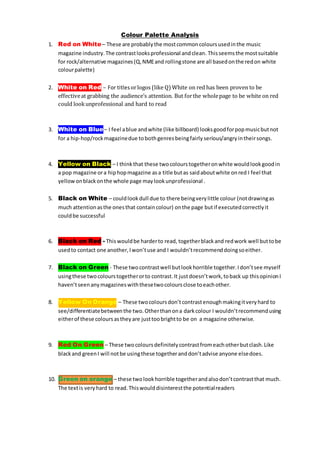
  • 1. Colour Palette Analysis 1. Red on White– These are probablythe mostcommoncoloursusedinthe music magazine industry.The contrastlooksprofessional andclean. Thisseemsthe mostsuitable for rock/alternative magazines(Q,NMEand rollingstone are all basedonthe redon white colourpalette) 2. White on Red – For titles orlogos (like Q) White on red has been proven to be effectiveat grabbing the audience’s attention. But forthe wholepage to be white on red could lookunprofessional and hard to read 3. White on Blue– I feel ablue andwhite (like billboard) looksgoodforpopmusicbutnot for a hip-hop/rockmagazinedue tobothgenresbeingfairly serious/angryintheirsongs. 4. Yellow on Black – I thinkthat these twocolourstogetheronwhite wouldlookgoodin a pop magazine ora hiphopmagazine asa title butas saidaboutwhite onred I feel that yellowonblackonthe whole page maylookunprofessional . 5. Black on White – couldlookdull due to there beingverylittle colour (notdrawingas much attentionasthe onesthat containcolour) onthe page butif executedcorrectlyit couldbe successful 6. Black on Red - Thiswouldbe harderto read, togetherblackand redwork well buttobe usedto contact one another,Iwon’tuse and I wouldn’trecommenddoingsoeither. 7. Black on Green - These twocontrastwell butlookhorrible together.Idon’tsee myself usingthese twocolourstogetherorto contrast.It justdoesn’twork,toback up thisopinionI haven’tseenanymagazineswiththesetwocoloursclose toeachother. 8. Yellow On Orange – These twocoloursdon’tcontrastenoughmakingitveryhard to see/differentiatebetweenthe two.Otherthanona darkcolour I wouldn’trecommendusing eitherof these coloursastheyare justtoobrightto be on a magazine otherwise. 9. Red On Green – These twocoloursdefinitelycontrastfromeachotherbutclash.Like blackand greenI will notbe usingthese togetheranddon’tadvise anyone elsedoes. 10. Green on orange – these twolookhorrible togetherandalsodon’tcontrastthat much. The textis veryhard to read.Thiswoulddisinterestthe potentialreaders
  • 2. Font Analysis Hip-Hop Styled 1. - This font would be great for a title of a hip hop magazine; it is similar to some graffiti so it suits the genre. This style looks good and is easily read. 2. – This font is bold but also has a half dirty look to it. I feel this would suit rock but wouldn’t be appropriate for a hip-hop/pop as it doesn’t look clean (contemporary)or street (hip- hop). The bold would attract attention to a rock magazine but may put off readers of another magazine as it doesn’t suit the genre. 3. – Again, this text may be ok for a rock/alternative magazine but wouldn’t be appropriate for the other two genres. 4. - This is a possibility for a pop magazine though pop seems to have a more standard, bold and clean look to it. This font has bits coming off the text so this may be a possibility for a pop magazine but not so much a probability. Like the other two this would only suit pop. Possibly rock/alternative 5. - This font could be a hip hop styled font or alternatively rock as it doesn’t look perfect (purposely). The only issue with this is that it could be hard to read. 6. – This font again could be used on a hip-hop Magazine due to it looking like its been sprayed on (with marks where the paints dried) linking back to graffiti that fits the stereotypes of the genre (street music) 7. – This font may be suitable for pop due to it being smooth and clean though it isn’t square like many I have seen from other magazines
  • 3. 8. - This font could be good for a rock/alternative magazine due to it looking warns out and bold, I would only use this on a rock, magazine as it doesn’t suit the other two genres. 9. – This could be used for a hip-hop based magazine as it looks like handwriting/graffiti. Though it is readable, I feel font 1 is more suited to the genre. 10. – another suited to rock, easily read and worn out but still looks professional, this is a possibility. 11. - This even though it is a standard font suits pop magazines (from observation) it is clean, and square. It looks more professional as pop doesn’t have a style/stereotype fitted to the genre unlike the other two.