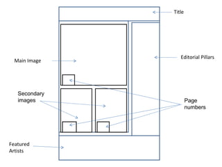
The document describes the layout and design choices for the contents page of a magazine called "Riff Raff". It explains that the title will be in a unique font in black and red to stand out on a black background. The main image will be of a band performing at the top of the page. Secondary images of solo artists will be below with page numbers. Featured artist names will be listed at the bottom left in a readable font. The four editorial pillars - News, Features, Reviews, and Gigs - will be listed in a sans-serif font in white down the right third of the page to guide the reader's eye flow.
2. Title The title of the contents page will be Riff Raff contents because it complies with successful magazine conventions of a Contents page to have the name of the magazine which serves as the magazines logo. It will be in Black Casper and Sans Serif font because the name of the magazine serves as the publications logo having its own unique font whereas the Sans serif font (like Reboard) is a secondary font as the lesser title. It will be white for the ‘Riff Raff’ and red for the ‘contents’ because it will have a black rectangle background so that it is highlighted as the title and so that it complies with my colour scheme of black, red and white. I will position it across the top with the ‘contents’ aligned with the editorial pillars because the ‘Riff Raff’ is the logo and is separate from the ‘contents’ and so that the editorial pillars are under the contents as that is the purpose of this page.