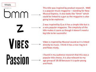
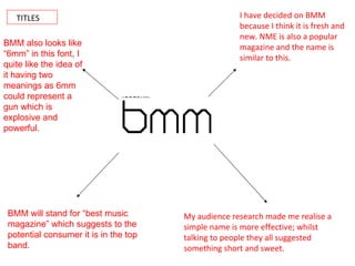
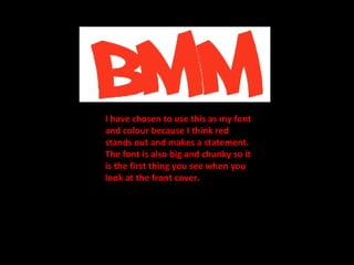
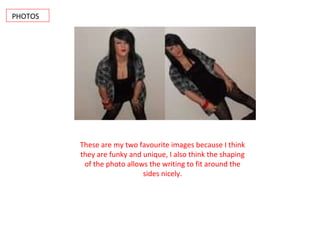
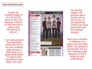
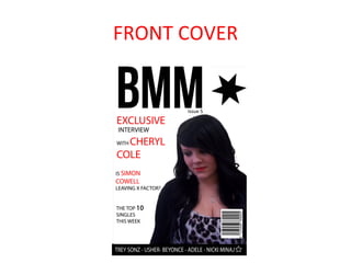
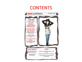
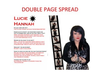
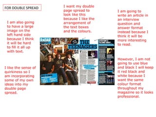
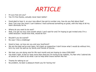
FOR FRONT COVER
TITLES
TITLES This title was inspired by product research.  NME is a popular music magazine – standing for New Musical Express. It also looks like “6mm” which could be linked to a gun as the magazine is also going to be explosive. Z was inspired by Q as it has a simple title but is a very popular magazine. The simplicity of the title makes it seem as though it doesn’t need a big title to be successful. Vibes is inspired by Musical sound as it is linked directly to music. I think it has a nice ring to it and flows nicely. I found in my audience research that this was a popular title choice, it is also relevant to my age group of 18-30 because it is quite young and fresh.
TITLES I have decided on BMM because I think it is fresh and new. NME is also a popular magazine and the name is similar to this. My audience research made me realise a simple name is more effective; whilst talking to people they all suggested something short and sweet. BMM will stand for “best music magazine” which suggests to the potential consumer it is in the top band. BMM also looks like “6mm” in this font, I quite like the idea of it having two meanings as 6mm could represent a gun which is explosive and powerful.
FONT AND COLOURS
 
I have chosen to use this as my font and colour because I think red stands out and makes a statement. The font is also big and chunky so it is the first thing you see when you look at the front cover.
IMAGE COLLAGE
MY IMAGES
PHOTOS These are my two favourite images because I think they are funky and unique, I also think the shaping of the photo allows the writing to fit around the sides nicely.
FOR CONTENTS PAGE I want my contents page to be laid out the same as this one because I think it is clear but still is unique and interesting to look at. I am also going to be using black white and red on my own contents page because I think they are a good combination of colours that compliment each other very well. For the big image I am going to get a similar one to this of four of the boys from school who have good style and are dressed smartly. There are a number of different text boxes and font sizes which I am going to incorporate into my own contents page because I think it looks fun and professional.
FRONT COVER
CONTENTS
DOUBLE PAGE SPREAD
FOR DOUBLE SPREAD I want my double page spread to look like this because I like the arrangement of the text boxes and the colours. I am also going to have a large image on the left hand side because I think it will be hard to fill it all up with text. I am going to write an article in an interview question and answer format instead because I think it will be more interesting to read. However, I am not going to use blue and black I will keep it red black and white because I want the same colour format throughout my magazine so it looks professional. I like the sense of quirkiness so I am incorporating some of my own ideas into my double page spread.
ARTICLE Hi Lucy how are you? Yes I’m fine thanks, actually never been better! Good glad to hear it, so your new album has got to number one, how do you feel about that? Aww I am over the moon I can’t believe I have achieved something so great, with the help of all my team obviously ha ha Where do you want to do next? Well, I’ve got my tour next month which I can’t wait for and I’m hoping to get invited onto I’m a celeb because I would love that, would be fun! Wouldn’t you be scared? No way! I like a challenge! Good to hear, so how are you and your boyfriend? We are the best we’ve ever been, he’s been so supportive I don’t know what I would do without him, he’s my rock! As well as my family and friends of course.. We hear you are doing race for life next month and are hoping to raise £500,000? Yes that’s right, id like to raise more then that but I’m trying to be realistic, my Nan who I adored die of cancer so I want to do what I can to help other brave women like her. Thanks for talking to us! No problem, its been a pleasure thank you for having me!

Planning

  • 1.
  • 2.
  • 3.
    TITLES This titlewas inspired by product research. NME is a popular music magazine – standing for New Musical Express. It also looks like “6mm” which could be linked to a gun as the magazine is also going to be explosive. Z was inspired by Q as it has a simple title but is a very popular magazine. The simplicity of the title makes it seem as though it doesn’t need a big title to be successful. Vibes is inspired by Musical sound as it is linked directly to music. I think it has a nice ring to it and flows nicely. I found in my audience research that this was a popular title choice, it is also relevant to my age group of 18-30 because it is quite young and fresh.
  • 4.
    TITLES I havedecided on BMM because I think it is fresh and new. NME is also a popular magazine and the name is similar to this. My audience research made me realise a simple name is more effective; whilst talking to people they all suggested something short and sweet. BMM will stand for “best music magazine” which suggests to the potential consumer it is in the top band. BMM also looks like “6mm” in this font, I quite like the idea of it having two meanings as 6mm could represent a gun which is explosive and powerful.
  • 5.
  • 6.
  • 7.
    I have chosento use this as my font and colour because I think red stands out and makes a statement. The font is also big and chunky so it is the first thing you see when you look at the front cover.
  • 8.
  • 9.
  • 10.
    PHOTOS These aremy two favourite images because I think they are funky and unique, I also think the shaping of the photo allows the writing to fit around the sides nicely.
  • 11.
    FOR CONTENTS PAGEI want my contents page to be laid out the same as this one because I think it is clear but still is unique and interesting to look at. I am also going to be using black white and red on my own contents page because I think they are a good combination of colours that compliment each other very well. For the big image I am going to get a similar one to this of four of the boys from school who have good style and are dressed smartly. There are a number of different text boxes and font sizes which I am going to incorporate into my own contents page because I think it looks fun and professional.
  • 12.
  • 13.
  • 14.
  • 15.
    FOR DOUBLE SPREADI want my double page spread to look like this because I like the arrangement of the text boxes and the colours. I am also going to have a large image on the left hand side because I think it will be hard to fill it all up with text. I am going to write an article in an interview question and answer format instead because I think it will be more interesting to read. However, I am not going to use blue and black I will keep it red black and white because I want the same colour format throughout my magazine so it looks professional. I like the sense of quirkiness so I am incorporating some of my own ideas into my double page spread.
  • 16.
    ARTICLE Hi Lucyhow are you? Yes I’m fine thanks, actually never been better! Good glad to hear it, so your new album has got to number one, how do you feel about that? Aww I am over the moon I can’t believe I have achieved something so great, with the help of all my team obviously ha ha Where do you want to do next? Well, I’ve got my tour next month which I can’t wait for and I’m hoping to get invited onto I’m a celeb because I would love that, would be fun! Wouldn’t you be scared? No way! I like a challenge! Good to hear, so how are you and your boyfriend? We are the best we’ve ever been, he’s been so supportive I don’t know what I would do without him, he’s my rock! As well as my family and friends of course.. We hear you are doing race for life next month and are hoping to raise £500,000? Yes that’s right, id like to raise more then that but I’m trying to be realistic, my Nan who I adored die of cancer so I want to do what I can to help other brave women like her. Thanks for talking to us! No problem, its been a pleasure thank you for having me!