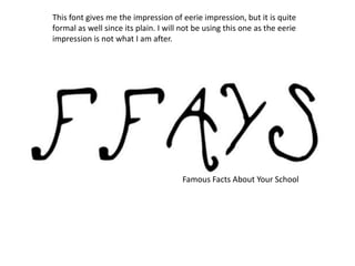
1. This font gives me the impression of eerie impression, but it is quite
formal as well since its plain. I will not be using this one as the eerie
impression is not what I am after.
Famous Facts About Your School
2. Famous Facts About Your School
This font looks like it is aimed at children and
teenagers since it is a bit childish. And is not
appropriate for my magazine.
3. Famous Facts About Your School
This font gives me the impression of a horror theme or scary,
which could be for my magazine because the facts could be
scary, but I will be using a formal way to represent my magazine.
4. This text gives the impression of a bit of a classy look and looks suitable
on the top of my magazine and this is why I will be choosing this one.
Famous Facts About Your School
5. Famous Facts About Your School
This font give me the impression of a sporty type of
perspective as it is like a basketball theme and is not
suitable for my magazine.
6. Famous
Facts
Your School
About
This text gives the impression of fun and enjoyable
but is not suitable for the type of magazine I will be
creating.
7. • I believe that the 4th slide is the best for my
magazine because it is formal and looks good
and is straight to the point and looks classy.