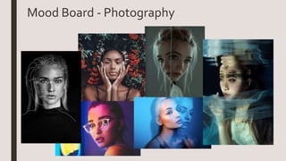
The document provides background on two individuals who will influence Hannah McNeill's photography magazine project.
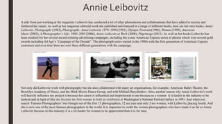
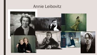
The first section discusses photographer Annie Leibovitz and her influential portrait style. It outlines her career history working for Rolling Stone magazine and other publications. The second section profiles Mind charity ambassador Duke McKenzie and singer George Ezra, discussing their openness about mental health which helps reduce stigma. Both individuals will provide inspiration for portraying people and mental health issues in the magazine.
Hannah McNeill is researching different styles of photography for an upcoming magazine focusing on people and global issues. Portrait photography will be integral as it focuses on facial features to evoke emotion and connection with readers. Annie Leibovitz is cited as an influential portrait photographer whose intimate celebrity portraits convey vulnerability. Leibovitz studied at the San Francisco Art Institute and got her start at Rolling Stone magazine, shooting over 140 covers in 10 years. She has published several books and led award-winning campaigns, becoming one of the most famous photographers. Mind charity is also researched for its mental health focus and celebrity ambassadors like boxer Duke McKenzie and singer George Ezra who openly discuss their own struggles.
This document provides a summary of research on two topics:
1) Photographer Annie Leibovitz and her influential portrait style that the author aims to incorporate into their own work. Details of Leibovitz's career and accomplishments are discussed.
2) Mental health charity Mind and two celebrities involved with the charity - boxer Duke McKenzie and singer George Ezra. Their experiences with mental health issues and contributions to Mind are summarized.
Hannah McNeill is conducting research for her FMP project. She needs to complete her preproposal, influences research, and photojournalism research before Tuesday. She also needs to finish her drawings, production diary, and readings.
Her research focuses on different styles of photography for her magazine, including portrait photography. She discusses Annie Leibovitz as an influential portrait photographer whose intimate celebrity portraits she admires. Leibovitz began her career at Rolling Stone magazine and has photographed many famous people.
Hannah also researches the Mind charity and their celebrity ambassadors who promote mental health awareness, such as boxer Duke McKenzie and singer George Ezra. Both openly discuss their personal experiences with mental health issues.
The document provides background research on several photographers and influencers that will influence the author's upcoming magazine project. It summarizes the work and career of portrait photographer Annie Leibovitz, noting her famous celebrity portraits for magazines like Rolling Stone. It also discusses mental health charity Mind and two of its celebrity ambassadors, boxer Duke McKenzie and singer George Ezra, who openly share their experiences with mental health issues. Finally, it profiles actress and activist Jameela Jamil, covering her career in media and her work promoting body positivity and feminism through initiatives like her "I Weigh" Instagram campaign. The influencers and organizations discussed will shape the aesthetic, topics, and messaging of the author's new magazine.
The document discusses possible magazine examples and describes VIBE magazine in more detail. It notes that VIBE magazine focuses on R&B and hip hop music genres, featuring those artists prominently on covers. Examples are provided of VIBE magazine covers, contents pages, and articles that emphasize large images and mention artists' recent activities, music releases, and relationships. The document chooses VIBE magazine as its example for having eye-catching covers featuring revealing or stylish poses of popular musicians.
Seventeen is an American teen magazine first published in 1944. It was the first teen magazine established in the US and targets females aged 10-19. The magazine began by inspiring teen girls but later took a more fashion-oriented approach. In the 1980s, Whitney Houston was one of the first black women to appear on the cover. Today, the magazine entertains and promotes self-confidence in young women alongside discussing issues like cyberbullying. In response to concerns over photo editing, Seventeen pledged to feature unedited images and published a "Body Peace Treaty" supporting positive body image.
Nylon is an American multi-platform media company and magazine focused on pop culture and fashion. It was first published in 1999 and features content on art, beauty, music, design, celebrities and travel. Nylon pioneered collaborations with digital platforms like MySpace and has expanded internationally. While initially received with criticism, it developed a following for its unique style blending music and fashion across different mediums.
The document discusses the indie music genre. It defines indie music as having a more specific target audience compared to mainstream music. Indie music magazines also have distinct styles, with covers typically featuring artists dressed in cool, stylish clothing. The color palettes of indie magazines tend to be more subtle without bright colors. Features like imagery, fonts, and colors are carefully chosen to match the indie aesthetic and target audience.
The document analyzes how a media product represents and challenges conventions of the indie music genre. It notes that the front cover features a female artist, challenging the genre's stereotype as male-dominated. Throughout the magazine, more female than male artists are featured. However, only white British ethnicities are included, representing the genre's white dominance. Images portray artists as moody through facial expressions and muted colors, aligning with stereotypes of the indie genre being moody and casual. Youth are prominently featured, signifying their importance in indie music.
The document discusses choosing an indie rock music magazine genre that focuses on an older audience rather than children. It provides examples of such magazines including Rolling Stone, NME, and Q Magazine. The genre was selected because indie rock is a widely known, growing genre with famous bands like Muse, Arctic Monkeys, and The Killers.
This document provides a history of fashion photography and profiles several influential fashion photographers from the late 19th century to the late 20th century. It introduces Adolph de Meyer and Cecil Beaton, two early pioneers of fashion photography for magazines like Vogue. Norman Parkinson is described as bringing more humor and capturing models in real situations outside the studio. Later photographers profiled include Erwin Blumenfeld, William Klein, Guy Bourdin, David Bailey, Patrick Demarchelier, and David Lachapelle, each known for developing distinctive styles and approaches to fashion and celebrity photography.
How does my media product represent particular socialpaigejones1234
The document discusses how the author represented the social group of indie genre in their magazine. They used images of artists dressed in indie-style clothing and featured famous indie bands to appeal to different age groups. The language used in the magazine was informal to convey an indie attitude. Colors like maroon, black, and white were chosen to attract indie fans. Images from festivals and of crowds were included to depict the laidback, carefree mood of the indie scene.
Madeleine Ward Foundation Portfolio EvaluationAnne Horne
My media product challenges conventions by using pink writing aimed at both males and females. It copies the monochrome color scheme of Q magazine using red, black, and white. The target audience is pleasure seekers and rebels aged 17-21 interested in indie rock music. Imagery of a woman with a blindfold signals taking risks and inner strength appealing to this core audience. The magazine may be distributed by IPC, a large UK media company reaching many adults, benefiting the magazine's reach among young music fans.
The document discusses plans for a new music magazine targeting indie music fans ages 16-25. It will focus on indie bands like MGMT, Two Door Cinema Club, and The Vaccines. Potential magazine title ideas include "Aero" and "Indie Zone." The main cover image may feature a band looking seriously at the camera. Articles will have pictures and writing split across pages. The font style will be a combination of clear, easy-to-read text and more uneven, jumbled styles. The target reader is described as a 22-year-old man who is passionate about indie music and attends concerts and festivals regularly.
Presenting IIP MOUNT (September-October 2016) - Newsletter. This time it was full of festivities, photo tourism, in himalayas, contests, ngo students learning and such activities. IIP Foundation is working on fast pace and is committed to contribute in Empowering India. Enjoy it friends.
The document discusses the conventions and codes used in the media product of an indie music magazine. It uses technical codes like fonts, layout, and images as well as symbolic codes like posing of subjects and color schemes to identify the magazine's genre and challenge stereotypes. The cover features indie artists to attract readers interested in that genre. The black and white color scheme and lack of color on the contents page further signals the indie genre. However, a double page spread subverts expectations by posing the artist with an indirect gaze rather than a direct smile at the camera as seen in other magazines. Overall, the document examines how the magazine's forms and styles develop and challenge conventions to effectively represent its target indie music audience.
The document summarizes how the media product, an indie music magazine, represents its target social group of 16-28 year old males and females interested in indie music. It does this through the choice of artists featured on the cover and in articles that would appeal to both males and females. The layout, color scheme, and styles portrayed are also meant to represent and attract this target indie audience. Feature articles focus on famous indie icons and bands. Images throughout aim to entice readers and represent the quirky, fun attitude associated with indie music fans.
The target audience for the music magazine is 14-17 year olds, predominantly white females from social classes C1-D. A questionnaire found that this group is interested in mainstream pop artists like Olly Murs, Katy Perry, Rihanna, and Nicki Minaj. They also enjoy fashion/celebrity gossip and bright, feminine colors like pink. The magazine was priced at £1.50 based on feedback that this weekly publication was affordable for the target audience.
The document discusses color scheme, logo, and image choices for a new indie music magazine. It analyzes the conventions used in similar magazines like NME and Spin. NME uses red and white colors that target ages 16-24. Spin features single artists against white backgrounds. The document considers earth tone color schemes like mustard and orange to make the new magazine unique while still attracting both male and female readers. It plans to use a mix of group and individual shots for the main image to represent indie artists and genres. Names proposed for the new magazine include Fleet, Unsigned, and Indigo.
The document summarizes the target audience for an indie/alternative music magazine. The audience would be gender neutral, ranging from ages 12 to 25 who are interested in social media, attending concerts, and unique clothing styles. A survey was conducted and respondents preferred the masthead "Never Mind the Music." The magazine cover features Arctic Monkeys and Oasis to attract readers interested in current and classic indie bands, and offers a concert ticket discount to appeal to their interests.
This document analyzes the layout and design elements of a music magazine contents page and double page spread (DPS) interview feature. It describes the purpose and design of various elements like subheadings, page numbers, images, and pull quotes. It notes how these elements are used effectively in Q Magazine. The writer intends to replicate several of these design elements in their own eclectic music magazine, such as using one page for a large image and fitting the article onto the other page for the DPS, and featuring the artist's name prominently in the background or masthead. The goal is to create an engaging layout while also competing with the design of Q Magazine.
The magazine will feature a famous British artist on the cover to attract fans and readers. It will have a bold, eye-catching title with contrasting colors to stand out. The cover photo will be professionally shot. The target audience is 15-24 year olds of all genders and social statuses, appealing to their interests in fashion, humor, achievements and music. Balanced and belonging psychographic types will enjoy the British artists and Grammy award theme.
This document discusses how the author's media product uses and challenges conventions of a real magazine genre. It provides examples of how different elements of the magazine follow or subvert expectations. The contents page uses a black and white color scheme and paragraph from the editor to indicate it focuses on indie music. The double page spread features a model dressed in darker indie-style clothing with an indirect gaze, challenging stereotypes. Technical elements like fonts and placement of images are designed to be modern and appeal to a young audience. Symbolic codes like clothing and gaze are used on the cover and spread to convey moodiness rather than following conventions.
How does your media product represent particular social groups?SiobhanRalph
The document discusses how the media product represents particular social groups. It uses features like images and colors that are popular among indie music fans. A young male model is used on the cover to attract both male and female indie fans aged 16-20. The images throughout convey indie style and attitudes, using both male and female models to appeal to that audience.
The document summarizes how the media product, a rock music magazine, represents its target audience. It aims to appeal to rock music fans, particularly teenagers, through its content, design elements, and model choice. Key design features like font, layout, and color scheme are similar to existing rock magazines to signal the genre. Articles about concerts and competitions for tickets are meant to attract teenage readers interested in live music. Color and language choices also aim to appeal specifically to younger demographics. The cover model, a female portrayed in a rock-inspired style, is meant to challenge conventions while appealing to both male and female readers.
The document summarizes research conducted to design a music magazine targeted towards young adults who enjoy indie and folk music genres. A questionnaire of 20 people found that Florence + The Machine and Mumford & Sons were popular artists. The magazine, called Capo, aims to attract 17+ year olds interested in festivals, social media, and folk/indie music. Its cover features festival lineup information and emerging artists to generate interest. Interior features include a reader poll of best albums and relaxed photos of an indie artist playing her instruments to appeal to the target audience.
Similarities and differences between music magazinesbrookeharris123
Aesthetica magazine was founded in 2002 by students at York St John University. It focuses on art, culture and design and is published six times per year for an international audience. It has a circulation of 144,000 and explores contemporary visual culture through editorial content and critical debate. Vibe magazine was launched in 1993 focusing on music and entertainment with a target audience of young, urban hip-hop fans. It has a circulation of over 301,000 and attracts 19 million customers monthly. Q magazine has been published monthly in the UK since 1986 covering various music genres. It has a circulation of 52,781 and costs £4 per issue.
NME (new musical express) is a British weekly music magazine that began as a newspaper in 1952. It was the first British paper to include music charts. The magazine is owned by IPC media, a large publishing company that produces over 60 magazines targeted at different audiences. NME targets both male and female younger audiences with its coverage of various music genres and genres.
NME (new musical express) is a British weekly music magazine that began as a newspaper in 1952. It was the first British paper to include music charts. The magazine is owned by IPC media, a large publishing company that produces over 60 media brands and targets a wide audience. NME covers various music genres and targets both male and female younger readers through its coverage of current music trends.
NME (new musical express) is a British music magazine that began as a newspaper in 1952 and has been published weekly since. It was the first British paper to include music charts. The magazine is owned by IPC Media, a large publishing company that produces over 60 brands. NME has an online website with over 5 million users per month and holds annual music awards voted on by readers. The target audience for NME is both male and female, especially younger people, as it aims to cover a wide range of up-to-date music genres.
Over the years, IPC has published magazines targeting various audiences, from upper class males in the 1800s to women in the 1930s. The documents discusses the different magazines IPC published each decade from the 1800s to today, targeting audiences like those interested in sports, homes, fashion, and television programming. IPC transitioned from primarily publishing newspapers to magazines as magazines became more popular. The document analyzes how IPC's target audiences and magazine genres evolved over time to appeal to broader demographics.
This magazine represents the indie rock social group in several ways:
1) It features popular indie rock artists and bands that were chosen based on audience research into what this group listens to.
2) The model on the front cover wears vintage plaid, a style popular within indie fashion, and has a relaxed expression reflecting the attitude of most indie people.
3) The layout and informal language used throughout the magazine mirrors other popular indie rock publications like NME and Q magazine to appeal to this target audience.
Q2. How does your media product represent a particular social groupvictoriaweller
This magazine represents the indie rock social group in several ways:
1) It features popular indie rock artists and bands that were chosen based on audience research into what this group listens to.
2) The model on the front cover wears vintage plaid, a style popular within indie fashion, and has a relaxed expression reflecting the attitude of most indie people.
3) The content uses informal language and a layout similar to other popular indie rock magazines like NME and Q, appealing to readers in this social group.
4) A double-page article interviews a local indie rock band, allowing the audience to relate to their interests in music and goals.
Running Head MODULE 01 WRITTEN ASSIGNMENT1MODULE 01 WRITTEN .docxtoltonkendal
Running Head: MODULE 01 WRITTEN ASSIGNMENT 1
MODULE 01 WRITTEN ASSIGNMENT 12
Popular Music Influence on the Society
Lyrics used in songs highly influence the society mostly the young people. Most young people can sing all the lyrics to their favorite songs. Artists are now viewed as key determinants of popular culture. Most popular culture trends come with music. Music incorporates fashion, slang and other key factors of popular culture. Popular music has changed over generations with new sounds being created to indicate the popular culture at the time. Thus, we can tell so much about a certain generation from the lyrics of the songs produced at the time the generation existed.
Mona Lisa
Mona Lisa is a classical song written by Nat King Cole. The song was part of “The Greatest Hits” album released in 1950. The song did well in the music billboard charts and it was a certified hit. The most interesting thing about the song is the history behind the song. The song describes a painting by Leonardo Da Vinci called Mona Lisa. Leonardo’s painting comprises of a beautiful woman who appears to have a mysterious smile. She looks elegant and one cannot tell what emotions she has at the time.
The song’s lyrics explain the dilemma in the picture where one tries to find out the real emotions of Mona Lisa. Nat King’s lyrics explain the dilemma one has after admiring the Mona Lisa’s beauty and her unpredictable emotions. The song symbolizes the mystery of love. In the song, Nat King questions whether Mona Lisa’s smile is meant to tempt a lover or to hide her heartbreak. Further, the lyrics explain love from a mysterious point of view. The song shows admiration for Mona Lisa even and her mysterious smile (Chapman & Johnson, 2016). Comment by Author: Adding some of the lyrics here to highlight the symbolic nature of the song would have added more depth to your analysis
How Music Influences People
Music influences the public mostly because of the feelings got from a song. The Mona Lisa song has an emotional appeal that is inspired by the lyrics. In the song, love is described as mysterious. The song was made in the 1950’s where there was a large dominance of group bands. The emotional appeal of the song was highly appropriate for the music audience. Nat King’s audience comprised of young people mostly at nightclubs looking for love and affection. Therefore, the song received a lot of popularity among the young audience. The music composition also represents the current generation at the time.
In the 1950’s, there was a rapid growth in the media industry and this led to rise in demand for new music that suited the audience (Bogle, 2015). Listening to music is now a popular culture and most people find it habitual. Music composition influences the mood of the listener and the intelligence. The lyrics of the song Mona Lisa are very intellectual especially while choosing a spouse. The mood set by the song is romantic. Therefore, this is very s ...
The document discusses the genres of various music magazines. It begins by explaining how the author initially planned to create a pop music magazine but later decided to change the genre to indie/alternative after researching popular magazines in each genre. It then provides details on several prominent indie/alternative magazines including their history, format, ownership, and coverage of underground music scenes.
IPC Media would be a suitable media institution to distribute the author's indie pop music magazine. IPC Media currently publishes NME, a popular UK music magazine that focuses specifically on music and features many indie pop artists. While magazines like Blender and Maxim were deemed unsuitable because they cover multiple genres and include sexual imagery, NME's content and target genre alignment makes it comparable to the author's proposed magazine. Therefore, IPC Media may be likely to also distribute an indie pop-focused magazine.
This document discusses planning for a media coursework project involving creating a pop/R&B magazine. It provides background on why the genre was chosen and discusses conventions of pop magazines, including common target audiences and longevity in the market. Example magazines in the genre are also listed and described briefly.
Being a music journalist requires creativity, entertaining writing skills, and the ability to explore different topics. Good English skills are important for structure and advanced grammar. Psychology and geography knowledge can provide insights into human behavior and locations. Rolling Stone is a popular biweekly magazine covering music, culture and politics that has expanded its audience. Music magazine writers like Alex Petridis and Jason King have won awards for their reviews and features. Mojo 4 Music is a popular rock music magazine company that sells merchandise to engage audiences, but the industry faces challenges from modern technology providing information online.
Lionel Messi was born in Argentina and traveled to Barcelona at age 13 to play for Barcelona FC, debuting at 16. He has played in benefit matches to help people in Africa and collaborated with NGOs. Nadal was born in Spain and has won the French Open 4 times. He and Iker Casillas organized a football match against malaria. Ronaldo, Zidane, and others played a match to raise money for poor children and demonstrate soccer's fight against terrorism.
The document discusses the creation of a music magazine aimed at teenagers. Key points:
- The magazine challenges conventions by including both established artists and originally created artists.
- The target audience is teenagers aged 14-17, aimed particularly at teenage girls. Bright colors and a teen pop/R&B genre were used to attract this audience.
- Photoshop and InDesign were used to edit images and layout the magazine professionally. Various tools were used to perfect images for the cover and articles.
- The magazine would be well-suited for distribution by BBC Magazines due to its similar genre and target audience to their existing magazines.
The document summarizes the research and planning that went into creating an indie music magazine targeted at 18-25 year olds. It discusses researching different music magazine genres and choosing to focus on indie. It also discusses including different fonts, colors, and stories that would appeal to and be relatable for the target audience. The magazine is meant to provide escapism and entertainment as well as a way for readers to find information, discuss music, and connect with artists featured in order to develop their identity.
Annie Leibovitz is an American photographer born in 1949 in Waterbury, Connecticut. She started her career as a staff photographer for Rolling Stone magazine in 1970, becoming chief photographer in 1973 and holding that role for 10 years. Her intimate celebrity photographs helped define Rolling Stone's style. Leibovitz was influenced by photographers like Richard Avedon, Robert Frank, and Henri Cartier-Bresson and sought to capture intimate moments with her subjects. She has had a significant career in photography and received the Royal Photographic Society's Centenary Medal in 2009.
Mark Kostabi is an artist and musician born in 1960 in California to Estonian immigrants. He became a prominent figure in the New York art scene in the 1980s and founded his large studio known for employing painting assistants. Kostabi works across multiple mediums and is internationally renowned for his figures incorporating strange shapes and patterns. He focuses on exploring human emotions and connections through color, line, shape, and tone in his artwork.
Jo Spence was a British writer, photo therapist, and cultural worker born in 1934 who died of breast cancer in 1992. She began her career running a successful portrait studio in London but later shifted to documentary photography focusing on social and political issues. Following a breast cancer diagnosis in 1982, Spence's work centered on identity, mental and physical health, and she integrated photography with her training as an art therapist. She is best known for her self-portraits documenting her experience with breast cancer, most notably the image "A Picture of Health?".
There are a few key factors that give vintage instruments their cachet and irresistible appeal:
1. History and provenance - Older instruments have a story and history behind them. Knowing that a guitar was played and recorded by a legendary artist gives it mystique. Over time it becomes a piece of musical history.
2. Scarcity - As instruments age, many are lost or destroyed. This makes surviving examples from earlier eras more rare and desirable as collectors' items. Scarcity drives up value.
3. Mojo/tonewood aging - It's believed that the wood in an instrument opens up and ages like fine wine over decades of play. This imbues the guitar with an indefinable "mo
This document is a UCAS application for a media studies degree. It includes the applicant's personal details and academic history. They have completed a two-year creative media diploma at York College, where they developed skills in Photoshop, Premiere, and InDesign by creating various media projects. These include a music video, magazines, podcasts, and posters. The applicant is interested in pursuing a career in advertising or journalism and hopes a media studies degree will help prepare them for these competitive fields. They conclude by emphasizing their passion for media studies and production experience gained through their college diploma.
The document discusses different aspects of a photoshoot including withering and blossoming, three foolish monkeys, the front cover, and a shoot in Liverpool. It touches on multiple elements and locations involved in creating photographs.
The document discusses photoshoots. It likely contains details about scheduling photo sessions, locations, models, photographers, and the goals or themes of the planned shoots. The overall topic is planning and logistics related to taking professional photographs.
Hannah spent her first week of her final major project conducting research and creating initial plans and proposals. She created a pre-proposal to outline her project idea and clarify her goals. She then researched four influencers - photographer Annie Leibovitz, mental health charity Mind, feminist activist Jameela Jamil, and journalist Gloria Steinem - to provide context and background knowledge. Hannah also analyzed existing mental health and photography fanzines to inform her project plans and ideas.
This document provides details about the pre-production process for a proposed feminism/wellbeing fanzine. The fanzine concept focuses on mental wellbeing and feminism through photography, illustrations, and articles. It will be targeted towards women ages 16-25. The author discusses various elements of the fanzine including the title "Euvoia", color scheme inspiration from feminist and mental health aesthetics, planned photo shoots and their equipment needs, and a potential double page spread featuring an artist's work. Production details like software, camera equipment, studio space, and models are considered. The goal is to create a unique fanzine that blends discussions of important topics through diverse creative works.
Hannah spent her first week of her final major project conducting research and creating initial plans and proposals. She created a pre-proposal to outline her project idea and clarify her goals. She then researched four influencers - photographer Annie Leibovitz, mental health charity Mind, feminist activist Jameela Jamil, and journalist Gloria Steinem - to provide context and background knowledge. Hannah also analyzed existing mental health and photography fanzines to inform her project plans and ideas.
This document provides details on the planning for a fanzine project focused on feminism and mental wellbeing. Some key points:
- The fanzine will be titled "Euvoia" and feature photography, illustrations, and articles on topics like feminism, mental health, and life as a student.
- Photoshoot ideas are described, including one for the front cover featuring a model looking through a hole in a paper with an intense expression.
- Equipment needs are outlined, including a camera, lights, paper/card, and a studio space. The estimated costs are low since the photographer has access to equipment and will use a model free of charge.
- The second page is
Hannah McNeill proposes creating a magazine about mental wellbeing and feminism for her final media studies project. The magazine will include articles on these topics as well as others related to "life" and will feature Hannah's original photography to accompany the articles. Hannah plans to conduct research on influencers in journalism, feminism, photography, mental health, and graphic design to inform her work. She will evaluate her project through a presentation detailing the process and end product, and through a weekly production diary reflecting on her progress.
Hannah spent her first week of her final major project conducting research and creating initial plans and proposals. She created a pre-proposal to outline her project idea and clarify her goals. She then researched four influencers - photographer Annie Leibovitz, mental health charity Mind, feminist activist Jameela Jamil, and journalist Gloria Steinem - to provide context and background knowledge. Hannah also analyzed existing mental health and photography fanzines to inform her project plans and ideas.
Hannah McNeill discusses potential problems and solutions related to equipment, storage, and power for her photography fanzine project. She identifies several issues that could arise such as relying on college equipment which may not always be available, memory sticks corrupting or being lost, and power outages. Her solutions include thorough planning, checking equipment thoroughly before use, bringing backup equipment and saving work in multiple locations, properly ejecting memory sticks, and saving work frequently to avoid losing progress if issues occur.
Hannah spent her first week of her final major project conducting research and creating initial plans and proposals. She created a pre-proposal to outline her project idea and clarify her goals. She then researched four influencers - photographer Annie Leibovitz, the mental health charity Mind, feminist activist Jameela Jamil, and journalist Gloria Steinem - to provide context and background knowledge for her project. In the second week, Hannah continued her research, analyzing existing fanzines and magazines to inform her project. She also created surveys to learn more about her target audience.
Hannah McNeill is researching photography styles for her magazine. She discusses portrait photography, using Annie Leibovitz as an example. Leibovitz is known for her intimate celebrity portraits. She studied at the San Francisco Art Institute and began her career at Rolling Stone magazine. Leibovitz has published several photography books and led successful advertising campaigns. Her influential career inspires Hannah.
Hannah also researches the mental health charity Mind. She notes Mind's use of celebrity ambassadors who share their personal struggles. Ambassadors like boxer Duke McKenzie and singer George Ezra openly discuss their experiences to help reduce stigma. Both have fundraised for Mind in recognition of its support for mental health issues.
Hannah spent her first week of her final major project conducting research and creating initial plans and proposals. She created a pre-proposal to outline her project idea and clarify her goals. She then researched four influencers - photographer Annie Leibovitz, the mental health charity Mind, feminist activist Jameela Jamil, and journalist Gloria Steinem - to provide context and background knowledge for her project. In the second week, Hannah continued her research, analyzing existing fanzines and magazines to inform her project. She also created surveys to learn more about her target audience.
Hannah spent her first week of her final major project conducting background research and creating a pre-proposal. She researched four influencers - photographer Annie Leibovitz, mental health charity Mind, feminist activist Jameela Jamil, and journalist Gloria Steinem. This helped provide context and inspiration for her project creating a feminism/mental wellbeing fanzine. Hannah also analyzed existing fanzines on Issuu to help shape her own product. She finished the week having laid good groundwork through background research and initial planning in her pre-proposal.
Hannah spent her first week of her final major project conducting research and creating initial proposals. She created a pre-proposal to outline her project idea of creating a fanzine on feminism and mental wellbeing. She then researched four influencers - photographer Annie Leibovitz, mental health charity Mind, activist Jameela Jamil, and feminist Gloria Steinem - to provide context and background knowledge for her project. Hannah analyzed existing fanzines on mental health and photography to help shape her own fanzine. She continued her research in week two by analyzing a journalist and conducting market research on additional fanzines.
Hannah McNeill documents her first week of pre-production for her final major project creating a feminism and mental wellbeing fanzine. She created a plan and spent the first two days writing a pre-proposal and conducting background research on four influencers, including photographer Annie Leibovitz and mental health charity Mind. On the third day, she analyzed existing mental health and photography fanzines to inform her own work. She finished the week by researching feminist activist Jameela Jamil and journalist Gloria Steinem to further her understanding of feminism for the project.
The student proposes creating an issue of a feminist, well-being magazine addressing modern issues. They want to normalize mental health and feminism by providing a platform for discussion and relatable content. Their goal is to educate young readers on these topics since there are no magazines currently filling this niche. They were inspired by a previous feminist zine project and want to bring wider acknowledgement of feminism and misunderstandings around it. The student plans to conduct research through feminist talks and online to deepen their knowledge and inform the magazine's development.
June 3, 2024 Anti-Semitism Letter Sent to MIT President Kornbluth and MIT Cor...Levi Shapiro
Letter from the Congress of the United States regarding Anti-Semitism sent June 3rd to MIT President Sally Kornbluth, MIT Corp Chair, Mark Gorenberg
Dear Dr. Kornbluth and Mr. Gorenberg,
The US House of Representatives is deeply concerned by ongoing and pervasive acts of antisemitic
harassment and intimidation at the Massachusetts Institute of Technology (MIT). Failing to act decisively to ensure a safe learning environment for all students would be a grave dereliction of your responsibilities as President of MIT and Chair of the MIT Corporation.
This Congress will not stand idly by and allow an environment hostile to Jewish students to persist. The House believes that your institution is in violation of Title VI of the Civil Rights Act, and the inability or
unwillingness to rectify this violation through action requires accountability.
Postsecondary education is a unique opportunity for students to learn and have their ideas and beliefs challenged. However, universities receiving hundreds of millions of federal funds annually have denied
students that opportunity and have been hijacked to become venues for the promotion of terrorism, antisemitic harassment and intimidation, unlawful encampments, and in some cases, assaults and riots.
The House of Representatives will not countenance the use of federal funds to indoctrinate students into hateful, antisemitic, anti-American supporters of terrorism. Investigations into campus antisemitism by the Committee on Education and the Workforce and the Committee on Ways and Means have been expanded into a Congress-wide probe across all relevant jurisdictions to address this national crisis. The undersigned Committees will conduct oversight into the use of federal funds at MIT and its learning environment under authorities granted to each Committee.
• The Committee on Education and the Workforce has been investigating your institution since December 7, 2023. The Committee has broad jurisdiction over postsecondary education, including its compliance with Title VI of the Civil Rights Act, campus safety concerns over disruptions to the learning environment, and the awarding of federal student aid under the Higher Education Act.
• The Committee on Oversight and Accountability is investigating the sources of funding and other support flowing to groups espousing pro-Hamas propaganda and engaged in antisemitic harassment and intimidation of students. The Committee on Oversight and Accountability is the principal oversight committee of the US House of Representatives and has broad authority to investigate “any matter” at “any time” under House Rule X.
• The Committee on Ways and Means has been investigating several universities since November 15, 2023, when the Committee held a hearing entitled From Ivory Towers to Dark Corners: Investigating the Nexus Between Antisemitism, Tax-Exempt Universities, and Terror Financing. The Committee followed the hearing with letters to those institutions on January 10, 202
Exploiting Artificial Intelligence for Empowering Researchers and Faculty, In...Dr. Vinod Kumar Kanvaria
Exploiting Artificial Intelligence for Empowering Researchers and Faculty,
International FDP on Fundamentals of Research in Social Sciences
at Integral University, Lucknow, 06.06.2024
By Dr. Vinod Kumar Kanvaria
This presentation includes basic of PCOS their pathology and treatment and also Ayurveda correlation of PCOS and Ayurvedic line of treatment mentioned in classics.
How to Build a Module in Odoo 17 Using the Scaffold MethodCeline George
Odoo provides an option for creating a module by using a single line command. By using this command the user can make a whole structure of a module. It is very easy for a beginner to make a module. There is no need to make each file manually. This slide will show how to create a module using the scaffold method.
Macroeconomics- Movie Location
This will be used as part of your Personal Professional Portfolio once graded.
Objective:
Prepare a presentation or a paper using research, basic comparative analysis, data organization and application of economic information. You will make an informed assessment of an economic climate outside of the United States to accomplish an entertainment industry objective.
Biological screening of herbal drugs: Introduction and Need for
Phyto-Pharmacological Screening, New Strategies for evaluating
Natural Products, In vitro evaluation techniques for Antioxidants, Antimicrobial and Anticancer drugs. In vivo evaluation techniques
for Anti-inflammatory, Antiulcer, Anticancer, Wound healing, Antidiabetic, Hepatoprotective, Cardio protective, Diuretics and
Antifertility, Toxicity studies as per OECD guidelines
Main Java[All of the Base Concepts}.docxadhitya5119
This is part 1 of my Java Learning Journey. This Contains Custom methods, classes, constructors, packages, multithreading , try- catch block, finally block and more.
3. There are millions of different types and interpretations of photography in the industry, different styles
for different occasions, as little as taking a photo from a slightly different angle can completely change
the focus of the photo conveying a different mood. For my magazine Photography will be an integral
part, and the different styles of photography that I intend in including are, firstly, portrait. Portrait
photography is a still and intense approach to photography, it focusses on the facial features and in my
opinion, it evokes the most emotion, as we look directly into people’s faces. Usually with portrait
photography the subject looks directly into the camera introducing a more intrusive connection with the
reader making it easier to connect and understand the photo. The subject of my magazine circles around
people and their lives and different issues around the world, therefore using portrait photography would
work effectively.
An example of a portrait photographer whose style and skill I appreciate and would like to incorporate
into my own work is Annie Leibovitz. Annie Leibovitz was born October 2nd, 1949 in Connecticut. She
is a very well-known American photographer best known for her portraits of celebrities, she often
achieves a sense of intimacy and lack of vulnerability in her photos which is often hard to capture with
celebrities. She has a lot of famous photographs known world-wide, for example, she photographed John
Lennon on the day he was murdered.
Leibovitz first started making moves towards her Career by studying painting at the San Francisco Art
Institute. The SFAI was founded in 1871 and is one of the oldest schools in the United States. When you
go to the SFAI website one of the first articles on the opening page is titled ‘Legacy Meets Legacy’ with an article about Annie Leibovitz talking about
her education from the University explaining at an event held by the University in honour of Leibovitz and her work over the years, highlighting how
much the University shaped her career. “I truly am here because of the San Francisco Art Institute”. As well as studying at San Francisco she took
night classes learning about photography. Then in 1970 her career professionally started by doing work for Rolling Stone magazine. Rolling Stone
magazine is an American magazine about pop culture, founded in 1967 by Jann Wenner – who is still the magazine’s publisher. After three years
working at the magazine Leibovitz worked up to chief photographer. Overall Leibovitz worked at the magazine for 10 years and shot 142 covers
altogether, she also worked alongside Vanity Fair and Vogue.
Some examples of different celebrities that Leibovitz took photographs of are; Whoopi Goldberg 1984, Angelina Jolie 2011, Scarlett Johansson and
Kiera Knightley 2006, Meryl Streep 1981.
Annie Leibovitz
4. A side from just working at the magazine Leibovitz has conducted a lot of other photoshoots and collaborations that have added to society and
furthered her career. As well as her magazine editorial work she published and featured in a range of different books, here are her own books; Annie
Leibovitz: Photographs (1983), Photographs: Annie Leibovitz 1970–1990 (1991), Olympic Portraits(1996), Women (1999), American
Music (2003), A Photographer’s Life: 1990–2005 (2006), Annie Leibovitz at Work (2008), Pilgrimage (2011). As well as her books Leibovitz has
been credited for her several award-winning advertising campaigns, including the iconic American Express series of photos which won several gold
awards including Ad Age’s ‘Campaign of the Decade”. The photograph series started in the 1980s with the first generation of American Express
customers and over time there are now three different generations with the campaign.
Not only did Leibovitz work with photography but she also collaborated with many art organisations, for example; American Ballet Theatre, the
Brooklyn Academy of Music, and the Mark Morris Dance Group, and with Mikhail Baryshnikov. Also, another reason why Annie Leibovitz’s work
will heavily influence my project is because her career is influential and inspirational to me because as a women it is harder in the industry to be
noticed and in light of this she became the first woman to hold an exhibition at Washington’s National Portrait Gallery in 1991. And when you
search ‘Famous Photographers’into Google out of the first 15 photographers, 12 are men and only 3 are women, with Leibovitz placing fourth. And
she is now one of the most famous photographers in the world. It is important to credit the women photographers who have made it as far as Annie
Leibovitz because in this industry it is a lot harder for women to be appreciated then it is for men.
Annie Leibovitz
5.
6. Bibliography
Anon. (2019). Annie Leibovitz. Available: https://en.wikipedia.org/wiki/Annie_Leibovitz. Last accessed 21
Jan 2020.
Anon. (2019). AN EVENING WITH ANNIE LEIBOVITZ. Available:
https://sfai.edu/support-sfai/an-evening-with-annie-leibovitz. Last accessed 21 Jan 2020.
Vanity Fair. (2019). Leibovitz. Available: https://www.vanityfair.com/contributor/annie-leibovitz. Last
accessed 21 Jan 2020.
Anon. (2020). Rolling Stone. Available: https://en.wikipedia.org/wiki/Rolling_Stone. Last accessed 21 Jan
2020.
. (2019). American Express. Available: https://iconiccollective.com/client/american-express. Last accessed
21 Jan 2020.
Susan Sontag (1999). Women. America: Random House. p101.
7. Mind – Duke McKenzie
My second piece of research context is on Mind – ‘for better mental health’ charity. Mind is a mental health charity in England and Wales, it
was founded in 1946 as the National Association for Mental Health. I thought for my project it would be useful to research about the charity
because my magazine is going to have articles and/or photoshoots about mental health. In order to respectfully include them I think it is
important to research a charity that talks about the struggles and difficulties that people living with mental health illnesses face. I want to
make sure that my magazine is accurate and respectful.
I wanted to research the charity Mind instead of others because unlike other charities it is very public about its celebrity ambassadors. The
charity has a page on its website dedicated to the celebrity ambassadors telling their story of why they support Mind, plucking stories form
their own life experiences which have led them to where they are today. Often the celebrities are telling stories about their own struggles with
depression and anxiety. I think it is a very important page to feature because often people with depression feel like they are on their own and
to see that there are other people, especially celebrities experiencing the same feelings and emotions as them hopefully makes them feel less
alone. Also, showing celebrities with depression and being open hopefully gives people the confidence to be open up and seek help. With
celebrities opening up and promoting charities like Mind it can really make a massive difference. Here are some examples of celebrities
involved in the charity and why they got involved in the first place and then what they’ve done since joining:
-Ambassador, Duke McKenzie MBE. Duke McKenzie is a former boxer and three weight
world champions. Duke was born 5 May 1963 born in Croydon. He competed from 1982 –
1998.
In March 2017 Duke was announced as an ambassador. Duke began extremely passionate
about mental health after his brother Dudley McKenzie commit suicide. This led him to
actively support Mind for the past nine years. Duke helped launch Mind’s partnership with
Heads Together, giving a taster boxercise class to Prince Harry and The Duke and Duchess of
Cambridge at the Olympic Park. Duke coached boxercise at Mind in Croydon and has
recently helped shape Mind’s Mental Health Awareness for Sport and Physical Activity
training, which he also helped launch in 2019. As an ambassador for Mind, Duke will help to
champion the benefits that physical exercise can have in managing a mental health problem.
8. “It’s fantastic that Mind is shining a light on the need for mental health awareness
in sport. Whilst some sports like cricket and football are working with professional
associations to provide support for their players, there are definitely other areas
where improvements still need to be made.” – Duke McKenzie 2017.
-Ambassador, George Ezra. George Ezra is an English singer, songwriter and
guitarist. He became famous in 2013 and since then has had numerous number one
hit records and in February 2019 he won the Brit Award for British Male Solo
Artist.
In July 2019 he was announced as an ambassador in recognition of his long-
standing dedication and commitment to mind.
George first became aware of Mind after witnessing the effect of mental health
problems on close friends and family. He then began experiencing anxiety himself
after returning home from an intensive touring schedule and has spoken out
honestly about his need to take time away from the spotlight. The singer-songwriter
has been involved with Mind since 2017, initially bucket collecting at gigs, before
deciding to put on a selection of shows – George Ezra & Friends – specifically in
aid of Mind in 2017 and 2018, raising over £70,000.
“We’re doing these two special gigs for Mind which, for those who don’t know, is a
charity very close to my heart; so, it’s brilliant to be tying this all together as a very
proud Ambassador for them.” – George Ezra 2019.
Mind
- George Ezra
9. Bibliography
Anon. (2020). Mind (charity). Available: https://en.wikipedia.org/wiki/Mind_(charity). Last accessed 21 Jan 2020.
Anon. (2019). Duke McKenzie. Available: https://en.wikipedia.org/wiki/Duke_McKenzie#Personal_life. Last
accessed 21 Jan 2020.
Mind. (2019). Our Ambassadors. Available: https://www.mind.org.uk/about-us/celebrity-support/our-
ambassadors/. Last accessed 21 Jan 2020.
Anon. (2019). George Ezra. Available: https://en.wikipedia.org/wiki/George_Ezra. Last accessed 21 Jan 2020.
Mind. (2019). George Ezra announced as Mind Ambassador. Available: https://www.mind.org.uk/news-
campaigns/news/george-ezra-announced-as-mind-ambassador/. Last accessed 21 Jan 2020.
Mind. (2017). Duke McKenzie MBE announced as latest Mind ambassador to tackle lack of mental health
awareness in sport. Available: https://www.mind.org.uk/news-campaigns/news/duke-mckenzie-mbe-announced-
as-latest-mind-ambassador-to-tackle-lack-of-mental-health-awareness-in-sport/. Last accessed 21 Jan 2020.
10. She also modelled for both British and American Vogue, Glamour, Cosmopolitan, and Japanese Teen Vogue, written for The Times, Cosmopolitan, The
Huffington Post, and Company. I have decided to research Jameela as she will be very influential to my project as not only is she a popular household name
and known across the world for her different skills and talents across media, but she is a massive feminist and a body neutrality activist. Jameela has also
started an Instagram called Iweigh where women post images of themselves and say how much they “weigh” not in kilos but in qualities and attributes they
possess. Which I will talk in further detail later on in my research.
During my research I discovered an article from The Guardian all about Jameela Jamil, the journalist begins the article by describing Jameela and portrays
her in a down to earth and normal celebrity. She compares Jameela to other American celebrities setting her aside from the cliché celebrity. The journalist
immediately stated how comfortable and relatable Jameela was immediately.
“When British celebrities make it big in the US, they go through a by now familiar process of becoming Hollywoodified: they get thinner, more groomed, less
fun, all the while insisting that their occasional deployment of a quaint British swearword proves they haven’t changed a bit. This is not Jameela Jamil.”
Throughout the article Jameela talk a lot about her issues with her own weight. She talks about how being a woman in the spotlight and on social media she
was always under fire about whether she weighed too much or too little. Saying that when she was a size 6, she was hurled insults by the press saying that
she was ‘too thin’but then when she gained weight due to taking steroids for her asthma, she was criticised for being ‘too fat’. I think it is so important that
Jameela openly talks about these comments and how they’re out of order, instead of letting the press consume her and make her feel like herself worth isn’t
enough. Instead these types of comments and journalism just motivate her to make a change in the world. But what Jameela said in the interview that really
upset her was the fact that she, an intelligent, successful women who became the first woman to host the chart show on radio 1 was being disregarded.
Jameela Jamil
Jameela Alia Burton-Jamil is a British actress, radio presenter, model, and writer. She began her career on T4,
where she hosted a pop culture show from 2009 until 2012. Then she became the radio host of The Official
Chart, then becoming the first solo female presenter of the BBC Radio 1 chart show. Here is a short list of what
Jameela Jamil has done; stars in NBC TV series ‘The Good Place’ Jameela had never planned on acting, she
started her acting career after having had no prior acting experience in 2016 after a breast cancer scare and
moving from London to Los Angeles because she the cancer scare encouraged her to “no longer wait to do the
things she wanted to do”. She planned to work as a screenwriter but instead her agent proposed an upcoming
comedy series, The Good Place.
11. Jameela has used some of her own experiences and drawn from her own pain to turn it around and use it in a positive way to help others and make a
change. In May 2019, Jamil shared that she had an abortion earlier in her life. She stated, "It was the best decision I have ever made. Both for me, and
for the baby I didn't want, and wasn't ready for, emotionally, psychologically and financially." Also, on 10 October 2019, as part of World Mental
Health Day, Jamil revealed she survived a suicide attempt six years prior. She criticised the lack of services for those who struggled with mental health
issues. She also revealed that she partook in EMDR therapy to treat her post-traumatic stress disorder. As well as these, when she was younger, she
had massive issues with anorexia and bulimia.
Through my research I found a book called ‘Feminist Don’t Wear Pink and Other Lies’ the main Author putting the book together Scarlett Curtis. The
book is a feminism book with 365 pages filled with stories and antidotes from different feminists around the world. I discovered an article from
Jameela Jamil that I thought would be useful and insightful. The title of Jameela’s article was ‘Tell him’ and feel under the chapter ‘Anger’. Jameela’s
article is all about how boys are forced to grow up in an environment where subliminal message is subconsciously telling boys from a young age to
believe in patriarchy. From dangerous imagery, song lyrics, peer pressure and often quite damaging/violent/entirely intimacy free pornography sold to
boys as ‘the norm’. Therefore, allowing them to grow up drowning in toxic masculinity and without a platform to express their emotions due to
ridicule. Jameela explains in the article how simple the solution is, she explains how all we as women have to do is ‘tell them’ educate our new
generations boys about how women have strived to be where we are now, have enough trust in our young generations to understand the struggles
women went through and what we are still having to suffer through. She explains how men are allowed to cry and how it doesn’t make you any less of
a man to be able to sympathise and share your emotions. The rest of the articles explains numerous ways in which women are powerful and significant
complementing all their underappreciated skills. The article is so motivational and extremely moving. Jameela writes it with passion and while reading
it you can feel her words and carry the pain it took her to have to write it. It is very powerful and underlines how much she cares which is refreshing
and a massive inspiration for all women. Here is a short extract from the article.
“Mother, sisters, and aunties, I implore you to take this little sponge and render him sodden with humanity and an understanding of women. It will
send him into this delusional world with an armour of empathy and self-assurance, with an understanding that a strong women is something to be
celebrated and not feared / crushed / undermined / spoken over / humiliated / shamed / blamed / discouraged / controlled / told that to be worth
anything in this world she must have big tits a small waist and thin arms, oh, and a big pert arse but absolutely no thighs and a young face (forever).”
Jameela Jamil
12. Iweigh movement – The Iweigh movement was created by Jameela after she was sick of seeing women’s self-worth being dependent on their
body weight. The movement is very powerful and has made a massive impact on people around the world. The movement is simply women
posting pictures of themselves with all the qualities they like about themselves instead of their weight. She started the movement by posting a
picture of herself with the caption ‘I weigh lovely relationship, great friends ….’And after the photo blew up, she started encouraging women
around the world to do the same, then started the account @iweigh where women send their photos and she posts as many as she can on the
account, glorifying the more important things in life. The account now has more then 120,000 followers with thousands of posts. It gives women a
safe place to be confident and themselves.
Jameela Jamil
13. Bibliography
Anon. (2020). Jameela Jamil. Available:
https://en.wikipedia.org/wiki/Jameela_Jamil#Filmography. Last accessed 23 Jan 2020.
Hadley Freeman. (2018). Jameela Jamil: 'I won't become a double agent for the patriarchy. Available:
https://www.theguardian.com/lifeandstyle/2018/jul/28/jameela-jamil-wont-become-double-agent-patriarchy.
Last accessed 23 Jan 2020.
Jameela Jamil (2018). Feminists Don't Wear Pink and Other Lies. London: Penguin. p123-134.
Katie Bingham-Smith. (2018). Why Jameela Jamil’s ‘I Weigh’Movement Is Inspirational AF. Available:
https://www.scarymommy.com/jameela-jamil-i-weigh-movement/. Last accessed 23 Jan 2020.
14. Gloria Steinem
Gloria Marie Steinem was born March 25, 1934, she is an American feminist, journalist, and social
political activist who became nationally recognized as a leader and a spokeswoman for the American
feminist movement in the late 1960s and early 1970s. Steinem was a columnist for New York
magazine, and a co-founder of Ms. Magazine. In 1969, Steinem published an article, "After Black
Power, Women's Liberation", which brought her to national fame as a feminist leader. In 2005,
Steinem, Jane Fonda, and Robin Morgan co-founded the Women’s Media Centre, an organization
that "works to make women visible and powerful in the media”.
Steinem was born in Toledo, Ohio, she grew up travelling in a trailer, her mother was Presbyterian,
mostly German and her father was Jewish, the son of immigrants. Her paternal grandmother, Pauline
Perimutter Steinem, was chairwoman of the educational committee of the National Women Suffrage
Association, a delegate to the 1908 International Council of Women, and the first woman to be
elected to the Toledo Board of Education, as well as a leader in the movement for vocational
education. So, she was raised she was heavily influenced by her grandmother. She studied at Waite
High School in Toledo and Western High School in Washington D.C. Then carried on her studies at
Smith College.
Gloria started her professional career by moving to New York to become a journalist. Gloria’s first
serious article was in 1962 for ‘Esquire’on the state of contraception. At the time the idea of the pill
was a phenomenon. Then her second big piece was the Playboy Bunny story a year later in 63 ‘A
Bunny’s Tale’. This story is a famous article written for a magazine called ‘Show’. The article was all
about the exploitation that the ‘bunnies’have to put up with and the sexual harassment that they
endured. Steinem has said that she is proud of the work she did publicizing the behavior and what
was happening behind the walls of the Playboy Club, which skirted the edge of the law. However, for
a period after the article was published, Steinem was unable to land other assignments. She said it
was because she had been a bunny even if it was for the right reasons.
15. Gloria Steinem
In 1971 Steinem joined prominent feminists, e.g. Bella Abzug and Betty Friedan in forming the National Women’s Political Caucus, which was a
feminist group that worked on behalf of women’s issues. She also took the lead in launching the feminist magazine ‘Ms’. (She remained one of its
editors for fifteen years and she continues to serve as a consulting editor for Ms now.) The magazine was first born in a insert in New York magazine in
December 1971, it’s first independent issues was a month later. The magazine included articles about important topics, including domestic violence.
A quote from Gloria Steinem from an article on October 31st 2011 in an issue of New York magazine talking about why she founded Ms:
” In the years leading up to the birth of Ms., women had trouble getting a credit card without a man’s signature, had few legal rights when it came to
divorce or reproduction, and were expected to aspire solely to marriage and motherhood. Job listings were segregated (“Help wanted, male”). There
was no Title IX (banning sex discrimination in federally funded athletic programs); no battered-women’s shelters, rape-crisis centers, and no terms such
as sexual harassment and domestic violence.”
Steinem wrote/published a range of books and most were very successful, however she did receive negative comments about her book ‘ Revolution
From Within: A Book of Self-Esteem’ because a lot of activists complained it was a retreat from social activism. She replied to this back lash with ‘ We
need to be long-distance runners to make a real social revolution. And you can’t be a long-distance runner unless you have some inner strength”. In an
interview with People magazine.
Some famous activism and feminist Quotes from Steinem;
‘The truth will set you free, but first it will piss you off.’
‘A woman without a man is like a fish without a bicycle.’
‘Without leaps of imagination, or dreaming, we lose the excitement of possibilities. Dreaming, after all, is a form of planning.’
‘Some of us are becoming the men we wanted to marry.’
‘We've begun to raise daughters more like sons... but few have the courage to raise our sons more like our daughters.’
‘The first problem for all of us, men and women, is not to learn, but to unlearn.’
‘Writing is the only thing that, when I do it, I don't feel I should be doing something else.’
‘If the shoe doesn't fit, must we change the foot?’
‘Law and justice are not always the same.When they aren't, destroying the law may be the first step toward changing it.’
‘Power can be taken, but not given.The process of the taking is empowerment in itself.’
16. Bibliography
Anon. (2020). Gloria Steinem. Available: https://en.wikipedia.org/wiki/Gloria_Steinem. Last accessed 24 Jan 2020.
KAREN KARBO. (2019). How Gloria Steinem became the 'world’s most famous feminist'. Available:
https://www.nationalgeographic.com/culture/2019/03/how-gloria-steinem-became-worlds-most-famous-feminist/. Last
accessed 24 Jan 2020.
Abigail Pogrebin. (2019). How Do You Spell Ms.? An oral history of Ms. Magazine and the feminists who changed history.
Available: https://www.thecut.com/2019/03/gloria-steinem-ms-magazine-history.html. Last accessed 31 Jan 2020.
Anon. (2019). GLORIA STEINEM. Available: https://forwomen.org/staff/gloria-steinem/. Last accessed 31 Jan 2020.
17. BobWoodward
Bob Woodward is an American Investigative journalist. He has worked for
The Washington Post since 1971 as a reporter and is currently an associate
editor. He was born in March 26 19433 (age 76), Geneva, Illinois, U.S. After
receiving his undergraduate degree from Yale University in 1965, he enlisted
into the U.S. Navy and served a five-year tour of duty. Following his
discharge from the Navy, Woodward landed a reporting position at the
Montgomery County Sentinel in Maryland. He left the newspaper the
following year for a position at The Washington Post.
He became a famous journalist while a young reporter for The Washington
Post in 1972, Woodward teamed up with Carl Bernstein; the two did much of
the original news reporting on the Watergate scandal. These scandals led to
numerous government investigations and the eventual resignation of
President Richard Nixon. The work of Woodward and Bernstein was called
"maybe the single greatest reporting effort of all time" by long time
journalism figure Gene Roberts.
*The Watergate scandal was a major federal political scandal in the United
States involving the administration of President Richard Nixon from 1972 to
1974 that resulted in the end of Nixon's presidency. The scandal stemmed
from the June 17, 1972, break-in of the Democratic National Committee
(DNC) headquarters at the Watergate Office Building in Washington, D.C.,
by five men and the Nixon administration's subsequent attempts to cover up
its involvement in the crime. Soon after the perpetrators were arrested, the
press and the Justice Department discovered a connection between cash
found on them at the time and a slush fund used by the Nixon re-election
campaign committee.*
18. • All the President's Men (1974) about the Watergate scandal;
• 25th Anniversary issue in (1999); written with Carl Bernstein
• The Final Days (1976) about Nixon's resignation; written with Carl Bernstein
• The Brethren (1979) about the Supreme Court in the Warren E. Burger years; written with Scott Armstrong
• Wired (1984) on the death of John Belushi and the Hollywood drug culture
• Veil: The Secret Wars of the CIA (1987) about the CIA's "secret wars" during the reign of William J. Casey
• The Commanders (1991) on The Pentagon, the first Bush administration and the Gulf War
• The Agenda (1994) about Bill Clinton's first term
• The Choice (1996) about Bill Clinton's re-election bid
• Shadow (1999) on the legacy of Watergate and the scandals that faced later Presidential administrations
• Maestro (2000) about Federal Reserve chairman Alan Greenspan
• Bush at War (2002) about the path to war with Afghanistan following September 11
• Plan of Attack (2004) about how and why President George W. Bush decided to go to war with Iraq
• The Secret Man: The Story of Watergate's Deep Throat (2005) about Mark Felt's disclosure, after more than 30 years, that he was
Deep Throat. The book was written before Felt admitted his title, as he was sickly and Woodward expected that some way or
another, it would come out.
• State of Denial: Bush at War, Part III (2006) about the Bush administration and the War in Iraq
• The War Within: A Secret White House History (2006–2008) (2008)
• Obama's Wars (2010) about the Obama administration's handling of the wars in Iraq and Afghanistan The Price of Politics
(2012) about President Obama and congressional Republican and Democratic leaders' attempt to restore the American economy
and improve the federal government's fiscal condition over 3.5 years.
• The Last of the President's Men (2015) about Alexander Butterfield, the Nixon aide who disclosed the secret White House taping
system that changed history and led to Nixon's resignation. Fear: Trump in the White House (2018)
Woodward continued to work for The Washington Post after his reporting on Watergate. He has since written 19 books on American politics,
13 of which topped best-seller lists. Here are all his books;
BobWoodward
19. Bibliography
Anon. (2020). Bob Woodward. Available: https://en.wikipedia.org/wiki/Bob_Woodward#Books. Last
accessed 3rd Feb 2020.
Anon. (2019). Bob Woodward. Available: http://bobwoodward.com/. Last accessed 3rd Feb 2020.
Biography.com Editors. (2019). Bob Woodward Biography. Available: https://www.biography.com/media-
figure/bob-woodward. Last accessed 3rd Feb 2020.
20. Milton Glaser
Milton Glaser (born June 26, 1929) is an American graphic designer. His designs include the I ❤ NY
logo, the psychedelic Bob Dylan poster, and the logos for DC Comics and Brooklyn Brewery In 1954,
he also co-founded Push Pin Studios, co-founded New York magazine with Clay Felker, and established
Milton Glaser, Inc. in 1974. His artwork has been featured in exhibits and placed in permanent
collections in many museums worldwide. Throughout his long career, he has designed many posters,
publications and architectural designs. He has received many awards for his work, including the
National Medal of the Arts award from President Barack Obama in 2009, and was the first graphic
designer to receive this award. He was also selected for the lifetime achievement award of the Cooper
Hewitt National Design Museum (2004) and the Fulbright Association (2011), and in 2009 he was the
first graphic designer to receive the National Medal of the Arts award. As a Fulbright scholar.
Glaser went to the High School of Music and Art and the Cooper Union art school in New York and, via
a Fulbright Scholarship, the Academy of Fine Arts in Bologna, Italy.
In an interview when asked ‘what made you decide to become an artist?’he said
“I cannot recall the singular event, but perhaps there’s never a single event. The decision was not a conscious one but came about largely
because I enjoyed making things. In fact, there was nothing more pleasurable to me than drawing and discovering I could do things I didn’t
know I was capable of.”
I like Glaser’s work because all his designs are fresh ideas, filled with initiative and individuality. All his designs are different, and I also like the
colour scheme he uses. His design usually just use plain, block colours but the colours he uses an explosive and creative. His designs usually
have the bright colours against a plan background making the colours pop and stand out. His work is extremely well known and popular
because it is so unique.
21.
22. Bibliography
Anon. (2020). Milton Glaser. Available: https://en.wikipedia.org/wiki/Milton_Glaser. Last accessed 3rd
Feb 2020.
Anon. (2018). In Breif Milton Glaser. Available: https://www.miltonglaser.com/milton/#1. Last accessed
3rd feb 2020.
Katy Cowan. (2018). Milton Glaser on his most iconic works and the importance of ethics in design.
Available: https://www.creativeboom.com/features/milton-glaser/ . Last accessed 3rd feb 2020.
28. MentalWellbeing Zine – Arts Student Union
- Fanzine
The mental well-being zine is a digital fanzine created by The Arts Students’ Union, published
by Susan Bubble Jan 2018. The fanzine is created by London Arts University students. The
zine was made to acknowledge students well being to make sure that everyone is surviving in
University life. The zine include useful contacts within the University as well as external
sources for support. The zine is all about mental health issues and about how to cope with
mental illness and different tips and tricks to help you come to terms with your mental illness.
The zine includes articles about talking to your friends, breaking down common
misconceptions and myths surrounding mental health. It addresses how even though at the
moment your mental state may appear stable however over time it can deteriorate and it is
something that we as people need to be constantly take care of. The number of students who
suffer with anxiety, depression and other mental health conditions had dramatically risen in
recent years with a 132% increase, however mental illness is still interpreted in different
uneducated ways. This zine appreciates that University can sometimes be lonely and make you
feel isolated and therefore they thought an effective way to keep on top of the students and
their mental health was to create a fanzine including relatable and eye opening articles.
29. Headline – The headline for the fanzine is subtle and approachable, it is straightforward
and clear. The title choice ‘Mental Wellbeing Zine’ is effective because it is precise and
doesn’t sugar coat the fanzine with a quirky name it is self explanatory. The fanzine is all
about mental health awareness and how to keep your head a float at University and I think
the decision to introduce the word ‘wellbeing’ instead of ‘Mental Health’ or another
version of the name is important because it immediately has more positive connotations as
the definition for wellbeing is ‘the state of being comfortable, healthy, or happy.’ Showing
that the zine is a positive and good thing even if the topic often has negative connotations.
The positioning of the heading at the top in the middle follows the traditional placement of
a title, allowing space for a picture on the front to advertise the fanzine and also in the
prime position to read at first glance. It follows the natural structure of a fanzine by not
including any barcodes, prices, any sub headings explaining articles inside the fanzine.
Colour scheme – The colour scheme on the front cover doesn’t follow a specific theme
and doesn’t appear to have any links or intentional colour scheme it looks like the editor
has just chosen a range of colours and decided to have them feature on the cover. The
background colour is purple which is the dominate colour that is repeated through the
fanzine for details like the headings of pages. I think the colour purple was used to feature
as the background colour and main colour through the fanzine because it is a neutral
colour not associated with men or women, and it symbolizes creativity and peace.
The other colours used in the cover are red, yellow, blue and orange which are all very
vibrant colours, I think the choice of colours is effective because usually mental wellbeing
would be associated with stand alone block colours instead of an array of bright colours.
Image – The image for the front cover is a purple background with different badges
sewed on to the front. The use of badges introduces a playful and child like feeling to the
fanzine. Each badge has a youthful drawing on like a little rainbow or a love heart that
would often associated with doodles in a children's diary. This could be reminding the
reader of a stress-free time. The way the badges have been sewn on support the fanzine
style and give the cover a DIY aesthetic, making the fanzine feel less intimidating and
serious but more welcoming. Each badge has a motivational message on it like ‘You Are
Strong’ and ‘Keep Trying’ these little messages are very motivational and obviously link
with the subject of the fanzine. The motivational messages hopefully intrigue the reader
making them want to read on and see more motivational messages.
30. Main focus/image - The main focus of the page is the animations/drawings on the left page, I think they are the main focus of the page because they have an entire page
devoted to them, the square drawings could of easily been made smaller and fit another article on the same page. However, the editor has decided to devote the entire page
to it. I think this is because the tips that it is advertising re very important, the animations aren’t just little doodles used to fill space, they are there to bring, easy ways you
can stay in control of your mental health. The page is effective because it is not overpowering with a million complicated ways to find inner peacefulness, it is simple and
straightforward, it isn’t telling you ways to drastically change your lifestyle, and it doesn’t make it seem like rules you have to follow. The drawings and tips are
welcoming and calming, they suggest ways to take care of yourself, not fix yourself. They are easy steps, and they don’t cost any money. A massive worry for students is
money and expenses so to have tips that are cost efficient and easily accessible is very important.
Colour scheme - I also like the way that bright, bold colours are used
for the pictures because, using bright colours promotes positivity and
happiness which is important because it symbolizes hope. Also, the
colours are aesthetically pleasing for the audience because they match the
drawing, the ‘stay hydrated’ image has a consistent theme of the colour
blue, the colour blue is obviously associated with aquatics making the
link between the colour and photo effect, this is the same with the colour
green being associated with the wilderness and ‘going for a walk’. Both
of these connotations used also symbolize openness and freedom which
can be directly linked with your mental state, indicating it is important to
be open and free. Also, the other colours featured, ink and orange might
not be directly linked with the photo the colours are still positive and
vibrant encouraging happy thoughts. For example, the colour orange
symbolizes the mixture of the energy of red and the happiness of yellow.
It is associated with joy, and the colour pink is the essence of love and
tenderness. Again both very important aspects of your mental stability,
pink symbolizing that we need to love comes from within and orange
reminding us to be joyful.
I think it is an interesting decision making the background pages of the
magazine all white, because for a fanzine usually their word be different,
more artistic backgrounds to make the fanzine more intriguing however
the Arts Student Union has decided to use the blank canvas aesthetic for
the zine, introducing a fresh and subtle style. However at the same time it
makes the zine appear more formal and serious.
31. Layout/Structure - The structure of the double spread is effective and clearly thought through because on the left page it has a page full of drawings and colour
and then the right page only has a simply designed article. The article on the adjoining page is simple and easy to read with no detail. I think the pages compliment
each other really well because they contradict each other, one bursting with colour and few words, the other with a lot of words and no colour, the pages successfully
cancel each other out, making the double page spread not too intense and easy to read and understand. Also, the structure of this fanzine hasn’t adopted the same
style as a stereotypical fanzine. For example, as I mentioned briefly during my ’Colour scheme’ paragraph fanzines would usually have varied backgrounds with
exotic and eye catching features that don’t make sense together, with a cut-out sketch book - unorganized aesthetic. An aspect that fanzines usually follow is having
an inconsistent theme, different pages would have different themes and they wouldn’t follow any page margins. However, this fanzine has a strict consistent style
that runs through the fanzine; the white background with no border, the same font/colour font, and same size font (excluding titles), it basic and simple layout.
Usually, fanzines are the opposite of this; the origin of fanzines being created on a low budget using items that you already owned, published without a professional
publisher. However, in the past years with the development of new software allowing us to create fanzines online, using digital applicants like, Photoshop and
InDesign, were are able to create fanzines however we like. As well as technology developing fanzines developed, stirring away from traditional expectations of
fanzines, so now in modern day we see more and more fanzines that follow a more bland and consistent style. So, although this fanzine may not follow what is
stereotypically a fanzine it still follows the requirements of a fanzine. A fanzine can be whatever the created interprets it as and what they created it to be. Also,
another note-worthy aspect about the layout/structure of the fanzine/double page spread
is that the articles included are short. I think this is important because if the articles were
heavy and long then they would be more likely to overwhelm the reader, I think long
articles about how to improve your mental health would trick the reader into thinking
that there are a lot of detailed things you need to do in order to stay stable, and this
would lead students into a false sense of danger when in reality there are only few main
steps to take into considerations. Therefore I think keeping the articles short is an
efficient way of making students more likely to read them. Also, university students
have the constant pressure that they haven’t got enough time, so if they are faced with a
long article they are less likely to read it.
Headings - The headings used in the article follow the same consistent style of the
article, the heading on the right has adopted a handwritten, elementary approach which
works well with the aesthetic of the rest of the page because it follows the doodle, care-
free vibe that the page oozes. Then on the second page the heading is simple and
straightforward, making the heading clear.
32. Target audience – Judging by the article context/relevance and the layout/style of the pages the target audience is clearly for a student, age range at university
level, specifically London Arts Students as the fanzine contains different contacts and numbers available for students to contact if they need any help. However, the
fanzine wasn’t just published online at the London Arts University it was also published to Issuu, a digital platform to share different pieces of journalism, specific
to magazines and fanzines, so the target audience must be wider then just their university of they wouldn't of gone out of their way to publish it on other platforms.
So, I think the target audience widens to potentially all students across the UK as most articles can be applied to any student. Also, even though it specifically
addresses university students the articles can be interchanged with different age groups as the same studies and theories with mental illness/well-being can be
transferred through age groups. Also, another key aspect of the fanzine that determines the target audience is the colour scheme used throughout the fanzine.
Through the fanzines two continuous colours used are orange and purple, both colours are neutral and not associated with any specific genders, I think this is done
purposefully because a lot of the time mental health issues are only associated with women and this means that men’s mental health issues are usually cast aside and
ignored because men a stereotype they have to live up to which means men aren’t allowed to cry and other stigmas that have been created not allowing men to be in
touch with their emotions. For example a statistic I found from ‘Men’s Health Forum’ “Just over three out of four suicides (76%) are by men and suicide is the
biggest cause of death for men under 35” and “Men are less likely to access psychological therapies than women. Only 36% of referrals to IAPT (Increasing Access
to Psychological Therapies) are men.” Therefore I think it is very important that the
magazine hasn’t used colours that traditionally carry the connotations for femininity, e.g.
pink. Making the magazine more targeted at women.
Typography – The typography through the fanzine stays the same font and style, the
font is plain and easy to read, the font is circular and friendly, the font is quite inviting
and easy to read. The font being easy to read adds to the calm aesthetic of the pages. The
consistency of the font through the pages gives the reader a sense of security because
consistency symbolizes reliability and the reader will subconsciously associate the
trustworthy repetition of the font and be more likely to trust the articles. Also, the writing
is spaced out with enough space between the letters, because sometimes articles have a
small font with little space between each letter which makes it difficult to read and
studies have shown that it is more likely to induce stress on the reader if the words are
closer together in a confined space.
33. Colour scheme – The colour scheme follows the same theme as the rest of the magazine with the colours orange and purple being protonate in the zine, used for
headings and subheadings. Both the colours would be classed as the staple colours for the zine however purple is defiantly the dominant colour, being used for main titles
and most sub headings, also any orange sub headings are underlined with a purple line. This shows that purple is the leading colour. The colour scheme on the drawing
obviously has the constant theme of green obviously representing the grass, but we can also interpret this as the colour green symbolizing growth, harmony, freshness,
safety which are all very important things and representatives of what you need for good mental wellbeing. The colour chosen for the person is an odd choice as it isn’t
the colour of any human. This could have been done so it doesn’t specify any race or ethnicity, or it could just be done as an element of magical realism. Magical realism
is ” a style of fiction that paints a
realistic view of the modern
world while also adding magical
elements.” -definition from
Wikipedia. So, the electric pink
could be used to make the page
more interesting and/or less
serious. Magical realis is a good
idea for this type of article
because among all the
seriousness of topic it gives the
reader an opportunity to enjoy
the article. This follows the style
of the front cover, bringing in
youthful, child-like aspects in
order to entertain the audience.
Image/Main Focus – The
image/ main focus of the double
page spread is the animation on
the left page stealing focus from
the page with it’s colour and
lively drawings.
Structure/Layout - The structure
of the double page spread mirrors
the last double page that I analyzed
following the same layout, with an
article on the right page and a
matching animations on the left
with a white background.
An aspect I like about the drawing is that the person featured has hair on their legs. This would indicate that this person is a man however the person has no other
noticeable features that would define it’s gender, e.g. no nipples. I think this is appropriate because it opens the article to both men and women instead of just targeted at
men or women. As well as this, I think the energetic green and pink colours compliment each other very well because they are so contradicting that it works.
34. Bibliography
Arts Student Union. (2020). xhibit. Available: https://www.arts-su.com. Last accessed 31 Jan 2020.
Jennifer Bourn. (2010). Color Meaning: Meaning of The Color Pink. Available:
https://www.bourncreative.com/meaning-of-the-color-pink/. Last accessed 31 Jan 2020.
Men’s Health Forum. (2017). KEY DATA: MENTAL HEALTH. Available:
https://www.menshealthforum.org.uk/key-data-mental-health . Last accessed 31 Jan 2020.
Anon. (2020). Magic realism. Available: https://en.wikipedia.org/wiki/Magic_realism. Last accessed 31 Jan
2020.
Susan Bubble. (2017). Mental wellbeing zine. Available: https://issuu.com/kit_friend/docs/1587-artssu-
wellbeing-booklet-2017-. Last accessed 31 Jan 2020.
35. Imdad Barbhuyan
-Photography
The next piece of media that I am analyzing to further my
knowledge on magazine/fanzine structure and to learn about
different artists and publishers, and to influence and inspire my
project is this photography fanzine/portfolio created by Imdad
Barnhuyan. I found the portfolio through researching
’Photography fanzines’ on the website ‘Issuu.com’. Issuu is
feature in a lot of my research regarding magazines because it is
so convenient and easy to use. I was looking through a range of
different photography magazines on the website before I found
this one. I decided to take this magazine/ portfolio and analyze it
in detail because I looked through the photographs taken, and I
immediately felt a connection with the style of photos and the
way she had taken them stood out for me against other
photographers.
As well as this, another reason this magazine stood out to me was
because when I went to research the publisher, the account only
had 1 follower, and was based in New Delhi, Indi. And I found
this so interesting because her photographs are so skillful and
impressive, and no one has been able to experience her
photographs. I also, found it very interesting that she was from
India because the different aesthetic that the culture represents is
so different to the UK and any photographs taken here, so I
immediately thought it would be interesting to analyze and
compare the photographs taken.
The media subject is a portfolio/magazine but my interpretation of
the subject is a mix of both magazine and portfolio, I think it is
more heavily a portfolio as there is only a few words at the
beginning of the piece of media and non through out, however
I’m going to analyze it as both.
Heading – The heading of the magazine is situated at the bottom of the font cover, not in direct
eye line, this is an unusual choice for an editor because it means the audience wont immediately
associate the picture with the title. Instead of choosing a name for magazine that relates to the
meaning of the series of the photographs the artist has decided to just write her name as the title
of the magazine. I think this is a bold statement because it leaves the audience questioning what it
the book entails. The placement and the name of the title indicates that the publisher is not
publishing the magazine for fame or attention but for herself.
Image – The image on the front cover shows a
bare hand covered in blue paint. The bare hand
could represent an unprotected and uncovered
hand. The positioning on the main hand is gentle
and simple. The hand has obviously been
positioned and doesn’t normally sit like that, so
the style of the artists photographs isn’t
Impromptu, spontaneous photos. The other
hands are blurred out just leaving one in a clear
focus. This could mean that the subject of the
magazine focuses on the perspective of one
person. Also, the colour blue is bold but then in
the center of the hand the bold blue is lightened
by a lighter blue, this makes the hand more
relaxed and has a less intense feeling. The colour
blue could have been used because it is often
associated with depth and stability.
Layout – The placement of the photo on the
white page resembles the structure of a polaroid
picture. A polaroid picture is a picture that is
taken using an instant camera, where the photo
only takes a minute to develop. Looking through
the theme of her magazine this could be a
coincidence but still note worthy.
36. Image/Main Focus – The main focus of the pages are obviously the images as they are the only aspect of the pages. These photographs are taken in India New
Delhi, I think the photos are very interesting and eye opening to a different side of India. This is because in the media Indian Photography is usually heavily
influenced by the traditional cultural aspects of the country. Commonly what an audience would expect with a stereotypical Indian photograph is monuments in India
e.g. Taj Mahal, or Qutub Minar, or street art and men and women dressed in traditional Indian clothing like a lehenga or sari. India is usually associated as a dry,
humid country and in the media is perceived as always being busy with streets filled with people, due to it’s high population of 1,374,382,078 people according to a
population meter, 2020. Especially in New Delhi the photography in the media shows crowded and busy streets. So, to experience this other side of India that isn’t
usually shown in the media is fascinating and refreshing. These photographs differ from the traditional type of photograph capture in India because they feature a
wide open spaces full of greenery which is not advertised as a
characteristic from India, New Delhi, it features different types
of flowers and the overall aesthetic is sedative and nurturing,
unlike the busy streets of India.
The subject of the photo is a women who is entangled with the
flowers/nature, in both photographs her face is hidden. There
are multiple different interpretations to explain why her face
could be hidden. Firstly, to hide her identity and leave the
audiences focus on the flowers and the scenery around the
women featured in the photos. Secondly, she could be using the
nature and flowers to protect her, using them in front of her face
and body as a shield against the world (the camera) allowing
them to submerge her identify. Or thirdly, she could be hiding
her face to continue the theme from the front cover. On the
front cover we cant see her face we just see her hand to create a
mysterious and always wanting more aesthetic. It also creates
consistency making the magazine/portfolio seem more
professional.
Colour Scheme - Both photos are obviously heavily
influenced by the colour red. The colour red isn’t overly feature
on the page but it is clearly the main subject of the photo
because it stands out against all the other aspects of the photos.
In the first photo there only two aspects of red but the deep,
bold shade of red with stands any of the other colours on the
page. The red coat is a statement as it immediately determines
the subject of the photo.
37. The colour red is a strong colour to choose and has multiple different connotations, it can symbolize a lot of different things. Flowers are an integral part of the
photographs, the photographer could’ve decided to have this particular photoshoot featuring around flowers because she wanted them to symbolize life and growth.
The flowers in the photos are lively and fresh, not weltering and dying, representing nurture and hope. Another quality of the flower that could be taken into
consideration is the size of the flowers and what that could indicate, the flowers are small and fragile/delicate this could be interpreted as them being innocent and
youthful. There is a theory called Floriography which is the ‘language of flowers’ it is an art, and it follows the concept that each flower carries its own special
meaning or symbolism, according to its variety and colour.
Some flowers even take on a new meaning dependent on the
number of them, for example, a single red rose denotes 'love at
first sight', whereas a dozen red roses say, 'be mine'. After
researching what different red flowers symbolize, I discovered
theme that most red flowers follow the connotations that the
colour red has acquired. E.g. a red rose means ‘to endure
passion’ , a red tulip means ‘true love’ and a red camellia
symbolizes ‘love, passion and deep desire’. Following the
connotations of red oozing similar characteristics, e.g. desire
and love, however red also represents determination, strength,
power and danger. The stern, serious facial expression in the
second photo and the strong stance she holds in the first photo
could be associated with the connotations of red being strong
and powerful making the photo link together.
There is a hazy, light effect from the sunlight over the photo,
this effect looks effective because the hazy – orange glow
symbolises authenticity and originality. One of ‘Hazy’s
connotations is the adjective hazy, ‘vague or ill-defined. “hazy
memories". Which, in my opinion, a hazy memory is a fond
memory that has been gradually forgotten over time but still
with stands in the memory. So, by using the hazy glow Imdad
Barbhuyan could be trying to adopt a old-style glow. However,
in my opinion the photograph on the right suggests a
juxtaposition with the hazy feel-good glow on the photo in
contrast with a serious and dull facial expression.
38. Bibliography
Issuu
Anon. (2018). Colour Meaning. Available: http://www.color-wheel-pro.com/color-meaning.html. Last
accessed 4th Feb 2020.
Pravin Tamang. (2017). he best cities in India for street photography. Available:
https://www.intrepidtravel.com/adventures/cities-india-street-photography/. Last accessed 4th Feb
2020.
Anon. (.). The Ultimate Guide to Flower Meanings. Available:
https://www.interflora.co.uk/content/flower-meanings/. Last accessed 4th Feb 2020.
39. Shot Angle
The angle of the photo is important because different angles have different meanings. For
example; if the photograph is taken from an angle looking over the subject of the photo it
belittles the character, showing that they are inferior to viewer. It makes the audience feel
above them, in control, we call this a bird’s eye view. However, a worm’s eye view
would be the opposite. An eye level angle represents that the viewers are equal to the
subject of the photo, this angle would be used to humanise the photo, it would give the
photo a more relatable perspective for the viewer, instead of feeling either intimidated or
in control. A lot of people would interpret an eye level shot as a “normal” shot but if you
are able to understand the depth that the angle of the photo carries then you will be able
to have a deeper connection with the photo. A lot of photojournalists take their photos
from an eye level angle to emphasise the realism of the photo. It is also very important to
use an eye level photo because this angle doesn’t include any judgement it creates an
idea of equality.
Shot Type
As well as the camera angle the shot type is just as important. There are numerous
different shot types in photography. For example, a long shot, where the camera includes
an entire scene, so typically shows the entire object or human figure and the background.
Or there’s a close up shot which is, a photo of a certain feature or part of the subject, it
takes up most of the frame. A close up of a person usually means a close up of their face,
e.g. their eye. In photojournalism, a lot of the photos acquire an extreme long shot, or a
long shot, with the exception of a few close-up shots. It is predominantly long shots
because this style of photograph gives the photographer the freedom to have as much in
the shot as possible, which gives the photo more ability to tell a story. It is easier to set a
scene and create an atmosphere with a long shot and they are more likely to convey a
tone and emotion. However, a close-up shot is frequently used because in a close-up
piece of photojournalism the photo is usually a lot more descriptive and detailed because
there is just one subject in the photo for the viewer to focus on.
ShotType
41. Interpretation of photojournalism.
Photojournalism can be interpreted as different things for different people, for a lot of people photojournalism is as standard as
broadcasting the news on recent/current events around the world. Or an audience can interpret photojournalism as just a
meaningless photograph, however it has a deeper meaning and demands a more severe thought process. It entirely depends on
the audience’s interpretation.
Photojournalism links well with the theory about perspective from Georgia O’Keeffe, her artwork/career was orientated around
perspective. Georgia O’Keeffe was an artist born on 15 November 1887; she was more famously known for her paintings of
flowers. O’Keeffe painted a lot of flowers that, to first glance looked just like flowers but after looking closer they had another
interpretation. O’Keeffe created her paintings so they would look like a flower but also be interpreted as a vagina, like an
illusion. The meaning behind O’Keeffe’s double meaning paintings were interpreted as coming from a feminism point of view,
trying to stir emotions about women and symbolising female empowerment. However, just because they were flowers/vaginas
didn’t mean they demanded a further interpretation. O’Keeffe refused to let any ‘women’s liberation’ or ‘feminist stuff’ immerse
in her paintings. It is obvious that the paintings were flowers and resembled vaginas, but it wasn’t for a feminist movement, it
was just to distinguish her work from other contemporary male artists. O’Keeffe is a great example of what the painting is, is
entirely in the eye of the beholder and depends on the perspective of the audience
“I made you take time to look at what I saw and when you took the time to really notice my flower, you hung all your
associations with flowers on my flower and you write about my flower as if I think and see what you think and see—and I
don't.” Georgia O’Keeffe talking about her interpretation of her paintings.
I think Georgia O’Keeffe’s perspective is interesting to try and employ to the concept of photojournalism because they are both
dependent on how the audience receives it.
For photojournalism, the way they receive the photo is completely dependent on the audience’s ability to decode the photo
because there is no text to support the photo, so for photojournalism it is important for the photo to contain symbolic meanings.
I think the symbolic connotations is a very important part of photojournalism because the point of photojournalism is to tell a
story with a picture, and as the same with any story if you have background knowledge you will understand the story in a
different way. For example, a photograph from Alfred Eisenstaedt’s of a sailor kissing a nurse, it is an iconic photo from the war.
To the eye it is just a photo of a nurse and a sailor kissing but with background and cultural knowledge the viewer would
understand that the two people in the picture don’t actually know each other but just grabbed and kissed each other in the
moment, due to celebrating on VJ day when the war was declared over. This photo stands out and is a very powerful photo
because it commemorated such an important time in history successfully capturing the atmosphere.
42. Bibliography
(.). What do you see in Georgia O'Keeffe's flowers? Available:
https://uk.phaidon.com/agenda/art/articles/2014/february/05/what-do-you-see-in-georgia-okeeffes-flowers/.
Last accessed 1 Oct 2019.
(2019). Photojournalism Definition, Tips, Types and Qualities. Available:
http://studylecturenotes.com/photojournalism-definition-tips-types-and-qualities/. Last accessed 19 Nov
2019.
43. Men’s Lives and FeministTheory
‘Men’s Lives and Feminist Theory’is a journal article called ‘Race, Gender & Class’ with
coverage from 1995-2016 by Robert Jensen, from University od Texas at Austin. The
article contains the topics, Men, Feminism, masculinity, identity politics, patriarchies and
oppression. I found the journal while researching different feminist theories, I was first
drawn to the article because I found the title very intriguing because it is very rare to find
an article talking about men’s lives and feminist theory in correlation to each other. Also,
I thought it would be interesting and insightful to hear about feminism theory from a
male perspective because a lot of the research I have analyzed is from a female
perspective. It is refreshing to look at a male perspective. Jensen talks about men and
their emotions and how all men face problems with themselves whether they keep then
hidden and in order to acknowledge and respect their feelings they need to understand
feminism because it ‘offers the best route to understanding the politics of such personal
problems and coming to terms with those problems.’ He takes feminism and has torn
away all the stigmas and blemished the ugly stereotypes that feminism has acquired over
the years due to misconceptions of the word.
Feminism is often interpreted by people who are uneducated on the topic as women
demanding more power and wanting more then equality, however this article explains
how feminism is so much more, the definition for feminism is ‘the theory of the political,
economic, and social equality of the sexes’. No where does is say about women wanting
more, it takes men into consideration just as much as women.
Bibliography
ROBERT JENSEN. (1995). Men's Lives and FeministTheory. Race,Gender &Class.Vol. 2
(2), p111-125.
Anon. (2019). feminism . Available: https://www.merriam-
webster.com/dictionary/feminism. Last accessed 7TH Feb 2020.
44. GOT A GIRL CRUSH
‘GOT A GIRL CRUSH’ is a feminism magazine from Brooklyn, America. The
description for the magazine is ‘We disrupt the broken narrative of most women’s
publications and tell stories of all ages, races, and backgrounds of women all over the
world.’ The series is available on Issuu with novice editions of the magazine,
however when I visit the official website there was only a few published editions of
the fanzine.
The type of publishers involved in the creation of these magazine always features a
very impressive group of activists; journalist, Democracy Now! reporter, & author
Amy Goodman, writer and activist Ashton Applewhite, co-founder of Black Lives
Matter Canada & global social justice ambassador, Janaya “future” Khan, Palestine’s
youngest journalist Janna Ayyad, in Issue 07.
The fanzines each cost around 12 dollars, made with 100% recycled matte paper.
45. The website
The website for ‘Got a Girl Crush has a very modern and interesting design. It is obvious that the editors of the site have taken a lot of time and research
to explore what is popular and what will entice a young, impressionable audience. The website doesn’t follow the format of a usual website, it doesn't
have a home page with options to venture to different pages it starts with a strong statement explaining what the fanzine is, but it leaves an element of
mystery for the audience as it doesn’t explain what the fanzine contains it just describes what to expect.
Colour Scheme - The first two colours the audience sees are bold white and black, which is a message in itself, this is because the solidarity and
boldness of the two contrasting colours symbolizes strength and authorization. Then as we scroll down the page we abruptly change colours to a pale blue
background with a white font, following the theme of two block colours. I like the colour scheme of this page because usually websites tend to follow a
strict stereotype of having a black font, because it is traditional and professional, however this website stirs away from a professional, straight forward
structure and introduces a more fun, energetic style. As the page carries on to the next portion of the article, being the 06 issue, the page again abruptly
changes colour, the colours being separated by a straight line. I think the sudden and straight change is pages symbolizes the candid and frank nature of
the magazine. The next colour chosen to feature on the opening page is a humble green colour. The green is a refreshing and calm shade, not an electric
or bright colour. I think the colours blue and green were used on the front page are two colours that are usually associated with men. I think the editors
have purposefully done this in order to break traditional stereotypes.
Headings – On the page the main heading is situated in the top left corner, the title is subtle and not overpowering. The positioning of the title is
misleading because it is quite out of the way. The title has a curly, ‘girly’ font for the ‘girl crush’ part. I think this is the fanzine making fun of the
traditional feminine handwriting because the font is exaggerated and obvious. The main heading is the short paragraph talking about the fanzines
purpose. This is situated in the center of the page with a bold, unavoidable font. Through the page there is a coincidence theme of bold and relevant titles.
Throughout the page there are sub-headings with inspirational quotes from the artists talking about activism and the fanzine. For example; “I really do
think that the media can be the greatest force for peace on earth. I mean when you hear someone, you don't have to necessarily agree with them but you
begin to understand where they're coming from. And that understanding is the beginning of peace.” -Amy Goodman
Structure – The structure of the page doesn’t follow any strict layout it follows it’s own structure. The page is long and the structure is interesting and
unique. I think it is an interesting approach to have the fanzine issues fanzines featured on the front page because you have to scroll and find the issues by
scrolling down which people might not be inclined to do.
46. This edition of ‘Got A Girl Crush’ was published 8 years ago and therefore isn’t a very
current edition of the fanzine and probably doesn’t show it’s best work as over the 8 years
the publishers and editors have developed and maintained more skills and knowledge about
magazine production and what their audience wants. However, I could of chosen to analyse
a recent edition but by choosing this issue I could look through all the pages because the
issue had been published on Issuu. I also chose this issue because I liked the front cover.
Colour Scheme - I liked the pastel colours used in the cover, I think it makes the page looks
harmonic and bright which is more likely to attract people to the fanzine. OIL paints have a
natural and settled look because once the colour touches the water on the page you can not
control where the colours spill on the page, this gives the page an open and artistic aesthetic.
I also like the use of the colour purple because purple signifies devotion and peace which
are two aspects specifically related to feminism and activism.
Main Focus/Image – The main focus of the cover is the three drawings of women. The
drawings seem like they are off women from the middle ages ,assuming by their outfits and
their weapons, or they could be interpreted as witches, according to the outfits and due to
the astrology signs on their clothes. Another reason they could be witches is because of
emblem on the right side of page, with shapes resembling a witch craft symbol. It would
make sense if the women were witches because witches can be interpreted as a strong
symbol in feminism. This is because witches are seen as strong women. Here is a quote
from an article talking about feminism in association with witches “The symbol of the witch
has endured over centuries as a representation of female empowerment. As the outsider with
uncanny power, the witch represents a challenge to patriarchal narratives. The witch’s
omnipresence in literature, cinema, and pop culture reflects the depth of Western society’s
obsession. Today, the symbol is taking on new resonance, both spiritually (paganism has
risen dramatically in the US in recent years) and symbolically, as activists fighting for their
gender, politics, sexuality, or environmental health invoke the witch as a statement of
strength and empowerment.”
As well as this, I like the cover photo because it shows three women working together and
helping each other, this should inspire/encourage women to unite. The women are using
weapons, such as bow and arrows which are very authentic and traditional weapons. They
can sometimes symbolize the zodiac sign of Sagittarius, depicted as a mythic archer, which
is linking to the astrology aspects of the cover.
47. ‘ We’re mostly girls, mostly girls
We chew loudly when we eat
(We never washed our bras)
We sneeze into your drink
(We dip everything in ranch)
Cause were mostly girls
Oh were so mostly
- Mostly girls’
Main Focus - The poem doesn’t follow the structure of a traditional poem, as it doesn’t
have any couplets and it doesn’t rhyme. I think the structure of the poem not following
any traditional rules relates to the fanzine because the fanzine subject and structure
follows the same no-regards style. Adopting a non-cholent and motivational point of
view, showing that feminists are tired of not being listening to and conforming to old
stereotypes and that we make our own new rules now. I also think it links to the fanzine
because the style of poem is new and modern and so is the fanzine with new initiative
and cut-edge ideas.
I appreciate the point of the poem and I like he message that it is putting across. The
poem is trying to prove that not all girls are the same, and we are all ‘mostly’ girls, but
not completely. We don’t just identify ourselves as ‘girls’ and that’s it, there are millions
of other aspects and qualities that we would regard ourselves of before we would just
address us as ‘girls’. The poem contradicts all the stereotypes that people believe about
girls.
Colour Scheme – The colours included on the page have no relevance and association
with each other which is odd and not very aesthetically pleasing, red, blue and orange are
not usually colours that would be put together. The ruby red used on the background is
often associated with a sassy, bold lipstick often worn by lead women in movies when
the character is described as provocative and exciting. I think this applies well with the
poem because it carries on the bold, strong theme of the poem and fanzine.
48. Anon.. (2020). Got a Girl Crush. Available: http://www.gotagirlcrush.com/. Last accessed 4th Feb 2020.
Issuu
Jennifer Bourn. (2011). Color Meaning: Meaning of The Color Purple. Available:
https://www.bourncreative.com/meaning-of-the-color-purple/. Last accessed 4th Feb 2020.
Sofia Quaglia. (2019). Women are invoking the witch to find their power in a patriarchal society. Available:
https://qz.com/1739043/the-resurgence-of-the-witch-as-a-symbol-of-feminist-empowerment/. Last accessed
4thFeb 2020.
@kawaiifuuu. (2018). Emoji dictionary . Available: https://www.dictionary.com/e/emoji/bow-and-arrow/. Last
accessed 4th Feb 2020.
Bibliography
49. When I was researching for different fanzines/magazines to use as
research I found a lot of magazines that contradicted themselves. I
was really disappointed to see that when I searched ‘feminism
magazine’ how many results featured front covers that set as back
years in our development of feminism. The magazine ‘feminist’
features basically naked women posing provocatively to the camera.
The positions and outfits that the women are wearing are not tasteful
or open for interpretation, they are created for the idea that people
will look at the women's bodies and sexualize them. This is so
frustrating to see because women for years have done so much in
order to prove to men that we are more then just a body and we
deserve to have mutual respect and to be taken seriously. Then
magazines like this are published with the heading ‘feminism’ when
this is the opposite of what feminism stands for. It also shows young,
influential boys and girls that women are here to be looked at and not
listened to.
To have the pictures associated with feminism is a massive step
backwards as people who already don’t believe that we live in
patriarchal society will question why women demand respect and to
be thought of as more then just a body but then we publish photos of
our bodies in order to get more sales and attention on a magazine.
However, people may argue that this is what feminism stands for,
because feminists argue that it is our bodies and we have the right to
do as we please with them, even if this disobeys normal social
standards. It is an argument that women should be proud of their
bodies and embrace them.
(Anti?) Feminism Magazine covers
Bibliography
https://issuu.com/search?q=feminism+magazine
51. TargetAudience
My fanzine will be targeted at a wide, varied audience, the fanzine focusses on mental wellbeing and feminism however it will also have a lot of less
important but still relevant headings to make the fanzine attract a wider audience. My fanzine will feature photography and art. When an audience first hears
about my product I think their initial interpretation would be that the target audience is female, young adults. And due to the subjects of the fanzine being
mental wellbeing and feminism people believe this is something that stereotypical men wouldn’t be interested in. And even though I believe that some men
would be interested in reading different elements of my fanzine, I do agree that the fanzine will attract a predominately female audience.
Mental wellbeing
Mental wellbeing is a subject that is usually associated with women and in the media there is a lot more hype and media coverage on women’s wellbeing
because women are more likely to talk to people about their feelings while men are more inclined to bottle up their emotions. However, recently, in past years
their have been a lot more programs and schemes about men and their mental health/wellbeing, in order to bring attention to men and attempting to let them
know that it’s alright to talk about their feelings, trying to stray away from masculine toxicity. ( the definition for masculine toxicity: The concept of toxic
masculinity is used in academic and media discussions of masculinity to refer to certain cultural norms that are associated with harm to society and to men
themselves. Traditional stereotypes of men as socially dominant, along with related traits such as misogyny and homophobia, can be considered "toxic" due
in part to their promotion of violence, including sexual assault and domestic violence. ) A few different schemes I researched for men’s mental health are
from the mental health website; Peer support – prisons, Peer support – fathers, Peer support - Comhar men's groups, and Co-produced guides - supporting the
farming community. The website also offers support lines that men can get in touch with; ‘If you need someone to talk to then Samaritans are available on
116 123 (UK) for free, 24/7. They are there to talk to, listen and they won't judge or tell you what to do. C.A.L.M : National helpline for men to talk about
any troubles they are feeling. Call 0800 58 58 58 (UK). They are available 5pm-midnight 365 days a year. For support in a crisis, Text Shout to 85258.’
So, my fanzine will be made for both men and women, including a range of different articles about about
men’s and women’s mental health. This making my target audience both men and women but slightly more in
favor of women because I know my audience and I appreciate men are less inclined to associate themselves
with reading a feminism/mental wellbeing fanzine. A way that I thought might encourage more men to read the
fanzine was if I uploaded it to an online site, for example Issuu. I think this would let men be more inclined to
read the fanzine, therefore widening my audience, because they wouldn't have to go out to a shop and buy it in
front of people, also the process of going to a shop, finding the fanzine and buying it is a lot of effort that men
who aren’t that interested in the fanzine won’t want to do, so by having the issue online it immediately makes
the transition effortless and easy.
The fanzine will be available in all places around the UK through the website Issuu however I thought it would
be interesting and useful to my project if I had further background knowledge about how mental health effects
different places in Great Britain and different demographics relating to it.
52. TargetAudience
Feminism
As I mentioned earlier I would like my target audience to be equally for men and women because the topics in by fanzine cove aspects and
articles that both men and women should be educated on and open about talking to, so I will make the fanzine along the understanding that men
would be interested in it too. However, I understand this is naive because as I said earlier men often find it difficult to be in touch with their
feminine side and therefore won’t be interested in reading a fanzine about feminism. When feminism was first founded in 1837 by Charles
Fourier, a utopian socialist and French philosopher, Feminism was the most ridiculous idea ever and it wasn’t taken seriously until 1913 I the
war when Emily Davison , an English suffragette jumped in front of a horse as a political stance. It has obviously been over a hundred years
since then and therefore the entire world has developed and changed with a lot of men and women supporting feminism, however even in this
age when people are more understanding there are a lot of men (and women – but mostly men) who don’t believe in feminism and think
patriarchy is a myth. Therefore, I think a lot of men won’t be interested in reading a fanzine about feminism. As well as that, men are less likely
to be interested in the fanzine not just due to the chance they might not believe in it but because feminism doesn’t directly effect them and
therefore doesn’t interest them.
So, overall I think my product is more likely to target a female audience, however I wont include restricting qualities in the fanzine that
eliminate the option for men to read/enjoy the fanzine.
Age Group
The target age range for my fanzine varies, my ideal target audience would be aged between 16-
25, because the fanzine will be modern and relevant. Fanzines are stereotypically cut-edge and
upcoming, therefore I would link them with a younger, more impressionable audience who are
more interested in interesting edits and new photos instead of being concerned about serious
articles, like in a magazine/newspaper. Also, although feminism and mental wellbeing affects
everyone the younger generation are more open to read and discuss the issues whereas older
generations are less likely to engage in discussions about feminism and mental wellbeing.
Therefore my fanzine will be catered to attract a younger audience. I would like the range of
ages to be wider as 16 – 25 seems like a small gap but I think it is the most realistic option.
Here is a bar chart explaining what percentage of men/women who are affected by mental health
according to age from October 2019 from Statista.
This chart proves that older generations are effected by mental health issues.
53. TargetAudience – Market
A massive aspect of target audience research is researching how I would approach my audience.
There are multiple different platforms that I can publish/distribute my fanzine through. Firstly, Issuu.com, a website I
refer to a lot. Issuu is a digital publishing innovator, Issuu is the only platform loved by marketers and creatives,
educators and editors around the world since 2008. Issuu lets publishers upload unlimited issues and create shareable
stories for free, however there are options where you can sign up for membership and access more features, for
example for $19 a month you can embed full screen readings. When uploading my fanzine I would just use the free
edition because I only need to upload my issue, I’m not concerned about extra perks included in being a member.
Secondly, I can print the edition myself using college materials and this distribute the issues myself. As my age falls
within my target age group it means that I have access to people my age who would be interested in purchasing the
fanzine. As well as being able to distribute the fanzine to people in my circle I also have college as a resource, college
caters for a massive range of people and I know that there would defiantly be a potential audience among my peers at
college. So through blackboard and emails I can advertise and distribute my fanzine.
Advertising
For advertising my fanzine I could create posters in order to attract attention and intrigue potential readers, this would
help people understand what the fanzine was about and would hopefully encourage people to talk about it, therefore
creating a buzz for the fanzine. In addition to this I could use social media platforms to sponsor my fanzine,
advertising it to specific demographics. Although attention from all social media websites like Facebook and
Instagram might seem like they would acquire the same audience, the different platforms would attract very different
audiences. I used website Sprout Social to find figures and demographics about what different social medias sites
have. This information will help me decide which platform will be most effective to use to advertise my fanzine.
54. Facebook
At one point Facebook was the most popular and the most used social media site among young people as it
was one of the first sites to come out where you could talk to anyone at any point, and post updates with
photos and statuses. Facebook is an American site but used all over the world and it was created by Mark
Zuckerberg in 2004, 16 years ago.
I could use Facebook to advertise my fanzine because it is the most used form of social media, with 51%
of people (figures from the US) checking it several times a day. So, people would defiantly see the
advertisement. Once I look further into the statistics about who uses the app I discover that 79% of people
from the age 18-29 frequently visit the site, this leaves only 21% of people not using it. Therefore it would
be the most effective app to use to advertise my fanzine.
Instagram
While Facebook is the most popular app among 18-49 years olds, which successfully covers my target audience I also wanted to analyze Instagram
and the type of people who use it. From my own personal analyses of people my age from myself and my friends (aged 19-21) people are much
more likely to use Instagram rather then Facebook. I was surprised at these figures and wanted to make sure that I was researching different websites
to get correct figures. Here are the results from Sproutsocial:
TargetAudience - Social Media
Then, I visited a website called Investopedia with an article called ‘Twitter vs. Facebook vs.
Instagram: What’s the difference?’This article talked about Twitter as well but I just won’t
include that in my analyses, however it is still useful to explore. Facebook has more then a
billion users over the world, it tends to appeal to adults, while Instagram’s users are often
between the ages of 18 and 29. – This is already incompatible with the data from
Sproutsocial, supporting what I originally thought. The immigration of youth from Facebook
to social media sites such as Instagram explains why 64% of it’s 500 million daily are
between the ages of 18 and 29.
Instagram was purchased by Facebook in 2012 for $1 billion and makes the majority of its
money through advertising, therefore if I was interested I could use Instagram as as site to
advertise my fanzine.
55. Bibliography – Target Audience
Anon. (2020). Toxic Masculinity. Available: https://en.wikipedia.org/wiki/Toxic_masculinity. Last accessed 7th Feb
2020.
Mental Health Foundation. (2019). Our work on men's mental health. Available:
https://www.mentalhealth.org.uk/blog/our-work-mens-mental-health. Last accessed 7th Feb 2020.
Martin Armstrong. (2019). The demographics of mental health in Great Britain. Available:
https://www.statista.com/chart/19603/demographics-of-mental-health-great-britain/ . Last accessed 7th Feb 2020.
Jann Chen. (2019). Social media demographics to inform your brand’s strategy in 2020. Available:
https://sproutsocial.com/insights/new-social-media-demographics/#FB-demos . Last accessed 7th feb 2020.
Anon. (2020). Facebook. Available: https://en.wikipedia.org/wiki/Facebook. Last accessed 7th Feb 2020.
JustinWalton. (2019). Twitter vs. Facebook vs. Instagram:What's the Difference?. Available:
https://www.investopedia.com/articles/markets/100215/twitter-vs-facebook-vs-instagram-who-target-
audience.asp. Last accessed 7th Feb 2020.
56. Survey
For further research investigating my target audience and what I can apply in my
product to attract them I decided to create a survey. Last year for my final major
project I conducted a survey with relevant questions to my project and I found it
extremely useful because it showed me what aspects I needed to focus on, for
example, last year there were elements of my product that I thought were straight
forward and would obviously be involved due to public demand however after
conducting my survey I understood that the perspective audience weren’t as
interested as I thought. I used the same website as I did last year because the
website is free and user friendly, it lets me analyze my results and look at the
insights and data trends within the results. And as well as this, the website makes it
easy to share the survey. I asked questions that were relevant to the product and
that I needed a wide range of perspectives about, so that I could make sure I was
attracting the correct audience. I planned my questions by looking through my
research and seeing what elements I found important. I started off with two simple
questions regarding demographics, I began with ‘What gender are you’ - looking
back the phrasing on the sentence sounds quite unprofessional and should be
phrased ‘what gender do you identify as’ – however I thought this was a good
opening question because it gives me some background information about the
interviewee meaning that later on I can look at the statistics and analyze if there's
any correlations in results. I included 4 different possible answers ’male, female,
non – binary or prefer not to answer’ I included 4 options because I understand that
there are not just two genders and I want the person taking part in the survey feel
comfortable. Then I followed with ‘how old are you’ with options that they can just
tick. Then I wrote a mix of multiple answers and text box questions.
I received 23 results from the survey and nearly all the answers were very
interesting and important to the development of my project. I received a few short
answers which aren’t a massive help to my project but still useful.
Here is the link for my survey.
@https://www.surveymonkey.co.uk/r/LY62CZG
1. ‘What gender are you’
2. ‘How old are you’
3. ‘What does feminism mean to you’
4. ‘Do you think that feminism is understood in
today’s society? And why.’
5. ‘In the past 10 years have you heard of any of
these opinions about feminism…’
6. ‘Do you think the negative stereotypes
associated with feminism are being lifted?’
7. ‘Are you personally effected or know anyone
who struggles with mental health issues’
8. ‘Do you think there are enough safe platforms
to read/discuss mental wellbeing in the media?’
9. ‘Do you think mental health issues are glorified
in the media? If so how ...’
58. Question one What gender are you and two How old are you
age group under 18 – 24 would not be interested in completing a
survey about feminism. But maybe that is my subconscious sexism
showing because most of the men who have answered the questions
have given thoughtful and insightful responses to the questions. I
understand why there are more men answering the survey because in
the classes of Media Studies in York college there are a lot more men
taking the class, so it does make sense for the amount of males who
have taken the survey to be more then women.
When creating my survey I assumed that with the survey being titled ‘feminism and wellbeing’that I would receive a
higher amount of responses from females oppose to men. This was obviously the wrong assumption because there
were more then double the amount of men completing the survey then women. I assumed that most men in the
The result for the second question was just how I assumed it would be, with a mix between the ages under 18 – 24 as this is the
mode age of the people in my media classes.
59. Question three What does feminism mean to you
The next question ’What does feminism mean to you’ was a text box question so it allowed the interviewee to write as much as they want.
With these answers I got some very interesting and varied responses, it was interesting seeing the correlation between all the answers and
how different genders/age groups answered. There were a range of opinions but the basic beliefs were all similar. I was very pleased with
the outcome of the results as I could tell that people had really taken the time to answer the questions. I have 23 responses so I’m not going
to put them all on here because it will be slightly overpowering and useless. So I will take screenshots of the most relevant answers.
This was the
overall reaction
from the
interviewees, just
talking about the
basic
understanding of
feminism.
However, one response stood out to me as it
followed a completely different perspective and
differed from the usual answers that I had been
seeing from the survey.
This stood out to me because obviously
everyone is entitled to their own opinion and I
have gone out of my way to ask them of their
opinion so they have the right to say what they
like. However, I think whoever has wrote this is
very uneducated and quite blind to what
feminism actually is. The person who wrote this
answer was surprisingly female, this surprised
me because usually women are more inclined to
support the idea of equality for men and women?
60. Question four
Do you think feminism is
understood in todays
society? And why.
This is the correlating answer
to the first response.
61. Question five
In the past 10 years have you heard of any of these opinions
about feminism...
Question six
Do you think the negative stereotypes associated with
feminism are being lifted?
62. Question seven
Are you personally effected or know anyone who struggles
with mental health issues
Question eight
Do you think there are enough safe platforms to read/discuss
mental wellbeing in the media?
63. Question nine Do you think mental health issues are glorified in the media? If so how ...
64. Survey Analyses
I thin my survey was very successful, it has worked as a really easy and clear way to learn about my audiences perspectives,
creating a a survey with open, intricate questions is effective because it means you will never receive the exact same answer,
giving you variety and range. I made sure when planning my questions I included an even range of open/closed questions, in
order to get the best responses. If all the questions were open ended then it might’ve bored the interviewee, resulting in less
detailed answers.
Question 4 had some interesting answers, all the answer were quite standard and I wasn’t surprised by the theme, however there
was one answer that really surprised me as the opinions were so outdated and ignorant. However, it is useful to have a few
results like this because it shows the different range of people and explains that there is still issues with feminism even in the
younger generation.
Questions five, six, seven and eight were all closed questions, letting the interviewee’s just pick an option given to them. The
questions that were closed were questions that I knew I didn't’t need a long detailed response as it was straight forward. Making
the data easier to collect and analyze.
Question nine was one of my most important questions. I was really intrigued with people’s opinions on mental wellbeing
because in my opinion mental health issues are defiantly glorified in the media, people answering the question focused on
media being the television but I interpret it as social medias as well. One example of why I think this is because health issues
such as anxiety and depression are always glorified as ‘cute’. I also wanted to make sure that while creating my fanzine I
wouldn't’t be glorifying any mental illnesses.
The survey I completed last year received more answers however I found this survey a lot more useful because the questions I
asked were a lot more relevant and invited interesting answers. The questions last year were just the first questions that I
thought of that were related to feminism, but in this survey I took time and thought about what I would need to know for my
project to make it most effective.