Performance Optimization
   for the Mobile Web
       Tuesday, October 23, 2012
             Boston, MA
Agenda

● Brief Overview of the Mobile Web

● Testing, Measuring and Debugging

● Mobile Web Performance Optimization Areas

● Future of the Mobile Web
Mobile Web is Still...


         SLOW!
Mobile Web Users...


  ARE FED UP!
Mobile RAGE is UP!!!
      Mobile Rage: How People React to Slow Load Times


                             23%          Curse at their phone

                                          Scream at their phones

                                          Throw their phones

                                          Behave less or more normally


                                    11%
62%

                               4%
Why?
BECAUSE OF US!
Mobile web is slow because...


We are doing it WRONG!
It's Complicated...
Mobile web varies by:
:(
:)
;)
It's all about...


  SPEED
Testing, Measuring & Debugging
Ways to Test, Measure & Debug:


                REAL DEVICES


   REMOTE
                               EMULATORS
BROWSER TOOLS


                REMOTE LABS
■ Good for first testing
■ Many different types --over 150+ (most are free)
■ www.mobilexweb.com/emulators
■ Can use a resized desktop browser
■ Emulators are not reliable


                  EMULATORS
■ BrowserStack.com
              ■ DeviceAnywhere.com
              ■ PerfectoMobile.com

REMOTE LABS   ■ Remove test lab (samsung) - free
              ■ Remote device access (nokia) - free
■ Opera Mobile with DragonFly
■ Blackberry Browser for Playbook
■ Mobile Chrome Developer Tools (via usb)
■ Mobile FireFox Developer Tools (via usb)
■ Very few remote browser tools available


   REMOTE
BROWSER TOOLS
■ Proxies on wifi: charles proxy, fiddler
■ Remote JavaScript tools: weinre, adobe shadow
■ Proxies on the device: mobitest
■ hybrids / pseudo-browsers: mobitest
■ JavaScript utility libs: jconsole, watchr
                                              REAL DEVICES
■ network sniffers: pcapperf
■ server-side sniffers
Areas of Optimization & Mobile Web's
    Performance Happy Friend:
Load Mobile Pages Faster

● Place stylesheets at top & scripts at the bottom


● JavaScript blocks parallel downloading (increasing load time)
Load Mobile Pages Faster (cont'd)

● Use multiple domains to overcome parallel download limitations
Load Mobile Pages Faster (cont'd)


● Minify JavaScript & CSS
● Defer loading of non-essential JavaScript
● GZIP components
● Reduce http requests (10x's slower than desktop)
● Deliver the mobile site directly --avoid redirects
● Use Local Storage & Application Cache (HTML5)
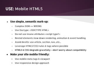
USE: Mobile HTML5


●   Use simple, semantic mark-up:
    ○   Complex DOM == WRONG
    ○   Use Doctype: <!DOCTYPE HTML>
    ○   Do not use insane attributes <script type?>
    ○   Nested elements slow down rendering, animation & event handling
    ○   Avoid devitis: use article, section, nav...etc...
    ○   Leverage HTML5/CSS3 rules & tags where possible
    ○   HTML5 & CSS3 degrade gracefully --don't worry about compatibility

●   Make your site mobile friendly:
    ○   Use mobile meta tags & viewport
    ○   Use responsive design approach
USE New Markup & Semantics

<details> / <summary>

<details open="open">
 <summary>Information</summary>
 <p>If your browser supports this element, it should allow
 you to expand and collapse these details.</p>
</details>


 Information

If your browser supports this element, it should allow
you to expand and collapse these details.
USE New Markup & Semantics

<mark>
Semantically highlight parts of your text:

Lorem ipsum dolor, <mark>consectetur</mark> adipiscing...
USE New Markup & Semantics

<output>

<form oninput="result.value=a.valueAsNumber + b.valueAsNumber">
0<input type="range" name="b">100 +<input type="number" name="a"> =
<output name="result"></output>
</form>
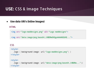
USE: CSS & Image Techniques


●   Use data URI's (inline images)

    HTML


    CSS
USE: CSS & Image Techniques


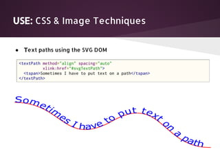
●   Text paths using the SVG DOM
USE: CSS & Image Techniques


●   Use inline SVG for charts and shape-based images
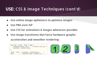
USE: CSS & Image Techniques (cont'd)

● Use online image optimizers to optimize images
● Use PNG over GIF
● Use CSS for animations & images whenever possible
● Use image transforms that force hardware graphic
  acceleration and smoother rendering:
THE FUTURE OF MOBILE
Mozilla, Google, and Opera are working very hard toward
making the web competitive with mobile native frameworks!

Promising Features Include:
●   WebRTC
●   WebAudio
●   WebVideo
●   PeerConnection
●   emscripten & porting w/ new JS features


http://AreWeMobileYet.com
https://wiki.mozilla.org/WebAPI
http://webrtc.org
What We've Covered:

● Brief Overview of the Mobile Web

● Testing, Measuring and Debugging

● Mobile Web Performance Optimization Areas

● Future of the Mobile Web
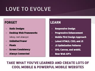
LOVE TO EVOLVE

FORGET                       LEARN
○   Static Designs           ○   Responsive Design
○   Desktop Web Frameworks   ○   Progressive Enhancement
    (okay, not always)       ○   Mobile First Design Approach
○   Unlimited Power          ○   Latest HTML5, CSS3, and JS
○   Pixels                   ○   JS Optimization Patterns
○   Screen Consistency       ○   SVG, Canvas, and webGL
○   Always Connected         ○   New Web API's


TAKE WHAT YOU'VE LEARNED AND CREATE LOTS OF
  COOL MOBILE & POWERFUL MOBILE WEBSITES
REFERENCE LINKS
1.   http://mobilehtml5.org - HTML5 Compatibility on Mobile & Tablet Browsers

2.   http://caniuse.com - Campatibility tables for support of HTML5, CSS4, SVG, and more in

     desktop & mobile browsers

3.   http://www.onbile.com/info/the-most-popular-mobile-browsers

4.   http://thenounproject.com/

Performance Optimization for Mobile Web | Fresh Tilled Soil

  • 1.
    Performance Optimization for the Mobile Web Tuesday, October 23, 2012 Boston, MA
  • 2.
    Agenda ● Brief Overviewof the Mobile Web ● Testing, Measuring and Debugging ● Mobile Web Performance Optimization Areas ● Future of the Mobile Web
  • 3.
    Mobile Web isStill... SLOW!
  • 4.
  • 5.
    Mobile RAGE isUP!!! Mobile Rage: How People React to Slow Load Times 23% Curse at their phone Scream at their phones Throw their phones Behave less or more normally 11% 62% 4%
  • 6.
  • 7.
  • 8.
    Mobile web isslow because... We are doing it WRONG!
  • 9.
  • 10.
  • 11.
  • 12.
  • 13.
  • 14.
  • 15.
  • 16.
  • 17.
  • 18.
  • 19.
    Ways to Test,Measure & Debug: REAL DEVICES REMOTE EMULATORS BROWSER TOOLS REMOTE LABS
  • 20.
    ■ Good forfirst testing ■ Many different types --over 150+ (most are free) ■ www.mobilexweb.com/emulators ■ Can use a resized desktop browser ■ Emulators are not reliable EMULATORS
  • 21.
    ■ BrowserStack.com ■ DeviceAnywhere.com ■ PerfectoMobile.com REMOTE LABS ■ Remove test lab (samsung) - free ■ Remote device access (nokia) - free
  • 22.
    ■ Opera Mobilewith DragonFly ■ Blackberry Browser for Playbook ■ Mobile Chrome Developer Tools (via usb) ■ Mobile FireFox Developer Tools (via usb) ■ Very few remote browser tools available REMOTE BROWSER TOOLS
  • 23.
    ■ Proxies onwifi: charles proxy, fiddler ■ Remote JavaScript tools: weinre, adobe shadow ■ Proxies on the device: mobitest ■ hybrids / pseudo-browsers: mobitest ■ JavaScript utility libs: jconsole, watchr REAL DEVICES ■ network sniffers: pcapperf ■ server-side sniffers
  • 24.
    Areas of Optimization& Mobile Web's Performance Happy Friend:
  • 25.
    Load Mobile PagesFaster ● Place stylesheets at top & scripts at the bottom ● JavaScript blocks parallel downloading (increasing load time)
  • 26.
    Load Mobile PagesFaster (cont'd) ● Use multiple domains to overcome parallel download limitations
  • 27.
    Load Mobile PagesFaster (cont'd) ● Minify JavaScript & CSS ● Defer loading of non-essential JavaScript ● GZIP components ● Reduce http requests (10x's slower than desktop) ● Deliver the mobile site directly --avoid redirects ● Use Local Storage & Application Cache (HTML5)
  • 28.
    USE: Mobile HTML5 ● Use simple, semantic mark-up: ○ Complex DOM == WRONG ○ Use Doctype: <!DOCTYPE HTML> ○ Do not use insane attributes <script type?> ○ Nested elements slow down rendering, animation & event handling ○ Avoid devitis: use article, section, nav...etc... ○ Leverage HTML5/CSS3 rules & tags where possible ○ HTML5 & CSS3 degrade gracefully --don't worry about compatibility ● Make your site mobile friendly: ○ Use mobile meta tags & viewport ○ Use responsive design approach
  • 29.
    USE New Markup& Semantics <details> / <summary> <details open="open"> <summary>Information</summary> <p>If your browser supports this element, it should allow you to expand and collapse these details.</p> </details> Information If your browser supports this element, it should allow you to expand and collapse these details.
  • 30.
    USE New Markup& Semantics <mark> Semantically highlight parts of your text: Lorem ipsum dolor, <mark>consectetur</mark> adipiscing...
  • 31.
    USE New Markup& Semantics <output> <form oninput="result.value=a.valueAsNumber + b.valueAsNumber"> 0<input type="range" name="b">100 +<input type="number" name="a"> = <output name="result"></output> </form>
  • 32.
    USE: CSS &Image Techniques ● Use data URI's (inline images) HTML CSS
  • 33.
    USE: CSS &Image Techniques ● Text paths using the SVG DOM
  • 34.
    USE: CSS &Image Techniques ● Use inline SVG for charts and shape-based images
  • 35.
    USE: CSS &Image Techniques (cont'd) ● Use online image optimizers to optimize images ● Use PNG over GIF ● Use CSS for animations & images whenever possible ● Use image transforms that force hardware graphic acceleration and smoother rendering:
  • 36.
    THE FUTURE OFMOBILE Mozilla, Google, and Opera are working very hard toward making the web competitive with mobile native frameworks! Promising Features Include: ● WebRTC ● WebAudio ● WebVideo ● PeerConnection ● emscripten & porting w/ new JS features http://AreWeMobileYet.com https://wiki.mozilla.org/WebAPI http://webrtc.org
  • 37.
    What We've Covered: ●Brief Overview of the Mobile Web ● Testing, Measuring and Debugging ● Mobile Web Performance Optimization Areas ● Future of the Mobile Web
  • 38.
    LOVE TO EVOLVE FORGET LEARN ○ Static Designs ○ Responsive Design ○ Desktop Web Frameworks ○ Progressive Enhancement (okay, not always) ○ Mobile First Design Approach ○ Unlimited Power ○ Latest HTML5, CSS3, and JS ○ Pixels ○ JS Optimization Patterns ○ Screen Consistency ○ SVG, Canvas, and webGL ○ Always Connected ○ New Web API's TAKE WHAT YOU'VE LEARNED AND CREATE LOTS OF COOL MOBILE & POWERFUL MOBILE WEBSITES
  • 39.
    REFERENCE LINKS 1. http://mobilehtml5.org - HTML5 Compatibility on Mobile & Tablet Browsers 2. http://caniuse.com - Campatibility tables for support of HTML5, CSS4, SVG, and more in desktop & mobile browsers 3. http://www.onbile.com/info/the-most-popular-mobile-browsers 4. http://thenounproject.com/