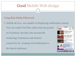
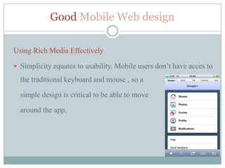
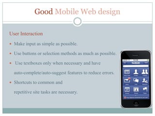
Mobile Web Apps Design

   DESIGNING GOOD WEB APP
The Mobile web


     The Mobile Web refers to the use of Internet-connected
    applications, or browser-based access to the Internet from
    a mobile device, such as a Smartphone or tablet computer,
    connected to a wireless network.
The mobile Web

 When phones first started to browse the web, the experience was

  bad, but it was an exciting idea. Smartphones came along
  improving the experience. The apple's iPhone Web browser was
  actually usable.The iPhone bridged the gap between the mobile
  web and the desktop web we wanted on our phones
Mobiles & the Modern Web


 The adoption of HTML5 and CSS3 reduced the load of the

  graphics to achieve some of the same beautiful interfaces and
  enhanced browsing speed.

 HTML5 also meant offline capabilities, something native apps

  held over web apps for a long time, and to some extent still do.
Good Mobile Web design


Aspects taken into consideration when designing a mobile Web app:

 User-focused content just like in traditional web design;

 Esential elements should be brought over the

  mobile web (Users’ needs have to be met quickly)
Good Mobile Web design


User Testing

Design is subjective:

 The way we respond to a design is influenced by culture, gender,

  age and even physical conditions (such as color blindness).

 Is important that design decisions be informed by user testing

  rather than personal experience.
Good Mobile Web design


Using Rich Media Effectively

 Mobile devices are capable of displaying multimedia content.

  You can watch YouTube videos that are posted

  on Facebook, but take into account the

  technology limitations and internet

  conectivity by keeping rich multimedia to

  the barest minimum.
Good Mobile Web design

Using Rich Media Effectively

 Simplicity equates to usability. Mobile users don’t have acces to

  the traditional keyboard and mouse , so a

  simple design is critical to be able to move

  around the app.
Good Mobile Web design

User Interaction
 Make input as simple as possible.

 Use buttons or selection methods as much as possible.

 Use textboxes only when necessary and have

  auto-complete/auto-suggest features to reduce errors.

 Shortcuts to common and

  repetitive site tasks are necessary.
Designing content for the Mobile Web


User-focused
 Content on the mobile web must be user-focused just like in traditional web

  design.

 Essential elements should be brought over, mobile users

 don’t want to have to search or scroll multiple pages to find what they are

  looking for.

 Make use of features of newer mobile devices. Many of them have support for

  the Geolocation API in HTML5, you can use their current location to present
  them with more relevant information.
Designing content for the Mobile Web


Understanding How Mobile Devices Work
 With so many users accessing the mobile web from many different and

  disparate devices,

 Understanding and prioritizing your target devices is paramount in

  creating unique and effective browsing experiences.

 Knowing the users’ devices help web designers create content and

  experiences specifically for that device.
User Experience


Empower Users with Freedom and Flexibility
 Give the user more freedom and control over their actions. The user

  should be able to personalize their working screen, backgrounds to turn
  on or off whatever controls that they desire.
Easy Mobile Development


JQTouch – Quick and easy Mobile Development
 JQTouch is a plugin for jQuery that allows you to build mobile websites for
  the iPhone and iPod Touch.
 There are plans to also support Google Android and

   Paml WebOS browsers in the future.
 Is completely open source and MIT licensed.

 Page history management and CSS3 page transitions,

   including 3d flip.
 The power of jQuery to build AJAX applications.
Mobile Web Apps Limits


Mobile pitfalls
 Most mobile devices don't support Flash yet, notably the iPhone, so mobile

    websites should avoid this

   It's possible to crash a mobile browser by loading in too many images or
    running too much JavaScript so it’s important to keep file sisez down.
Mobile Web Apps Limits


 Small screen size

 Lack of multiple windows

 Not being able to use a mouselike pointer

 Speed

 Cost

 Types of pages that can be accesible
Mobile Web Apps Design Development


References
1.   Wikipedia (http://en.wikipedia.org/wiki/Mobile_Web)

2.   Sixrevisions (http://sixrevisions.com/user-interface/a-quick-look-at-mobile-web-
     designs/)

3.   Paul Boag Smashing eBook#1 (https://shop.smashingmagazine.com/smashing-
     ebook-series-1-professional-web-design.html)

4.   Doctype.tv (http://doctype.tv/mobile)

MobileWebAppsDesign

  • 1.
    Mobile Web AppsDesign DESIGNING GOOD WEB APP
  • 2.
    The Mobile web  The Mobile Web refers to the use of Internet-connected applications, or browser-based access to the Internet from a mobile device, such as a Smartphone or tablet computer, connected to a wireless network.
  • 3.
    The mobile Web When phones first started to browse the web, the experience was bad, but it was an exciting idea. Smartphones came along improving the experience. The apple's iPhone Web browser was actually usable.The iPhone bridged the gap between the mobile web and the desktop web we wanted on our phones
  • 4.
    Mobiles & theModern Web  The adoption of HTML5 and CSS3 reduced the load of the graphics to achieve some of the same beautiful interfaces and enhanced browsing speed.  HTML5 also meant offline capabilities, something native apps held over web apps for a long time, and to some extent still do.
  • 5.
    Good Mobile Webdesign Aspects taken into consideration when designing a mobile Web app:  User-focused content just like in traditional web design;  Esential elements should be brought over the mobile web (Users’ needs have to be met quickly)
  • 6.
    Good Mobile Webdesign User Testing Design is subjective:  The way we respond to a design is influenced by culture, gender, age and even physical conditions (such as color blindness).  Is important that design decisions be informed by user testing rather than personal experience.
  • 7.
    Good Mobile Webdesign Using Rich Media Effectively  Mobile devices are capable of displaying multimedia content. You can watch YouTube videos that are posted on Facebook, but take into account the technology limitations and internet conectivity by keeping rich multimedia to the barest minimum.
  • 8.
    Good Mobile Webdesign Using Rich Media Effectively  Simplicity equates to usability. Mobile users don’t have acces to the traditional keyboard and mouse , so a simple design is critical to be able to move around the app.
  • 9.
    Good Mobile Webdesign User Interaction  Make input as simple as possible.  Use buttons or selection methods as much as possible.  Use textboxes only when necessary and have auto-complete/auto-suggest features to reduce errors.  Shortcuts to common and repetitive site tasks are necessary.
  • 10.
    Designing content forthe Mobile Web User-focused  Content on the mobile web must be user-focused just like in traditional web design.  Essential elements should be brought over, mobile users  don’t want to have to search or scroll multiple pages to find what they are looking for.  Make use of features of newer mobile devices. Many of them have support for the Geolocation API in HTML5, you can use their current location to present them with more relevant information.
  • 11.
    Designing content forthe Mobile Web Understanding How Mobile Devices Work  With so many users accessing the mobile web from many different and disparate devices,  Understanding and prioritizing your target devices is paramount in creating unique and effective browsing experiences.  Knowing the users’ devices help web designers create content and experiences specifically for that device.
  • 12.
    User Experience Empower Userswith Freedom and Flexibility  Give the user more freedom and control over their actions. The user should be able to personalize their working screen, backgrounds to turn on or off whatever controls that they desire.
  • 13.
    Easy Mobile Development JQTouch– Quick and easy Mobile Development  JQTouch is a plugin for jQuery that allows you to build mobile websites for the iPhone and iPod Touch.  There are plans to also support Google Android and Paml WebOS browsers in the future.  Is completely open source and MIT licensed.  Page history management and CSS3 page transitions, including 3d flip.  The power of jQuery to build AJAX applications.
  • 14.
    Mobile Web AppsLimits Mobile pitfalls  Most mobile devices don't support Flash yet, notably the iPhone, so mobile websites should avoid this  It's possible to crash a mobile browser by loading in too many images or running too much JavaScript so it’s important to keep file sisez down.
  • 15.
    Mobile Web AppsLimits  Small screen size  Lack of multiple windows  Not being able to use a mouselike pointer  Speed  Cost  Types of pages that can be accesible
  • 16.
    Mobile Web AppsDesign Development References 1. Wikipedia (http://en.wikipedia.org/wiki/Mobile_Web) 2. Sixrevisions (http://sixrevisions.com/user-interface/a-quick-look-at-mobile-web- designs/) 3. Paul Boag Smashing eBook#1 (https://shop.smashingmagazine.com/smashing- ebook-series-1-professional-web-design.html) 4. Doctype.tv (http://doctype.tv/mobile)