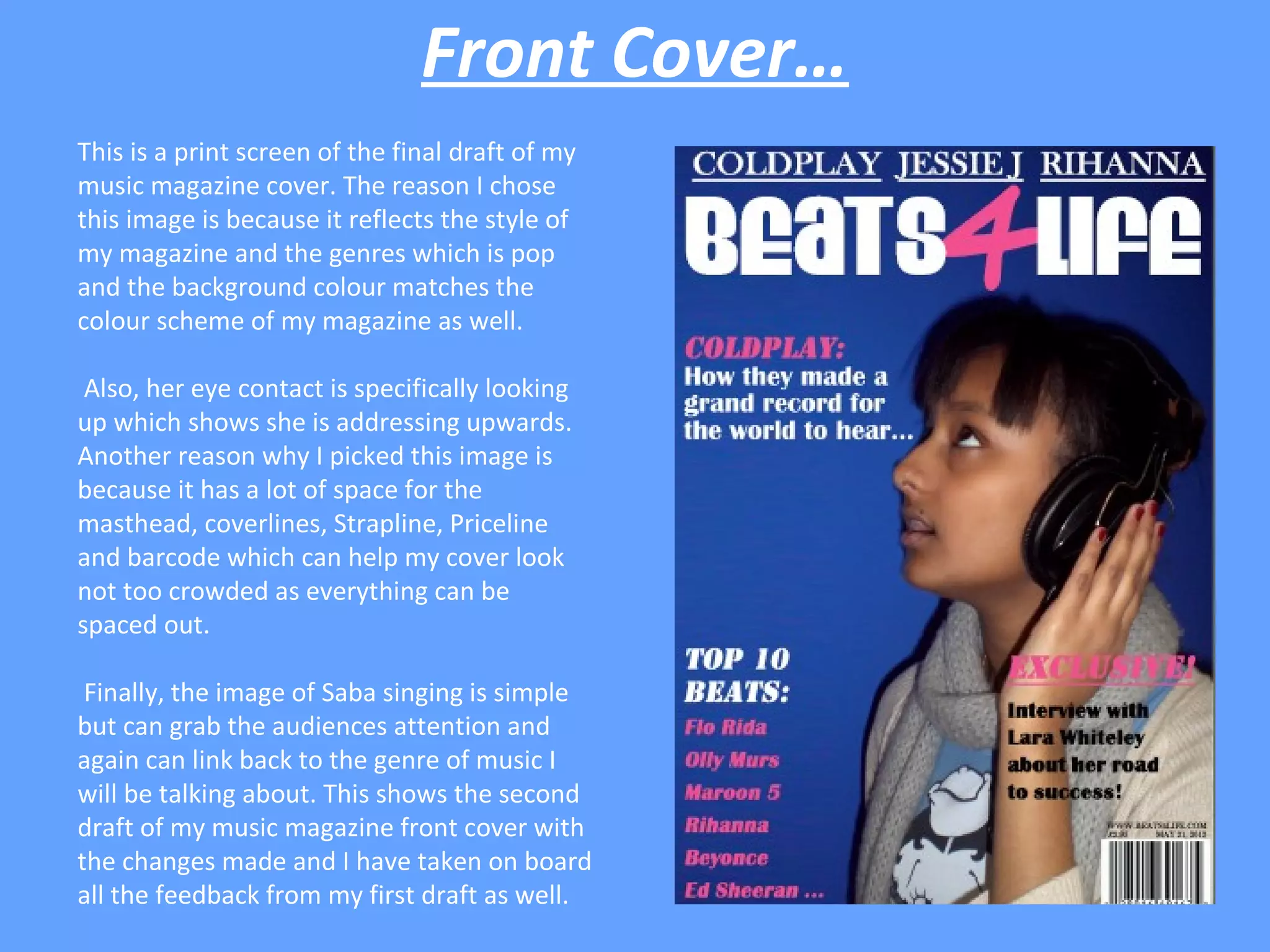
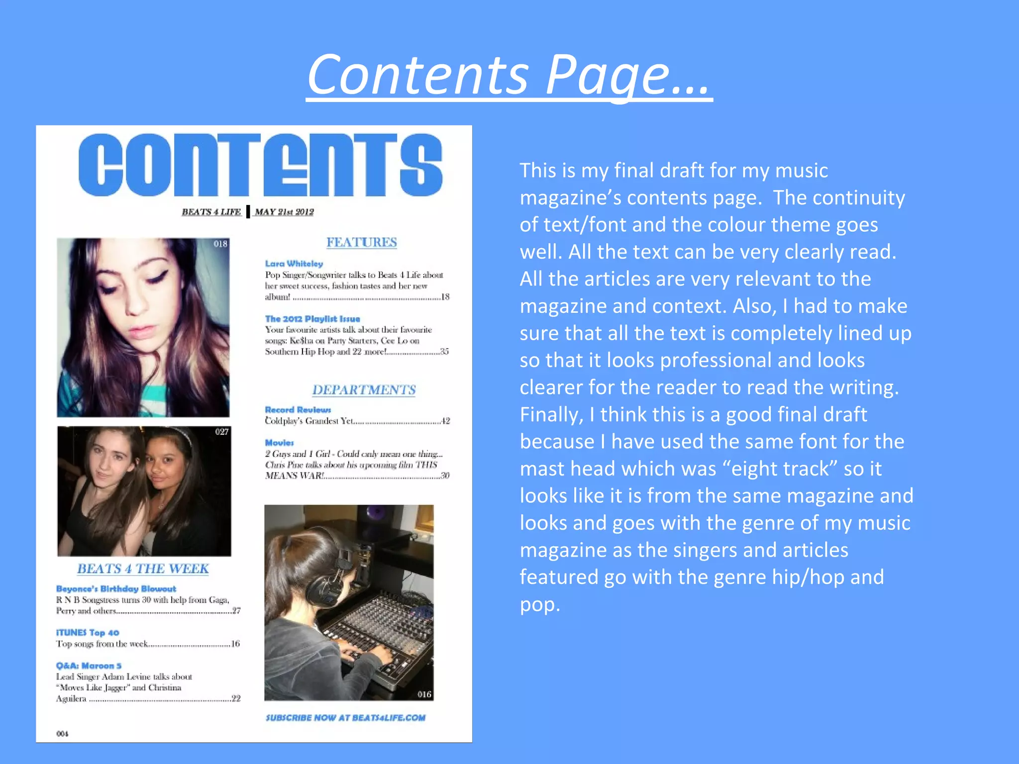
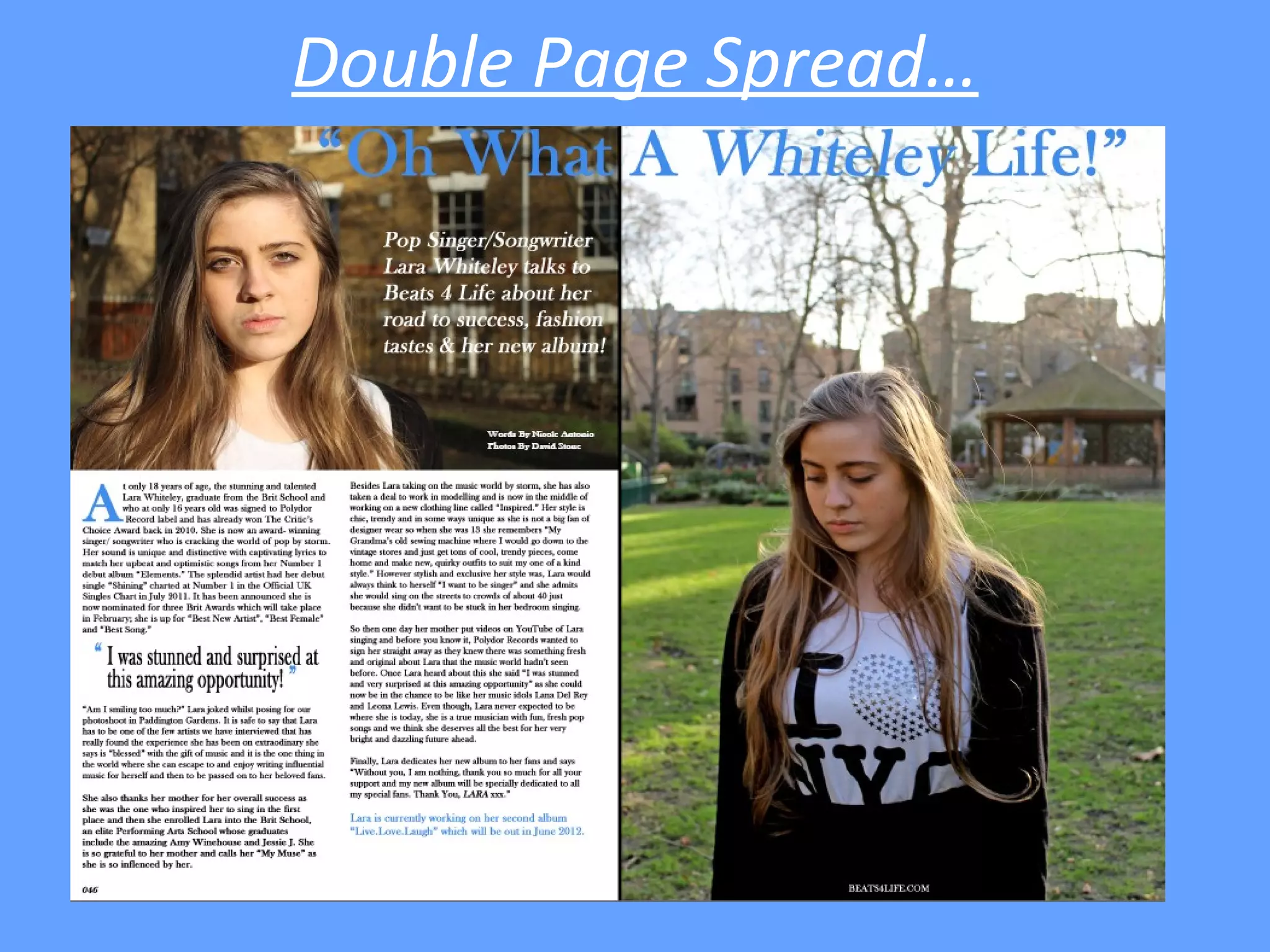
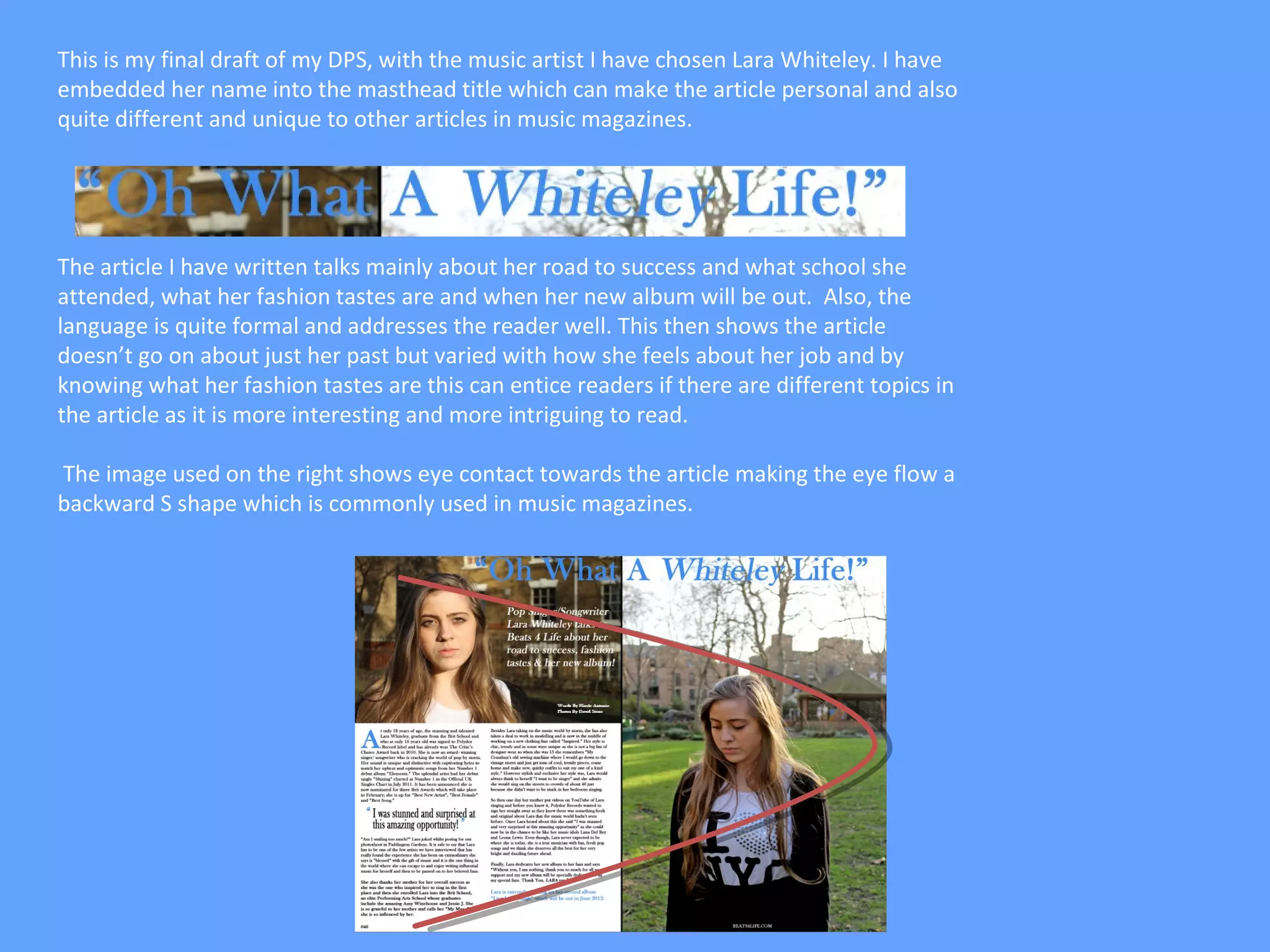
Final Drafts of all Three
    Publications….
     By Nicole Antonio
Front Cover…
This is a print screen of the final draft of my
music magazine cover. The reason I chose
this image is because it reflects the style of
my magazine and the genres which is pop
and the background colour matches the
colour scheme of my magazine as well.

 Also, her eye contact is specifically looking
up which shows she is addressing upwards.
Another reason why I picked this image is
because it has a lot of space for the
masthead, coverlines, Strapline, Priceline
and barcode which can help my cover look
not too crowded as everything can be
spaced out.

 Finally, the image of Saba singing is simple
but can grab the audiences attention and
again can link back to the genre of music I
will be talking about. This shows the second
draft of my music magazine front cover with
the changes made and I have taken on board
all the feedback from my first draft as well.
Contents Page…
       This is my final draft for my music
       magazine’s contents page. The continuity
       of text/font and the colour theme goes
       well. All the text can be very clearly read.
       All the articles are very relevant to the
       magazine and context. Also, I had to make
       sure that all the text is completely lined up
       so that it looks professional and looks
       clearer for the reader to read the writing.
       Finally, I think this is a good final draft
       because I have used the same font for the
       mast head which was “eight track” so it
       looks like it is from the same magazine and
       looks and goes with the genre of my music
       magazine as the singers and articles
       featured go with the genre hip/hop and
       pop.
Double Page Spread…
This is my final draft of my DPS, with the music artist I have chosen Lara Whiteley. I have
embedded her name into the masthead title which can make the article personal and also
quite different and unique to other articles in music magazines.


The article I have written talks mainly about her road to success and what school she
attended, what her fashion tastes are and when her new album will be out. Also, the
language is quite formal and addresses the reader well. This then shows the article
doesn’t go on about just her past but varied with how she feels about her job and by
knowing what her fashion tastes are this can entice readers if there are different topics in
the article as it is more interesting and more intriguing to read.

The image used on the right shows eye contact towards the article making the eye flow a
backward S shape which is commonly used in music magazines.

Final Drafts of all Three Publications

  • 1.
    Final Drafts ofall Three Publications…. By Nicole Antonio
  • 2.
    Front Cover… This isa print screen of the final draft of my music magazine cover. The reason I chose this image is because it reflects the style of my magazine and the genres which is pop and the background colour matches the colour scheme of my magazine as well. Also, her eye contact is specifically looking up which shows she is addressing upwards. Another reason why I picked this image is because it has a lot of space for the masthead, coverlines, Strapline, Priceline and barcode which can help my cover look not too crowded as everything can be spaced out. Finally, the image of Saba singing is simple but can grab the audiences attention and again can link back to the genre of music I will be talking about. This shows the second draft of my music magazine front cover with the changes made and I have taken on board all the feedback from my first draft as well.
  • 3.
    Contents Page… This is my final draft for my music magazine’s contents page. The continuity of text/font and the colour theme goes well. All the text can be very clearly read. All the articles are very relevant to the magazine and context. Also, I had to make sure that all the text is completely lined up so that it looks professional and looks clearer for the reader to read the writing. Finally, I think this is a good final draft because I have used the same font for the mast head which was “eight track” so it looks like it is from the same magazine and looks and goes with the genre of my music magazine as the singers and articles featured go with the genre hip/hop and pop.
  • 4.
  • 5.
    This is myfinal draft of my DPS, with the music artist I have chosen Lara Whiteley. I have embedded her name into the masthead title which can make the article personal and also quite different and unique to other articles in music magazines. The article I have written talks mainly about her road to success and what school she attended, what her fashion tastes are and when her new album will be out. Also, the language is quite formal and addresses the reader well. This then shows the article doesn’t go on about just her past but varied with how she feels about her job and by knowing what her fashion tastes are this can entice readers if there are different topics in the article as it is more interesting and more intriguing to read. The image used on the right shows eye contact towards the article making the eye flow a backward S shape which is commonly used in music magazines.