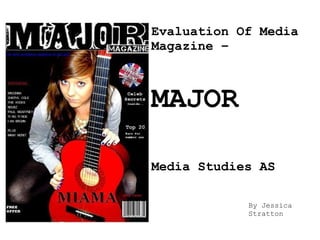
Evaluation Of Media Magazine – MAJOR Media Studies AS By Jessica Stratton
Introduction With being set the task of creating a new Music magazine I made 'Major Magazine' which is an indie/pop featured magazine. I wanted my magazine to have a different image from other mainstream magazines so I gave it the theme of being very British proud. Using mainly the union Jack colours (red, blue and white) to help get this point across. AS I was fairly new to the idea of creating a magazine I had a preliminary task of creating a student magazine. For my task I did a student magazine called 'On campus'. I gave it this name as it was aimed at university/college students and I felt it fitted in well with the theme.
Research To start off the planning of my magazine I created a survey to find out what genre my magazine should be. These results came back as ‘Indie/Rock’. This helped me make the decision that I should possibly make my magazine to fit into the 'indie' genre. I mind mapped potential name ideas for my magazine and asked my class wh ich name they believed to be best and professional, the result came back as ‘Major’ being the favourite choice. I also analysed two popular music magazines to help myself understand the conventions of a magazine. This included analysing the front pages, contents pages and double page spreads. From doing this I found how magazines make themselves different from others and what conventions make a magazine. I found both magazines very mature and professional which I aimed for my magazine to reach this potential.  I think HMV would be a shop that would distribute my magazine as it’s very mainstream, and is an incredibly popular music shop. It would help promote my magazine in terms of genre as HMV does not deal with one set genre but has music magazines to suit peoples taste. Distribution I thought of potential ideas for my magazine. I came up with the idea of interviewing a local band, yet that idea didn't work out so I interviewed a local singer called Miama then organised a time with her to take some photos to include in my magazine . I then conducted an interview and wrote it up on my double page spread using publisher. I edited my photographs with Picasa.
Conventions of a magazine Mast head Third left Third left Mast head Barcode Name of band Name of band Main image Main image Cover lines Date/ issue number
Codes and conventions The codes and conventions in media can be separated into 3 distinct groups - technical (camera techniques & shots), symbolic (i.e. clothing, colours) written and audio (music etc). Technical: I have used a range of high, eyelevel and low angle shots to give off the professional image I wanted. This was also to show my artist in many different ways, as I want my magazine to be seen as. Symbolic: I have gone with the British theme for my magazine. To achieve this I had to stick with the union jack colours which are red, blue and green. Although these are rather masculine colours I tried my best to make my magazine seem unisex, not just for men. To help this I used an image of a woman on the front cover and included some ‘girlie’ colours such as pink inside. The clothes ‘Miama’ is wearing is very laid back and has a boho/country style. To my front cover image has a guitar in showing the musical influence as possibly the genre of music?  Written: I have written  my article in an edgy and fun way. I have included a ‘fun’ photograph which draws your attention straight to the page. I have included not many questions on my double age spread as I wanted it to be a light read. My magazine represents today's youth in a positive way as I have included an stereotypical youth/teenager adaptations to my work. Issues such as drugs and drink have not been shown anywhere in my work to provide a child friendly outlook. By doing this it sets a good example for the youth today and shows that you can still have fun without including these issues.
Constructing the Magazine Layout and design- I have constructed my magazine to seem very simple yet professional. The layout of my pages are constructed to fit in with other music magazine such as adapting the style of columns of text, if in an interview. Music instruments such as a guitar help stereotype the kind of band such as indie, by being slightly rock. I have also change colour, size and boldness of some texts as many magazines do to exaggerate quotes or artists names. Front cover:  I choose an image that I could easily work around to produce this cover. I left a black background as it helps fit into the indie/rock theme; yet it also makes it unique compared to other magazines. While thinking of my magazine being in distribution with it being one of the only music magazines to feature a black front cover it will stand out a lot more against white backgrounds. I then featured story's in the third left as it is a convention of a magazine and also helps the reader see what's featured. I then helped link my theme of 'British' all together by putting a logo of “50 best British albums...” to tie in the whole theme. Contents page: I have sectioned my contents page into 2 separate sections 'regulars' and 'features' as this is a technique used in many magazines. I have also put other images of bands and quotes to contribute to the page. I have continued using the blue , red and white theme also as I ant to continue this theme for the whole issue. I have placed the issue number at the top of the page to add quirkiness and give off the image I wanted. Double page spread:  I have placed the photograph in the middle of the page as it draws you straight to what you were looking  for, the artist. I have used a pink font as it is a very girlie interview and exaggerated quotes by making them bolder and bigger. I fitted the interview texts around the image and added a few features that magazines use to improve it. Captions are placed to go underneath the pictures a convention that magazines in general follow. This is used to anchor the meaning of my pictures and what I want them to convey. The front cover also uses direct eye contact  to appeal to the reader, and help engage their attention.
Unused images This is my preferred idea of the name and font of my magazine. The  graphics for the masthead were chosen because as my genre is indie/rock I wanted a masthead to have that edge to it. Suggested fonts and names:  I used da  font.com to produce this font.
Finished Product
Improvements: I could have improved my time management, as this was very sketchy. If I had the chance to do this project again I would take more time to research and analyze many different genres of music magazines and annotate them.  Achievements: With ‘Major’ magazine I believe that the colour scheme has worked well to create a unique and edgy music magazine. The genre of indie/pop has been shown through this colour scheme and title font which has worked well. What I've learnt: From my preliminary task to final piece I can see that I created new skills that entitle me to making a well produced final piece. I have learnt how to edit images well enough to look professional from using editing software such as Picasa and what conventions are found generally in magazines as well as music ones. I now feel I have progressed in terms of presentation and professionalism. As we used Blogger.com to keep our course work I firstly and foremost learnt how to make and use a blog. This is a good skill to have as the world is emerging into the Internet 2.0. As blogs are becoming more and more popular by the day having my own blog is a great advantage to have.

Media

  • 1.
    Evaluation Of MediaMagazine – MAJOR Media Studies AS By Jessica Stratton
  • 2.
    Introduction With beingset the task of creating a new Music magazine I made 'Major Magazine' which is an indie/pop featured magazine. I wanted my magazine to have a different image from other mainstream magazines so I gave it the theme of being very British proud. Using mainly the union Jack colours (red, blue and white) to help get this point across. AS I was fairly new to the idea of creating a magazine I had a preliminary task of creating a student magazine. For my task I did a student magazine called 'On campus'. I gave it this name as it was aimed at university/college students and I felt it fitted in well with the theme.
  • 3.
    Research To startoff the planning of my magazine I created a survey to find out what genre my magazine should be. These results came back as ‘Indie/Rock’. This helped me make the decision that I should possibly make my magazine to fit into the 'indie' genre. I mind mapped potential name ideas for my magazine and asked my class wh ich name they believed to be best and professional, the result came back as ‘Major’ being the favourite choice. I also analysed two popular music magazines to help myself understand the conventions of a magazine. This included analysing the front pages, contents pages and double page spreads. From doing this I found how magazines make themselves different from others and what conventions make a magazine. I found both magazines very mature and professional which I aimed for my magazine to reach this potential. I think HMV would be a shop that would distribute my magazine as it’s very mainstream, and is an incredibly popular music shop. It would help promote my magazine in terms of genre as HMV does not deal with one set genre but has music magazines to suit peoples taste. Distribution I thought of potential ideas for my magazine. I came up with the idea of interviewing a local band, yet that idea didn't work out so I interviewed a local singer called Miama then organised a time with her to take some photos to include in my magazine . I then conducted an interview and wrote it up on my double page spread using publisher. I edited my photographs with Picasa.
  • 4.
    Conventions of amagazine Mast head Third left Third left Mast head Barcode Name of band Name of band Main image Main image Cover lines Date/ issue number
  • 5.
    Codes and conventionsThe codes and conventions in media can be separated into 3 distinct groups - technical (camera techniques & shots), symbolic (i.e. clothing, colours) written and audio (music etc). Technical: I have used a range of high, eyelevel and low angle shots to give off the professional image I wanted. This was also to show my artist in many different ways, as I want my magazine to be seen as. Symbolic: I have gone with the British theme for my magazine. To achieve this I had to stick with the union jack colours which are red, blue and green. Although these are rather masculine colours I tried my best to make my magazine seem unisex, not just for men. To help this I used an image of a woman on the front cover and included some ‘girlie’ colours such as pink inside. The clothes ‘Miama’ is wearing is very laid back and has a boho/country style. To my front cover image has a guitar in showing the musical influence as possibly the genre of music? Written: I have written my article in an edgy and fun way. I have included a ‘fun’ photograph which draws your attention straight to the page. I have included not many questions on my double age spread as I wanted it to be a light read. My magazine represents today's youth in a positive way as I have included an stereotypical youth/teenager adaptations to my work. Issues such as drugs and drink have not been shown anywhere in my work to provide a child friendly outlook. By doing this it sets a good example for the youth today and shows that you can still have fun without including these issues.
  • 6.
    Constructing the MagazineLayout and design- I have constructed my magazine to seem very simple yet professional. The layout of my pages are constructed to fit in with other music magazine such as adapting the style of columns of text, if in an interview. Music instruments such as a guitar help stereotype the kind of band such as indie, by being slightly rock. I have also change colour, size and boldness of some texts as many magazines do to exaggerate quotes or artists names. Front cover: I choose an image that I could easily work around to produce this cover. I left a black background as it helps fit into the indie/rock theme; yet it also makes it unique compared to other magazines. While thinking of my magazine being in distribution with it being one of the only music magazines to feature a black front cover it will stand out a lot more against white backgrounds. I then featured story's in the third left as it is a convention of a magazine and also helps the reader see what's featured. I then helped link my theme of 'British' all together by putting a logo of “50 best British albums...” to tie in the whole theme. Contents page: I have sectioned my contents page into 2 separate sections 'regulars' and 'features' as this is a technique used in many magazines. I have also put other images of bands and quotes to contribute to the page. I have continued using the blue , red and white theme also as I ant to continue this theme for the whole issue. I have placed the issue number at the top of the page to add quirkiness and give off the image I wanted. Double page spread: I have placed the photograph in the middle of the page as it draws you straight to what you were looking for, the artist. I have used a pink font as it is a very girlie interview and exaggerated quotes by making them bolder and bigger. I fitted the interview texts around the image and added a few features that magazines use to improve it. Captions are placed to go underneath the pictures a convention that magazines in general follow. This is used to anchor the meaning of my pictures and what I want them to convey. The front cover also uses direct eye contact to appeal to the reader, and help engage their attention.
  • 7.
    Unused images Thisis my preferred idea of the name and font of my magazine. The graphics for the masthead were chosen because as my genre is indie/rock I wanted a masthead to have that edge to it. Suggested fonts and names: I used da font.com to produce this font.
  • 8.
  • 9.
    Improvements: I couldhave improved my time management, as this was very sketchy. If I had the chance to do this project again I would take more time to research and analyze many different genres of music magazines and annotate them. Achievements: With ‘Major’ magazine I believe that the colour scheme has worked well to create a unique and edgy music magazine. The genre of indie/pop has been shown through this colour scheme and title font which has worked well. What I've learnt: From my preliminary task to final piece I can see that I created new skills that entitle me to making a well produced final piece. I have learnt how to edit images well enough to look professional from using editing software such as Picasa and what conventions are found generally in magazines as well as music ones. I now feel I have progressed in terms of presentation and professionalism. As we used Blogger.com to keep our course work I firstly and foremost learnt how to make and use a blog. This is a good skill to have as the world is emerging into the Internet 2.0. As blogs are becoming more and more popular by the day having my own blog is a great advantage to have.