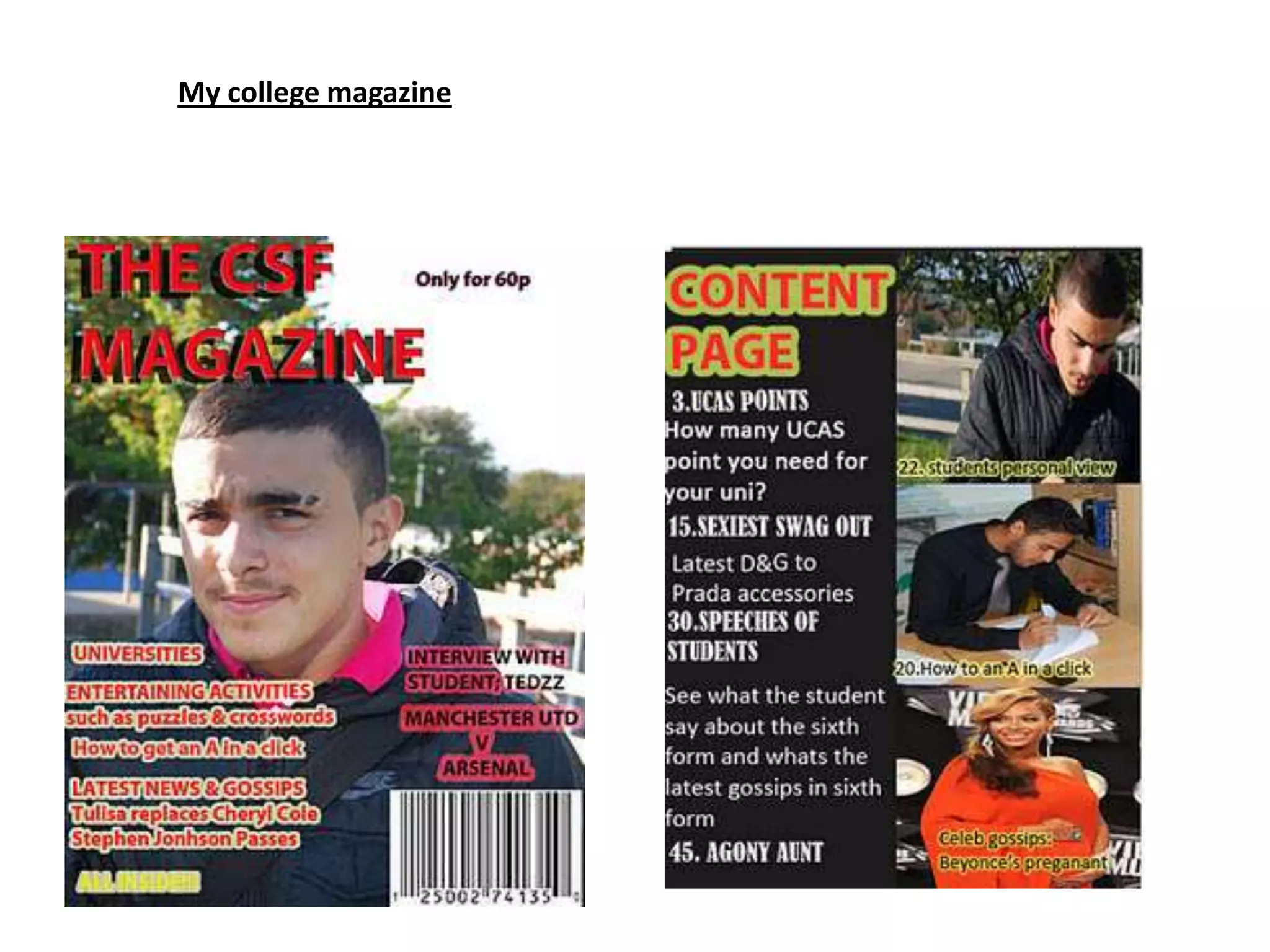
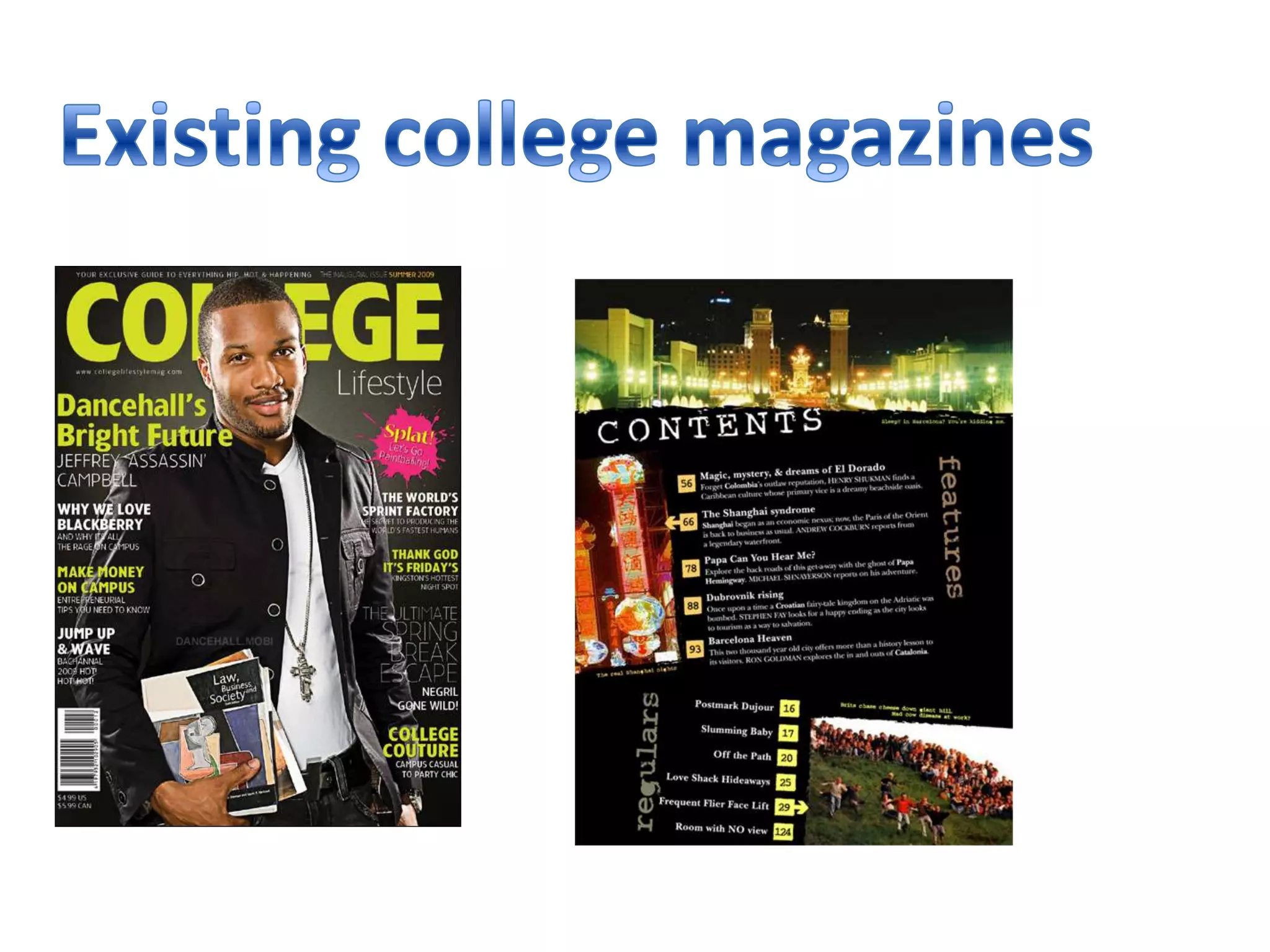
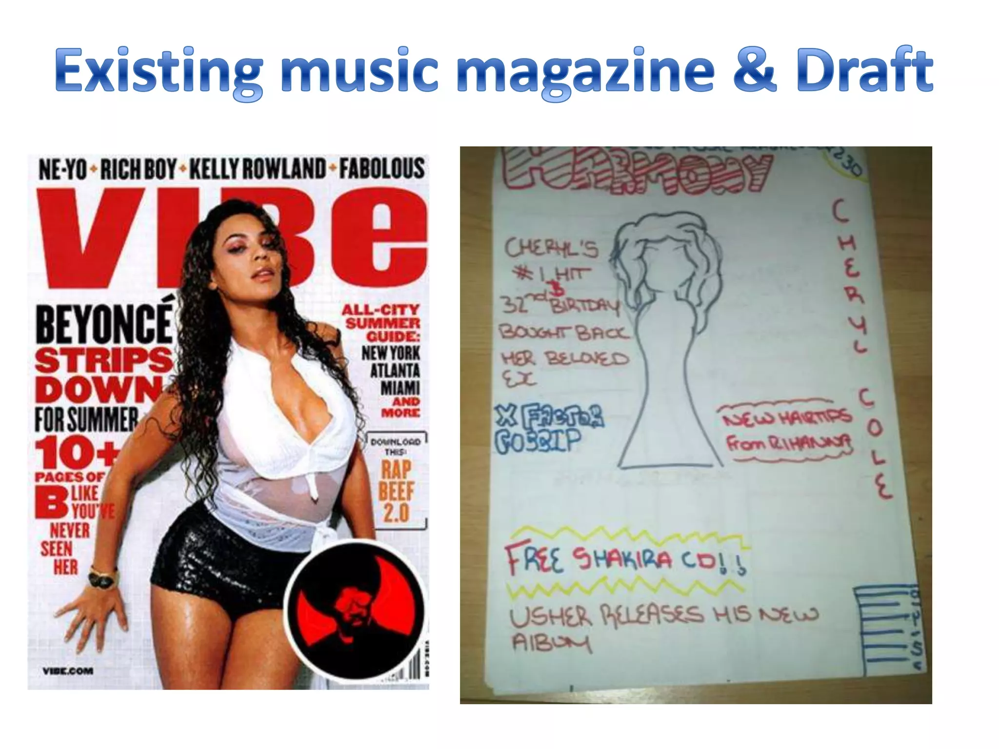
- The document reflects on the author's college magazine and compares it to existing professional magazines.
- While the author's magazine has an organized style and bright colors, it lacks detailed information that may appeal to the 16-19 year old audience.
- The author also feels the cover image takes up too much space, making it seem unprofessional compared to other magazines.
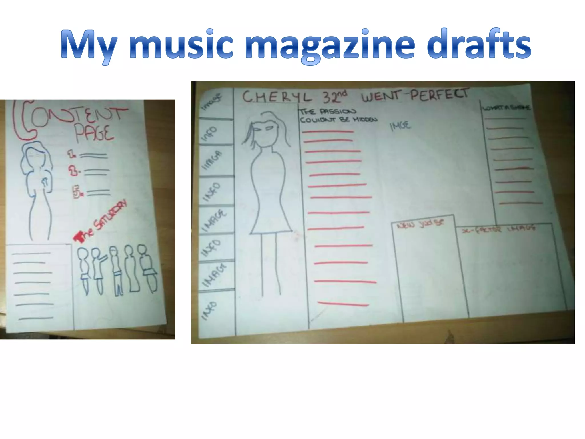
- The author develops new ideas from analyzing other magazines and creates drafts for a music magazine that follows typical magazine conventions.