Download as PDF, PPTX


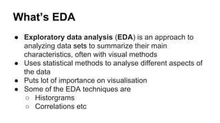


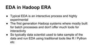


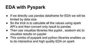
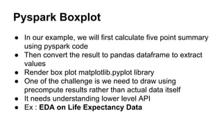

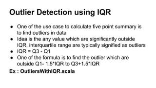

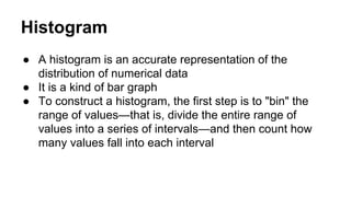
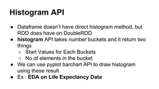

This document discusses exploratory data analysis (EDA) techniques that can be performed on large datasets using Spark and notebooks. It covers generating a five number summary, detecting outliers, creating histograms, and visualizing EDA results. EDA is an interactive process for understanding data distributions and relationships before modeling. Spark enables interactive EDA on large datasets using notebooks for visualizations and Pandas for local analysis.


![Hacking-Uncovered-How-People-Get-Hacked-and-How-to-Stay-Safe[1].pptx](https://cdn.slidesharecdn.com/ss_thumbnails/hacking-uncovered-how-people-get-hacked-and-how-to-stay-safe1-260130170011-4883a9c7-thumbnail.jpg?width=640&height=640&fit=bounds)
![제 23회 보아즈(BOAZ) 빅데이터 컨퍼런스 - [MBOAX] : ABSA를 활용한 소비자 반응 분석 기반 운영 효율화 대시보드 설계](https://cdn.slidesharecdn.com/ss_thumbnails/3-1boaz23rdconferencemboax-260203102709-9d519923-thumbnail.jpg?width=640&height=640&fit=bounds)


