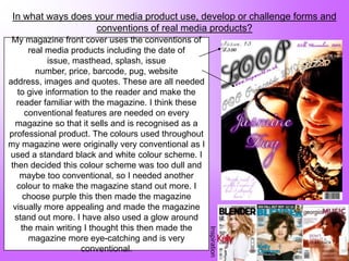
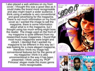
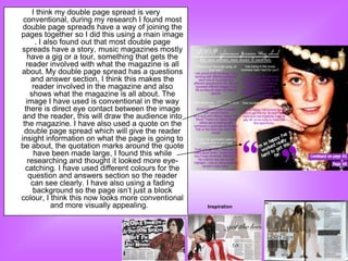
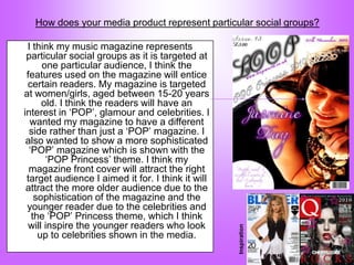
Charlotte Unwin discusses how her music magazine uses conventions of real media products in its design and layout. She aims the magazine at women aged 15-20 who are interested in pop music and celebrities. While including standard features like dates and prices, she adds unconventional touches like a purple color scheme to make the magazine stand out. The target audience is a mature teenager inspired to be a "pop princess." The magazine would be sold in stores like supermarkets and newsagents alongside a similar title.
Unit 8 - Information and Communication Technology (Paper I).pdfThiyagu K
This slides describes the basic concepts of ICT, basics of Email, Emerging Technology and Digital Initiatives in Education. This presentations aligns with the UGC Paper I syllabus.
Palestine last event orientationfvgnh .pptxRaedMohamed3
An EFL lesson about the current events in Palestine. It is intended to be for intermediate students who wish to increase their listening skills through a short lesson in power point.
The Roman Empire A Historical Colossus.pdfkaushalkr1407
The Roman Empire, a vast and enduring power, stands as one of history's most remarkable civilizations, leaving an indelible imprint on the world. It emerged from the Roman Republic, transitioning into an imperial powerhouse under the leadership of Augustus Caesar in 27 BCE. This transformation marked the beginning of an era defined by unprecedented territorial expansion, architectural marvels, and profound cultural influence.
The empire's roots lie in the city of Rome, founded, according to legend, by Romulus in 753 BCE. Over centuries, Rome evolved from a small settlement to a formidable republic, characterized by a complex political system with elected officials and checks on power. However, internal strife, class conflicts, and military ambitions paved the way for the end of the Republic. Julius Caesar’s dictatorship and subsequent assassination in 44 BCE created a power vacuum, leading to a civil war. Octavian, later Augustus, emerged victorious, heralding the Roman Empire’s birth.
Under Augustus, the empire experienced the Pax Romana, a 200-year period of relative peace and stability. Augustus reformed the military, established efficient administrative systems, and initiated grand construction projects. The empire's borders expanded, encompassing territories from Britain to Egypt and from Spain to the Euphrates. Roman legions, renowned for their discipline and engineering prowess, secured and maintained these vast territories, building roads, fortifications, and cities that facilitated control and integration.
The Roman Empire’s society was hierarchical, with a rigid class system. At the top were the patricians, wealthy elites who held significant political power. Below them were the plebeians, free citizens with limited political influence, and the vast numbers of slaves who formed the backbone of the economy. The family unit was central, governed by the paterfamilias, the male head who held absolute authority.
Culturally, the Romans were eclectic, absorbing and adapting elements from the civilizations they encountered, particularly the Greeks. Roman art, literature, and philosophy reflected this synthesis, creating a rich cultural tapestry. Latin, the Roman language, became the lingua franca of the Western world, influencing numerous modern languages.
Roman architecture and engineering achievements were monumental. They perfected the arch, vault, and dome, constructing enduring structures like the Colosseum, Pantheon, and aqueducts. These engineering marvels not only showcased Roman ingenuity but also served practical purposes, from public entertainment to water supply.
How to Make a Field invisible in Odoo 17Celine George
It is possible to hide or invisible some fields in odoo. Commonly using “invisible” attribute in the field definition to invisible the fields. This slide will show how to make a field invisible in odoo 17.
The French Revolution, which began in 1789, was a period of radical social and political upheaval in France. It marked the decline of absolute monarchies, the rise of secular and democratic republics, and the eventual rise of Napoleon Bonaparte. This revolutionary period is crucial in understanding the transition from feudalism to modernity in Europe.
For more information, visit-www.vavaclasses.com
This is a presentation by Dada Robert in a Your Skill Boost masterclass organised by the Excellence Foundation for South Sudan (EFSS) on Saturday, the 25th and Sunday, the 26th of May 2024.
He discussed the concept of quality improvement, emphasizing its applicability to various aspects of life, including personal, project, and program improvements. He defined quality as doing the right thing at the right time in the right way to achieve the best possible results and discussed the concept of the "gap" between what we know and what we do, and how this gap represents the areas we need to improve. He explained the scientific approach to quality improvement, which involves systematic performance analysis, testing and learning, and implementing change ideas. He also highlighted the importance of client focus and a team approach to quality improvement.
Synthetic Fiber Construction in lab .pptxPavel ( NSTU)
Synthetic fiber production is a fascinating and complex field that blends chemistry, engineering, and environmental science. By understanding these aspects, students can gain a comprehensive view of synthetic fiber production, its impact on society and the environment, and the potential for future innovations. Synthetic fibers play a crucial role in modern society, impacting various aspects of daily life, industry, and the environment. ynthetic fibers are integral to modern life, offering a range of benefits from cost-effectiveness and versatility to innovative applications and performance characteristics. While they pose environmental challenges, ongoing research and development aim to create more sustainable and eco-friendly alternatives. Understanding the importance of synthetic fibers helps in appreciating their role in the economy, industry, and daily life, while also emphasizing the need for sustainable practices and innovation.
How to Create Map Views in the Odoo 17 ERPCeline George
The map views are useful for providing a geographical representation of data. They allow users to visualize and analyze the data in a more intuitive manner.
2024.06.01 Introducing a competency framework for languag learning materials ...Sandy Millin
http://sandymillin.wordpress.com/iateflwebinar2024
Published classroom materials form the basis of syllabuses, drive teacher professional development, and have a potentially huge influence on learners, teachers and education systems. All teachers also create their own materials, whether a few sentences on a blackboard, a highly-structured fully-realised online course, or anything in between. Despite this, the knowledge and skills needed to create effective language learning materials are rarely part of teacher training, and are mostly learnt by trial and error.
Knowledge and skills frameworks, generally called competency frameworks, for ELT teachers, trainers and managers have existed for a few years now. However, until I created one for my MA dissertation, there wasn’t one drawing together what we need to know and do to be able to effectively produce language learning materials.
This webinar will introduce you to my framework, highlighting the key competencies I identified from my research. It will also show how anybody involved in language teaching (any language, not just English!), teacher training, managing schools or developing language learning materials can benefit from using the framework.
2. In what ways does your media product use, develop or challenge forms and
conventions of real media products?
My magazine front cover uses the conventions of
real media products including the date of
issue, masthead, splash, issue
number, price, barcode, pug, website
address, images and quotes. These are all needed
to give information to the reader and make the
reader familiar with the magazine. I think these
conventional features are needed on every
magazine so that it sells and is recognised as a
professional product. The colours used throughout
my magazine were originally very conventional as I
used a standard black and white colour scheme. I
then decided this colour scheme was too dull and
maybe too conventional, so I needed another
colour to make the magazine stand out more. I
choose purple this then made the magazine
visually more appealing and made the magazine
stand out more. I have also used a glow around
the main writing I thought this then made the
Inspiration
magazine more eye-catching and is very
conventional.
3. I also placed a web address on my front
cover. I thought this was a good idea as it
could make the brand more recognisable
and also might reach a wider audience. I
think using a website is very conventional
and good advertising for the magazine.
There is not much information on my front
cover as I wanted the image to sell the
magazine, there is some information
about what is in the magazine, but I
thought using too much writing might bore
the reader. The image used on the front of
my magazine is quite different from my
researched music magazines. I found that
most music magazines were bright and
vibrant, I decided that I wanted my
magazine to be different in this way as I
was looking for a more elegant magazine,
therefore I think my image has
conventional features but for the genre of
Researched magazines.
my magazine I think it is also
unconventional in the way it has been
presented. I think using my „POP‟
Princess‟ slogan made the music genre
more recognisable.
4. The contents page also uses conventions of real
media products. I think my contents page is
conventional in the way it has been layed out
such as where the image is positioned and
how the writing is presented. There is also a
picture of the front cover on my contents
page which is also conventional, I found this
out during my research. I have also
advertised on my contents page by writing,
„jewellery from next‟, above the front cover
image, I thought this made the page look
more professional. Also, I have used a quote
on my contents page which I think will
involve the reader and entice them. I have
tried to keep my contents page as simple as
possible so it is clear to read but there is still
conventions on there what are needed to sell
the music magazine. When writing about
pages in the magazine I wrote LOOP on the
font I used for the masthead, I think this
looks professional as other magazines do
this. I have also highlighted the pages so
they are easier to read and I also think this
makes the page look more appealing to the
Inspiration
eye. Overall, I think my contents page is very
conventional and has all the information
needed for a successful contents page.
5. I think my double page spread is very
conventional, during my research I found most
double page spreads have a way of joining the
pages together so I did this using a main image
. I also found out that most double page
spreads have a story, music magazines mostly
have a gig or a tour, something that gets the
reader involved with what the magazine is all
about. My double page spread has a questions
and answer section, I think this makes the
reader involved in the magazine and also
shows what the magazine is all about. The
image I have used is conventional in the way
there is direct eye contact between the image
and the reader, this will draw the audience into
the magazine. I have also used a quote on the
double page spread which will give the reader
insight information on what the page is going to
be about, the quotation marks around the quote
have been made large, I found this while
researching and thought it looked more eye-
catching. I have used different colours for the
question and answers section so the reader
can see clearly. I have also using a fading
background so the page isn‟t just a block
colour, I think this now looks more conventional
and more visually appealing. Inspiration
6. How does your media product represent particular social groups?
I think my music magazine represents
particular social groups as it is targeted at
one particular audience, I think the
features used on the magazine will entice
certain readers. My magazine is targeted
at women/girls, aged between 15-20 years
old. I think the readers will have an
interest in „POP‟, glamour and celebrities. I
wanted my magazine to have a different
side rather than just a „POP‟ magazine. I
also wanted to show a more sophisticated
„POP‟ magazine which is shown with the
„POP Princess‟ theme. I think my
magazine front cover will attract the right
target audience I aimed it for. I think it will
attract the more older audience due to the
sophistication of the magazine and the
younger reader due to the celebrities and
the „POP‟ Princess theme, which I think
will inspire the younger readers who look
Inspiration
up to celebrities shown in the media.
7. Also, I think the contents page image
is quite conventional as during my
research I found that images
running down the side of the page
or presented like a film strip are
quite popular. Firstly, I tried the
image as a background as it would
be clear what the whole magazine
would be focused on but after
experimenting with this I found this
looked too busy for the page. The
image I have used makes the page
more vibrant and elegant. I think the
main target audience for my music
magazine would be girls/women that
are interested in what is going on in
the „POP‟ world and want to find out I think my contents page
about music gossip. overall, is particularly
aimed at a certain
audience.
8. What kind of media institution might distribute your media product and why?
My magazine will be sold in big brand shops such as, Asda and Tesco, I would also
sell my music magazine in newsagents and other supermarkets. I would place my
magazine next to „Blender‟ magazine as I think we have similar features. I have
decided to price my music magazine at £3.00, I think this is a reasonable price for
the magazine as it is quite elegant and professional and I think people will be
willing to pay this price for the magazine if they are interested in 'POP' music and
celebrities. The price of the magazine also refers back to the target market. I
aimed my magazine at a more upper class audience, so I think this would be an
accurate price range. Initially, I was going to price my magazine around £1.50 -
£2.00 but decided to change the price as I thought about who my target audience
was aimed at. I thought that it was best to higher my price for the magazine as if
the target audience is more upper class then the price shouldn‟t be such an issue
for a higher class audience. The age range was aiming between 15-20 years, I
think this price is reasonable to this target market. There are also 70 pages in the
magazine which also reflects back to the price of the magazine as they are getting
quite a lot for the price £3.00.
9. Who would be the audience for your media product?
The media products used in my magazine are referring to a more mature
teenager ageing between 15-20 years. The magazine is targeted at
girls/women; this is shown clearly by the girl on the front cover. The
images used show a more elegant and professional „POP‟ magazine.
Although my music magazine is quite different to others, I think the way
it has been presented is very conventional as I used a black and white
font as I think this looks professional, I also added purple to my colour
scheme, I think this then gives the magazine more of a lively look and
referred better to a 'POP' magazine than just black and white as this
could be quite boring. I think the reader of the magazine would be a girl
interested in 'POP' and is inspired to be like a 'POP princess'. I think the
magazine offers a lot of variety as your not only finding out about what‟s
going on in the music business there is a lot of different celebrities
involved. I think the images used are very girly so a younger audience
could also be attracted to the magazine but I would target my „POP‟
magazine at 15-20 year olds.
10. How did you attract/address your audience
Attracting the audience is a very important part of
producing the magazine as it needs to be eye-catching
and appealing to the audience. I think the main
attraction to my magazine would be the main image.
By using a main image this then gives the reader
something to focus on and be attracted to. During my
research I discovered that using an image that had a
direct eye contact draws the reader into the
magazine, baring this in mind, I went for an image that
drew the reader into the magazine by eye contact but
in a different way. The girl in my image is focusing on
the inside of the magazine and a quote that is on the
front cover of my magazine, I think the audience will
wonder why she is focusing on this particular feature
and it will entice people. Also, I think the layout of my
magazine isn‟t to busy and shows quite a professional
„POP‟ magazine. I also think the elegance of the
magazine, such as the colour scheme that people that
Direct eye contact are interested in fame and music will instantly be Inspiration
attracted to the magazine as it shows a different side to
'POP' music. Also, I used the website dafont.com to
find a font that suited with my theme, I think finding the
right font is important as it fits with my genre and
attracts the audience. Lastly, I have used the theme
“POP” Princess which will attract a younger audience
that may be inspired to be like the people inside the
magazine.
11. I used the program Photoshop to edit my images, I think the main
image is the first thing that will attract the reader to the
magazine, so I thought it was important that I choose the right
one. I edited my images quite a lot to see which ones worked
best. These are some screen shots to show what editing tools I
had to use to produce my magazine products.
I had to use this to open
up the images I wanted
to edit. I used the rectangle
This is the toolbar in I used the crop button shape to border
photoshop elements. a lot to make my some of my images
images smaller. Or to and make my
crop things out of the backgrounds for my
image. products.
12. What have you learnt about technologies from the process of constructing this product?
By being given this brief „produce a music magazine‟ I have
had to do a lot editing, such as cropping
pictures, removing objects out the images using effects
such as black and white. This has given me a better
understanding of the different programs and have
helped me produce my work to a better quality. Having
to use fireworks has given me a wider knowledge of the
program and I have learnt different editing skills.
Also, Photoshop is another program I had to use.
Mostly, I had to use this program to remove things from
my images, I am now confident with using the program
and found it quite enjoyable to use. There is also
slideshare which I had to use to upload presentations to
my blogger, I now find this easy to use. Also, I used the
website dafont.com to find a font that suited my genre.
Lastly, Blogger was the main program I used as
everything had to be shown on here so I was using this
website frequently, at first I didn‟t know a lot about
blogger or how to access the website and how to use
it, I now think blogger is really easy to use and have a
wider knowledge how to access different blogs to look
at other students blogs to leave feedback on their work.
13. Looking back at your preliminary task, what do you feel you have learnt in the
progression from it to the full product?
During the time I had to produce my music magazine I have developed a better
knowledge of what are needed to produce a music magazine. At the beginning
of my media course we had to produce a school magazine for our preliminary
task, by doing this it gave me an insight of what producing a magazine would be
like and what is needed to produce a successful magazine. I think I have
produced a better magazine by learning different programs before starting the
music magazine. After producing my magazine I have learnt what conventional
and unconventional magazines are and I now know what a conventional
magazine has to consist of and what is needed to sell the magazine
successfully. All the conventions for a magazine are needed to help the reader
purchase the magazine and also attract the audience. I have learnt different
technology skills such as using Photoshop, fireworks and blogger, which I have
used to develop my images and present my work. Researching different
magazines and what different features they use has also helped me produce my
work and give me a better understanding. Also, getting feedback on my work
from other students has helped me improve my work and have I now have a
better knowledge on producing a successful music magazine.
These images are of my school
magazine which was my
preliminary task, looking back I now
see what is needed in a successful
magazine. The basic skills I had at
the beginning of the task has now
developed a lot better and I can
now use programs such
as, fireworks, Photoshop and
blogger a lot easily.