1. Contents page of Magazine
I have selected a font from the
website ‘’Dafont.com’’ called
Charcoal CY and then applied it to the
logo of the magazine. The outline
makes the writing appears bolder,
more sharp and urban.
I have also selected a good font called Guanine which would appear bold and eye catching for the viewers.
The title is placed at the top of the page next to the logo of the magazine due to the importance of It on the
page and also because it is easier for viewers to understand the content of the page if the title is apparent
from the very first glance.
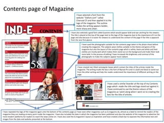
I have used the photographs suitable for the contents page taken in the photo-shoot before
creating the magazine. The subjects wear clothes suitable to the theme and genre of the
magazine but also the layout of the contents page which is white, black and white and their
clothes are mostly dark which makes them stand out on the background and make them look
more bold. In the process of editing I have increased the brightness and contrast of the
photographs to make the subjects appear more radiant.
I have created red, tilted rectangular boxes which contain the titles of the articles inside the
magazine. The writing inside the box is the font of Myriad Pro and it is bold and black to stand out
from the other writing and help the reader understand the importance of different writing on the
page.
I have repeated the logo of the magazine again onto the bottom of the contents page as I have seen other magazines such as Q magazine do, almost as a label to remind the readers of the
magazine they are reading at every point inside the magazine. I have also included the date in which the magazine has been published and also the website of the magazine to advertise the
more modern platforms for readers to reach the news online on. I have also used the Q magazine’s layout as inspiration and have created a black bar to separate the informative text and
images from the date and website presented at the bottom.
I have used a similar boarder at the top of my Contents
page which made the title and logo stand out against it.
I have continued to use the theme colours of the
magazine as I went along when I went on to creating the
bars for the title of articles.
2. I have chosen from a selection of images I have taken in the photo-
shoot of the particular subjects that I wanted to include inside my
Contents page. I have chosen the images bordered in red due to the
fact that they were not blurred, they were defined and bold. The
images had the suitable size to be included in the contents page and
had allowed me to place the images above the red boarders and
have parts of the subjects outside the box and colliding with other
boarders.
I have removed the green screen by
using the rubber tool on the Photoshop
software. I then chose the magic tool
and selected the subjects.
Furthermore, I continued by selecting
the option of ‘’ Select inverse’’ and
then dragged the image of the subjects
onto the Contents page where I have
adjusted the size of the images and
made sure that they are not stretched
or too small and pixelated. I wanted to
make sure that it is high definition.