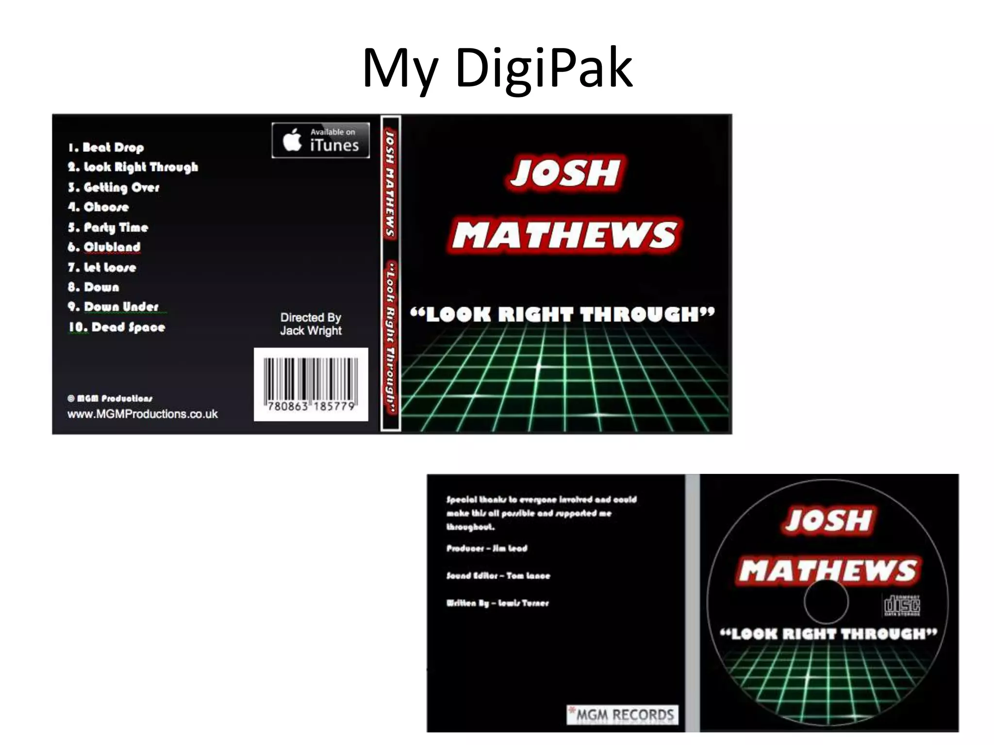
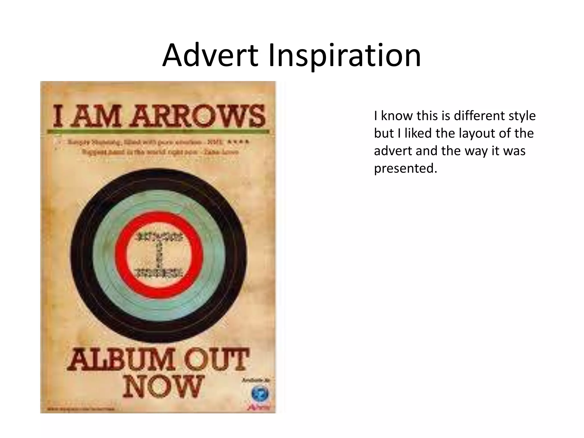
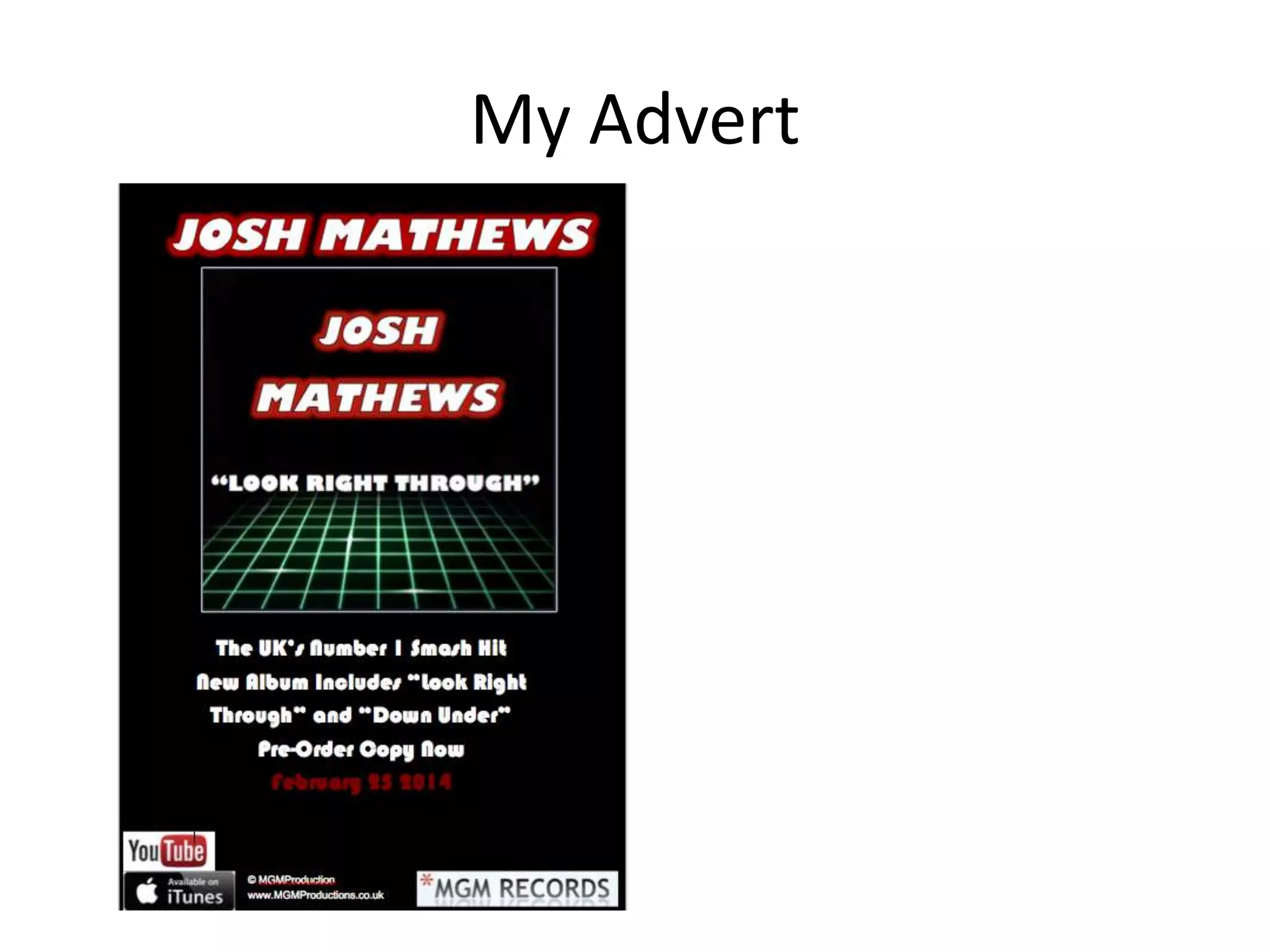
2. How effective is the combination
of your music video and the digipak
and magazine research?

By JACK KNIGHT
• So to start of with I did plenty of research about digipaks of
my genre and style of music video and the conventions
included for the music video. I also did a lot of research on
artist album adverts and from this I was able to see what
would look good on my advert. I've tried to do it so the
digipak and advert helped with the style of the music video
and I had tried to have them compliment each other. So for
the style of digipak it should have contesting colours which
stand out. This is same for the advert as well because the
advert has to help promote the album so the style needs to
be the same or very similar which is what I what I have gone
for. I have seen advert which have the similar style o mine
which is where I have got my inspiration from and tried to
develop the idea. It isn't as good as but I have tried to get it
similar style.
Inspiration for digipak
My DigiPak
• So for my digipak I decided to go for contrasting colours which
where green and reds because they work well together. I
decided not to include an image of the artist on the front
because I wanted mine to be different form others. I tried
challenging and developing the conventions without using
pictures. I also used a black background which helped the
colours stand out. When creating this I wanted it to be
different but noticeable and recognizable to the music video
but after creating I believe I could have done this better but at
the time of creating I really like the idea and design. Also my
inspiration for this style of digipak was from “David Guetta”
which is on the previous slide. I like how he used the affects
on the text which made it stand out which I tried to
implement on my own. To begin which I was going to use an
image but I thought I should challenge the conventions and
not use one.
Advert Inspiration
I know this is different style
but I liked the layout of the
advert and the way it was
presented.
My Advert
• So for my advert I decided I make it very similar to the digipak
style so it would show what the audience would get. I wanted
to keep this simple but good to look at. I think the advert its
good but if I was to do it again I would change it by adding an
image. I wouldn’t for the digipak but I for the advert I would
but I still think it look good. I have tried to follow the
conventions of an advert by keeping it sweet and simple and
not having a lot on the advert so people would like to read
and take an interest. I like how there isn't much space left on
the page so it looks well presented and doesn’t make people
turn there nose to it. I think I have done a good job and
presenting the advert to the audience and am happy with
what it turned out like.

Evaluation Question 3

  • 1.
    2. How effectiveis the combination of your music video and the digipak and magazine research? By JACK KNIGHT
  • 2.
    • So tostart of with I did plenty of research about digipaks of my genre and style of music video and the conventions included for the music video. I also did a lot of research on artist album adverts and from this I was able to see what would look good on my advert. I've tried to do it so the digipak and advert helped with the style of the music video and I had tried to have them compliment each other. So for the style of digipak it should have contesting colours which stand out. This is same for the advert as well because the advert has to help promote the album so the style needs to be the same or very similar which is what I what I have gone for. I have seen advert which have the similar style o mine which is where I have got my inspiration from and tried to develop the idea. It isn't as good as but I have tried to get it similar style.
  • 3.
  • 4.
  • 5.
    • So formy digipak I decided to go for contrasting colours which where green and reds because they work well together. I decided not to include an image of the artist on the front because I wanted mine to be different form others. I tried challenging and developing the conventions without using pictures. I also used a black background which helped the colours stand out. When creating this I wanted it to be different but noticeable and recognizable to the music video but after creating I believe I could have done this better but at the time of creating I really like the idea and design. Also my inspiration for this style of digipak was from “David Guetta” which is on the previous slide. I like how he used the affects on the text which made it stand out which I tried to implement on my own. To begin which I was going to use an image but I thought I should challenge the conventions and not use one.
  • 6.
    Advert Inspiration I knowthis is different style but I liked the layout of the advert and the way it was presented.
  • 7.
  • 8.
    • So formy advert I decided I make it very similar to the digipak style so it would show what the audience would get. I wanted to keep this simple but good to look at. I think the advert its good but if I was to do it again I would change it by adding an image. I wouldn’t for the digipak but I for the advert I would but I still think it look good. I have tried to follow the conventions of an advert by keeping it sweet and simple and not having a lot on the advert so people would like to read and take an interest. I like how there isn't much space left on the page so it looks well presented and doesn’t make people turn there nose to it. I think I have done a good job and presenting the advert to the audience and am happy with what it turned out like.