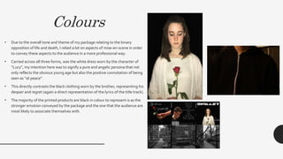
The combination of the main music video and ancillary texts like the album packaging was very effective in creating a strong brand identity for the band. Consistent fonts, colors, images, and iconography across all materials allowed audiences to easily identify the band's style and the themes of loss and grief associated with the album. Black was used to represent the stronger emotions while white symbolized purity. Images of a church and roses referenced the album's lyrics and themes in a sophisticated visual way. Audience feedback confirmed the promotional package successfully established the band's brand and genre.