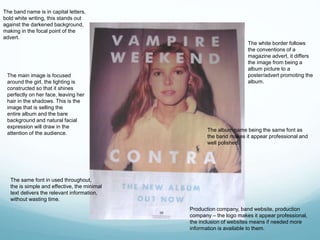
MAGAZINE ADVERT
RESEARCH
Jodie Turini
The band name is in capital letters,
bold white writing, this stands out
against the darkened background,
making in the focal point of the
advert.
The same font in used throughout,
the is simple and effective, the minimal
text delivers the relevant information,
without wasting time.
The album name being the same font as
the band makes it appear professional and
well polished.
Production company, band website, production
company – the logo makes it appear professional,
the inclusion of websites means if needed more
information is available to them.
The main image is focused
around the girl, the lighting is
constructed so that it shines
perfectly on her face, leaving her
hair in the shadows. This is the
image that is selling the
entire album and the bare
background and natural facial
expression will draw in the
attention of the audience.
The white border follows
the conventions of a
magazine advert, it differs
the image from being a
album picture to a
poster/advert promoting the
album.
Main picture of lead
singer, eyeliner and
facial expression
implies that is an rock
genre.
A review of the album,
shows it is a highly rated
professional album. Also,
includes some songs that
the album includes, sneak
peeks.
Links of how to find out
more information if
necessary.
A charity logo,
suggesting some of the
profits may go to
charity, this is unique
and could attract the
audience. It is a
humble symbol and
reflects the band.
Variety of texts used,
keeping the variety high
and makes it eye catching/
The text of the album
title is in dramatic
writing, implying a
rock/emo genre of
music.

Research maga

  • 1.
  • 2.
    The band nameis in capital letters, bold white writing, this stands out against the darkened background, making in the focal point of the advert. The same font in used throughout, the is simple and effective, the minimal text delivers the relevant information, without wasting time. The album name being the same font as the band makes it appear professional and well polished. Production company, band website, production company – the logo makes it appear professional, the inclusion of websites means if needed more information is available to them. The main image is focused around the girl, the lighting is constructed so that it shines perfectly on her face, leaving her hair in the shadows. This is the image that is selling the entire album and the bare background and natural facial expression will draw in the attention of the audience. The white border follows the conventions of a magazine advert, it differs the image from being a album picture to a poster/advert promoting the album.
  • 3.
    Main picture oflead singer, eyeliner and facial expression implies that is an rock genre. A review of the album, shows it is a highly rated professional album. Also, includes some songs that the album includes, sneak peeks. Links of how to find out more information if necessary. A charity logo, suggesting some of the profits may go to charity, this is unique and could attract the audience. It is a humble symbol and reflects the band. Variety of texts used, keeping the variety high and makes it eye catching/ The text of the album title is in dramatic writing, implying a rock/emo genre of music.