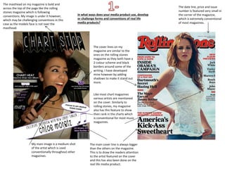
The masthead on my magazine is bold and
across the top of the page like the rolling
stones magazine which is following
conventions. My image is under it however,
which may be challenging conventions in this
case as the models face is not over the
masthead.
The cover lines on my
magazine are similar to the
ones on the rolling stones
magazine as they both have a
2-colour scheme and black
borders around some of the
writing. I have developed
mine however by adding
shadows to make it stand out
more.
My main image is a medium shot
of the artist which is used
conventionally throughout other
magazines.
Like most chart magazines
various artists are mentioned
on the cover. Similarly to
rolling stones, my magazine
also has this feature to show
their rank in the charts which
is conventional for most music
magazines.
The main cover line is always bigger
than the others on the magazine.
This is to draw the readers attention
to the artist featured on the cover
and this has also been done on the
real life media product.
in what ways does your media product use, develop
or challenge forms and conventions of real life
media products?
The date line, price and issue
number is featured very small in
the corner of the magazine,
which is extremely conventional
of most magazines.
I chose a consistent house style of lilac, black
and white to keep the magazine looking stylish
and sleek. Most music magazines use various
colours on their cover so my magazine may be
challenging conventions.
I chose to put a puff/pug
on my front cover
advertising a competition.
Pugs are used frequently
throughout music
magazines but always
include different types of
information. This makes
the magazine more
aesthetically pleasing and
fun.
The majority of music magazines have a
bold barcode on the front cover. I
included one on mine but faded it so it
doesn’t look too sharp and misplaced on
my front cover.
Many magazines have a
footer but I decided not
to include one as my
main cover line covers
the majority of the page
and I didn’t want to
make it look too busy.
The date line on my magazine is above the
barcode which is conventional for most
magazines.
Like most magazines the title on the page is ‘Contents’ to show
that it’s the page that all the information for the content of the
magazine will be shown on.
It is also a convention of
magazines to have
subheadings above the
information to order the
contents page and help
readers find the certain
information they are
looking for.
My magazine uses the
conventional idea of the
rule of thirds, the page
is layout in a convention
way as it follows this
rule and is sectioned
out neatly into three
columns.
Another convention is
to have an article and
another picture of the
front cover artist
featured on the
contents page.
Similarly to the real life media product my
magazine follows conventions as my picture of
the artist in the article takes up the whole left
side of the page with a puff in the top left
corner.
There is a drop cap at the beginning
of my article which is also a usual
convention of magazine articles.
Like most magazines I have ordered my
article into columns to make the layout
look neater and more precise.
If an artist is taking up the main story line of the magazine their
name would usually be placed over the picture to give publicity
for the artist. In this case I haven’t included that but instead my
magazines logo which may be seen as challenging conventions.
I have used two different colours in my main
article which are lilac and black; the ones I have
used as my house style throughout. I did this so
the readers can easily distinguish who is talking in
the article at each time – lilac being the questions
and black being the answers. This isn’t carried
out in a lot of magazines which could make it a
conventional feature to my specific magazine,

1 conventions

  • 1.
    The masthead onmy magazine is bold and across the top of the page like the rolling stones magazine which is following conventions. My image is under it however, which may be challenging conventions in this case as the models face is not over the masthead. The cover lines on my magazine are similar to the ones on the rolling stones magazine as they both have a 2-colour scheme and black borders around some of the writing. I have developed mine however by adding shadows to make it stand out more. My main image is a medium shot of the artist which is used conventionally throughout other magazines. Like most chart magazines various artists are mentioned on the cover. Similarly to rolling stones, my magazine also has this feature to show their rank in the charts which is conventional for most music magazines. The main cover line is always bigger than the others on the magazine. This is to draw the readers attention to the artist featured on the cover and this has also been done on the real life media product. in what ways does your media product use, develop or challenge forms and conventions of real life media products? The date line, price and issue number is featured very small in the corner of the magazine, which is extremely conventional of most magazines.
  • 2.
    I chose aconsistent house style of lilac, black and white to keep the magazine looking stylish and sleek. Most music magazines use various colours on their cover so my magazine may be challenging conventions. I chose to put a puff/pug on my front cover advertising a competition. Pugs are used frequently throughout music magazines but always include different types of information. This makes the magazine more aesthetically pleasing and fun. The majority of music magazines have a bold barcode on the front cover. I included one on mine but faded it so it doesn’t look too sharp and misplaced on my front cover. Many magazines have a footer but I decided not to include one as my main cover line covers the majority of the page and I didn’t want to make it look too busy. The date line on my magazine is above the barcode which is conventional for most magazines.
  • 3.
    Like most magazinesthe title on the page is ‘Contents’ to show that it’s the page that all the information for the content of the magazine will be shown on. It is also a convention of magazines to have subheadings above the information to order the contents page and help readers find the certain information they are looking for. My magazine uses the conventional idea of the rule of thirds, the page is layout in a convention way as it follows this rule and is sectioned out neatly into three columns. Another convention is to have an article and another picture of the front cover artist featured on the contents page.
  • 4.
    Similarly to thereal life media product my magazine follows conventions as my picture of the artist in the article takes up the whole left side of the page with a puff in the top left corner. There is a drop cap at the beginning of my article which is also a usual convention of magazine articles. Like most magazines I have ordered my article into columns to make the layout look neater and more precise. If an artist is taking up the main story line of the magazine their name would usually be placed over the picture to give publicity for the artist. In this case I haven’t included that but instead my magazines logo which may be seen as challenging conventions.
  • 5.
    I have usedtwo different colours in my main article which are lilac and black; the ones I have used as my house style throughout. I did this so the readers can easily distinguish who is talking in the article at each time – lilac being the questions and black being the answers. This isn’t carried out in a lot of magazines which could make it a conventional feature to my specific magazine,