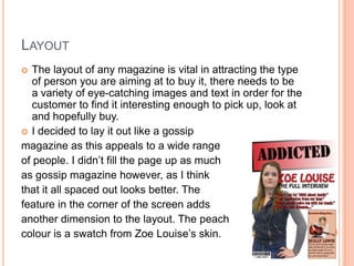
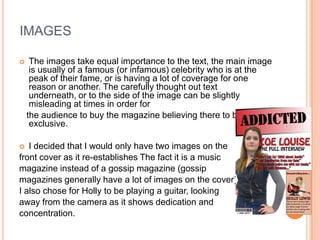
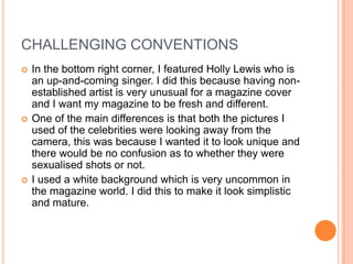
1) IN WHAT WAYS DOES YOUR MEDIA
PRODUCT USE, DEVELOP OR
CHALLENGE FORMS AND
CONVENTIONS OF REAL MEDIA
PRODUCTS?
CODES AND CONVENTIONS
 My media product was a music magazine. I first
  researched codes and conventions of all
  magazines and figured out that one of the most
  important thing for a magazine is the layout and
  from this, the text and images.
 I used Conventions of existing magazines as well
  as challenging them, so it could be identified as
  similar to other products but different enough to be
  individual.
 I had a barcode and price on the front cover as this
  is an existing convention that can’t really be altered.
LAYOUT
  The layout of any magazine is vital in attracting the type
   of person you are aiming at to buy it, there needs to be
   a variety of eye-catching images and text in order for the
   customer to find it interesting enough to pick up, look at
   and hopefully buy.
 I decided to lay it out like a gossip
magazine as this appeals to a wide range
of people. I didn’t fill the page up as much
as gossip magazine however, as I think
that it all spaced out looks better. The
feature in the corner of the screen adds
another dimension to the layout. The peach
colour is a swatch from Zoe Louise’s skin.
IMAGES

    The images take equal importance to the text, the main image
     is usually of a famous (or infamous) celebrity who is at the
     peak of their fame, or is having a lot of coverage for one
     reason or another. The carefully thought out text
     underneath, or to the side of the image can be slightly
     misleading at times in order for
    the audience to buy the magazine believing there to be an
     exclusive.

  I decided that I would only have two images on the
front cover as it re-establishes The fact it is a music
magazine instead of a gossip magazine (gossip
magazines generally have a lot of images on the cover).
I also chose for Holly to be playing a guitar, looking
away from the camera as it shows dedication and
concentration.
TEXT
   The text is the main lure for any magazine cover.
    The colour of the font is sometimes in keeping with
    the overall colour schemes and sometimes
    contrasts to create an intense and eye-catching
    look.
 I decided to go for a red and black colour

scheme as they are very dynamic,
eye-catching looks. The text was displayed
over the image to include layering and make
it look more professional.
 For the font, I used Stencil std for the title

and Hobo std for the for the exclusive.
I used a masthead at the top of the page so the
    audience could distinguish the magazine
    immediately.
Double Page Spread
   In my double page spread, I decided to use a four-
    column grid in order to make it look more
    professional and in keeping with other magazines.

   I also capitalised the first letter of the article as
    nearly all other magazines do.

   The same border used in the front cover and
    contents page was used in the double page as this
    creates brand identity, which makes it easier for the
    reader to distinguish the magazine.
CHALLENGING CONVENTIONS
   In the bottom right corner, I featured Holly Lewis who is
    an up-and-coming singer. I did this because having non-
    established artist is very unusual for a magazine cover
    and I want my magazine to be fresh and different.
   One of the main differences is that both the pictures I
    used of the celebrities were looking away from the
    camera, this was because I wanted it to look unique and
    there would be no confusion as to whether they were
    sexualised shots or not.
   I used a white background which is very uncommon in
    the magazine world. I did this to make it look simplistic
    and mature.

Evaluation question 1

  • 1.
    1) IN WHATWAYS DOES YOUR MEDIA PRODUCT USE, DEVELOP OR CHALLENGE FORMS AND CONVENTIONS OF REAL MEDIA PRODUCTS?
  • 2.
    CODES AND CONVENTIONS My media product was a music magazine. I first researched codes and conventions of all magazines and figured out that one of the most important thing for a magazine is the layout and from this, the text and images.  I used Conventions of existing magazines as well as challenging them, so it could be identified as similar to other products but different enough to be individual.  I had a barcode and price on the front cover as this is an existing convention that can’t really be altered.
  • 3.
    LAYOUT  Thelayout of any magazine is vital in attracting the type of person you are aiming at to buy it, there needs to be a variety of eye-catching images and text in order for the customer to find it interesting enough to pick up, look at and hopefully buy.  I decided to lay it out like a gossip magazine as this appeals to a wide range of people. I didn’t fill the page up as much as gossip magazine however, as I think that it all spaced out looks better. The feature in the corner of the screen adds another dimension to the layout. The peach colour is a swatch from Zoe Louise’s skin.
  • 4.
    IMAGES  The images take equal importance to the text, the main image is usually of a famous (or infamous) celebrity who is at the peak of their fame, or is having a lot of coverage for one reason or another. The carefully thought out text underneath, or to the side of the image can be slightly misleading at times in order for the audience to buy the magazine believing there to be an exclusive.  I decided that I would only have two images on the front cover as it re-establishes The fact it is a music magazine instead of a gossip magazine (gossip magazines generally have a lot of images on the cover). I also chose for Holly to be playing a guitar, looking away from the camera as it shows dedication and concentration.
  • 5.
    TEXT  The text is the main lure for any magazine cover. The colour of the font is sometimes in keeping with the overall colour schemes and sometimes contrasts to create an intense and eye-catching look.  I decided to go for a red and black colour scheme as they are very dynamic, eye-catching looks. The text was displayed over the image to include layering and make it look more professional.  For the font, I used Stencil std for the title and Hobo std for the for the exclusive. I used a masthead at the top of the page so the audience could distinguish the magazine immediately.
  • 6.
    Double Page Spread  In my double page spread, I decided to use a four- column grid in order to make it look more professional and in keeping with other magazines.  I also capitalised the first letter of the article as nearly all other magazines do.  The same border used in the front cover and contents page was used in the double page as this creates brand identity, which makes it easier for the reader to distinguish the magazine.
  • 7.
    CHALLENGING CONVENTIONS  In the bottom right corner, I featured Holly Lewis who is an up-and-coming singer. I did this because having non- established artist is very unusual for a magazine cover and I want my magazine to be fresh and different.  One of the main differences is that both the pictures I used of the celebrities were looking away from the camera, this was because I wanted it to look unique and there would be no confusion as to whether they were sexualised shots or not.  I used a white background which is very uncommon in the magazine world. I did this to make it look simplistic and mature.