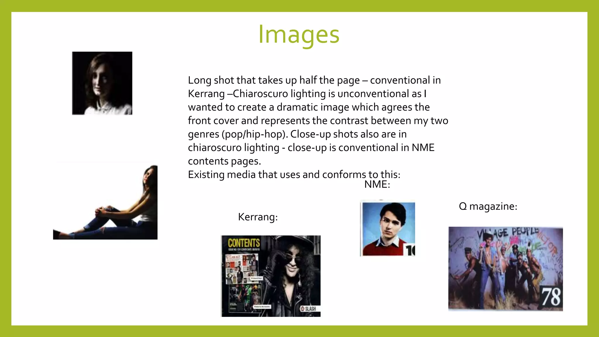
This document analyzes how the media product both uses conventions from real magazines as well as challenges conventions. It discusses how the front cover uses conventions like a masthead, anchor text, and pull quote from magazines like NME and Q Magazine. However, it also challenges conventions through the use of a black, white, and navy color scheme and unconventional lighting in the main image. The contents page similarly both uses numbering and column conventions while also challenging conventions through an unconventional masthead font and inclusion of social media links and competitions. Double page spreads also combine conventional layouts, images, and text styles seen in magazines like Q and Kerrang with some unconventional design elements.