Harry Butler // Q1
'In what ways does your media product use, develop or
challenge forms and conventions of real media products?'
DIGIPAK
Before creating my own digipak, I undertook both research and planning.
During this process I looked at and analysed a number of existing digipaks in
order to develop a better understanding of what 'real' products look like.
I went for a simplistic style to the whole of my digipak, which does conform
with many existing products. This choice of design was inspired by digipaks
such as 'XX' by The XX and 'Lost Sirens' by New Order, which both take a
very minimalist approach to the design used for their front covers. I wanted to
incorporate this style into my digipak as I felt it would fit well with the genre
of music I selected (electro-soul) and would be more aesthetically pleasing for
my audience to look at instead of a more complex design. The main feature of
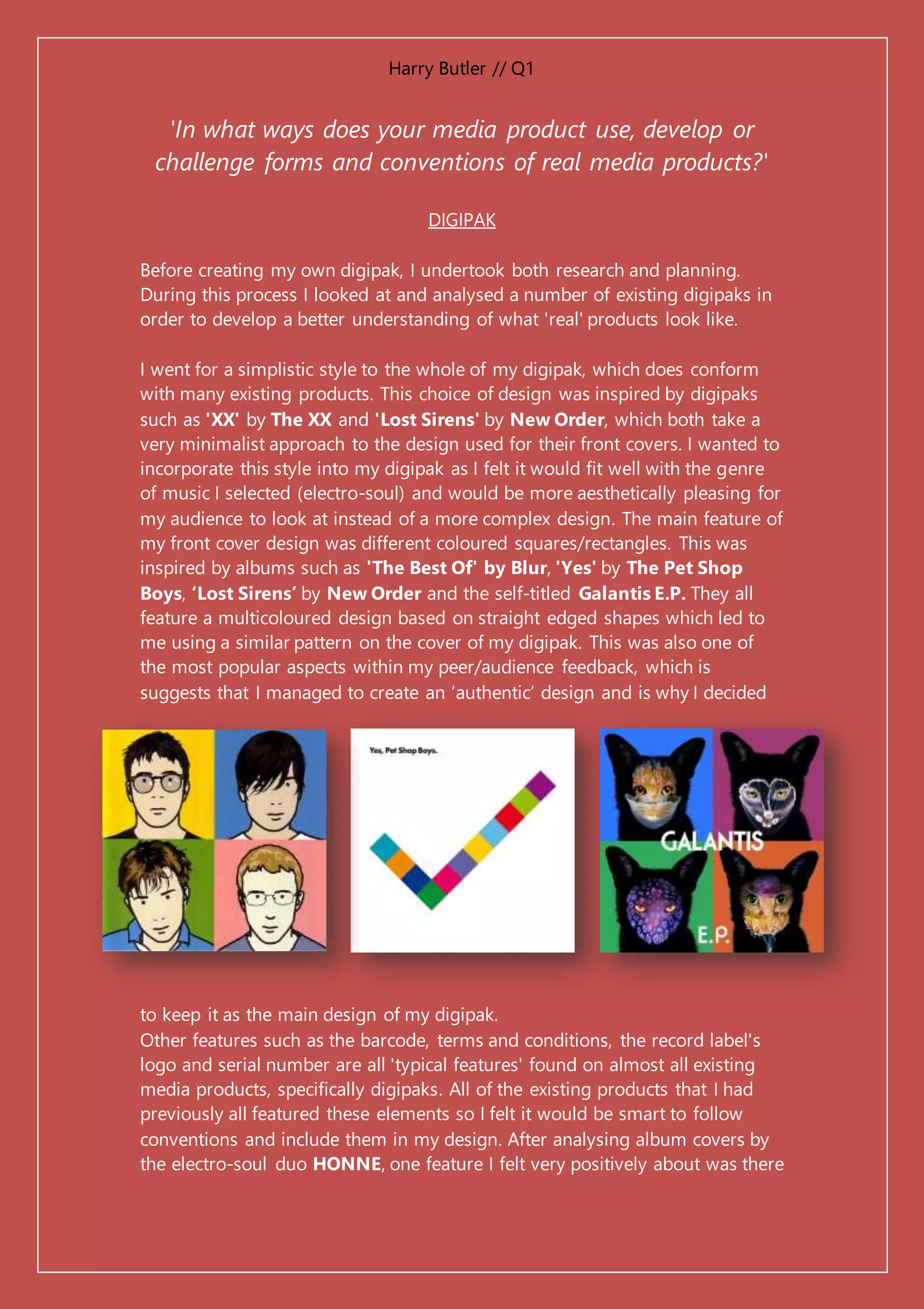
my front cover design was different coloured squares/rectangles. This was
inspired by albums such as 'The Best Of' by Blur, 'Yes' by The Pet Shop
Boys, ‘Lost Sirens’ by New Order and the self-titled Galantis E.P. They all
feature a multicoloured design based on straight edged shapes which led to
me using a similar pattern on the cover of my digipak. This was also one of
the most popular aspects within my peer/audience feedback, which is
suggests that I managed to create an ‘authentic’ design and is why I decided
to keep it as the main design of my digipak.
Other features such as the barcode, terms and conditions, the record label's
logo and serial number are all 'typical features' found on almost all existing
media products, specifically digipaks. All of the existing products that I had
previously all featured these elements so I felt it would be smart to follow
conventions and include them in my design. After analysing album covers by
the electro-soul duo HONNE, one feature I felt very positively about was there
Harry Butler // Q1
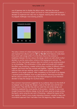
use of Japanese text to display the album name. I felt that this was an
interesting and uncommon aspect not found on many professional products. I
decided to implement this idea into my digipak meaning that, with this aspect,
my digipak challenges most existing products.
The colour scheme of a black background with all white text is very common
and inspired from albums such as 'XX' by The XX which features a fully black
front cover with a large white 'X' on the front. Due to the contrast in
brightness between the two colours the design stands out well, which is why I
decided to use the same colour scheme of the background and text. The
colour for the main design however does not conform to any existing product
to my knowledge. The combination of blue, green and purple with a pastel-
like effect was something I created whilst trying a number of different colours
together and found that they worked well together. Together the colours I
used are clear and eye catching, which is ideal when trying to gain the
attention of my target audience. After completing my first draft of my digipak,
I received positive feedback from my peer/audience informing me that they
felt the colours worked well on top of the black background and I therefore
decided to keep this design for my final version.
One common improvement suggested by my audience about my first draft of
my digipak was to change the designs I used on the left cover and the two
inside covers. They felt that they did not match the rest of the design and
therefore weakened the visual quality of the product. I decided to use a very
straight forward but effective design on the left cover panel by simply writing
the band’s name using the text tool in Photoshop. I altered the layout of the
text slightly to make it more visualy interesting however I wanted to keep with
minimalistic approach that I had taken from the beginning. After researching
Harry Butler // Q1
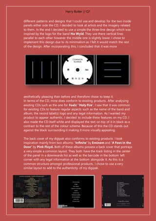
different patterns and designs that I could use and develop for the two inside
panels either side the CD, I decided to look at artists and the imagery related
to them. In the end I decided to use a simple the three-line design which was
inspired by the logo for the band No Wyld. They use there vertical lines
parallel to each other however the middle one is slightly lower. I chose to
implement this design due to its minimalism as I felt it would match the rest
of the design. After incorporating this, I concluded that it was more
aesthetically pleasing than before and therefore chose to keep it.
In terms of the CD, mine does conform to existing products. After analysing
existing CDs such as the one for Foals’ ‘Holy Fire’, I saw that it was common
for existing CDs to feature regular aspects such as the name of the band and
album, the record label(s) logo and any legal information. As I wanted my
product to appear authentic, I decided to include these features on my CD. I
also made the CD itself white and displayed the text on top of it in black as a
contrast to the rest of the colour scheme. Because of this the CD stands out
against the black surrounding it making it more visually appealing.
The back cover of my digipak also conforms to existing products. I took
inspiration mainly from two albums: ‘Infinite’ by Eminem and ‘A Foot in the
Door’ by Pink Floyd. Both of these albums possess a back cover that portrays
a very simple a common layout. They both have the track listing in the center
of the panel in a downwards list as well as the barcode in the bottom left
corner with any legal information at the bottom alongside it. As this is a
common structure amongst professional products, I chose to use a very
similar layout to add to the authenticity of my digipak.
Harry Butler // Q1
MAGAZINE ADVERT
Similarly to my digipak, before creating my magazine advert I researched into
and analysed a number of existing products to see what features and designs
are common with 'real' adverts.
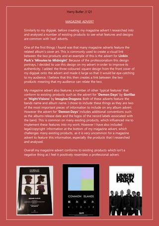
One of the first things I found was that many magazine adverts feature the
related album's cover art. This is commonly used to create a visual link
between the two products and an example of this is the advert for Linkin
Park’s ‘Minutes to Midnight’. Because of the professionalism this design
portrays, I decided to use this design on my advert in order to improve its
authenticity. I added the three-coloured square design from the front cover of
my digipak onto the advert and made it large so that it would be eye-catching
to my audience. I believe that this then creates a link between the two
products meaning that my audience can relate the two.
My magazine advert also features a number of other 'typical features' that
conform to existing products such as the advert for 'Demon Days' by Gorillaz
or 'Night Visions' by Imagine Dragons. Both of these adverts feature the
bands name and album name. I chose to include these things as they are two
of the most important pieces of information to include on any album advert.
However the advert for 'Demon Days' includes additional conventions such
as the albums release date and the logos of the record labels associated with
the band. This is common on many existing products, which influenced me to
implement these features into my work. However I have also included
legal/copyright information at the bottom of my magazine advert, which
challenges many existing products, as it is very uncommon for a magazine
advert to feature this information, especially the products that I researched
and analysed.
Overall my magazine advert conforms to existing products which isn't a
negative thing as I feel it positively resembles a professional advert.
Harry Butler // Q1
MUSIC VIDEO
Throughout the entire research and planning stage, I looked at a number of
existing music videos in order to seek inspiration and ideas that I could
directly use or adapt for my final music video. Many of features of my video
come about due to this process whereas others challenge the conventions of
existing videos.
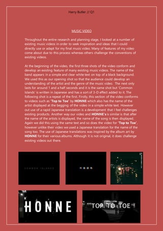
At the beginning of the video, the first three shots of the video conform and
develop an existing feature of many existing music videos. The name of the
band appears in a simple and clear white text on top of a black background.
We used this as our opening shot so that the audience could develop an
understanding of the artist and the genre of the music video. The next only
lasts for around 1 and a half seconds and it is the same shot but ‘Common
Islands’ is written in Japanese and has a sort of 3-D effect added to it. The
following shot is a repeat of the first. Firstly, this section of the video conforms
to videos such as ‘Top to Toe’ by HONNE which also has the name of the
artist displayed at the begging of the video in a simple white text. However
out use of a rapid Japanese translation is a development that I feel challenges
existing products. Another way our video and HONNE’s is similar is that after
the name of the artists is displayed, the name of the song is then displayed.
Again we did this using the same text and so does the video for ‘Top to Toe’,
however unlike their video we used a Japanese translation for the name of the
song too. The use of Japanese translations was inspired by the album art by
HONNE for their various albums. Although it is not original, it does challenge
existing videos out there.
Harry Butler // Q1
One video that largely influenced our final video was the video for Tom
Odell's 'Another Love'. The video consists of the artist sat in a chair singing
the entirety of the song whilst making constant eye contact with the camera
as it pans in and out. Our video conforms to this as the one of the
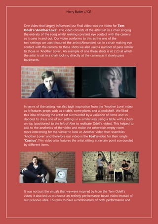
two settings we used featured the artist (Alexander) sat in a chair making eye
contact with the camera. In these shots we also used a number of pans similar
to those in ‘Another Lover’. An example of one these shots is at 2:23 at which
the artist is sat in a chair looking directly at the camera as it slowly pans
backwards.
In terms of the setting, we also took inspiration from the 'Another Love' video
as it features props such as a table, some plants and a bookshelf. We liked
this idea of having the artist sat surrounded by a variation of items and so
decided to dress one of our settings in a similar way using a table with a clock
on top (positioned to the left of Alex to replicate Odell's video). This helped to
add to the aesthetics of the video and make the otherwise empty room
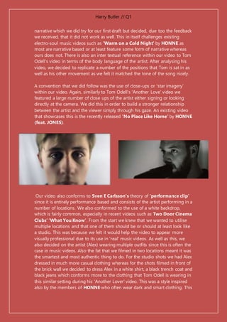
more interesting for the viewer to look at. Another video that resembles
‘Another Lover’ and therefore our video is the Foal’s video for their single
‘Cassius’. This video also features the artist sitting at certain point surrounded
by different items.
It was not just the visuals that we were inspired by from the Tom Odell’s
video, it also led us to choose an entirely performance based video instead of
our previous idea. This was to have a combination of both performance and
Harry Butler // Q1
narrative which we did try for our first draft but decided, due too the feedback
we received, that it did not work as well. This in itself challenges existing
electro-soul music videos such as 'Warm on a Cold Night' by HONNE as
most are narrative based or at least feature some form of narrative whereas
ours does not. There is also an inter textual reference within our video to Tom
Odell's video in terms of the body language of the artist. After analysing his
video, we decided to replicate a number of the positions that Tom is sat in as
well as his other movement as we felt it matched the tone of the song nicely.
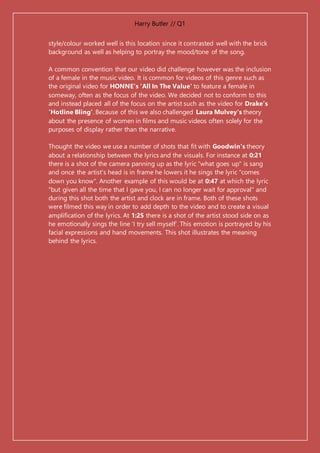
A convention that we did follow was the use of close-ups or 'star imagery'
within our video. Again, similarly to Tom Odell's 'Another Love' video we
featured a large number of close ups of the artist either signing or looking
directly at the camera. We did this in order to build a stronger relationship
between the artist and the viewer simply through his gaze. An existing video
that showcases this is the recently released 'No Place Like Home' by HONNE
(feat. JONES).
Our video also conforms to Sven E Carlsson's theory of 'performance clip'
since it is entirely performance based and consists of the artist performing in a
number of locations. We also conformed to the use of a white backdrop,
which is fairly common, especially in recent videos such as Two Door Cinema
Clubs’ ‘What You Know’. From the start we knew that we wanted to utilise
multiple locations and that one of them should be or should at least look like
a studio. This was because we felt it would help the video to appear more
visually professional due to its use in 'real' music videos. As well as this, we
also decided on the artist (Alex) wearing multiple outfits since this is often the
case in music videos. Also the fat that we filmed in two locations meant it was
the smartest and most authentic thing to do. For the studio shots we had Alex
dressed in much more casual clothing whereas for the shots filmed in front of
the brick wall we decided to dress Alex in a white shirt, a black trench coat and
black jeans which conforms more to the clothing that Tom Odell is wearing in
this similar setting during his 'Another Lover' video. This was a style inspired
also by the members of HONNE who often wear dark and smart clothing. This
Harry Butler // Q1
style/colour worked well is this location since it contrasted well with the brick
background as well as helping to portray the mood/tone of the song.
A common convention that our video did challenge however was the inclusion
of a female in the music video. It is common for videos of this genre such as
the original video for HONNE's 'All In The Value' to feature a female in
someway, often as the focus of the video. We decided not to conform to this
and instead placed all of the focus on the artist such as the video for Drake’s
‘Hotline Bling’. Because of this we also challenged Laura Mulvey's theory
about the presence of women in films and music videos often solely for the
purposes of display rather than the narrative.
Thought the video we use a number of shots that fit with Goodwin's theory
about a relationship between the lyrics and the visuals. For instance at 0:21
there is a shot of the camera panning up as the lyric "what goes up" is sang
and once the artist's head is in frame he lowers it he sings the lyric "comes
down you know". Another example of this would be at 0:47 at which the lyric
"but given all the time that I gave you, I can no longer wait for approval" and
during this shot both the artist and clock are in frame. Both of these shots
were filmed this way in order to add depth to the video and to create a visual
amplification of the lyrics. At 1:25 there is a shot of the artist stood side on as
he emotionally sings the line ‘I try sell myself’. This emotion is portrayed by his
facial expressions and hand movements. This shot illustrates the meaning
behind the lyrics.

Evaluation Question 1

  • 1.
    Harry Butler //Q1 'In what ways does your media product use, develop or challenge forms and conventions of real media products?' DIGIPAK Before creating my own digipak, I undertook both research and planning. During this process I looked at and analysed a number of existing digipaks in order to develop a better understanding of what 'real' products look like. I went for a simplistic style to the whole of my digipak, which does conform with many existing products. This choice of design was inspired by digipaks such as 'XX' by The XX and 'Lost Sirens' by New Order, which both take a very minimalist approach to the design used for their front covers. I wanted to incorporate this style into my digipak as I felt it would fit well with the genre of music I selected (electro-soul) and would be more aesthetically pleasing for my audience to look at instead of a more complex design. The main feature of my front cover design was different coloured squares/rectangles. This was inspired by albums such as 'The Best Of' by Blur, 'Yes' by The Pet Shop Boys, ‘Lost Sirens’ by New Order and the self-titled Galantis E.P. They all feature a multicoloured design based on straight edged shapes which led to me using a similar pattern on the cover of my digipak. This was also one of the most popular aspects within my peer/audience feedback, which is suggests that I managed to create an ‘authentic’ design and is why I decided to keep it as the main design of my digipak. Other features such as the barcode, terms and conditions, the record label's logo and serial number are all 'typical features' found on almost all existing media products, specifically digipaks. All of the existing products that I had previously all featured these elements so I felt it would be smart to follow conventions and include them in my design. After analysing album covers by the electro-soul duo HONNE, one feature I felt very positively about was there
  • 2.
    Harry Butler //Q1 use of Japanese text to display the album name. I felt that this was an interesting and uncommon aspect not found on many professional products. I decided to implement this idea into my digipak meaning that, with this aspect, my digipak challenges most existing products. The colour scheme of a black background with all white text is very common and inspired from albums such as 'XX' by The XX which features a fully black front cover with a large white 'X' on the front. Due to the contrast in brightness between the two colours the design stands out well, which is why I decided to use the same colour scheme of the background and text. The colour for the main design however does not conform to any existing product to my knowledge. The combination of blue, green and purple with a pastel- like effect was something I created whilst trying a number of different colours together and found that they worked well together. Together the colours I used are clear and eye catching, which is ideal when trying to gain the attention of my target audience. After completing my first draft of my digipak, I received positive feedback from my peer/audience informing me that they felt the colours worked well on top of the black background and I therefore decided to keep this design for my final version. One common improvement suggested by my audience about my first draft of my digipak was to change the designs I used on the left cover and the two inside covers. They felt that they did not match the rest of the design and therefore weakened the visual quality of the product. I decided to use a very straight forward but effective design on the left cover panel by simply writing the band’s name using the text tool in Photoshop. I altered the layout of the text slightly to make it more visualy interesting however I wanted to keep with minimalistic approach that I had taken from the beginning. After researching
  • 3.
    Harry Butler //Q1 different patterns and designs that I could use and develop for the two inside panels either side the CD, I decided to look at artists and the imagery related to them. In the end I decided to use a simple the three-line design which was inspired by the logo for the band No Wyld. They use there vertical lines parallel to each other however the middle one is slightly lower. I chose to implement this design due to its minimalism as I felt it would match the rest of the design. After incorporating this, I concluded that it was more aesthetically pleasing than before and therefore chose to keep it. In terms of the CD, mine does conform to existing products. After analysing existing CDs such as the one for Foals’ ‘Holy Fire’, I saw that it was common for existing CDs to feature regular aspects such as the name of the band and album, the record label(s) logo and any legal information. As I wanted my product to appear authentic, I decided to include these features on my CD. I also made the CD itself white and displayed the text on top of it in black as a contrast to the rest of the colour scheme. Because of this the CD stands out against the black surrounding it making it more visually appealing. The back cover of my digipak also conforms to existing products. I took inspiration mainly from two albums: ‘Infinite’ by Eminem and ‘A Foot in the Door’ by Pink Floyd. Both of these albums possess a back cover that portrays a very simple a common layout. They both have the track listing in the center of the panel in a downwards list as well as the barcode in the bottom left corner with any legal information at the bottom alongside it. As this is a common structure amongst professional products, I chose to use a very similar layout to add to the authenticity of my digipak.
  • 4.
    Harry Butler //Q1 MAGAZINE ADVERT Similarly to my digipak, before creating my magazine advert I researched into and analysed a number of existing products to see what features and designs are common with 'real' adverts. One of the first things I found was that many magazine adverts feature the related album's cover art. This is commonly used to create a visual link between the two products and an example of this is the advert for Linkin Park’s ‘Minutes to Midnight’. Because of the professionalism this design portrays, I decided to use this design on my advert in order to improve its authenticity. I added the three-coloured square design from the front cover of my digipak onto the advert and made it large so that it would be eye-catching to my audience. I believe that this then creates a link between the two products meaning that my audience can relate the two. My magazine advert also features a number of other 'typical features' that conform to existing products such as the advert for 'Demon Days' by Gorillaz or 'Night Visions' by Imagine Dragons. Both of these adverts feature the bands name and album name. I chose to include these things as they are two of the most important pieces of information to include on any album advert. However the advert for 'Demon Days' includes additional conventions such as the albums release date and the logos of the record labels associated with the band. This is common on many existing products, which influenced me to implement these features into my work. However I have also included legal/copyright information at the bottom of my magazine advert, which challenges many existing products, as it is very uncommon for a magazine advert to feature this information, especially the products that I researched and analysed. Overall my magazine advert conforms to existing products which isn't a negative thing as I feel it positively resembles a professional advert.
  • 5.
    Harry Butler //Q1 MUSIC VIDEO Throughout the entire research and planning stage, I looked at a number of existing music videos in order to seek inspiration and ideas that I could directly use or adapt for my final music video. Many of features of my video come about due to this process whereas others challenge the conventions of existing videos. At the beginning of the video, the first three shots of the video conform and develop an existing feature of many existing music videos. The name of the band appears in a simple and clear white text on top of a black background. We used this as our opening shot so that the audience could develop an understanding of the artist and the genre of the music video. The next only lasts for around 1 and a half seconds and it is the same shot but ‘Common Islands’ is written in Japanese and has a sort of 3-D effect added to it. The following shot is a repeat of the first. Firstly, this section of the video conforms to videos such as ‘Top to Toe’ by HONNE which also has the name of the artist displayed at the begging of the video in a simple white text. However out use of a rapid Japanese translation is a development that I feel challenges existing products. Another way our video and HONNE’s is similar is that after the name of the artists is displayed, the name of the song is then displayed. Again we did this using the same text and so does the video for ‘Top to Toe’, however unlike their video we used a Japanese translation for the name of the song too. The use of Japanese translations was inspired by the album art by HONNE for their various albums. Although it is not original, it does challenge existing videos out there.
  • 6.
    Harry Butler //Q1 One video that largely influenced our final video was the video for Tom Odell's 'Another Love'. The video consists of the artist sat in a chair singing the entirety of the song whilst making constant eye contact with the camera as it pans in and out. Our video conforms to this as the one of the two settings we used featured the artist (Alexander) sat in a chair making eye contact with the camera. In these shots we also used a number of pans similar to those in ‘Another Lover’. An example of one these shots is at 2:23 at which the artist is sat in a chair looking directly at the camera as it slowly pans backwards. In terms of the setting, we also took inspiration from the 'Another Love' video as it features props such as a table, some plants and a bookshelf. We liked this idea of having the artist sat surrounded by a variation of items and so decided to dress one of our settings in a similar way using a table with a clock on top (positioned to the left of Alex to replicate Odell's video). This helped to add to the aesthetics of the video and make the otherwise empty room more interesting for the viewer to look at. Another video that resembles ‘Another Lover’ and therefore our video is the Foal’s video for their single ‘Cassius’. This video also features the artist sitting at certain point surrounded by different items. It was not just the visuals that we were inspired by from the Tom Odell’s video, it also led us to choose an entirely performance based video instead of our previous idea. This was to have a combination of both performance and
  • 7.
    Harry Butler //Q1 narrative which we did try for our first draft but decided, due too the feedback we received, that it did not work as well. This in itself challenges existing electro-soul music videos such as 'Warm on a Cold Night' by HONNE as most are narrative based or at least feature some form of narrative whereas ours does not. There is also an inter textual reference within our video to Tom Odell's video in terms of the body language of the artist. After analysing his video, we decided to replicate a number of the positions that Tom is sat in as well as his other movement as we felt it matched the tone of the song nicely. A convention that we did follow was the use of close-ups or 'star imagery' within our video. Again, similarly to Tom Odell's 'Another Love' video we featured a large number of close ups of the artist either signing or looking directly at the camera. We did this in order to build a stronger relationship between the artist and the viewer simply through his gaze. An existing video that showcases this is the recently released 'No Place Like Home' by HONNE (feat. JONES). Our video also conforms to Sven E Carlsson's theory of 'performance clip' since it is entirely performance based and consists of the artist performing in a number of locations. We also conformed to the use of a white backdrop, which is fairly common, especially in recent videos such as Two Door Cinema Clubs’ ‘What You Know’. From the start we knew that we wanted to utilise multiple locations and that one of them should be or should at least look like a studio. This was because we felt it would help the video to appear more visually professional due to its use in 'real' music videos. As well as this, we also decided on the artist (Alex) wearing multiple outfits since this is often the case in music videos. Also the fat that we filmed in two locations meant it was the smartest and most authentic thing to do. For the studio shots we had Alex dressed in much more casual clothing whereas for the shots filmed in front of the brick wall we decided to dress Alex in a white shirt, a black trench coat and black jeans which conforms more to the clothing that Tom Odell is wearing in this similar setting during his 'Another Lover' video. This was a style inspired also by the members of HONNE who often wear dark and smart clothing. This
  • 8.
    Harry Butler //Q1 style/colour worked well is this location since it contrasted well with the brick background as well as helping to portray the mood/tone of the song. A common convention that our video did challenge however was the inclusion of a female in the music video. It is common for videos of this genre such as the original video for HONNE's 'All In The Value' to feature a female in someway, often as the focus of the video. We decided not to conform to this and instead placed all of the focus on the artist such as the video for Drake’s ‘Hotline Bling’. Because of this we also challenged Laura Mulvey's theory about the presence of women in films and music videos often solely for the purposes of display rather than the narrative. Thought the video we use a number of shots that fit with Goodwin's theory about a relationship between the lyrics and the visuals. For instance at 0:21 there is a shot of the camera panning up as the lyric "what goes up" is sang and once the artist's head is in frame he lowers it he sings the lyric "comes down you know". Another example of this would be at 0:47 at which the lyric "but given all the time that I gave you, I can no longer wait for approval" and during this shot both the artist and clock are in frame. Both of these shots were filmed this way in order to add depth to the video and to create a visual amplification of the lyrics. At 1:25 there is a shot of the artist stood side on as he emotionally sings the line ‘I try sell myself’. This emotion is portrayed by his facial expressions and hand movements. This shot illustrates the meaning behind the lyrics.