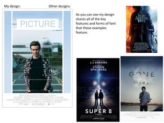
The document provides an analysis of the trailer created by the student for their media product. The trailer uses several cinematic conventions including beginning in a disoriented way to match how the audience will feel, keeping the antagonist mysterious, and showing fragments of the protagonist's life to build empathy. It also leaves some elements ambiguous using the "enigma code" to further intrigue audiences. The trailer was edited together using techniques like transitions, sound mixing, and After Effects. Elements like costumes, cinematography, and sound were chosen deliberately to signify meanings and build suspense. The accompanying poster and magazine cover were designed to be consistent with the trailer and use standard conventions like prominent text sizes and placements.
Analysis of similar texts in the thriller genrebobonthedrums
This is used for my As Media research so I can have a greater understanding of common conventions within thriller movies and how I can apply them to my own production
Welcome to TechSoup New Member Orientation and Q&A (May 2024).pdfTechSoup
In this webinar you will learn how your organization can access TechSoup's wide variety of product discount and donation programs. From hardware to software, we'll give you a tour of the tools available to help your nonprofit with productivity, collaboration, financial management, donor tracking, security, and more.
Operation “Blue Star” is the only event in the history of Independent India where the state went into war with its own people. Even after about 40 years it is not clear if it was culmination of states anger over people of the region, a political game of power or start of dictatorial chapter in the democratic setup.
The people of Punjab felt alienated from main stream due to denial of their just demands during a long democratic struggle since independence. As it happen all over the word, it led to militant struggle with great loss of lives of military, police and civilian personnel. Killing of Indira Gandhi and massacre of innocent Sikhs in Delhi and other India cities was also associated with this movement.
How to Make a Field invisible in Odoo 17Celine George
It is possible to hide or invisible some fields in odoo. Commonly using “invisible” attribute in the field definition to invisible the fields. This slide will show how to make a field invisible in odoo 17.
How to Split Bills in the Odoo 17 POS ModuleCeline George
Bills have a main role in point of sale procedure. It will help to track sales, handling payments and giving receipts to customers. Bill splitting also has an important role in POS. For example, If some friends come together for dinner and if they want to divide the bill then it is possible by POS bill splitting. This slide will show how to split bills in odoo 17 POS.
This is a presentation by Dada Robert in a Your Skill Boost masterclass organised by the Excellence Foundation for South Sudan (EFSS) on Saturday, the 25th and Sunday, the 26th of May 2024.
He discussed the concept of quality improvement, emphasizing its applicability to various aspects of life, including personal, project, and program improvements. He defined quality as doing the right thing at the right time in the right way to achieve the best possible results and discussed the concept of the "gap" between what we know and what we do, and how this gap represents the areas we need to improve. He explained the scientific approach to quality improvement, which involves systematic performance analysis, testing and learning, and implementing change ideas. He also highlighted the importance of client focus and a team approach to quality improvement.
Read| The latest issue of The Challenger is here! We are thrilled to announce that our school paper has qualified for the NATIONAL SCHOOLS PRESS CONFERENCE (NSPC) 2024. Thank you for your unwavering support and trust. Dive into the stories that made us stand out!
Synthetic Fiber Construction in lab .pptxPavel ( NSTU)
Synthetic fiber production is a fascinating and complex field that blends chemistry, engineering, and environmental science. By understanding these aspects, students can gain a comprehensive view of synthetic fiber production, its impact on society and the environment, and the potential for future innovations. Synthetic fibers play a crucial role in modern society, impacting various aspects of daily life, industry, and the environment. ynthetic fibers are integral to modern life, offering a range of benefits from cost-effectiveness and versatility to innovative applications and performance characteristics. While they pose environmental challenges, ongoing research and development aim to create more sustainable and eco-friendly alternatives. Understanding the importance of synthetic fibers helps in appreciating their role in the economy, industry, and daily life, while also emphasizing the need for sustainable practices and innovation.
We all have good and bad thoughts from time to time and situation to situation. We are bombarded daily with spiraling thoughts(both negative and positive) creating all-consuming feel , making us difficult to manage with associated suffering. Good thoughts are like our Mob Signal (Positive thought) amidst noise(negative thought) in the atmosphere. Negative thoughts like noise outweigh positive thoughts. These thoughts often create unwanted confusion, trouble, stress and frustration in our mind as well as chaos in our physical world. Negative thoughts are also known as “distorted thinking”.
1. Evaluation Question 1
In what ways does your media product use,
develop or challenge forms and conventions of a
real media product.
2. Trailer analysis
The opening sequence within my final trailer is composed to portray a disoriented and
dazed character and representations of the surroundings. Much like how I wanted the
audience to feel as they also do not know where they are as the shot has not shown any
visible objects or figures apart from a single light that varies in focus. It is a common
convention within trailers, more specifically science fiction and horror trailers to begin with
a dark non established setting. Alongside the opening shot a voice over is featured, the
anonymous subject says “imagine being able to picture any where in the world, and been
there” This typically establishes very little. However By using the word 'picture' within the
quote it directs it to the title of the film and establishes a faint synopsis/ concept of the
film. There is then a build up of music and font that fades in with the conventional phrase
“This” and then shortly followed by “Summer” several shots later as it staggers the tension
built from the music and the audiences thoughts. However the shot prior to summer is of
the protagonist as he is unmasked from a white sheet that is covering his face. This
connotes that he has been captured, as well as this he is presumed and portrayed as the
protagonist as it is a convention for the initial shots of a trailer to feature the protagonist.
When creating these shots to signify the look of a hostage situation I had the framing at a
low angle and purposely not capturing the antagonists face to give a sense of mystery
and to build suspense. This also gives a clear representation of Clause Levi Strauss's
narrative theory of binary opposites, the portrayal within the narrative of good v evil as to
hold someone hostage is not a convention of a hero as theorist Vladimir Propp suggests
the hero seeks something whereas the villain opposes the hero.
4. After the following “summer” title sequence the shot fades into a shot of the inside of a
garage, still there has not been an established role of characters, setting or narrative I chose
to do this as I wanted to follow Roland Barthe's narrative codes and apply a narrative device
that teases the audience by presenting a puzzle or riddle known as the enigma code. A
common convention within trailers that applies throughout the duration, in relation to a larger
scale. Such as not revealing the whole plot and more specifically focal points within the plot.
I applied this, like many other trailers on a smaller scale by not revealing characters, plot or
structure until later on in the trailer. It is not until around 30 seconds in until this is
established. The shot within garage is composed really nice as it is a low angle shot that
uses depth of field by having silhouetted items in the foreground and then as the garage
door is opened by slowly by the subject within the shot he is a silhouette due to the natural
backlighting. The next shot establishes some form of setting as we see the protagonist,
established due to how he is the only characters face seen so far in what is portrayed as his
home as we see him looking into a darkly lit living room. Then a shot of him looking into the
room with a figure in the foreground, however the figure can not be identified. The next shot,
I purposely composed with various bottles of alcohol that centred the viewers focus on the
remote. Which is then picked up by the protagonist before cutting to black. Alone these three
shots establish a lot in terms of background for the protagonist within the film. My intention
for this sequence was to establish the protagonists life at home. The protagonist is portrayed
as a teenager, therefore it is a convention to live at home with a parent. I chose to portray
him living with his father, hence the sports on the television. As in terms of connotation and
speculation it is much wider. For example mothers are seen as caring and a vital part of
growing up. However by using a father, a alcoholic father, signified by the various bottles of
alcohol the audience can empathise for the character much more and become more
emotionally involved.
5. “All is about to change” follows the shot as the words alone build suspense, however to add
to this I added a suspense building audio track in the background that consists of strings that
peak prior the next shot before blending with a more intense and eery soundtrack. I chose to
include another shot from the hostage scene as it directly refers to the font I recently added.
Using the same style of framing by staying the same level as the protagonist and not
capturing the antagonists face it continues the suspense and mystery that is established
throughout and reinforced by the sounds followed. The dialogue during this sequence is vital
as it really helps establish the genre of the film and a focal point within the narrative. The
captor refers to the protagonist as his experiment. A frequent convention within science
fiction and various narrative formats within the genre as commonly, an experiment gone
wrong either becomes a monster that then needs stopping or alternatively is the protagonist
that develops some form of ability to then stop the association that caused the experiments.
A narrative theory that can be applied to this and more specifically my product is Tzvetan
Todorov theory of equilibrium. Th e initial stage is equilibrium, what the protagonist is used,
daily routine in relation to my trailer this would be the living room scene. The disequilibrium,
a disruption to the equilibrium, the experiment and finally a new equilibrium, the new life after
a resolution of the disequilibrium as it will not be the same as the previous equilibrium. This
is often scattered within trailers and starts with the disequilibrium much like my trailer.
The next shot foreshadows the end of the film as I added a variation of sound effects before
a anti climactic pin drop to stop all of the sound before an impaling sound and a shot of the
protagonist throwing up. I chose to do this as it did foreshadow the ending however this is
only noticed if the audience notice all of the signifiers with the sound effects. However due to
the duration of the shot and brief change in setting it is deliberately overlooked as the next
sequence quickly follows.
6. The next shot relevant is of the protagonist at college, in a class room. Although it is a
brief shot it reveals more about the character and his life. Not only is the class room
empty the whiteboard has “Late, Nick see principal” written on it. This was written
intentionally to show the unfortunate life the protagonist leads. Again forming a
relationship between the audience and the protagonist. The next key sequence shows the
focus point of the disruption as the protagonist now has the ability to teleport. I feel as
though the final delivery of the effect, although is amateurish still works well as the
staggering of layer opacity's and key frames alongside a futuristic Foley sound effect work
well together and really help clarify the genre chosen genre. The trailer then reaches a
peak as it shows various of the special effects recently featured and multiple fighting
sequences. The dialogue within the scenes shown focus on the dispute between the
characters as the antagonist reveals that he is supposed to do as he says. A key line that
shows the type of character the villain is. And from the protagonist the line “I will not be
your experiment” shows the will of the character. The final sequence, revolves back
around to the protagonists home as the scene features him in bed, from what looks like
judging by the facial expressions a bad dream. I chose to shoot the initial facial
expressions as a close p to capture the emotions of the character and the dream like
state. I feel as though this shot is very effective as a final sequence as it can be
interpreted as both a scene from the beginning of the film or the end. Continuing the
enigma code. After the trailer cuts to black a brief montage is shown prior to the title
sequence as it shows the protagonist in various locations using the micro element I used
the match cut technique to signify the teleportation effect.
7. Trailer Narrative
My trailer begins in a disoriented and dazed motion as it pans between a spotlight and the
low key surroundings. A non dietetic voice over is played over the footage, this gives some
context to the trailer and a relation to the films title. The narrative of the trailer slowly shows
the protagonists life in a fragmented fashion as the scenes are scattered throughout and
have little consistency in terms of chronology. The trailer also keeps the antagonist
unidentified until much later on, as this builds suspense and gives an impression of
mystery and a concealed identity. The trailer progresses to show the protagonists lifestyle
and develops empathy from the audience due to his unconventional and tough upbringing.
This is contrasted with the more recent event of him held hostage and experimented on, in
hopes to be controlled for an unknown purpose. The trailer progresses to show clips of the
protagonist attempting to overcome the antagonist but ends the sequence without a clear
victor. After building the mass amounts of tension and suspense it is left anti climactic and
a mystery as the next shot shows the protagonist at home in bed in what is portrayed as a
bad dream. My trailer features various macro elements and applies a variety of narrative
theories. From the binary oppositions of good v evil, the fragmented stages of equilibrium
and the enigma code.
Tim O'Sullivan discusses the fact that film makers intend to portray particular ideologies
through a media text and influence the audience specific beliefs. In relation to my product I
am trying to portray a sense of collective identity and how David Gauntlett said “Identity is
complicated. Everybody thinks they've got one.” This relates to the possession of someone
without there consent.
8. Editing
Throughout the editing process of my film trailer I developed and used a range of
techniques. The software application that I used was both Adobe Premier Pro and Adobe
After Effects.
Premier Pro is the video editing software used for general editing purposes. From
transitions, cutting and much more. Within my product I used a number of transition. The
main one that I used was a conventional transition. Fade to black also known as cross
dissolve. I also manually changed the volume within the sound of my product using key
frames and adjusting the levels.
I initially created various production logos using Photoshop and imported the designs into
premier pro. This gave the trailer a more professional look and an initial impression of the
product. This is why I gave the production logos a metallic finish so that they look
presentable and are suitable for the theme of the film.
10. I added various clips of font within my traile r(left) as it is a convention that is very popular
within trailers and helps build suspense and still develop narrative as oppose to a still cut
to black.
In terms of conventional portrayal of dialogue throughout my trailer I did not follow the
conventions as a lot of the shots were over the shoulder and talking down to the
protagonist and from the protagonist facing away from the antagonist as he is tied up.
11. Cinematography
I used a variety of cinematography and shot techniques within my trailer (Left). I used
them not only for visual aesthetics but also to help signify visual representation between
characters. For example below shows a high angle shot as it tracks around the
protagonist from a high angle shot of the antagonists perspective, much like an over the
shoulder shot.
12. Mise En Scene
The costume for my protagonist was very casual as I wanted to represent the college/
teen student image. This is why his clothing included the long sleeve flannel shirt. I also
chose to use a leather jacket due to the scene in the garage as I thought that it would add
a little comedy to the trailer, as he walks by the large motorbike and grabs the push bike.
However the costume for the antagonist could have been much improved as it was very
unconventional and causal.
13. Sound
In terms of the sound that I used for my product, I feel as though I used a range of sounds
within my product and in various ways. I included a combination of three different
soundtracks. Each of which had a specific purpose. The first soundtrack was The Sea Will
Claim us. This was a very mellow soundtrack that had a very calm and relaxing sound to
it that put the audience at ease. The next was Invariance a drum like beat that staggered
in volume and progression as it developed, great for building suspense. And the final
soundtrack was The Last Frontier a very science fiction like soundtrack that used strings
to slowly build tension and suggested an increase in scale.
14. Ancillary Text-Film Poster
For my poster design I wanted a very cinematic and
appealing poster that featured al of the conventions and
maintained a modern stylistic form of presentation. The
actors names are featured at the top of the poster in a
faded blue to contrast the vivid gradient of blue that I
added at the top of the design. Although in some
posters it is seen as a convention to have the stars name
in a large vivid font, I feel as though it is dependent on
the film and view of the creator. There are lots of
designs that do not follow the convention as it is more
subjective.
I drew a lot of inspiration from the “Gone Girl” poster in
terms of framing for the boarder as it looks similar to a
polaroid photo, which in this case is fitting given the
title. I featured the slogan on the lower section of the
design using the darken layer blend tool so the font
contrasted between the varying colours. The slogan
says “Think of where you are going.” I chose this phrase
as it can be applied to the title and concept of the film
and have a deeper meaning to each viewer.
15. I placed the poster credits and release date at the
bottom as this is the most conventional and iconic place
for the release date to be applied. I did however ensure
that the release date was in a larger font than the
credits as it is one of the key purposes of the poster.
The framing I chose for the image within the poster
works really well with the design as it has a lot of
negative and unused space that was ideal for the
placement of the title. The title is the largest and most
significant piece of text within the poster. The purpose
of the title is to appeal to the audience. I used a very
similar font throughout the poster as well as my creative
product. I ensured that all of the font was sans serif to
maintain an aesthetic theme and modernised look to the
product. I chose to have the title inverted with a fill box
so it was even bolder and looked more fitting with the
other boarders used within the poster design.
I staggered and displaced the subject within the picture
and added various backgrounds in the edited sections to
give a visual representation of displacement and the
teleporting effect, without simply overlaying a blurred
smoke effect. I feel as though this makes my product
look far more professional and impressive to the
audience.
16. My design: Other designs:
As you can see my design
shares all of the key
features and forms of font
that these examples
feature.
17. Ancillary Text-Magazine Cover
For my magazine cover I wanted it to make a clear
connection to my movie poster. Therefore I used a very
similar image however I edited the image slightly and
filled the background in a sky like texture and colour and
then again staggered and faded the subject however
using duplicates of the same image to get the effect
shown. I feel as though this represents the aesthetic as
well as the design featured on the movie poster. I also
based the cover design and composed it in a similar
fashion in terms of inverted font and san serif text. I also
used the same title on the cover photo that is featured
on the poster. This creates a sense of consistency and
establishes a trademark for my product.
The skyline of the magazine cover is one of the many
conventions that I followed I also included various
stories and key articles featured in the edition. To the
right of this I included the issue and date to give a sense
of consistency and make the magazine look official.
The masthead is featured at the top of the page and in a
much large and bolder font than the other font featured
on the cover. This is so it stands out and becomes an
icon for the magazine, much like a brand.
18. I also featured the magazine website so it seems more
recent and digitalised.
The taglines on the right are used to the readers an
insight into what is included in the magazine. This is
common convention within magazine covers as it gives a
more in depth but yet still brief look at the stories
within.
The cover line/ headline is almost as bold as the title as
it is the key story within the magazine and the focal
point/ selling point of the issue. This is why it is a
convention for the title to stand out and be followed by
a quote above it and various sell lines around it.
I added a barcode for a sense of realism and
consistency.
Colour also plays a large part on how your product is
interpreted by an audience as they can help establish
the genre of the film. Science fiction often features blue
tints and ambient lighting that emphasise the visual
effects. I purposely used a grey blue and white pallet for
this design as it is a mixture between neutral and
moody.
19. My magazine cover uses the conventions from various
other existing products, this is how I composed my
design. Like the examples of existing products the main
image takes up the majority of the space and is placed in
the centre of the page with plenty of free space for tag
lines and other various forms of text. The masthead is
placed at the top followed by the skyline slightly above.
A lot of the font within the cover magazines can be used
in order to focus the viewers attention for example each
of the covers shown draw a square around the subjects
face.
20. Conclusion
In conclusion, my trailers use a variety of existing media conventions and follows the
disoriented structure of a film trailer. It does not establish too much neither too little. By
beginning with the disruption and showing sequences of the equilibrium it makes the new
equilibrium very unclear, I feel as though this is the intention for a film trailer and feel as
though the final outcome of each of my trailers were very successful. I feel as though
combined each of my products portray and represent each other in a positive form and
portray the genre, aesthetic and develop the conventions of existing media products.