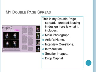
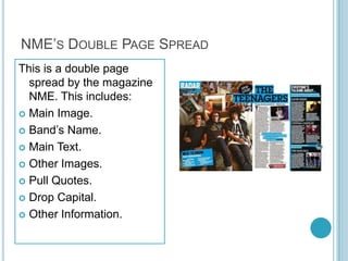
This document compares the forms and conventions used in the student's magazine to real magazines like NME and Kerrang. It analyzes the front covers, contents pages, and double page spreads. While the student used real magazines as references for layouts and ideas, they developed their own designs and content to make the magazine original. The analysis found similarities like central images but also differences in things like color schemes and amount of content. The student aimed to recreate real magazine styles and formats to produce a successful magazine.
My books- Hacking Digital Learning Strategies http://hackingdls.com & Learning to Go https://gum.co/learn2go
Resources at http://shellyterrell.com/classmanagement
My books- Hacking Digital Learning Strategies http://hackingdls.com & Learning to Go https://gum.co/learn2go
Resources at http://shellyterrell.com/classmanagement
The reality for companies that are trying to figure out their blogging or content strategy is that there's a lot of content to write beyond just the "buy now" page.
29. Why? I placed my image more to the right of the centre as I then had room to include cover lines on the left. I have placed other things on the right as well but more on the left as most magazines constructions are like this. My Masthead is placed on the left at the top as well as this draws your eye up there. I placed it in a box so it stood out a lot more as this is what the magazine is called.
31. My Contents Page This is my Contents Page that I have created it includes: Magazine Name. Main Heading. Issue Number. Sub-headings. Page Numbers. Photographs. Image of Front Cover. Information of what is in the magazine. Colour Scheme.
32. Kerrang Contents Page This is a contents page produced by Kerrang! It includes: Main Heading. Sub-headings. Page Numbers. Photographs. Information of what is in the magazine. Image of the Front Cover. Introduction. Colour Scheme.
33. Comparison Mine and Kerrang’s contents page both include a variety of images that are included in the magazine. My contents page includes the title of the magazine whereas Kerrang doesn’t use this and just has the image of the front cover. Kerrang’s contents page have an introduction/ paragraph at the top explaining things that will be included in the magazine, I have not included this. Kerrang’s contents heading is on the right whereas mine is on the left under the magazine name, the images of the front covers are also on opposite corners.
35. My Double Page Spread This is my Double Page spread. I created it using in design here is what it includes: Main Photograph. Artist’s Name. Interview Questions. Introduction. Smaller Images. Drop Capital
36. NME’s Double Page Spread This is a double page spread by the magazine NME. This includes: Main Image. Band’s Name. Main Text. Other Images. Pull Quotes. Drop Capital. Other Information.
37. Comparison Both Double Page Spreads have a main image on the left with the artists/bands name close to this image. The text is on the right page and has either questions or the paragraphs. On the far right they both have smaller images but in different ways as mine just has the images and NME’s has the column ‘Everyone's Talking About...’ NME’s Double page spread is a lot busier then mine. Both have a colour scheme.
38. Forms and Conventions I have used a real magazine front cover to aid me whilst creating my front cover. I did not copy it I just used some of the layouts and ideas but changed them to include things in my magazine, making it my own. I did the same thing for my contents page and double page spread, I did not copy them just used ideas and layouts but mainly coming up with things myself. The magazines were there to help me and look back at. I was hoping to create a successful piece of work.