Hannah Taylor
PORTFOLIO
2 3
CONTACT
HANNAH TAYLOR
360 615 5039
123 Hickory Lane
Nashville, TN
hannahthetailor.wordpress.com
table of contents
B R O C H U R E
I N F O G R A P H I C
W E B P A G E M O C K U P
M A G A Z I N E C O V E R
M O N T A G E
P H O T O D E S I G N
B U S I N E S S I D E N T I T Y
C O D I N G
P R E Z I
4
6
8
1 0
1 2
1 4
1 6
1 8
2 0
4 5
brochure
DESCRIPTION
DATE
COURSE
INSTRUCTOR
PROGRAMS USED
OBJECTIVE
PROCESS
A promotional brochure for a restaurant called Coho Door.
November 30, 2016
Visual Communications 130 - Section 17
Doug Holladay
Adobe InDesign, Adobe Illustrator, Adobe Photoshop
Entice the reader to eat at the restaurant Coho Door through
words and visually pleasing photos.
I decided to make a brochure for a restaurant because I
wanted to do something out of my comfort zone. I began by
creating the logo of the Coho salmon which was inspired by
the Native American artwork that is seen so commonly in the
Pacific Northwest. I then began to create a shape map of
the text boxes and curved shapes I wanted in this brochure.
I chose photos that were crisp and similar in color and style
to the color scheme. I then added in the text making sure to
have a variety in the boldness and size. I felt that a white
background was too plain so I added a patterned background
which really tied in the whole look of the brochure.
COHO
DO OR
We only use the freshest, most local ingredients,
delivered daily by farmers and fishermen from
around the Portland area. Be sure to try our Fresh
Salmon Salad, made with hand picked lettuce and
tomatoes,as well as Columbia River salmon,caught
that morning.
Only at Coho Door will you find the most perfect
salmon you have ever tasted. Fresh cut by our chef
and seared to perfection,you will be coming back as
often as possible to taste the most delicious salmon
in the Portland-Metro area.
PERFECTION ON THE OTHER SIDECoho Door
516 NW 3rd Avenue
Portland, Oregon
501 615 3608
www.cohodoor.com
F RES H
“A five star dining experience”
-Portland Monthly
Our lunch menu is just as complete as our dinner
menu. Not only that, but you don’t need to dress
up to sit down for a meal with us! Come stop by on
your lunch break and enjoy the same great tastes
you would during dinner for an affordable price!
Be sure to try our delicious array of sandwiches,
from pulled pork and hamburgers, to our famous
home cooked ham sandwich. If you’re looking for
something a bit lighter, our salads can provide that
meal you’re looking for. Salmon, chicken and steak
salads are just some of the many options on the
lunch menu.
“Classy, yet totally affordable”
-Food & Wine Magazine
“The best new restaurant in Portland”
-The Oregonian
Our selection of appetizers will have you
coming back to try them all!
Our handmade pulled pork sandwich.
Pork cooked daily!
LUNCH
DINNEROurdinnermenuiswhatwe’remostproud
of.We have options for everyone,from the
foodie to the pickiest eater you know,
everyonewillfindtheirfavoriteitemhere.
Several salads,fish including Salmon and
Halibut,several cuts of steak and a still wide
variety of sandwiches. Theres something for
everyonehere.Plus,withover10sideitems,
you could come here over two thousand
times, and never eat the same meal twice.
We hope you’ll take that challenge too!
6 7
Infographic
Sources:
https://sleepfoundation.org/sleep-tools-tips/healthy-sleep-tips/
http://www.sleepmedsite.com/page/sb/sleep_disorders/sleep_statistics
http://www.gallup.com/poll/166553/less-recommended-amount-sleep.aspx
LUNE
What causes
insomnia?
Sleep
Apnea
Depression
Stress
Chronic
Pain
Eating
Habits
Anxiety
1 out of 3 adultswill have insomnia at some point in their lifetime
Like a Baby
Sleep
Sleep Tips
Fight the urge to
drink caffeine or
eat large meals
before bedtime.
Doctors recommend
8 to 8.5 Hours
40%
of Americans
get 6 hours
of sleep or
less per night.
Walk, run, bike for
30 minutes a day,
5 days a week.
Avoid electronics
1 hour before bed.
DESCRIPTION
DATE
COURSE
INSTRUCTOR
PROGRAMS USED
OBJECTIVE
PROCESS
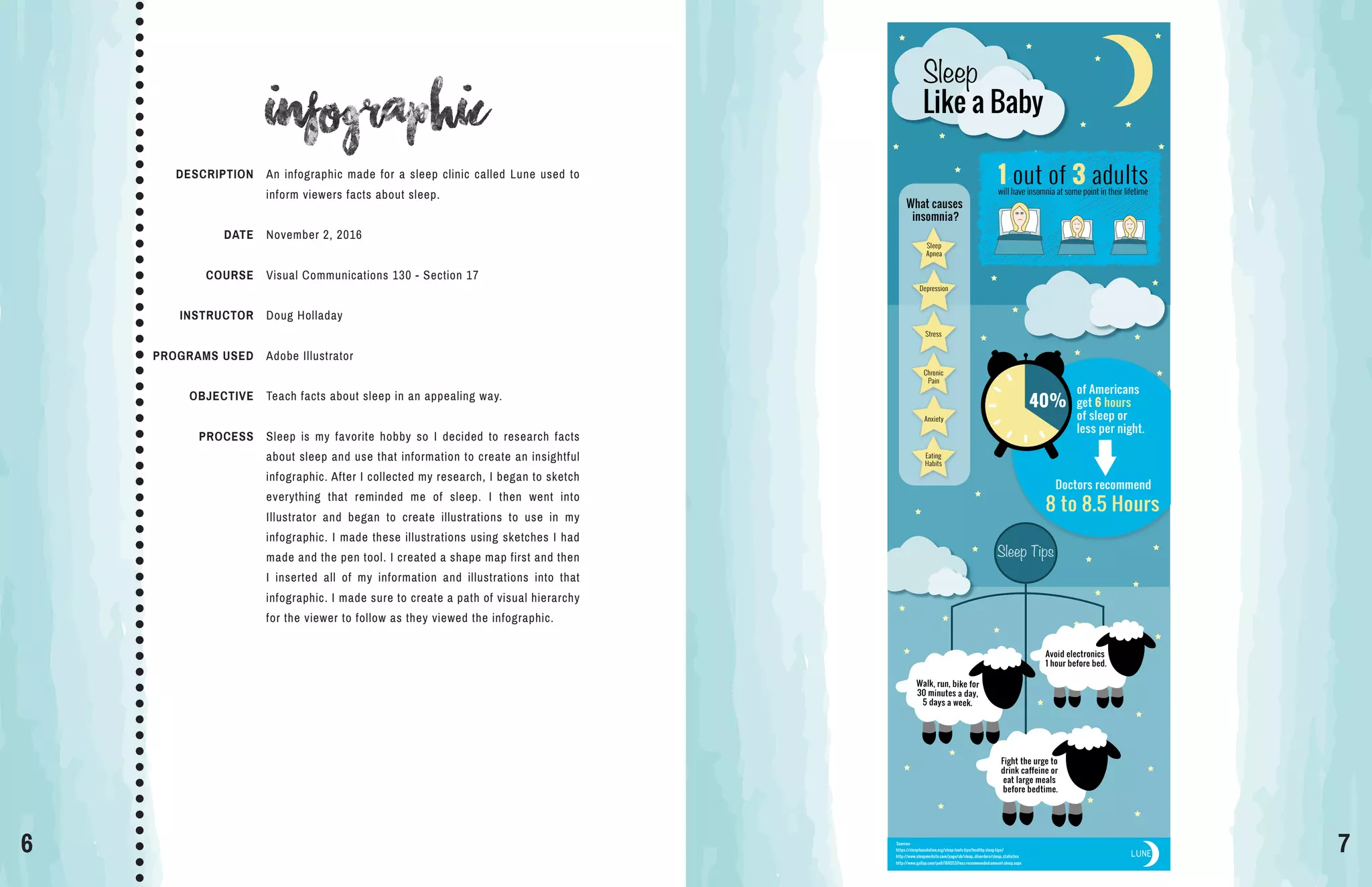
An infographic made for a sleep clinic called Lune used to
inform viewers facts about sleep.
November 2, 2016
Visual Communications 130 - Section 17
Doug Holladay
Adobe Illustrator
Teach facts about sleep in an appealing way.
Sleep is my favorite hobby so I decided to research facts
about sleep and use that information to create an insightful
infographic. After I collected my research, I began to sketch
everything that reminded me of sleep. I then went into
Illustrator and began to create illustrations to use in my
infographic. I made these illustrations using sketches I had
made and the pen tool. I created a shape map first and then
I inserted all of my information and illustrations into that
infographic. I made sure to create a path of visual hierarchy
for the viewer to follow as they viewed the infographic.
8 9
webpage mockup
DESCRIPTION
DATE
COURSE
INSTRUCTOR
PROGRAMS USED
OBJECTIVE
PROCESS
A mock-up of the home page of a website created for a
jewelry company called Boho and Basil.
November 16, 2016
Visual Communications 130 - Section 17
Doug Holladay
Adobe Illustrator, Adobe Photoshop
Design a homepage for a website using Photoshop to create
a mockup.
The company that I used for this project is a jewelry business
that my friend owns. I first began to sketch out three different
layouts of webpages. I chose my best sketch and created a
wireframe in Photoshop. Using a wireframe made it simple
to add all of the content to the page. I created the logo in
Adobe Illustrator by taking my friend’s original hand drawn
logo and turning it into a digital version with color.
10 11
magazine cover
DESCRIPTION
DATE
COURSE
INSTRUCTOR
PROGRAMS USED
OBJECTIVE
PROCESS
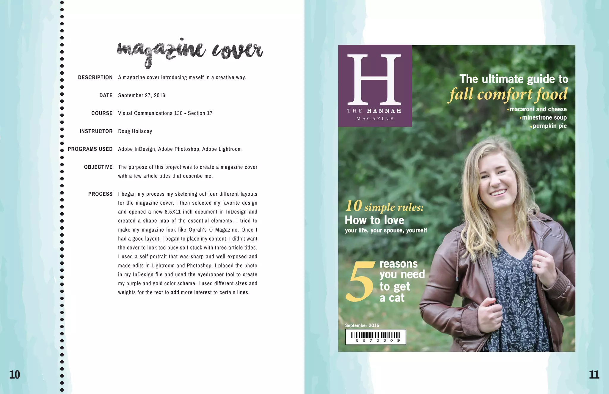
A magazine cover introducing myself in a creative way.
September 27, 2016
Visual Communications 130 - Section 17
Doug Holladay
Adobe InDesign, Adobe Photoshop, Adobe Lightroom
The purpose of this project was to create a magazine cover
with a few article titles that describe me.
I began my process my sketching out four different layouts
for the magazine cover. I then selected my favorite design
and opened a new 8.5X11 inch document in InDesign and
created a shape map of the essential elements. I tried to
make my magazine look like Oprah’s O Magazine. Once I
had a good layout, I began to place my content. I didn’t want
the cover to look too busy so I stuck with three article titles.
I used a self portrait that was sharp and well exposed and
made edits in Lightroom and Photoshop. I placed the photo
in my InDesign file and used the eyedropper tool to create
my purple and gold color scheme. I used different sizes and
weights for the text to add more interest to certain lines.
H
September 2016
T H E H A N N A H
M A G A Z I N E
How to love
your life, your spouse, yourself
10simple rules:
The ultimate guide to
fall comfort food
macaroni and cheese
minestrone soup
pumpkin pie
reasons
you need
to get
5a cat
12 13
montage
DESCRIPTION
DATE
COURSE
INSTRUCTOR
PROGRAMS USED
OBJECTIVE
PROCESS
Two images have been blended together to create a spiritual
message of peace and joy.
October 19, 2016
Visual Communications 130 - Section 17
Doug Holladay
Adobe Photoshop
Create a spiritual message by blending to images together.
The first thing I did was pray to find a spiritual message in
the scriptures that I could use for this project. The words of
a hymn kept coming to my mind “Fear not, I am with thee”
which is from the scripture Isaiah 41:10. Next, I searched
for two images that would merge well together. I placed the
photo of the boy as the background and placed the image
of Jesus sitting next to him. I added a mask to the layer and
used a black paintbrush to remove the parts of the photo
that I didn’t need. I also decreased the opacity to make him
appear that he was with the boy in spirit, not there physically.
I used the eyedropper tool to select the colors from the boy’s
shirt and placed the text on the right hand side.
14 15
Photodesign
DESCRIPTION
DATE
COURSE
INSTRUCTOR
PROGRAMS USED
OBJECTIVE
PROCESS
A flier for the local town’s farmer’s market.
October 12, 2016
Visual Communications 130 - Section 17
Doug Holladay
Adobe Photoshop
Create a design that includes a well composed photograph
with text to showcase knowledge of Photoshop and using a
color scheme.
I went to my local farmers market to take photos for this
project. While taking my photos, I made sure to provide
enough room to place text. I chose my most well-composed
photo and made a few edits in Photoshop. I placed the photo
in a blank 11X8.5 full bleed document in Photoshop. I added
in the two bottom shapes by creating rectangles and using
the pen tool to create the curves. To showcase my color
scheme, I placed a thin rectangle on the left side with the
name of the color scheme.
16 17
Business identity
DESCRIPTION
DATE
COURSE
INSTRUCTOR
PROGRAMS USED
OBJECTIVE
PROCESS
Create a logo for a children’s clothing company that looks
good on business cards and letterheads.
October 28, 2016
Visual Communications 130 - Section 17
Doug Holladay
Adobe InDesign, Adobe Illustrator
To create a logo for a company that can be placed on
business cards and letterheads.
I began my process by first spending a few hours research-
ing logos on Pinterest and Google. I then sketched several
ideas of what I wanted to have as my logo. In Illustrator, I
created the crown by using the pen tool to create one half
and reflected a copy of the other half. I colored one side
lighter to create dimension in the logo. I then began to add
text to my logo. I created three different versions but in the
end chose the darker purple with all white text because it
stood out more. After choosing my best logo, I constructed
a business card and letterhead.
Jack
and
Jill
Jack and Jill
a children’s clothing company
208 Maple Street
Murfreesboro, TN
615 987 6543
jackandjill@square.com
jackandjill.com
208 Maple Street
Murfreesboro, TN •• •615 987 6543 jackandjill@square.comjackandjill.com
Jack
and
Jill
18 19
coding
DESCRIPTION
DATE
COURSE
INSTRUCTOR
PROGRAMS USED
OBJECTIVE
PROCESS
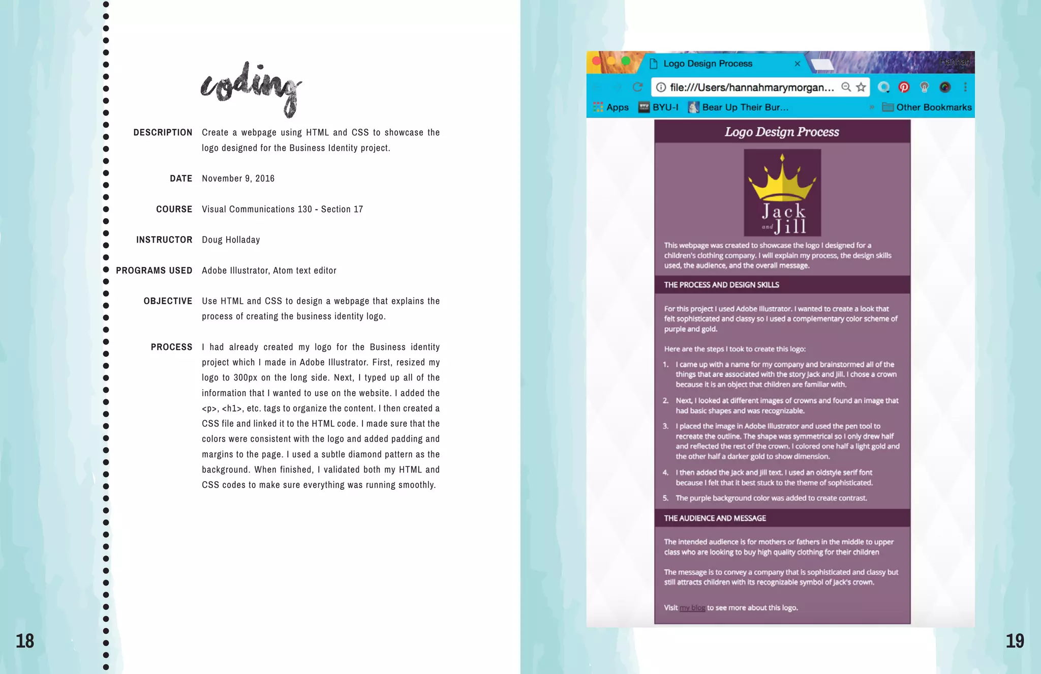
Create a webpage using HTML and CSS to showcase the
logo designed for the Business Identity project.
November 9, 2016
Visual Communications 130 - Section 17
Doug Holladay
Adobe Illustrator, Atom text editor
Use HTML and CSS to design a webpage that explains the
process of creating the business identity logo.
I had already created my logo for the Business identity
project which I made in Adobe Illustrator. First, resized my
logo to 300px on the long side. Next, I typed up all of the
information that I wanted to use on the website. I added the
<p>, <h1>, etc. tags to organize the content. I then created a
CSS file and linked it to the HTML code. I made sure that the
colors were consistent with the logo and added padding and
margins to the page. I used a subtle diamond pattern as the
background. When finished, I validated both my HTML and
CSS codes to make sure everything was running smoothly.
20 21
prezi
DESCRIPTION
DATE
COURSE
INSTRUCTOR
PROGRAMS USED
OBJECTIVE
PROCESS
Create a presentation on Prezi that gives traveling tips.
October 5, 2016
Visual Communications 130 - Section 17
Doug Holladay
Prezi
Make a Prezi presentation that follows the guidelines of
creating effective slide design.
I wanted to create something that gave tips on how to
travel in a creative way so I found a background image of a
desk and used an image of a journal. My goal was to make
it look like the tips had been written in a journal. I started
to sketch the flow of my presentation on a piece of paper.
I then began to place my content in the order I outlined. I
used graphics from Prezi and used a script font to make it
look handwritten.

My Portfolio

  • 1.
  • 2.
    2 3 CONTACT HANNAH TAYLOR 360615 5039 123 Hickory Lane Nashville, TN hannahthetailor.wordpress.com table of contents B R O C H U R E I N F O G R A P H I C W E B P A G E M O C K U P M A G A Z I N E C O V E R M O N T A G E P H O T O D E S I G N B U S I N E S S I D E N T I T Y C O D I N G P R E Z I 4 6 8 1 0 1 2 1 4 1 6 1 8 2 0
  • 3.
    4 5 brochure DESCRIPTION DATE COURSE INSTRUCTOR PROGRAMS USED OBJECTIVE PROCESS Apromotional brochure for a restaurant called Coho Door. November 30, 2016 Visual Communications 130 - Section 17 Doug Holladay Adobe InDesign, Adobe Illustrator, Adobe Photoshop Entice the reader to eat at the restaurant Coho Door through words and visually pleasing photos. I decided to make a brochure for a restaurant because I wanted to do something out of my comfort zone. I began by creating the logo of the Coho salmon which was inspired by the Native American artwork that is seen so commonly in the Pacific Northwest. I then began to create a shape map of the text boxes and curved shapes I wanted in this brochure. I chose photos that were crisp and similar in color and style to the color scheme. I then added in the text making sure to have a variety in the boldness and size. I felt that a white background was too plain so I added a patterned background which really tied in the whole look of the brochure. COHO DO OR We only use the freshest, most local ingredients, delivered daily by farmers and fishermen from around the Portland area. Be sure to try our Fresh Salmon Salad, made with hand picked lettuce and tomatoes,as well as Columbia River salmon,caught that morning. Only at Coho Door will you find the most perfect salmon you have ever tasted. Fresh cut by our chef and seared to perfection,you will be coming back as often as possible to taste the most delicious salmon in the Portland-Metro area. PERFECTION ON THE OTHER SIDECoho Door 516 NW 3rd Avenue Portland, Oregon 501 615 3608 www.cohodoor.com F RES H “A five star dining experience” -Portland Monthly Our lunch menu is just as complete as our dinner menu. Not only that, but you don’t need to dress up to sit down for a meal with us! Come stop by on your lunch break and enjoy the same great tastes you would during dinner for an affordable price! Be sure to try our delicious array of sandwiches, from pulled pork and hamburgers, to our famous home cooked ham sandwich. If you’re looking for something a bit lighter, our salads can provide that meal you’re looking for. Salmon, chicken and steak salads are just some of the many options on the lunch menu. “Classy, yet totally affordable” -Food & Wine Magazine “The best new restaurant in Portland” -The Oregonian Our selection of appetizers will have you coming back to try them all! Our handmade pulled pork sandwich. Pork cooked daily! LUNCH DINNEROurdinnermenuiswhatwe’remostproud of.We have options for everyone,from the foodie to the pickiest eater you know, everyonewillfindtheirfavoriteitemhere. Several salads,fish including Salmon and Halibut,several cuts of steak and a still wide variety of sandwiches. Theres something for everyonehere.Plus,withover10sideitems, you could come here over two thousand times, and never eat the same meal twice. We hope you’ll take that challenge too!
  • 4.
    6 7 Infographic Sources: https://sleepfoundation.org/sleep-tools-tips/healthy-sleep-tips/ http://www.sleepmedsite.com/page/sb/sleep_disorders/sleep_statistics http://www.gallup.com/poll/166553/less-recommended-amount-sleep.aspx LUNE What causes insomnia? Sleep Apnea Depression Stress Chronic Pain Eating Habits Anxiety 1out of 3 adultswill have insomnia at some point in their lifetime Like a Baby Sleep Sleep Tips Fight the urge to drink caffeine or eat large meals before bedtime. Doctors recommend 8 to 8.5 Hours 40% of Americans get 6 hours of sleep or less per night. Walk, run, bike for 30 minutes a day, 5 days a week. Avoid electronics 1 hour before bed. DESCRIPTION DATE COURSE INSTRUCTOR PROGRAMS USED OBJECTIVE PROCESS An infographic made for a sleep clinic called Lune used to inform viewers facts about sleep. November 2, 2016 Visual Communications 130 - Section 17 Doug Holladay Adobe Illustrator Teach facts about sleep in an appealing way. Sleep is my favorite hobby so I decided to research facts about sleep and use that information to create an insightful infographic. After I collected my research, I began to sketch everything that reminded me of sleep. I then went into Illustrator and began to create illustrations to use in my infographic. I made these illustrations using sketches I had made and the pen tool. I created a shape map first and then I inserted all of my information and illustrations into that infographic. I made sure to create a path of visual hierarchy for the viewer to follow as they viewed the infographic.
  • 5.
    8 9 webpage mockup DESCRIPTION DATE COURSE INSTRUCTOR PROGRAMSUSED OBJECTIVE PROCESS A mock-up of the home page of a website created for a jewelry company called Boho and Basil. November 16, 2016 Visual Communications 130 - Section 17 Doug Holladay Adobe Illustrator, Adobe Photoshop Design a homepage for a website using Photoshop to create a mockup. The company that I used for this project is a jewelry business that my friend owns. I first began to sketch out three different layouts of webpages. I chose my best sketch and created a wireframe in Photoshop. Using a wireframe made it simple to add all of the content to the page. I created the logo in Adobe Illustrator by taking my friend’s original hand drawn logo and turning it into a digital version with color.
  • 6.
    10 11 magazine cover DESCRIPTION DATE COURSE INSTRUCTOR PROGRAMSUSED OBJECTIVE PROCESS A magazine cover introducing myself in a creative way. September 27, 2016 Visual Communications 130 - Section 17 Doug Holladay Adobe InDesign, Adobe Photoshop, Adobe Lightroom The purpose of this project was to create a magazine cover with a few article titles that describe me. I began my process my sketching out four different layouts for the magazine cover. I then selected my favorite design and opened a new 8.5X11 inch document in InDesign and created a shape map of the essential elements. I tried to make my magazine look like Oprah’s O Magazine. Once I had a good layout, I began to place my content. I didn’t want the cover to look too busy so I stuck with three article titles. I used a self portrait that was sharp and well exposed and made edits in Lightroom and Photoshop. I placed the photo in my InDesign file and used the eyedropper tool to create my purple and gold color scheme. I used different sizes and weights for the text to add more interest to certain lines. H September 2016 T H E H A N N A H M A G A Z I N E How to love your life, your spouse, yourself 10simple rules: The ultimate guide to fall comfort food macaroni and cheese minestrone soup pumpkin pie reasons you need to get 5a cat
  • 7.
    12 13 montage DESCRIPTION DATE COURSE INSTRUCTOR PROGRAMS USED OBJECTIVE PROCESS Twoimages have been blended together to create a spiritual message of peace and joy. October 19, 2016 Visual Communications 130 - Section 17 Doug Holladay Adobe Photoshop Create a spiritual message by blending to images together. The first thing I did was pray to find a spiritual message in the scriptures that I could use for this project. The words of a hymn kept coming to my mind “Fear not, I am with thee” which is from the scripture Isaiah 41:10. Next, I searched for two images that would merge well together. I placed the photo of the boy as the background and placed the image of Jesus sitting next to him. I added a mask to the layer and used a black paintbrush to remove the parts of the photo that I didn’t need. I also decreased the opacity to make him appear that he was with the boy in spirit, not there physically. I used the eyedropper tool to select the colors from the boy’s shirt and placed the text on the right hand side.
  • 8.
    14 15 Photodesign DESCRIPTION DATE COURSE INSTRUCTOR PROGRAMS USED OBJECTIVE PROCESS Aflier for the local town’s farmer’s market. October 12, 2016 Visual Communications 130 - Section 17 Doug Holladay Adobe Photoshop Create a design that includes a well composed photograph with text to showcase knowledge of Photoshop and using a color scheme. I went to my local farmers market to take photos for this project. While taking my photos, I made sure to provide enough room to place text. I chose my most well-composed photo and made a few edits in Photoshop. I placed the photo in a blank 11X8.5 full bleed document in Photoshop. I added in the two bottom shapes by creating rectangles and using the pen tool to create the curves. To showcase my color scheme, I placed a thin rectangle on the left side with the name of the color scheme.
  • 9.
    16 17 Business identity DESCRIPTION DATE COURSE INSTRUCTOR PROGRAMSUSED OBJECTIVE PROCESS Create a logo for a children’s clothing company that looks good on business cards and letterheads. October 28, 2016 Visual Communications 130 - Section 17 Doug Holladay Adobe InDesign, Adobe Illustrator To create a logo for a company that can be placed on business cards and letterheads. I began my process by first spending a few hours research- ing logos on Pinterest and Google. I then sketched several ideas of what I wanted to have as my logo. In Illustrator, I created the crown by using the pen tool to create one half and reflected a copy of the other half. I colored one side lighter to create dimension in the logo. I then began to add text to my logo. I created three different versions but in the end chose the darker purple with all white text because it stood out more. After choosing my best logo, I constructed a business card and letterhead. Jack and Jill Jack and Jill a children’s clothing company 208 Maple Street Murfreesboro, TN 615 987 6543 jackandjill@square.com jackandjill.com 208 Maple Street Murfreesboro, TN •• •615 987 6543 jackandjill@square.comjackandjill.com Jack and Jill
  • 10.
    18 19 coding DESCRIPTION DATE COURSE INSTRUCTOR PROGRAMS USED OBJECTIVE PROCESS Createa webpage using HTML and CSS to showcase the logo designed for the Business Identity project. November 9, 2016 Visual Communications 130 - Section 17 Doug Holladay Adobe Illustrator, Atom text editor Use HTML and CSS to design a webpage that explains the process of creating the business identity logo. I had already created my logo for the Business identity project which I made in Adobe Illustrator. First, resized my logo to 300px on the long side. Next, I typed up all of the information that I wanted to use on the website. I added the <p>, <h1>, etc. tags to organize the content. I then created a CSS file and linked it to the HTML code. I made sure that the colors were consistent with the logo and added padding and margins to the page. I used a subtle diamond pattern as the background. When finished, I validated both my HTML and CSS codes to make sure everything was running smoothly.
  • 11.
    20 21 prezi DESCRIPTION DATE COURSE INSTRUCTOR PROGRAMS USED OBJECTIVE PROCESS Createa presentation on Prezi that gives traveling tips. October 5, 2016 Visual Communications 130 - Section 17 Doug Holladay Prezi Make a Prezi presentation that follows the guidelines of creating effective slide design. I wanted to create something that gave tips on how to travel in a creative way so I found a background image of a desk and used an image of a journal. My goal was to make it look like the tips had been written in a journal. I started to sketch the flow of my presentation on a piece of paper. I then began to place my content in the order I outlined. I used graphics from Prezi and used a script font to make it look handwritten.