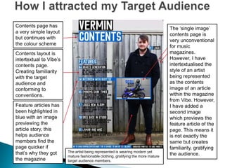
1) The document discusses the design and content choices for a proposed rap magazine to appeal to a young, predominantly male audience.
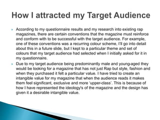
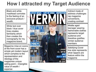
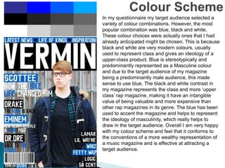
2) Key design elements like color scheme, layout, and visuals were chosen to represent an "upper-class" magazine with an intangible value of wealth and exclusivity in order to attract the target demographic.
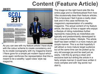
3) Articles and sections were tailored to feature fashion, lifestyle, and rappers in a mature yet accessible way to gratify readers and challenge conventions of typical "grimy" rap magazines.