Hauz Khas Call Girls ☎ 7042364481 independent Escorts Service in delhi
Evaluation – jacob hargrave (jacob hargrave) (1)
1. Evaluation – Jacob Hargrave
The purpose of my project was to rebrand the Stoptober and make some adverts that they
would be able to use when relaunching their campaign after a few years of not having a big
budget. I think my work was mixed in terms of what level it was at. I think my T-side poster
was my best piece of work and it was to a good level but some of my other bits there needs
to be improvement for example my merch is to simple and it would be nice if people could
buy them and not just make them for events.
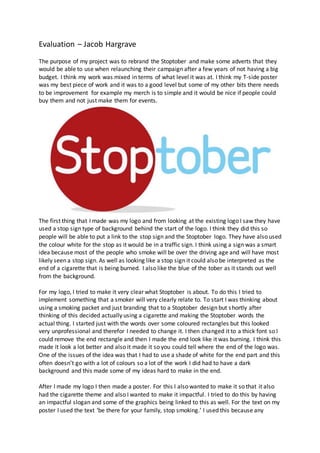
The first thing that I made was my logo and from looking at the existing logo I saw they have
used a stop sign type of background behind the start of the logo. I think they did this so
people will be able to put a link to the stop sign and the Stoptober logo. They have also used
the colour white for the stop as it would be in a traffic sign. I think using a sign was a smart
idea because most of the people who smoke will be over the driving age and will have most
likely seen a stop sign. As well as looking like a stop sign it could also be interpreted as the
end of a cigarette that is being burned. I also like the blue of the tober as it stands out well
from the background.
For my logo, I tried to make it very clear what Stoptober is about. To do this I tried to
implement something that a smoker will very clearly relate to. To start I was thinking about
using a smoking packet and just branding that to a Stoptober design but shortly after
thinking of this decided actually using a cigarette and making the Stoptober words the
actual thing. I started just with the words over some coloured rectangles but this looked
very unprofessional and therefor I needed to change it. I then changed it to a thick font so I
could remove the end rectangle and then I made the end look like it was burning. I think this
made it look a lot better and also it made it so you could tell where the end of the logo was.
One of the issues of the idea was that I had to use a shade of white for the end part and this
often doesn’t go with a lot of colours so a lot of the work I did had to have a dark
background and this made some of my ideas hard to make in the end.
After I made my logo I then made a poster. For this I also wanted to make it so that it also
had the cigarette theme and also I wanted to make it impactful. I tried to do this by having
an impactful slogan and some of the graphics being linked to this as well. For the text on my
poster I used the text ‘be there for your family, stop smoking.’ I used this because any
2. smokers looking at it will make them think about their family’s and how smoking affects
them and their family. For the colours, I used I tried to make it so that everything can stand
out using the natural colours that they would be. An example of this is trying to get a
background that makes the natural colours of the cigarette and also the logo I made.
I think for the message of my work was communicated clearly. I think this because when
you look at the work I did you can instantly tell it is about smoking and also because the
name you can tell that it is about stopping. I think for my posters also give the message with
the graphics and also the slogans on them.
I think my target audience it quite wide as there are a lot of smokers that I will be trying to
get onto the Stoptober challenge. To try to get to them all I tried to base my posters on
something that will appeal to a large range of the audience. There where 2 things that was
thinking about using. One was health and the other was the cost of smoking. I tried to make
a poster for both. For impacting the audience, the most and also getting to the most people
I think that health will be the best way because it effects everyone who smokes and also
their family. To show this I did this in my A3 poster with the man walking to his grave with
his family in the background. This is quite impactful and also gets the massage out. I think
because I put a family there it might not appeal to younger people who can’t relate to the
family. I think if I was I did it again I would change the colours to match the three posters I
did and also I would change the image to maybe add the person’s family on it as well. As
well as this I did a T-Side bus poster to try and show the costs of smoking. On the poster, I
have a conveyer belt and some packets of cigarettes and they are rolling off into a fire. Then
I have the branding on the right side of the ‘T’.
I think my poster will hopefully have a good effect on the public and they are made to
inform then and also to surprise them. I Think this because the things I made are trying to
impact the audience directly and change their opinions from thinking smoking is a necessity
to knowing it is harming them and their family. For the techniques, I have used in my
posters they are: claims, impactful messages and slogans. I think the techniques I used,
worked with what I tried to put across in my posters but it would have been nice to get
some more in there for example a focal point in my A3 poster.
Needing a focal point in my A3 poster also was reflected in my feedback from my
questionnaire. I had comments like ‘it was a bit unorganised.’ and
‘it needs a bigger image and smaller text.’ Both of the comments imply that there needs
changes in the layout and also the sizing of my things on the poster. I also got a lot of
feedback on the colour I had chosen for both of my posters relating to each other with a lot
of people wanting them to be the same and changing the green one to red. Some other
consistent feedback also was on the font for my A3 poster ad changing this to a different
one as it doesn’t go with the rest of the poster. I think I would agree with all of the feedback
I got for my posters and if I have time I will try to change my posters to match them.
I also made some merch that was designed for events and for Volunteers who promote
Stoptober. For my ideas, I wanted to make it simple and also easy to recognise. To do this I
just decided to put the Stoptober logo across the front with the NHS logo under it. I did this
3. because I wanted to make it look official so therefor I just put the logo on it. This made It
look official but I think it might have needed some more things on it. One idea might have
been to put the contact information on the back. This would have made the T-shirts less
boring and also more interesting to look at. I think my merchandise matched the purpose. I
think it did because it is trying to mainly raise awareness and provide information and I think
it does this.
A lot of the feedback I got for this is trying to make into a t-shirt that I can sell but I think
there is a very small audience for this and therefor making it for people to ware when trying
to promote the Stoptober challenge they can ware it so people know who to ask for advice
and where to find help on stopping. I also got feedback on needing to get more colours and
also maybe make a design that people can buy after they take the challenge and then stop
smoking.
I think as an overall campaign will have a good impact. I think that as last year there has
been a sharp cut in the budget and therefor the number of people trying to stop smoking in
October compared to the previous year reduced but a substantial amount. Therefor if the
things that I made where spread they could reignite the campaign and also then try and
reboot the people stopping smoking in October. I think if the campaign was going to be
successful they need to put more money back onto it. I think that my work will be effective
with a few changes to some of the pieces of work.
When I started the task, I wanted to rebrand what they had already done and I wanted to
do this as they had a successful campaign but it was getting a bit old and falling out of the
public eye. I think that I rebranded it well and the things like the posters need to be