
Recommended
More Related Content
What's hot
What's hot (18)
Viewers also liked
Viewers also liked (14)
Similar to Digital graphics evaluation pro forma.pptx
Similar to Digital graphics evaluation pro forma.pptx (20)
More from willydavisj
More from willydavisj (20)
Recently uploaded
Recently uploaded (20)
Digital graphics evaluation pro forma.pptx
- 2. DOES YOUR FINAL PRODUCT REFLECT YOUR ORIGINAL INTENTIONS? My finished product was almost exactly the same as my flat plans. The things that aren't the same I think are improvements. For example on page 3 I split the page and I had Laquisha tied up in a room on one side and captain bananas in a different environment on the other side. This is effective because the audience know where Laquisha has been tied up and the audience know a good description on what Captain Banana looks like, as he hasn't been introduced yet. My story has not stayed the same as my plans, quite a few things have been altered. I added two more pages to my story this is because on the first paged I needed to have a moment in my story to show Laquisha being freed by Pablo. The second page I made extra was the front cover. The front cover included all the characters in the book. Also I altered the script to make it more professional and the children can understand it more.
- 3. HOW WELL HAVE YOU CONSTRUCTED YOUR IMAGES? I believe my images were well constructed as I used a range of bright eye catching colours, drop shadows, gradients, shapes etc. My book has a simple cartoon look but it has its detailed aspect with the gradient sky, inner shadow walls and furniture and the outer glow on the sun and the moon. My characters are all of the same style simple and colourful. I showed expression on my character’s using their mouth and eye-brows. I have also used different colours to interpret different emotions for my characters. For example I made captain bananas black and have red scars. This interprets that captain banana is evil and dark. The red scars interpret captain banana is ruff and you wouldn’t want to mess with him.
- 4. The text font is the same throughout my whole book apart from the front cover title and the end page. This is good because if I had loads of different fonts it would look messy and unprofessional. The text size is easy to read so children can easily read along. The text I used was on my narrating text was ‘Marion’. I picked this because It's easy to read and it's clear.
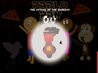
- 5. HOW WELL HAVE YOU USED TEXT TO ANCHOR YOUR IMAGES Here I related the text to the theme of the story. Pablo is an Italian pizza delivery man who rides a flying pizza delivery bike and at the end of my book it says ‘The End’. I wanted a big ending so I enlarged the text, colourised it with the Italian flag and wrapped it round the moon. I think this was a good Idea because I chose these colours green, white and red to resemble the Italian flag which links to the rest of the story because pizza is Italian and Pablo is Italian. This teaches children the colours of the Italian flag and that pizza is from Italy. Here I made the text wrap around the characters to show what sound is occurring. I did this because it really emphasizes on what's happening. It also involves the audience because children will read aloud the sounds from the book.
- 6. IS YOUR PRODUCT SUITABLE FOR YOUR AUDIENCE? My audience is 4-7 years old it also be unisex (for girls and boys) I picked this age because I feel as its most suitable as my book includes very minor violence. Another reason why I think my story is suitable for these ages because at the young ages of 4-7 you are still learning social life skills and the friendship between Pablo and Robert is very strong and they work together to defeat the evil. If Robert was not in the story Pablo would not have gotten past captain banana. The moral of the story is if you work together you can accomplish big things. I think some children will take that on board and if say, a child has any problems they will ask their fellow companions. My story is ethical because it contains different cultures for example Laquisha is African American and Pablo is Italian. I think this is good because children can learn about the different cultures, not only that, Laquisha and Pablo share a relationship and they are accepting each other for who they are.
- 7. WHAT DO YOU LIKE/DISLIKE ABOUT THE TECHNIQUES YOU HAVE USED? I used loads of different techniques this includes Polygonal Lasso Tool, Custom Shape Tool, Eyedrop Tool, Free Transform Tool etc. Polygonal Lasso Tool I used this a lot to help me create my characters. To do this I drew a shape on a layer using the polygonal lasso tool and I hit right click and I hit layer via copy. This allows me to create a solid shape from what I have drawn. Used this method to create my arms, legs, hair, ears, feet and facial features. I like this method because I can create whatever shape I want. Rectangle/Eclipse/Custom Shape Tool I used these to help me create my backgrounds and characters. I used the eclipse tool to make: heads, eyes, wheels, scenery, etc. The eclipse tool helped me a lot when coming to make circles. When I wanted to adjust the circle to what I wanted, I went to edit, transform, warp. The custom shape tool helped me a lot also because when coming to make Robert the raven I needed a triangle and in the custom tools there was a triangle. I needed to bend the triangle and to do this I went to edit, transform, warp. After I did this I altered the triangle to bend a little to make it look more like a bird's beak. There has been a lot of cases where I needed to use the custom shape tool and it helped a lot, it's also quick and easy. I used the rectangle Tool to create: body’s, tables, windows and chairs.
- 8. Eye Drop Tool This tool helped me I lot when making by book. This is because whenever I wanted an exact colour from another shape I would click the eye drop tool, click the shape I wanted the colour from. Once I had done that I had the exact same colour as the shape I selected. This was very useful because it saves me taking ages trying to get the exact colour. Transform Tool normal warp The Transform Tool allows you to completely transform a shape or you can just rotate it or scale it. There are other options like warp, skew, distort, perspective, flip horizontal and vertical. The transform tool was very useful when want to adjust my shapes and text. For example I wanted to wrap the text round the moon. To do this I rasterized my text and I went to the warp tool and I wrapped it. The warp effect makes it look like paper
- 9. WHAT DO YOU LIKE/DISLIKE ABOUT HOW YOUR FINAL PRODUCT LOOKS? LIKES Firstly, I like my colour gradients on the sky. Throughout the whole book the sun goes down and the last page is a moon with Pablo and Laquisha riding off into the moonlight. Secondly, my backgrounds. This is because I added lots of shadow detail using the inner shadow effect. I also like the objects I added for example the ‘home sweet home’ sign. This adds subtle humour to the background and it adds detail. I really like the page where I had made it so it looks like the reader is looking through Pablo's binoculars. I like It because it engages the reader and it makes them feel like they are their looking through the binoculars. Thirdly, I like my end page. This is because I think the text stands out really well and I like the way it’s wrapped round the moon. The night sky background brings out the text even more because the bright text stands out even more on a black background. Fourthly, I like the story as I made the Peter Pan story have a twist where there is a Captain Banana instead of captain hook and that Pablo can only fly on his magical flying pizza delivery bike. I also like it that instead of Tinkerbelle I have Robert the raven. Lastly, I like that the fact I made my characters show emotion using their mouth and eye- brows. This is because the readers will know how characters are feeling.
- 10. Dislikes I should of added shoes for my to my characters as it would've added more detail. Next time I will add shoes because it does add more detail. The text could be more exciting as it doesn't really do much and it's quite simple and it's not very exciting to look at, but it's easy to read. To improve I would add a more exciting font and put it in more interesting positions for example I would split the text up and put half of it in a tree and half of on a cloud.
- 11. WHY DID YOU INCLUDE THE CONTENT YOU USED? Colours I chose the colours I did because I feel as if everything I have coloured suits its colour. For example Laquisha was wearing a pink dress, I feel as if this was suitable because pink is colour girls wear more then boys and its more favored by woman so I picked a pink dress. Another example is the brown table because I wanted it too look wooden and brown is the representation of wood. Effects I have included lots of different effects in my book for example I have included inner shadows, colour gradients, drop shadows and strokes. Included these effects in my story to add more detail. For example the walls get darker in the edges and in corners. I used colour gradients in the sky to add more detail instead of having just one colour. Fonts I choose my fonts the way they are because I think my fonts are clear and easy to follow. I made it clear so children can read it and understand It better. Where as if I picked loads of different fonts it might of put children off and It wouldn’t be as clear.
- 12. CODES HAVE YOUR USED IN YOUR WORK? Choices of colour, style, locations, character design and tone all give additional meaning to your work. I did not add any signs or symbols because I wanted my book to be just about the story not about any religions. I made Laquisha’s dress pink to symbolise she is a clear representation on a woman and children won't get mixed up if she is male or female. The pizza delivery bike had the text ‘Pablo pizza’ written on it to show that, that’s Pablo’s pizza delivery bike. Captain banana has a scar on his eye to symbolise he is a dangerous gorilla. The ‘home sweet home’ sign symbolizes that they are in a home and they are in a happy, friendly and calm environment. The moral of the story is that working in a team is always better than being on your own. This is because Pablo wouldn't’ of gotten past captain banana if Robert didn’t swoop in and help him.
- 13. Audience Responses Cultural competence: Media texts require us to have a certain level of cultural understanding to be able to interpret them. At a basic level, this could mean being able to read the language that a magazine is written in. At a deeper level, it means being able to interpret signs and symbols that we use a visual shorthand to communicate ideas. We recognise these signs in our own culture but find it harder to understand when looking at others. We create and attach meaning to signs and symbols in many different forms. Creative Media Production 2012 13
- 14. Audience Responses Cultural competence: What is this? This is a Norwegian Pine tree, covered in snow and with a red ribbon on. Our cultural understanding allows us to interpret its meaning. To us, in British society, it means Christmas, presents and family. This is because we share a cultural knowledge. Creative Media Production 2012 14
- 15. Audience Responses Cultural competence: There are many other signs and symbols that we attach meaning to. A leather jacket can imply rebellion. A sports car can imply wealth and power. A cross can represent religion. Creative Media Production 2012 15
- 16. Audience Responses Cultural competence: Visual representations of everyday objects are often the same the world over. A car appears as a car, no matter what country it appears in. What that car means however, can be very different depending on your cultural background. Creative Media Production 2012 16
- 17. WHAT REPRESENTATIONS CAN BE FOUND IN YOUR WORK? My book contains a man and a woman none of them are discriminated in anyway. Pablo is Italian and Laquisha is African American. I picked these names because they are stereotypical but it's not offensive in anyway, I just wanted to add some humour. Also I picked these names because it educates children on different cultural names. I didn’t mention religion in my book because I wanted it to appeal to all beliefs and I didn’t want to offend anyone. My book contains classic fairy tail stereotypes, the villain, hero and the woman who is loved by the hero and is saved from the evil. Some people will find this sexist because the man is saving the woman, but I think its fine because I have made a different version on Peter Pan and in the original Peter Pan, he saves the woman.
- 18. WHAT STYLE HAVE YOU EMPLOYED IN YOUR PRODUCTS? Discuss influences/ existing products What visual style does your work have and why did you choose it? Throughout my book I have kept the same style, of just using Photoshop shapes, using custom shape tool etc. I added effects to my simple shapes like inner shadows and drop shadows to make my images and backgrounds standout, but at the same time it still looks simple. I choose the simple style because it adds a memorable look to It that children will remember when they are older. My book is not influenced by any other book, this adds a unique aspect to my book. I added a blur effect on my binoculars to make it seem like the reader is looking through them, this involves the reader with my book. I added inner shadows on the wooden planks in the house at the start to add more detail. The wooden planks also gave the room
- 19. WHAT WERE THE STRENGTHS AND WEAKNESSES OF THE PRE- PRODUCTION AND PLANNING Strengths My preproduction and planning help me a lot. This is because when coming to make my final pages for my book I had a good idea of what I was wanting to make. If I did not do my flat plans I would not of had a guideline to go by, this would be time consuming and a lot harder. The planning made my life and work flow a lot easier. Looking through other authors children's books helped me lot because it gave me an idea on what layout I could use or font size and placement. The books I analysed where, Where The Wild Things Are, The Gruffalo and Oliver's vegetables. Weaknesses I didn’t have any weaknesses on my planning I believed it helped me an awful lot and am glad I did the planning I did. I took me a week and a half, that gave me time to add extra detail.
- 20. HISTORICAL AND CULTURAL CONTEXT How does your work compare to what has come before? What other similar products have existed in the past? What current products exist? My story is based on the historical story Peter Pan. I based my story around Peter Pan because it has a fantastic story line and re create that. If children like Peter Pan they will like my book. By book contains different cultures for example Pablo is Italian and Laquisha is African American. I think this is a good aspect because children can learn about different cultures and names. Also, for children who don’t know anything about Peter Pan and they read my book and like it, parents might tell them about The original Peter Pan. This is good because it lives on the tail of Peter Pan. Peter Pan was made in 1904 it was a play before it was a book. The book was made in 1911. Another book with historical and cultural context is Jack And The Beanstalk, this is because it’s a very old English fairy tail. Jack And The Beanstalk was made in 1734. Jack And The Beanstalk was published in the Brothers Grimm this a piece of history in English culture.
- 21. PEER FEEDBACK Summarise peer feedback and discuss • Responses you agree with • Responses you disagree with The peer feedback I received helped me a lot as it informed me on what needed improving. For example i asked my friends if captain bananas looked scary and they said he could have a scar to show he's tough. so i added a scar on his eye to enforce the fact he is a bad gorilla and that the audience will know he has been in a few fights. Another suggestion I got told was to add a gradient to the sky instead of one colour. I added a gradient and made it look like the sun was setting to make the background more interesting. All the feedback i received paid a contribution to my work so i dont have any points i disagree with.