
Recommended
More Related Content
What's hot
What's hot (20)
Viewers also liked
Viewers also liked (17)
Similar to Evaluation 1
Similar to Evaluation 1 (20)
Recently uploaded
Recently uploaded (20)
Evaluation 1
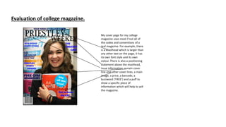
- 1. Evaluation of college magazine. My cover page for my college magazine uses most if not all of the codes and conventions of a real magazine. For example, there is a Masthead which is larger than any other text on the page, it has its own font style and its own colour. There is also a positioning statement above the masthead, issue information, a main cover line and other cover lines, a main image, a price, a barcode, a buzzword (‘FREE’) and a puff to show a specific piece of information which will help to sell the magazine.
- 2. For my cover page I used Photoshop to produce it, using tools such as the text tool to add text on to the page - masthead, cover lines, positioning statement etc. I used the shape tool to create a circle shape for the puff and added a block colour into it I also used it to add rectangles behind the writing brining the opacity down to blur out the writing in the background of the main image, I copy and pasted images onto Photoshop such as the main image and the barcode – adjusting them to the size I wanted them to be, for example I shrunk down the barcode so it was like the size you would normally see it on a real magazine, and I enlarged the main image and placed it so that the persons face took up more room and there was less background shown.
- 3. The strengths of my magazine cover • It presents the normal codes and conventions of a normal magazine • I followed the brief by using a medium close up of someone • Its college based as all the cover lines, content and images relate to college life. The weaknesses • I feel that it doesn’t like very realistic • The image I used has text in the background which makes it hard to read all the cover lines placed on top which is why I had to use the shape tool on Photoshop and bring down the opacity of the rectangle to blur out the background • The font and colour looks quite childish and therefore wouldn’t really appeal to the ages that a college magazine should appeal to.