The document discusses the intentions and design choices behind a digipak, magazine advertisement, and music video created to promote an album.
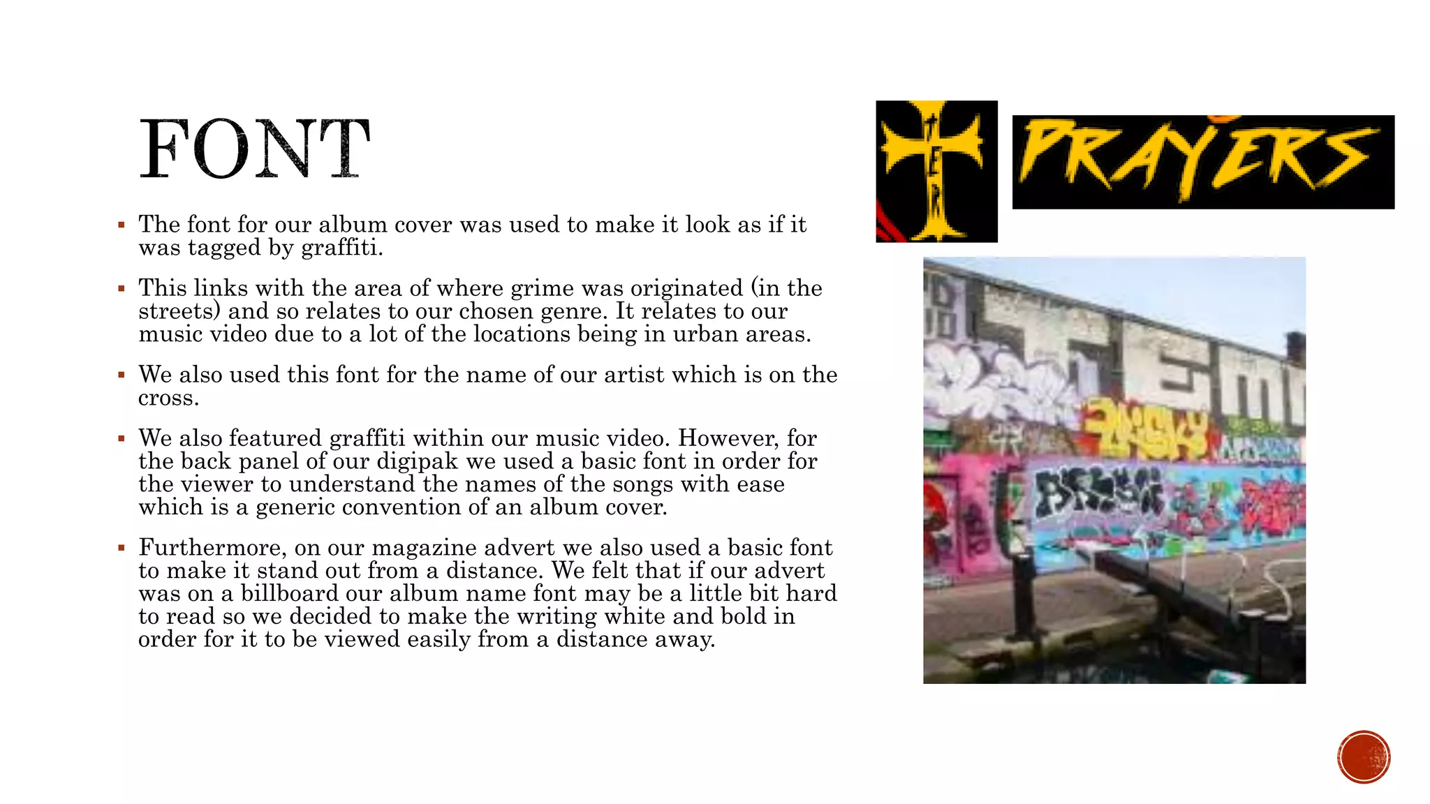
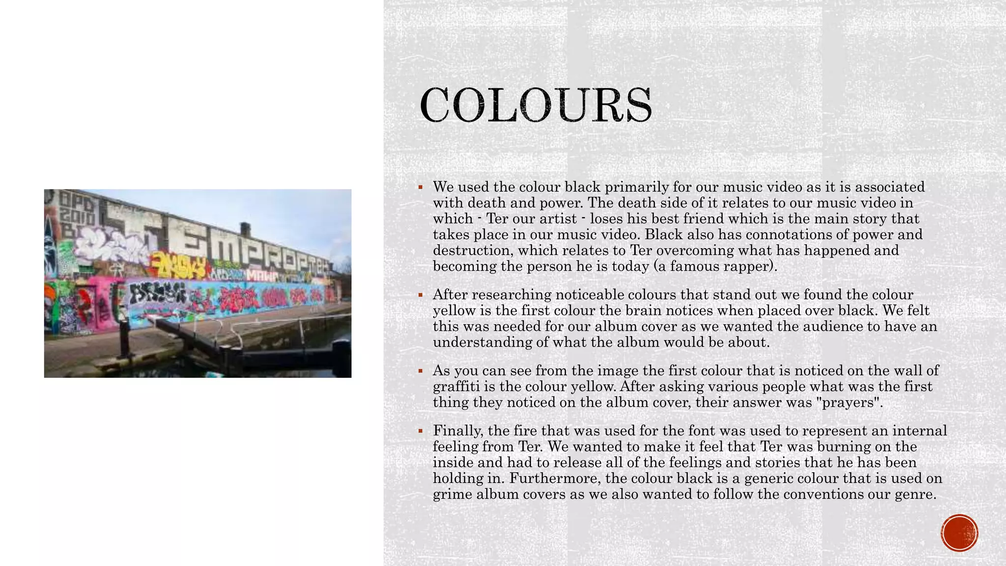
The main intentions were to relate the digipak design to the music video's narrative about grieving the loss of a friend. Religious symbols like praying hands were used throughout to signify the character turning to prayer. Contrasting colors and fonts were chosen to make text stand out.
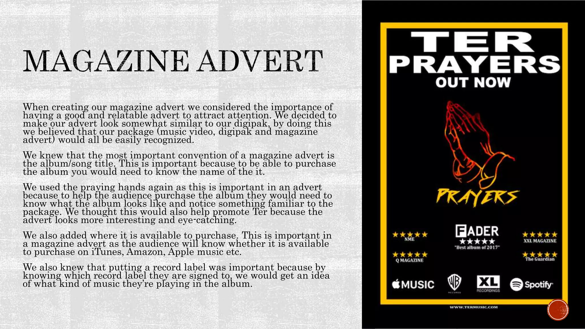
The magazine advertisement was designed to look similar to attract recognition as part of a cohesive package. Key details like the album title and art were included alongside purchase information. Overall, religious symbols and genre conventions were employed across products to effectively portray the grime genre and grief-centered storyline.
June 3, 2024 Anti-Semitism Letter Sent to MIT President Kornbluth and MIT Cor...Levi Shapiro
Letter from the Congress of the United States regarding Anti-Semitism sent June 3rd to MIT President Sally Kornbluth, MIT Corp Chair, Mark Gorenberg
Dear Dr. Kornbluth and Mr. Gorenberg,
The US House of Representatives is deeply concerned by ongoing and pervasive acts of antisemitic
harassment and intimidation at the Massachusetts Institute of Technology (MIT). Failing to act decisively to ensure a safe learning environment for all students would be a grave dereliction of your responsibilities as President of MIT and Chair of the MIT Corporation.
This Congress will not stand idly by and allow an environment hostile to Jewish students to persist. The House believes that your institution is in violation of Title VI of the Civil Rights Act, and the inability or
unwillingness to rectify this violation through action requires accountability.
Postsecondary education is a unique opportunity for students to learn and have their ideas and beliefs challenged. However, universities receiving hundreds of millions of federal funds annually have denied
students that opportunity and have been hijacked to become venues for the promotion of terrorism, antisemitic harassment and intimidation, unlawful encampments, and in some cases, assaults and riots.
The House of Representatives will not countenance the use of federal funds to indoctrinate students into hateful, antisemitic, anti-American supporters of terrorism. Investigations into campus antisemitism by the Committee on Education and the Workforce and the Committee on Ways and Means have been expanded into a Congress-wide probe across all relevant jurisdictions to address this national crisis. The undersigned Committees will conduct oversight into the use of federal funds at MIT and its learning environment under authorities granted to each Committee.
• The Committee on Education and the Workforce has been investigating your institution since December 7, 2023. The Committee has broad jurisdiction over postsecondary education, including its compliance with Title VI of the Civil Rights Act, campus safety concerns over disruptions to the learning environment, and the awarding of federal student aid under the Higher Education Act.
• The Committee on Oversight and Accountability is investigating the sources of funding and other support flowing to groups espousing pro-Hamas propaganda and engaged in antisemitic harassment and intimidation of students. The Committee on Oversight and Accountability is the principal oversight committee of the US House of Representatives and has broad authority to investigate “any matter” at “any time” under House Rule X.
• The Committee on Ways and Means has been investigating several universities since November 15, 2023, when the Committee held a hearing entitled From Ivory Towers to Dark Corners: Investigating the Nexus Between Antisemitism, Tax-Exempt Universities, and Terror Financing. The Committee followed the hearing with letters to those institutions on January 10, 202
Synthetic Fiber Construction in lab .pptxPavel ( NSTU)
Synthetic fiber production is a fascinating and complex field that blends chemistry, engineering, and environmental science. By understanding these aspects, students can gain a comprehensive view of synthetic fiber production, its impact on society and the environment, and the potential for future innovations. Synthetic fibers play a crucial role in modern society, impacting various aspects of daily life, industry, and the environment. ynthetic fibers are integral to modern life, offering a range of benefits from cost-effectiveness and versatility to innovative applications and performance characteristics. While they pose environmental challenges, ongoing research and development aim to create more sustainable and eco-friendly alternatives. Understanding the importance of synthetic fibers helps in appreciating their role in the economy, industry, and daily life, while also emphasizing the need for sustainable practices and innovation.
A Strategic Approach: GenAI in EducationPeter Windle
Artificial Intelligence (AI) technologies such as Generative AI, Image Generators and Large Language Models have had a dramatic impact on teaching, learning and assessment over the past 18 months. The most immediate threat AI posed was to Academic Integrity with Higher Education Institutes (HEIs) focusing their efforts on combating the use of GenAI in assessment. Guidelines were developed for staff and students, policies put in place too. Innovative educators have forged paths in the use of Generative AI for teaching, learning and assessments leading to pockets of transformation springing up across HEIs, often with little or no top-down guidance, support or direction.
This Gasta posits a strategic approach to integrating AI into HEIs to prepare staff, students and the curriculum for an evolving world and workplace. We will highlight the advantages of working with these technologies beyond the realm of teaching, learning and assessment by considering prompt engineering skills, industry impact, curriculum changes, and the need for staff upskilling. In contrast, not engaging strategically with Generative AI poses risks, including falling behind peers, missed opportunities and failing to ensure our graduates remain employable. The rapid evolution of AI technologies necessitates a proactive and strategic approach if we are to remain relevant.
Francesca Gottschalk - How can education support child empowerment.pptxEduSkills OECD
Francesca Gottschalk from the OECD’s Centre for Educational Research and Innovation presents at the Ask an Expert Webinar: How can education support child empowerment?
How to Make a Field invisible in Odoo 17Celine George
It is possible to hide or invisible some fields in odoo. Commonly using “invisible” attribute in the field definition to invisible the fields. This slide will show how to make a field invisible in odoo 17.
Operation “Blue Star” is the only event in the history of Independent India where the state went into war with its own people. Even after about 40 years it is not clear if it was culmination of states anger over people of the region, a political game of power or start of dictatorial chapter in the democratic setup.
The people of Punjab felt alienated from main stream due to denial of their just demands during a long democratic struggle since independence. As it happen all over the word, it led to militant struggle with great loss of lives of military, police and civilian personnel. Killing of Indira Gandhi and massacre of innocent Sikhs in Delhi and other India cities was also associated with this movement.
Unit 8 - Information and Communication Technology (Paper I).pdfThiyagu K
This slides describes the basic concepts of ICT, basics of Email, Emerging Technology and Digital Initiatives in Education. This presentations aligns with the UGC Paper I syllabus.
Introduction to AI for Nonprofits with Tapp NetworkTechSoup
Dive into the world of AI! Experts Jon Hill and Tareq Monaur will guide you through AI's role in enhancing nonprofit websites and basic marketing strategies, making it easy to understand and apply.
Biological screening of herbal drugs: Introduction and Need for
Phyto-Pharmacological Screening, New Strategies for evaluating
Natural Products, In vitro evaluation techniques for Antioxidants, Antimicrobial and Anticancer drugs. In vivo evaluation techniques
for Anti-inflammatory, Antiulcer, Anticancer, Wound healing, Antidiabetic, Hepatoprotective, Cardio protective, Diuretics and
Antifertility, Toxicity studies as per OECD guidelines
2. Our Intentions:
When creating our digipak our main intentions were to make it relate in some
way to our music video. After listening to our chosen song many times and
looking at our main performer we decided that a relevant theme would be
religion. We wanted to make our digipak very subtle using contrasting colours
to make our main feature stand out.
We chose religion as the narrative of our song is about someone close that dies
and his friend grieving. Usually after these circumstances people grieving will
reach out to the church for comfort. We accomplished this by using an outline of
some praying hands to signify TER praying for his friend.
The synergy for our package is the praying hands symbol. We used this on our
ancillary texts as well as featuring it in our music video. Our intentions was for
the viewer to have an idea of what could happen in our video just by viewing
the digipak. We thought this could be possible due to the name of the album
(prayers) and also the images shown.
The title and name of the album is the biggest text used as we wanted it to
stand out and grab attention.
The main colours used were black, white and yellow, this is because they
contrast with one another and make the font stand out. We used a fire/flame
background on our text as we thought this may have connotations of rage,
anger and fear. This relates nicely to our music video as Ter may be feeling
scared and angry after losing his best friend in such a horrible circumstance.
We thought adding rosary beads would also be a nice touch as they again relate
to religion.
3. When creating our magazine advert we considered the importance of
having a good and relatable advert to attract attention. We decided to
make our advert look somewhat similar to our digipak, by doing this
we believed that our package (music video, digipak and magazine
advert) would all be easily recognized.
We knew that the most important convention of a magazine advert is
the album/song title. This is important because to be able to purchase
the album you would need to know the name of the it.
We used the praying hands again as this is important in an advert
because to help the audience purchase the album they would need to
know what the album looks like and notice something familiar to the
package. We thought this would also help promote Ter because the
advert looks more interesting and eye-catching.
We also added where it is available to purchase. This is important in
a magazine advert as the audience will know whether it is available
to purchase on iTunes, Amazon, Apple music etc.
We also knew that putting a record label was important because by
knowing which record label they are signed to, we would get an idea
of what kind of music they’re playing in the album.
4. The overall synergy for our package was to
portray religion. We accomplished this by
including the praying hands, rosary beads, the
dove and the church/grave yard in our music
video.
The praying hands were the most iconic symbol
throughout our package as it was the front cover
for our album as well as featuring it in our music
video too.
The rosary beads are used when praying so we
believed this worked for our package as it
correlates to the praying hands.
The dove is used to represent peace. We used the
dove on the inside of our gate fold to make it
seem as if it was carrying the rosary beads to
someone and in the image on the following side
Ter is holding the rosary beads in an open hand
as if they have just been dropped there.
The church is the final scene in our music video.
This is where Ter visits his friends grave and
lays down the flowers. This shows the final stage
of his grieving before he begins to carry on with
his life.
5. The font for our album cover was used to make it look as if it
was tagged by graffiti.
This links with the area of where grime was originated (in the
streets) and so relates to our chosen genre. It relates to our
music video due to a lot of the locations being in urban areas.
We also used this font for the name of our artist which is on the
cross.
We also featured graffiti within our music video. However, for
the back panel of our digipak we used a basic font in order for
the viewer to understand the names of the songs with ease
which is a generic convention of an album cover.
Furthermore, on our magazine advert we also used a basic font
to make it stand out from a distance. We felt that if our advert
was on a billboard our album name font may be a little bit hard
to read so we decided to make the writing white and bold in
order for it to be viewed easily from a distance away.
6. We used the colour black primarily for our music video as it is associated
with death and power. The death side of it relates to our music video in
which - Ter our artist - loses his best friend which is the main story that
takes place in our music video. Black also has connotations of power and
destruction, which relates to Ter overcoming what has happened and
becoming the person he is today (a famous rapper).
After researching noticeable colours that stand out we found the colour
yellow is the first colour the brain notices when placed over black. We felt
this was needed for our album cover as we wanted the audience to have an
understanding of what the album would be about.
As you can see from the image the first colour that is noticed on the wall of
graffiti is the colour yellow. After asking various people what was the first
thing they noticed on the album cover, their answer was "prayers".
Finally, the fire that was used for the font was used to represent an internal
feeling from Ter. We wanted to make it feel that Ter was burning on the
inside and had to release all of the feelings and stories that he has been
holding in. Furthermore, the colour black is a generic colour that is used on
grime album covers as we also wanted to follow the conventions our genre.
7. In our music video we featured three different types of
colour effects. The first was a black and white effect. This
was used primarily as the colour through our music video
due to it being quite dull and depressing relating to Ter’s
feeling and also because a lot of grime music videos are also
black and white.
The second effect was a prism effect. This effect was used to
give a sense of confusion. We only used this effect a couple
of times and it happens when Ter thinks he has seen his
friend but when he looks back to see if he did it turns out
that no one is there. The prism effect allowed us to portray
disorientation easily as this is what Ter was experiencing at
that time.
The final effect was a cast effect. This gave the scenes a
blue effect which was used for Ter’s flashbacks. The blue
helped create the feeling of sadness (“feeling blue”) and Ter
reminiscing the good times he had with his friend as well as
the night where his friend was killed. The cast effect also
gave a clear indication that, that specific shot was a
flashback.
8. GENRE
In our music video we have used a variety of
signifiers to reveal that our song is from the grime
genre. Examples of this include the locations
where we filmed as well as the clothes that our
artist was wearing.
We got Ter to wear a hat for a lot of the shots as
this was his start iconography, we also got him to
wear a mask in some shots, as well as others with
is hood up.
Tracksuits are another signifier that a song is
from the grime genre as this is what they typically
wear when in the music video due to them being
such a lower budget market they don't typically
wear extravagant clothing. On the controversy,
some artists may wear designer brands to show
how far they have come.
All of the colour effects we used for the music
video follow the conventions of a grime music
video which we believed it allowed our music video
effective.
9. How effective is the combination of your main product and ancillary texts?
We think that our digipak, magazine advertisement and music video combined
work really well as a package and are recognisable to the public.
Overall we believe that our ancillary texts and our main text was effective to
understand that our genre was grime. We believe that the synergy throughout the
package gave a clear indication of what our narrative was too.
Furthermore, we believe that our package has definitely hit the target audience of
time viewers - typically between the ages of 16-30 - as it shows that our ancillary
texts are basic yet effective and that there isn't loads going on that our audience
begin to get distracted when looking at it.
Our main product and ancillary texts fit in with our genre and look like a typical
grime package.