Download to read offline
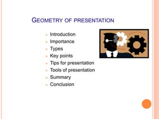
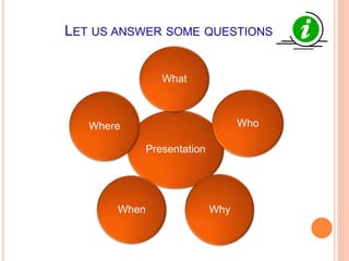
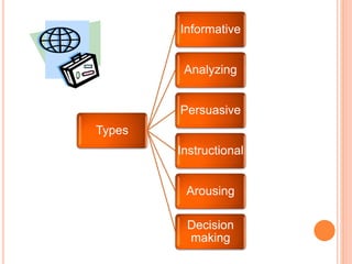


This document provides tips for an effective presentation. It discusses the geometry and structure of a presentation, including introducing the topic, importance, types, key points, tips, and tools. It covers types of presentations like informative, analytical, and persuasive. Tips include understanding the audience, preparing content, confident delivery, and controlling the environment. When preparing content, the document recommends including a title, outline, background, summary, and conclusions. Tools for presentation include slides, videos, pictures, graphs, and oration. The document provides examples of good and bad practices for slides, fonts, backgrounds, colors, spelling/grammar, videos, pictures, graphs, and oration.


![Presentation tips lecture [Autosaved] (3).pptx](https://cdn.slidesharecdn.com/ss_thumbnails/presentationtipslectureautosaved3-220731045341-ebc87184-thumbnail.jpg?width=640&height=640&fit=bounds)


