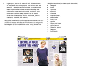
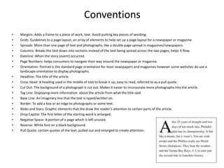
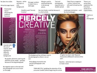
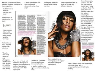
Page Layout/Recipe Cards
Shania Carter
• Page layout should be effective and professional in
all magazines and newspapers. The clearer that the
layout is, creates a clearer message to the audience
in the right manner. There are a list of things that
support the page layout including; headlines, pull
quote and columns. Page layouts can be about
attracting the attention of your audience, making
the layout pleasing and flowing.
Magazines with lots of sponsored advertisements rely on
professional page layout quite heavily because they want
to compete for visual attention when being distributed.
Things that contribute to the page layout are:
• Margins
• Grids
• Spreads
• Columns
• Dateline
• Page Numbers
• Orientation
• Base Line
• Border
• Blobs and Stars
• Drop Capital
• Negative Space
• Reverse
• Pull Quote
Conventions
• Margins: Adds a frame to a piece of work, text. Avoid putting key pieces of wording.
• Grids: Guidelines to a page layout, an array of elements to help set up a page layout for a newspaper or magazine.
• Spreads: More than one page of text and photographs, like a double page spread in magazines/newspapers.
• Columns: Breaks the text down into sections instead of the text being spread across the two pages, helps it flow.
• Dateline: When the story (event) occurred.
• Page Numbers: helps consumers to navigate their way around the newspaper or magazine.
• Orientation: Portrait is the standard page orientation for most newspapers and magazines however some websites do use a
landscape orientation to display photographs.
• Headline: The title of the article.
• Cross Head: A heading used in the middle of text to break it up, easy to read, referred to as a pull quote.
• Cut Out: The background of a photograph is cut out. Makes it easier to incorporate more photographs into the article.
• Tag Line: Displaying more information about the article from what the title said.
• Base Line: An imaginary line that the text is typed/written on.
• Border: To add a box or an edge to photographs or some text.
• Blobs and Stars: Graphic elements that the draw the reader’s attention to certain parts of the article.
• Drop Capital: The first letter of the starting word is enlarged.
• Negative Space: A portion of a page which is left unused.
• Reverse: White font on a black background.
• Pull Quote: certain quotes of the text, pulled out and enlarged to create attention.
Margins used to
avoid putting text
in the wrong
places.
Taken from a magazine
– online. Columns are
still used to break up the
text.
Text and
photography
expands over a
double spread.
No date line visible. No page numbers
as taken from a
web page.
Landscape orientation – used
by most webpages.
Headline used ‘Fiercely
Creative’
No cross heads, could be because it
is a short article.
The background has still been used in
the photograph so there is no cut
out.
A tagline has been used ‘Beyoncé
honoured as Billboard’s woman of the
year’.
Baseline – what the text is resting on
to make it even.
Pink edging around the text
and the photograph is the
border.
No graphic elements used to grab
attention of the reader – perhaps
because of the big photograph.
There is no
actual drop
capital but the
first three
words are in
capital letters.
No negative space as the text and
the photograph use a lot of room
on the page.
Reverse – white
writing on a
pink
background.
‘FANS ARE STILL’ grabbing the attention of the
consumer (reader) before beginning the article.
Attractive page layout.
Pink border
layout –
attracting the
audience,
feminine.
Example with
the use of
reverse, white
writing on a
different
coloured
background.
Tagline on
the
photograph.
A margin has been used on this
layout to avoid text from being in
the wrong places.
A grid may have been used
to help gather the
elements to set up these
pages.
Double page spread for
photograph(s) and the
interview.
Three separate columns to
break up the text with
different subjects.
No dateline as to
when the
interview took
place.
Page numbers at
the bottom of the
page.
The orientation
of the text is
portrait but the
whole double
spread is
landscape.
No headline as
this is from the
middle of an
interview.
There is a
cross head
above the
first
photograph.
This has been
used because
the publisher
wants you to
keep reading.
There is no particular cut
out for the photograph as
the white background that it
has been taken against
matches the style of the
page layout.
There is not a tagline in
this example because
there is no headline.
A baseline has been used
again to make sure the text is
even.
There is a black border
running around the edge of
the pages, making the
layout stylish.
There is one pull quote from this example,
entices the reader with a
hard/sympathetic point made by the
celebrity.
From this example,
we have seen that
the page layout is
stylish, with a black
and white effect. The
page layout has
blended in well with
the colours,
reflecting the
colours/personality
of the magazine and
celebrity. I think that
the black border on
this example has
added the edge to
the type of interview
which is being
written about. I also
think that a grid has
been used instead of
a template because
of the way the pull
quote has been
positioned.

Page layout

  • 1.
  • 2.
    • Page layoutshould be effective and professional in all magazines and newspapers. The clearer that the layout is, creates a clearer message to the audience in the right manner. There are a list of things that support the page layout including; headlines, pull quote and columns. Page layouts can be about attracting the attention of your audience, making the layout pleasing and flowing. Magazines with lots of sponsored advertisements rely on professional page layout quite heavily because they want to compete for visual attention when being distributed. Things that contribute to the page layout are: • Margins • Grids • Spreads • Columns • Dateline • Page Numbers • Orientation • Base Line • Border • Blobs and Stars • Drop Capital • Negative Space • Reverse • Pull Quote
  • 3.
    Conventions • Margins: Addsa frame to a piece of work, text. Avoid putting key pieces of wording. • Grids: Guidelines to a page layout, an array of elements to help set up a page layout for a newspaper or magazine. • Spreads: More than one page of text and photographs, like a double page spread in magazines/newspapers. • Columns: Breaks the text down into sections instead of the text being spread across the two pages, helps it flow. • Dateline: When the story (event) occurred. • Page Numbers: helps consumers to navigate their way around the newspaper or magazine. • Orientation: Portrait is the standard page orientation for most newspapers and magazines however some websites do use a landscape orientation to display photographs. • Headline: The title of the article. • Cross Head: A heading used in the middle of text to break it up, easy to read, referred to as a pull quote. • Cut Out: The background of a photograph is cut out. Makes it easier to incorporate more photographs into the article. • Tag Line: Displaying more information about the article from what the title said. • Base Line: An imaginary line that the text is typed/written on. • Border: To add a box or an edge to photographs or some text. • Blobs and Stars: Graphic elements that the draw the reader’s attention to certain parts of the article. • Drop Capital: The first letter of the starting word is enlarged. • Negative Space: A portion of a page which is left unused. • Reverse: White font on a black background. • Pull Quote: certain quotes of the text, pulled out and enlarged to create attention.
  • 4.
    Margins used to avoidputting text in the wrong places. Taken from a magazine – online. Columns are still used to break up the text. Text and photography expands over a double spread. No date line visible. No page numbers as taken from a web page. Landscape orientation – used by most webpages. Headline used ‘Fiercely Creative’ No cross heads, could be because it is a short article. The background has still been used in the photograph so there is no cut out. A tagline has been used ‘Beyoncé honoured as Billboard’s woman of the year’. Baseline – what the text is resting on to make it even. Pink edging around the text and the photograph is the border. No graphic elements used to grab attention of the reader – perhaps because of the big photograph. There is no actual drop capital but the first three words are in capital letters. No negative space as the text and the photograph use a lot of room on the page. Reverse – white writing on a pink background. ‘FANS ARE STILL’ grabbing the attention of the consumer (reader) before beginning the article. Attractive page layout. Pink border layout – attracting the audience, feminine. Example with the use of reverse, white writing on a different coloured background. Tagline on the photograph.
  • 5.
    A margin hasbeen used on this layout to avoid text from being in the wrong places. A grid may have been used to help gather the elements to set up these pages. Double page spread for photograph(s) and the interview. Three separate columns to break up the text with different subjects. No dateline as to when the interview took place. Page numbers at the bottom of the page. The orientation of the text is portrait but the whole double spread is landscape. No headline as this is from the middle of an interview. There is a cross head above the first photograph. This has been used because the publisher wants you to keep reading. There is no particular cut out for the photograph as the white background that it has been taken against matches the style of the page layout. There is not a tagline in this example because there is no headline. A baseline has been used again to make sure the text is even. There is a black border running around the edge of the pages, making the layout stylish. There is one pull quote from this example, entices the reader with a hard/sympathetic point made by the celebrity. From this example, we have seen that the page layout is stylish, with a black and white effect. The page layout has blended in well with the colours, reflecting the colours/personality of the magazine and celebrity. I think that the black border on this example has added the edge to the type of interview which is being written about. I also think that a grid has been used instead of a template because of the way the pull quote has been positioned.