Sell line


        Mast head

     Main image                          Cover
                                         line


            Name of featured artist


                                    Cover line and
 Cover lines and   Cover line and
                                    appropriate
 appropriate       appropriate
 images                             image
                   image
                                              Barcode
Contents
                               List of contents


A-Z of bands
featured in
magazine


               Small article


                                         Advertisement for magazine
                                         subscription
Title of article


                          Images


                              Images


                                   Images
                                                     Images


Main article
                                            Images
                                                         Images


                                   Images
                                                     Images
Quotes


Main image


            Main article
           Main article
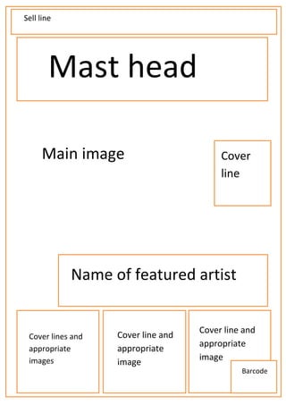
I have chosen this layout for my front cover as I believe that it follows the route of the eye and
includes all of the features you would expect to see on the front cover of a music magazine. From
my research I have found out that most people tend to want information about the contents on the
front cover, therefore I have included a lot of space for cover lines so that the audience can get a
good idea of the contents of the magazine. There will also be a large, clear mast head at the top of
the page, allowing the audience to know the name of the magazine. I also plan to use a large image
of the featured band/artist for the background of the magazine. I have decided to do this, as from
my questionnaire I have noticed that the audience want to see a big, clear image of the main
bands/artists that they like.


I have chosen this layout for my contents page as I believe that it follows the route of the eye, and
shows all of the information that the audience need to know about the contents of the magazine. I
have chosen to include an A-Z of the bands that are included in the magazine as it makes it easier for
the audience to locate the bands that they are looking for. I have chosen to include a small article as
it gives the audience a taste of what is to come further into the magazine. There is also a list of the
contents and the pages in which they can be found, this makes it easier for them to find the things
they are looking for in the music magazine.


I have chosen this layout for my double page spread as I believe that it follows the route of the eye
and has enough space for all of the needed information. I have also seen similar layouts for double
page spreads that have been used in the professional magazines that I have used in my research.
Therefore I believe that the layout I have chosen is suitable for the genre of magazine I have chosen
to do.
Colour schemes


                 I may choose to use these colours (red white black) I from my research I
                 have found that they are very common with the genre of music I have
                 chosen to base my magazine on. They also tend to represent the rock
                 genre, which I plan to include in my magazine.


                 I may choose to use these colours as I have seen similar colours used on
                 one of the contents pages in one of the magazines I have chosen to
                 research, I also think that it represents the genre of music I have chosen
                 to do.


                               I may choose these colours as I think that it will look
                               professional, and will be a successful house style if I use
                               these colours constantly, I have also seen similar colours
                               used in my research.


                                 I may choose to use these colours as I have seen these
                                 colours used on the front cover of a magazine that I have
                                 included in my research (NME magazine) I also think that
                                 they represent the indie genre well, as they are bright.
                                 They will also make certain parts of the magazine stand
                                 out as the colours are bold and noticeable

Draft for magazine

  • 1.
    Sell line Mast head Main image Cover line Name of featured artist Cover line and Cover lines and Cover line and appropriate appropriate appropriate images image image Barcode
  • 2.
    Contents List of contents A-Z of bands featured in magazine Small article Advertisement for magazine subscription
  • 3.
    Title of article Images Images Images Images Main article Images Images Images Images
  • 4.
    Quotes Main image Main article Main article
  • 5.
    I have chosenthis layout for my front cover as I believe that it follows the route of the eye and includes all of the features you would expect to see on the front cover of a music magazine. From my research I have found out that most people tend to want information about the contents on the front cover, therefore I have included a lot of space for cover lines so that the audience can get a good idea of the contents of the magazine. There will also be a large, clear mast head at the top of the page, allowing the audience to know the name of the magazine. I also plan to use a large image of the featured band/artist for the background of the magazine. I have decided to do this, as from my questionnaire I have noticed that the audience want to see a big, clear image of the main bands/artists that they like. I have chosen this layout for my contents page as I believe that it follows the route of the eye, and shows all of the information that the audience need to know about the contents of the magazine. I have chosen to include an A-Z of the bands that are included in the magazine as it makes it easier for the audience to locate the bands that they are looking for. I have chosen to include a small article as it gives the audience a taste of what is to come further into the magazine. There is also a list of the contents and the pages in which they can be found, this makes it easier for them to find the things they are looking for in the music magazine. I have chosen this layout for my double page spread as I believe that it follows the route of the eye and has enough space for all of the needed information. I have also seen similar layouts for double page spreads that have been used in the professional magazines that I have used in my research. Therefore I believe that the layout I have chosen is suitable for the genre of magazine I have chosen to do.
  • 6.
    Colour schemes I may choose to use these colours (red white black) I from my research I have found that they are very common with the genre of music I have chosen to base my magazine on. They also tend to represent the rock genre, which I plan to include in my magazine. I may choose to use these colours as I have seen similar colours used on one of the contents pages in one of the magazines I have chosen to research, I also think that it represents the genre of music I have chosen to do. I may choose these colours as I think that it will look professional, and will be a successful house style if I use these colours constantly, I have also seen similar colours used in my research. I may choose to use these colours as I have seen these colours used on the front cover of a magazine that I have included in my research (NME magazine) I also think that they represent the indie genre well, as they are bright. They will also make certain parts of the magazine stand out as the colours are bold and noticeable